This checklist is for B2B brands that sell a high-end service. If you meet these two criteria, this is for you:
- You offer premium service to other businesses
You sell to companies, not consumers. You’re B2B. And your services aren’t cheap. Yours is a premium service. You are not the lowest price in the market. - There are multiple decision-makers
Your buyers are making a “high consideration” decision. There are several people involved in the sales process and it can take weeks to decide on a provider.
The B2B marketing website is critical in driving demand through clarity and trust, through content and design. We invite you to review the service pages on your website against this checklist.
- Are there missed opportunities?
- Is anything unclear?
- Could changes to the content and design make it a better page?
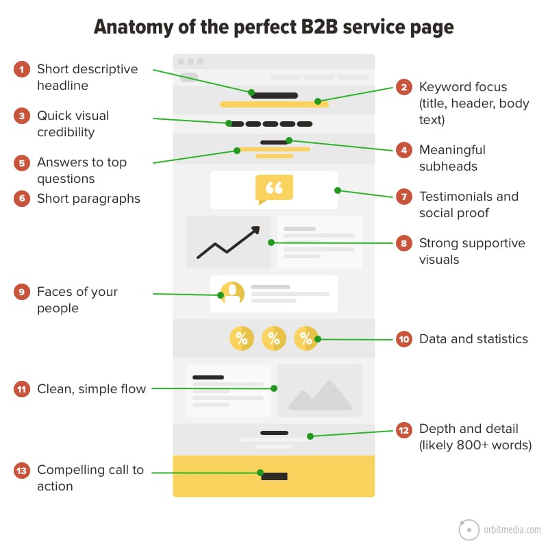
We hope this guide will help you improve those pages or planning for a redesign. We’ll start with a visual of a B2B website service page that includes them all.
Note: This checklist does not include so-called global elements, such as website navigation and footers, which appear on every page on your website.
1. Short and descriptive headline
Those few words at the top of the page should pass the “backyard BBQ test.”
Imagine you meet someone for the first time at a party. They ask what you do. You respond with the words at the top of your service page.
- Now do they understand what you do?
- Or are they confused?
- Did you pass the test?
Here are examples of headers that don’t pass the test:
- “We take excellence to new levels”
- “Transforming experiences one brand at a time”
- “Capture opportunities. Driving ROI.”
None of those actually describe a service.
If the header at the top of the page isn’t descriptive, visitors will have to scroll, scan and keep reading to learn what your company offers.
Every visit to your page starts with this question: Am I in the right place? It’s the header’s job to answer.
2. Keyword focus
Service pages are often easy to optimize for search. People look for services all the time. These searches are “commercial intent” keyphrases, which are the best kind. They drive demand from people who don’t yet know your brand.
This is where keyphrase research comes in. And this is the second reason to make that header descriptive.
The key is to pick battles that are worth winning (high search volume) and that can be won (low competition). Next, align pages with phrases. The content on these pages will indicate its relevance by using both the target phrase in the most important places
- Title tag
- Header <h1> tag
- The body text
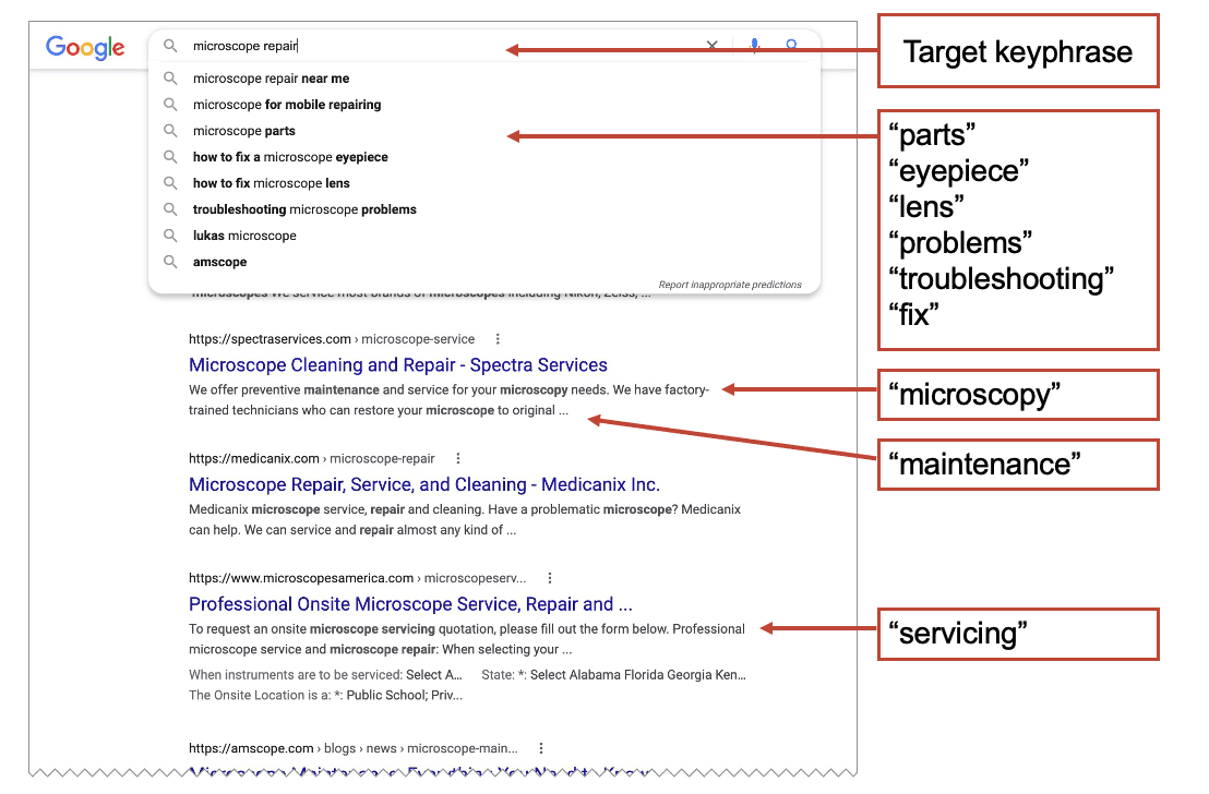
Beyond the basics, the page should incorporate the semantically related phrases. These are the phrases, questions and subtopics that are closely related to your primary phrase. Building them into the content is called semantic SEO. But how do you find these phrases? It’s easy. They are everywhere. Just search for the primary phrase and related words, phrases, subtopics and questions will appear everywhere in the search results page.
- Suggested phrases
- Bolded phrases (beyond the specific words you searched for)
- Related searches at the bottom
- “People also ask” questions and answers
In this example, I searched for the commercial-intent service phrase, “microscope repair” and see many semantically related phrases I should include in my page.
You can also do this with tools, such as MarketMuse Optimize or the SEMrush SEO Writing Assistant.
A well-planned B2B service website has an entire sitemap that is search optimized. There are lots of pages aligned with lots of different keyphrases. Each is an opportunity to attract a high-intent visitor. Our guide on how to make a sitemap explains in detail with examples.
3. Quick visual credibility
Often, the next step for a great B2B service page is to differentiate the brand from competitors. This can be done quickly and visually with logos high up, near the top of the page.
- Logos of clients
- Awards
- Partnerships
- Certifications
These so-called “trust seals” build trust instantly. They also provide a bit of differentiation. Not every competitor can put these on their pages.
4. Meaningful subheads
Subheads keep the visitor flowing through the content. They tell the visitor what’s in each section, so they can decide if they want to slow down and read deeper.
- If the subheads are vague, the visitor is less likely to slow down
- If the subheads are meaningful, they’re more likely to read the section.
Suppose you’re a company that services jetpacks for space exploration companies.
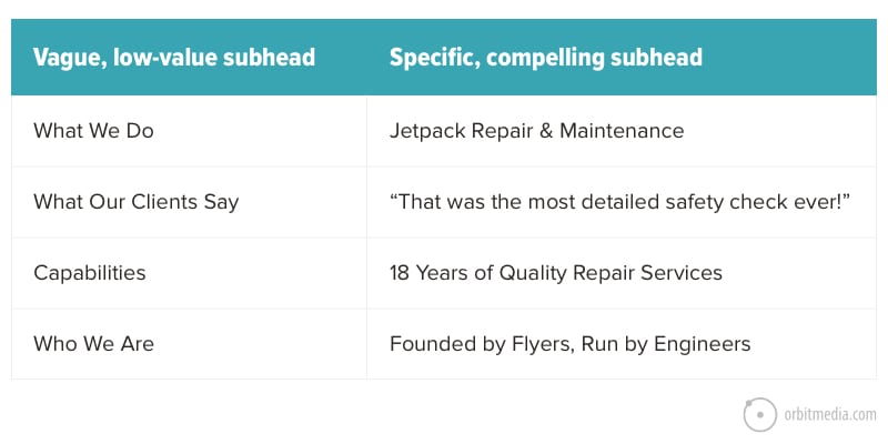
Specificity is good for visitors. It’s also good for search engines.
5. Answers to top sales questions
Imagine the phone rings. It’s a prospect called to talk about this service. They have questions. You answer them. They have objections. You address them. It’s a conversation.
The best service pages emulate that sales conversation. It answers questions, addresses objections and gives examples. The more educated the visitor, the more likely they are to become a lead.
Here are questions you can ask your current clients to find out what to put on the service page.
- Take me back to the moment when you first realized you needed help. What was going on at the time?
- What else did you try and what didn’t you love about it?
- What almost kept you from buying from us?
- What made you confident enough to give us a try?
- When evaluating options, what was most important to you?
- What can you do now (or do better) that you couldn’t do before?
- Give me an example of when our services made a difference for you?
- If you couldn’t work with us ever again, what would you miss the most?
- What’s the #1 thing that you’d tell a friend if you wanted to convince them to give us a try?
This qualitative research is key to conversion copywriting. Before you know the answers to these questions, it’s very difficult to build a high performing page.
6. Short paragraphs and plenty of formatting
Subheads help, but visitors will still struggle if you use dense, blocky paragraphs. Long paragraphs get scanned. Short paragraphs get read.
As a general rule, make sure paragraphs are no longer than three lines.
Your page has a back button, just like every other page on the web. Competition for attention is fierce. If the visitor finds your content hard to consume, they know they can find help somewhere else.
So break up those paragraphs. Add some whitespace. And while your add it, mix in some other formatting to make your sales copy easy to scan:
- Bullet and numbered lists
- Bold and italics
- Internal links
- Short, simple words
- Multiple images …more on pictures in a minute
In these examples, the text is the same. Only the formatting is different. Which works better for scan readers? Which will have better engagement?
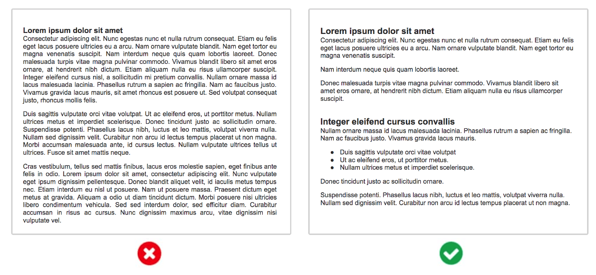
It’s up to the writer, but the designer helps. The container for this content shouldn’t have very small text, very long lines and weak color contrast. Light gray on white? Who can read that?
7. Testimonials from happy clients
A lawyer wouldn’t go to trial without a witness. Web designers shouldn’t go live without testimonials.
Every one of your messages has a messenger. And the best messenger is the client themselves. When they say it, the message transforms from regular marketing into social proof.
Social proof shows that others have chosen your brand, making the choice feel safer. And the wording in testimonials is often more forthright than anything you could have written yourself.
Notice how testimonials, either video or text, can answer questions and address objections.
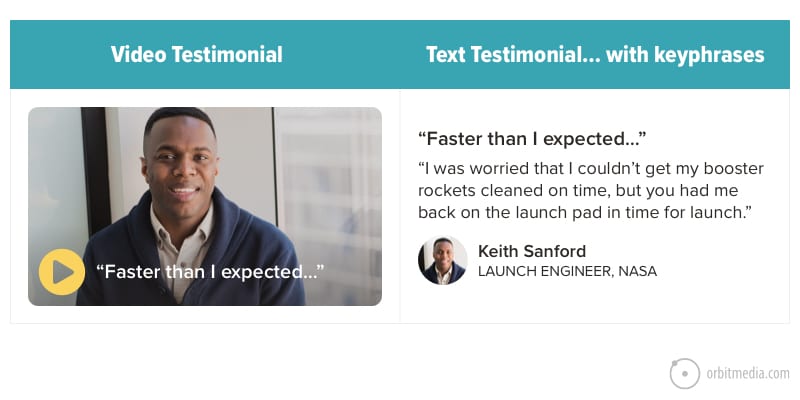
Notice how the best testimonials have their own little headlines. In videos, they’re in the thumbnail. In text, they’re above the testimonial, the same way Amazon has little headlines above the reviews.
Text-based testimonials are also opportunities to include a keyphrase (we’ll talk about keyphrases and SEO in a minute). Read more on how to write testimonials.
Does your current page include evidence that you’re legitimate? If not, it is a pile of unsupported marketing claims.
8. Strong supportive visuals
Charts and graphs are more visually compelling than text. They are more likely to be seen and remembered. So whenever possible, upgrade those statistics from text to visuals.
Diagrams are also powerful. Does your service involve a multi-step process? Don’t just describe it with text; show it with visuals.
Visuals get visitors to lean in and engage with the content. The best visuals are custom designed and unique to your business. They align with the brand and match the design.
The weakest visuals? Stock photography. Use stock only as a last resort.
9. Faces of your people
Faces are magnetic. We are all hard-wired to look at faces. So pictures of people instantly make a service page more compelling.
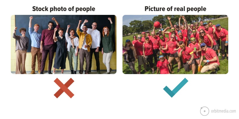
And when those pictures are real people at the business, they lend legitimacy. They create a human connection. They answer some important questions.
Who is behind this brand? Who might I work with if I use this company? Is this a real business?
If you don’t show your team, you miss another chance to differentiate. You people are your difference. You’re the only company with your team.
You may also lose your visitor. If they want to see who works there, they have no choice but to leave and go to LinkedIn.
Little companies always try to look bigger. And big companies always try to look smaller. Really, every company should just try to be more human.
10. Data and statistics
If Testimonials are a challenge, there are other ways to add evidence. Data about your business or the value of your services can help nudge the visitor toward conversion.
Beyond the industry- or company-specific stats you can add, here are some common examples.
- Years in business
- Number of clients / successful projects
- Number of team members
- Typical return on investment
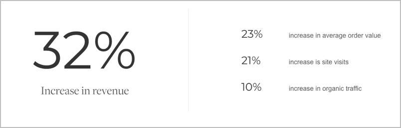
When given a bit of design love, these numbers can jump off the page and set you apart from competitors. Statistics appeal to the desire of all visitors to make rational decisions based on data.
Remember, evidence is differentiation. Without evidence, the content is common. Anyone can make a claim without evidence.
11. Clean, simple flow
The webpage uses a visual hierarchy that guides the visitors’ eyes down the page through a series of prioritized messages, answering questions and adding evidence.
The page knows what it wants visitors to look at. It gives them those things one at a time.
That means there aren’t several things competing for their attention. No matter how far down your visitor scrolls, it’s clear what you’re giving them.
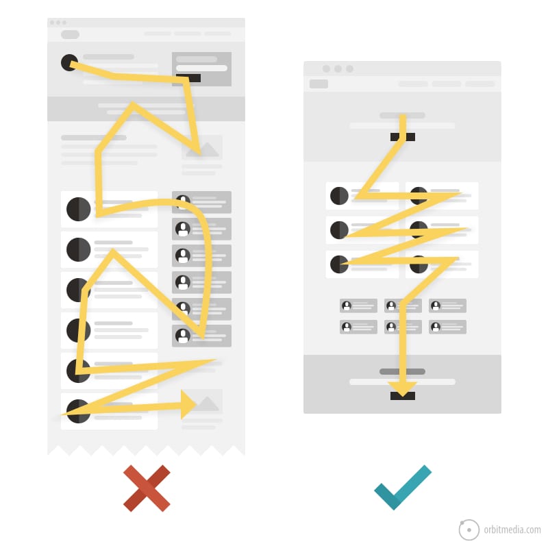
Visual hierarchies are carefully crafted in the design process. The designer controls the eyes of the visitor using size, placement, color and whitespace.
When the visual hierarchy aligns with the messaging priority, the page guides the visitors attention through a series of thoughts, increasing clarity and trust as the visitor flows down the page.
This is how content and containers drive conversions.
12. Depth, detail and 800 words
A great sales call can take a while. The prospect has quite a few questions and the salesperson’s answers are detailed and thorough.
A great sales page is no different. It takes its time covering each topic, often using 800 to 1000 words. A short sales page is like a sales associate who hangs up the phone before the conversation with the prospect is finished.
The goal of the writer is to make it complete, answering every question and thereby addressing every objection.
“But I thought that website visitors have short attention spans? Doesn’t that mean I should have short pages?”
No. It just means the content should be scannable and broken up into sections. Which means…
13. Compelling call to action
Sales pages often stop right before the finish line. Rather than offering a call to action (CTA) suggesting the visitor gets in touch, the page just dead ends.
Instead of asking for the lead a sales page without a CTA implicitly suggests these options:
- Scroll backwards, up to the top of the page and click contact
- Hit the back button, going back to search results and visit another website
- Close the tab and go do something else
So the first step is to make sure that the page has at least one call to action, near the bottom, toward the end of the sales conversation.
Next, look closely at the verbs. Does it just say “contact” or is it something more compelling. Verbs such as “read” “learn” and “click” aren’t much better. Your buttons and links can work harder for you.
A great call to action triggers demand. It is relevant to the page. It’s personal, warm and inviting. It’s a gentle nudge. And it makes all the difference.
 |
Been a while since your Booster rockets had a checkup?Our in-house, expert engineers are ready to help out. If there’s a problem, they’ll spot it pronto. Schedule a service checkup with Jessica, your jetpack specialist. → |
…and two things to remove
We see these on service pages everywhere. If you have either of these, you can likely improve results just by removing these elements today.
- Carousels and slideshows
Although designers may say that these “let visitors click to see more” what they really do is “hide things until the visitor clicks.” We’ve never seen data suggesting that sliders are successful; we’ve seen a lot of data showing they are not.Why not make things easier to see? Why not simply stack those elements so visitors can see them by simply scrolling? - Social sharing icons
Do you expect visitors to share your sales page? Not likely. This is one of the classic social media integration mistakes. They add visual noise without adding value.If you have social media icons on a sales page, put that URL into Buzzsumo to see if it’s ever been shared.
The perfect B2B website service page stands on its own
It attracts visitors and it compels those visitors to take action. It is both cheese and mousetrap. It does this in the same way that any top sales rep does: by answering questions, offering examples and finally, by asking for the business.
Above all, it makes it easy.
If you don’t have one of these on your site, it might be hard to imagine the business impact. Right now, as you read this sentence, people are looking for your services. Who do they find? They’re visiting your competitor’s webpages. What are they learning?
It’s kind of incredible. If you’ve never seen the Analytics behind a high-performing sales page, it’s dramatic. It’s a game changer. Improve your sales pages to check these boxes and let us know how it goes.