When it comes to homepage image sliders (also called carousels, slideshows, rotating offers, faders, call them what you like), ask online marketers their opinions on them, and you’re bound to get a passionate response. Many (especially developers and conversion rate optimizers) think they are the scourge of the internet! Others (often designers) think they are great. So which is it?
Just do a little Googling and you’ll find no shortage of opinions on the subject. I have (or had, I’m no longer sure!) a pretty strong opinion on their effectiveness.
A few weeks ago, Andy Crestodina wrote a post on this site about “Best Practices” for top websites and included homepage slideshows as one of the best practices. I left a comment basically calling them distractions and conversion killers! As a result, Andy invited me to go dig up all the research that is out there and summarize it here. Guest post opportunity!
Objectives & Testing
It’s tough to research something without an objective in mind. For example, if your only objective is for your site to convey a certain brand image, then you would approach the research out there differently than if your objective is to get people to buy products.
My thought is that nearly every website has goals, some actions we hope that users will take when they visit. We call these desired actions “conversions.” They could be things like placing an order, filling out a lead form, signing up for a subscription or even just clicking an ad or viewing several different pages on the site.
Therefore, when reviewing the different opinions and philosophies on the use of sliders, I’m most interested in those that can support their claims with actual test data that shows an increase or decrease in conversions for the site. Other data, like how often people interact with a slider, or usability observations, or even expert opinions are still valuable, but I mostly want to see research data on how sliders affect the bottom-line.
As you’ll see, this is a little harder to find than one might think!
Usability Experts & Tests
I’m a huge fan of usability testing, watching actual people try to use a site to accomplish a set of tasks, and observing areas where they have difficulties. It’s a great way to uncover issues with the site that, if fixed, could increase conversions. So when I see usability experts comment about what they’ve seen in testing, I listen up!
Lee Duddell, WhatUsersDo
Lee is the Founder and UX Director at WhatUsersDo, a London-based remote usability testing firm. He’s been watching usability tests for years. And lots of those tests involved sites with sliders. Here’s what Lee had to say about “observing thousands of tests” in 2011.
They are next to useless for users and often ‘skipped’ because they look like advertisements. Hence, they are a good technique for getting useless information on a homepage… Use them to put content that users will ignore on your homepage. Or, if you prefer, don’t use them. Ever.
Pretty strong words!
Adam Fellwoes, Digerati
Adam was Head of User Experience at Digerati when he said:
Almost all of the testing I’ve managed has proven that content delivered via carousels are missed by most users. Few interact with them and many comment that they look like adverts — we’ve witnessed the banner blindness concept in full effect.
Craig Kistler, Signet
Craig is Founder of conversion rate optimization firm Strategy & Design Co., and owner of a web design firm, Small Farm Design. Having observed user tests for over 15 years, he’s seen plenty involving image sliders. Craig said:
In all the testing I have done, homepage carousels are completely ineffective… In test after test the first thing the visitor did when coming to a page with a large carousel is scroll right past it and start looking for triggers that will move them forward with their task.
But Where’s The Data?
The testimony of the experts above should not be discounted. They are all indeed experts in the usability field, and their input is certainly enlightening.
In none of those cases is actual test data being presented. Even if it were, usability testing is a means for developing hypotheses to test further. Usability tests on their own are not statistically significant and do not identify whether a change will result in better bottom-line numbers for a website.
That is done by collecting data on the effectiveness of image sliders and testing pages with them against pages without to see which performs better.
However, finding published test results is often quite difficult. Companies conducting tests are naturally unwilling to divulge what they are testing, and what those results are. It is strategic information which is rarely made public.
Nonetheless, there are some tests and other data available on the effectiveness of sliders on actual websites. Most of these studies focus on one of two areas:
- how much sliders are interacted with
- how they affect the bottom-line conversion rate of a site
Let’s look at both.
Slider Interaction Studies
Many of the comments above talk about how rarely people see and interact with sliders. There are some studies available that back that hypothesis up. These studies look at how often users click on sliders or even look at them, and which slides in a set are interacted with most.
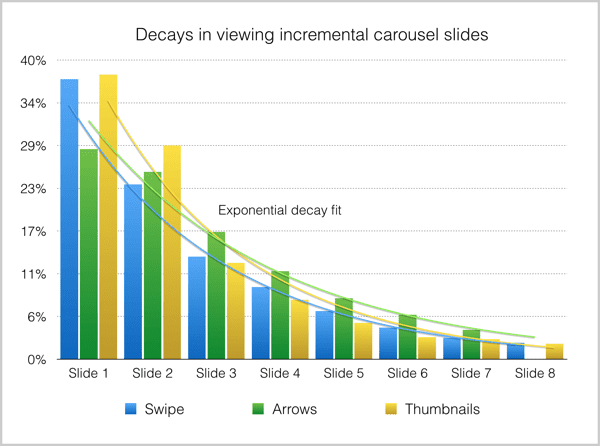
Study #1: Notre Dame University
Some of the most detailed data comes from a study by Notre Dame University web developer Erik Runyon. The nd.edu website ran a slider during the study that received a click-through rate of barely 1%. Further, 84% of those clicks were on the first item in the rotation.
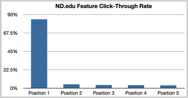
In the Notre Dame University study, nearly 90% of the clicks on the slider were made on the first image in the rotation.
The study also included tracking sliders on four other sites that fared a little better, one with an overall click-through rate of 8.8%, and the others between 1.7% and 2.3%. Erik mentions that he expected these sites to have higher CTRs due to the more targeted nature of the sites’ visitors. But still, the clicks were heavily weighted in favor of the first slide.
Click data on four other sites in the Notre Dame study showed greater click-through rates, but the first item in the rotation was still clicked much more often than others.
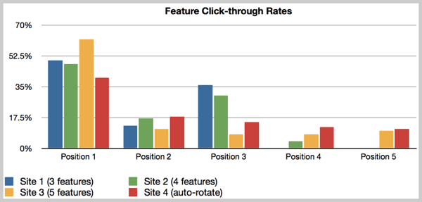
Study #2: Beaconfire Tests on Nonprofit Sites
Beaconfire, a digital agency focusing on nonprofit clients, conducted a similar study with four different clients’ websites. The CTR on these four sites was well under 1%, and again, the first slide in the rotation got the dominant amount of clicks.
![]()
In Beaconfire’s study of four nonprofit websites, the overall click-through rate was again very low, under 1%, and the first item in the rotation was again the most frequently clicked item.
What did Beaconfire take away from this? “People might notice the first couple slides, but they’re not likely to click, and beyond that, no one is even seeing them.”
Study #3: Conversionista and Grzzly Zoo
Conversionista is a Conversion Rate Optimization firm based in Sweden. They ran a test with one of their clients, Grizzly Zoo, a small online pet shop also based in Sweden. The test compared a homepage with a large image slider (control), versus one with a static image. In addition to measuring clicks and engagement, they used eye-tracking technology to see what areas users were giving the most attention.
For the version with the slider, users “seemed to avoid the slider and did not click on it.” For the test version with the static image, eye tracking data showed “a drastically improved interest for the top area and a substantial amount of users also chose to click on the new version.” The numbers showed that too. The static image version was clicked over 40% of the time, while the version with the slider was clicked only 2% of the time.
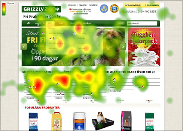
A heat map of user attention showed that the slider in the Conversionista study was virtually ignored (the attention spots that appear to be on the slider were actually on drop-down menus in the navigation.)
Study #4: This Site (Orbit Media)!
After that little blog comment exchange between Andy Crestodina and me, Andy shared the results of an engagement study that Orbit had done with regards to a rotating slideshow vs a static image, as measured in clicks on the image or slideshow. Their version with the static image gained nearly three times as many clicks as the version with the slideshow.
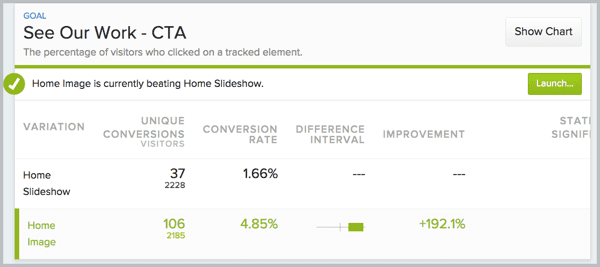
Orbit Media tested engagement in the form of clicks on a static image vs a rotating slide show. “The winner was clear” according to Andy Crestodina.
Study #5: University of York
When he saw the Notre Dame study above, Paul Kelly of the University of York decided to track interactions with the slider on that site. Unfortunately, Paul’s results include a breakdown of clicks per slide, but not an overall click-through rate for the slider. Those results do reiterate, however, that the first slide gets by far the most clicks (and presumably attention). In this experiment, around half of the clicks were on the first slide.
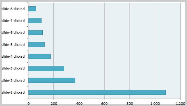
The University of York study again showed that by far the most attention is given to the first slide in the rotation.
Further, he found that when he reduced the number of slides in the slider from eight down to a maximum of five, the slider was clicked more often. However, as the content of the slides was different from earlier collections, it’s not certain whether the increased clicks were due to the smaller number of slides, or simply more compelling content in the slides.
Study #6: MWI Data
Harrison Jones of Digital Marketing firm MWI reported some click-through data for three different websites his firm worked with, each using a homepage slider for different purposes. All three had very low click-through rates, ranging from 0.65% all the way down to 0.16%.
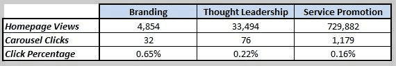
A study by MWI of three different websites with different strategies for homepage sliders showed that in all three cases, clicks to the slider were rare.
Study #7: Mobify Study
Kyle Peatt of Mobify published the results of a study of several mobile ecommerce sites that each had at least $20 million of ecommerce sales per year. In all of these cases, there was no slider on the homepage of the site, but sliders were instead used on the product detail pages of these stores, as image galleries. Also, these sliders did not advance on their own; they only advanced upon taps or swipes by the user to do so.
For this kind of implementation, the interaction numbers were much better. Over the eleven month study of over 7.5 million interactions of sliders, users took the initiative to advance a slider 72% of the time, and zoomed in (analogous to clicking on a homepage slider) 23% of the time.
Additionally, while the first slide in the slider was still interacted with most often, the drop-off for successive slides was not nearly as great as in other studies. In the Mobify study, of all the people who zoomed on the slider, 54% zoomed the first slide, and 16% zoomed the second slide. This is a much smaller drop-off from slide to slide than the homepage desktop studies above have been showing.
The drop-off in interaction from the first slide to successive slides was not nearly as drastic in the Mobify study of sliders on product detail pages as on the other studies above.
This information says a lot. It says that sliders can be a useful part of the user experience. It shows that using sliders to show things like different angles of a product photo, and in a more specific context such as on a product detail page can be much more engaging than a homepage slider barking out offer after offer.
Click Data Is Nice, But I Care About Conversions
Knowing whether people are using the slider is great, but learning whether a slider will increase or decrease conversions is what you should really be after here.
And that can be done only by an A/B test, which eliminates all other variables, showing a version with the slider to half of the new visitors to the site, and a version without the slider to the other half. The test then measures if one version had a significantly better result in terms of conversions or online revenue.
Fortunately, there is some information available on actual studies that have been conducted measuring the effect on bottom-line metrics such as conversions, revenue, etc. And when you get right down to it, this is the measure you should care most about.
Do rotators contribute to or detract from the profitability of a website?
Anecdotal A/B Testing Testimony
As I said, companies often prefer not to make public the data from A/B tests they’ve run. However, several conversion rate optimization kingpins have spoken about tests the’ve conducted. Even though they can’t give specifics, their comments are certainly worthy of attention.
Chris Goward is founder of conversion rate optimization firm WiderFunnel, and author of the book You Should Test That! Chris had this to say about rotating offers:
“We have tested rotating offers many times and have found it to be a poor way of presenting homepage content. I don’t have public case studies I can share, but can tell you generally that we’ve rarely seen them win in a test.”
Site Tuners CEO Tim Ash, who also wrote the book Landing Page Optimization, has helped over 1,250 firms improve the bottom-line contribution from their websites. Few have been as outspoken at Tim has regarding the evils of rotating carousels. And yes, he has called them “evil.” He said, “rotating banners are absolutely evil and should be removed immediately.”
Tim said, “The evil truth of rotating banners is that they do the opposite of what’s intended, distracting users away from your most important content. There are multiple explanations from my site about why it [rotating banners] steals attention from key tasks, and a range of other experts agree that they don’t work.”
Finally, Usability Consultant Craig Tomlin, who has been practicing user experience consulting since 1996 and has worked with clients including IBM, Kodak, and Disney, wrote an article where he referenced a history of testing.
Craig found that the average click-through rate among hundreds of sites he had tracked was less than 1%, and conversions were being hurt. Per Craig, “Among the hundreds of website audits I have completed in which carousels were causing poor conversion – when my clients killed their carousel, they typically increased their conversion significantly. The message is clear, kill your carousel before it kills your website!”
Finally, Adobe Optimization Manager Blair Keen referenced a test performed for a financial services client. Instead of replacing the slider with a static image, Blair simply removed the slider entirely, simply raising all of the contents below it. He tested this against the version that had the slider and found that the version without resulted in a 23% increase in sales.
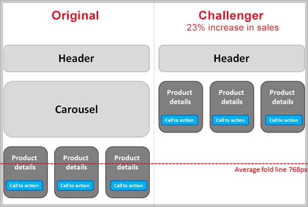
Adobe performed an A/B test for a financial services client that produced a 23% lift when the slider was simply removed.
ServerTastic
SSL reseller ServerTastic ran a series of A/B tests on the homepage of their website regarding its use of image sliders. Versions without sliders outperformed those with sliders by an average of 16.48% in terms of revenue per visitor.
However, the slider wasn’t a total failure. ServerTastic also tracked the number of people who signed up for their reseller program, another type of conversion.
Here, the number of signups actually decreased for versions of the site without sliders, by 29%. Signing up is free and therefore guarantees no revenue for ServerTastic, so this is more of a micro-conversion. But reseller signups do represent the opportunity for more future revenues.
In the end, these numbers, along with declining click-through rates for the sliders caused ServerTastic to drop the slider entirely.
The Conversion Scientist – A Slider Win
Austin-based Brian Massey, of CRO consulting firm Conversion Sciences, shared his firm’s experiences with optimizing sites with image sliders. Brian agrees that on the whole, unoptimized sliders will likely hurt your conversion rates, but he also feels that if implemented properly, they can improve the results of a site. And he has data to back that up!
Their initial efforts tested each of the images in the slider as a static image, compared to a version that used them all as a slider. Surprisingly, only one static image version beat the slider version with high statistical significance. The other versions were too close to call.
So they tried setting up the slider with a specific order based on what they learned in that first round of testing.

By optimizing the order of the slides in the slider, Conversion Sciences was able to put together a page with a slider that outperformed any static image by 61%.
This version of the banner beat the earlier winning static image with a lift of 61%. I highly recommend you read Brian’s full post on this with tips on how to optimize sliders for best performance.
Device Magic Video Test
Mobile forms provider Device Magic also ran an A/B test that involved a slider. Their existing homepage featured a video that they thought might be too low-quality and technical. They tested it against a slider that tried to communicate the same message across five slides.
The completed test showed that the slider version experienced 35% more conversions (sign-ups for the service) than the video version. So another winning test for sliders! However, it should be noted, as it is in the post and its comments, that beating a poorly done video is not the same as outperforming a quality hero image.
But more importantly, it shows that there can be different uses for sliders, and one that is used to tell a story and engage the user is a better use than a slider that rotates through four or five conflicting offers. (As of the writing of this post, Device Magic now uses neither a video nor a slider on its homepage.)
TL;DR – So What’s The Answer?
As you can see, there are a lot of opinions and data on both sides of the fence. But in the end, like most other decisions, the “answer” is to set objectives and test! Everyone’s site is different, and so are the visitors you court.
The only way to know what works best is to test different versions against your objectives. Look at the Conversion Scientist study above. They ran one test, which led them to some insight to enable them to find a winning version that included a slider.
If you cannot A/B test your site, at least set up analytics to measure things like views and clicks of each frame of a slider so you can determine what entices users and what they ignore. And if you do choose to use a slider, follow some of the key learnings outlined in the various studies above:
- Make your highest-performing, most important slide first in the rotation. Many people will never see the second.
- Make the duration of each slide long enough that even slow readers have enough time to comprehend the content.
- Use a soft fade for your transitions instead of a more animated horizontal slide. More motion distracts your users.
- Make navigating the slider easy. Show large Previous and Next arrows that are easily noticeable. Use buttons to navigate to other slides in the set that are large enough to click/tap easily. Bonus for incorporating swipe capabilities for mobile users.
- Optimize the load time required for the slider. Make the images as small as you can, and load some of the later slides in the background since many users will not get to them.
- Most importantly, use content that will work for your slider. If your primary call to action is in one of five slides on a slider, it is rarely seen. Sliders are better for telling a story, building your brand, or showing different images relating to the same concept.
How Do Your Sliders Perform?
Now is your chance. I’d wager that 75% of the people reading this blog have a site that uses an image slider. If you’re not already, start measuring your visitors’ interaction with it. Or better yet, run an A/B test against a version that does not use the slider. Then, please, share your results with all of us here in the comments section!