Here’s an internet story that happens a million times a day.
Vivian visits a website…but she doesn’t see what she’s looking for… she scrolls down a bit… but she still doesn’t find it… scrolls a bit more… still not there… then she goes all the way down to the bottom of the page… and there it is, in the website footer. The link she was looking for!
All over the internet, website footers are saving the day, catching visitors like a safety net before they hit the bottom of the page hard.
The purpose of a website footer is to help visitors by adding information and navigation options at the bottom of web pages.
Website footer design is about choosing what to include, with the intention of helping visitors and meeting business goals.
How Important Are Footers, Really?
These are important choices because footers are highly visible. A lot of visitors see them. A study by Chartbeat looked at 25 million website visits and found that visitors scroll down thousands of pixels. No page is too tall, no footer too far.
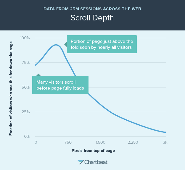
If you’re curious about how far down visitors scroll on your website, there are paid tools that will show you the “scroll depth” on your site. Hotjar, Crazy Egg and ClickTale are a few examples.
27 things that can go in footers
How should you design your website footer? Here are 27 ideas and examples, starting with the most common content and features. Scroll down past this list to see our own guidelines and best practices for what to include in a footer design.
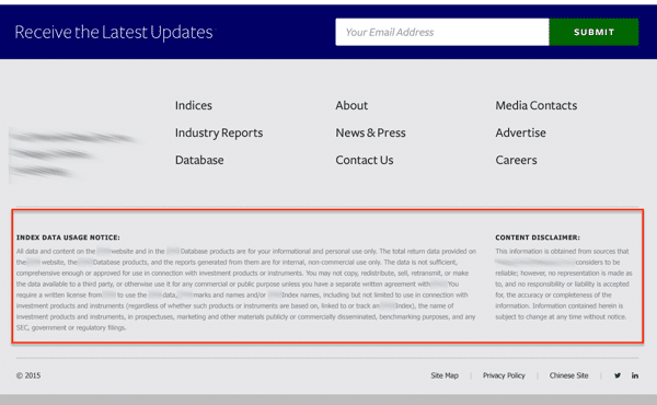
1. Copyright
If your footer had just one element, this might be it. The year and the copyright symbol. It’s a weak but easy protection against website plagiarism.
Pro Tip: A tiny bit of code will keep the year updated automatically.
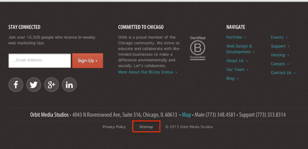
2. Sitemap
This is the most common link found in footers which links to the HTML version of the sitemap. These links are rarely clicked by visitors, but like the XML sitemap, they may help search engines find things.
3. Privacy Policy
This is the second most common element in footer design. It typically links to a page explaining what information the website collects, how it’s stored and how it might be used. For most websites, it’s about tracking (Analytics and remarketing), form submissions and email signups.
Need a privacy policy? We used TermsFeed to generate ours or use this handy Free Privacy Policy Generator.
4. Terms of Use
The “terms of use” are a bit different from privacy. They explain what the visitor agrees to by visiting the website. Like a disclaimer, they state that by using the site, the visitor agrees to certain things.
For websites in highly regulated industries, you may want to put the text right in the footer.
If legal text is critical, adding it to your footer will make sure that you have maximum coverage. You’ve got the fine print on every page.
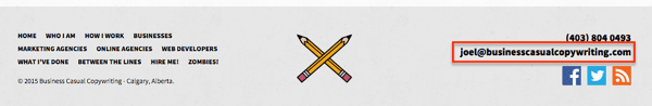
5. Contact
Visitors expect to find contact information in the top right of the header. It’s a web design standard. It’s also standard to find a “contact” link in the bottom right (or center) of the footer.
This should be a link to the contact page with a contact form, not an email link. There are lots of reasons to use a contact form rather than an email link.
- The form submission is easy to track as a goal completion in Analytics.
- The visitor may not be on a computer that they use for email.
- Forms send visitors to thank you pages, which can provide more messaging and calls to action.
- Forms send visitors auto-response emails, again, more messaging and CTAs.
- Forms can save submissions into a database in case email doesn’t get through.
- Forms can connect to marketing automation and other systems.
- Forms can ask specific questions and route submissions to specific people, depending on the answers.
- Email links are spam magnets.
So leave that email link out of your footer! In fact, I don’t recommend putting an email link anywhere on your website.
This website has great copywriting, but a contact form would have been better than the email link.
6. Address and link to map/directions
Place information is something that visitors expect to find in footers. It’s also a way to tell Google where you are, which is important for businesses with local customers. Linking to the map is a handy way to help visitors find you.
When programmed properly, this map link turns into a big fingertip-size button for mobile visitors, bringing up the map app on their phone or tablet.
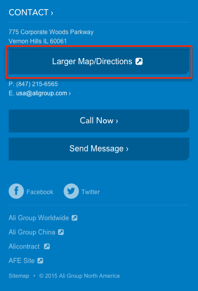
7. Phone numbers
Like the address, a phone number with a local area code is evidence to Google that you’re a local business. And like the map button, a phone number should automatically transform into a clickable button when viewed on a mobile device. Tap to dial!
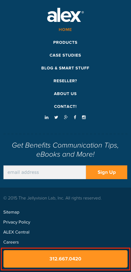
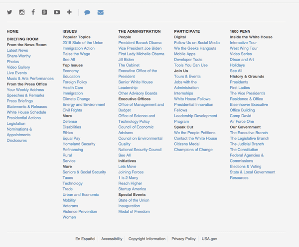
8. Navigation
Here’s where your footer can rescue falling visitors. If they’ve made it down this far, they must not have found what they were looking for. Time to offer some more options.
The last few years have seen a usability trend called the “fat footer,” which means adding more than just the standard items listed above, starting with navigation.
Footers now often contain the same links you’d find in a “mega-menu” dropdown in the header navigation. But this doesn’t necessarily save a visitor from falling down your page. Remember, these are visitors who didn’t find what they were looking for above.
Here are a few sources of ideas for footer navigation:
- Check your “Site Search > Queries” report in Analytics. What are visitors searching for? What aren’t they finding? See the Report of Broken Dreams.
- Check your “Behavior Flow” report in Analytics. Where do visitors seem to want to go? Here’s how to find the top path through your website.
- Which interior pages need a search ranking boost? Learn to use internal linking for an SEO advantage.
You don’t have to just repeat your main navigation. You also shouldn’t just add your entire sitemap. This forces visitors to dig through a pile of links. How’s that helpful?
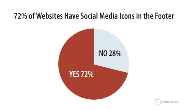
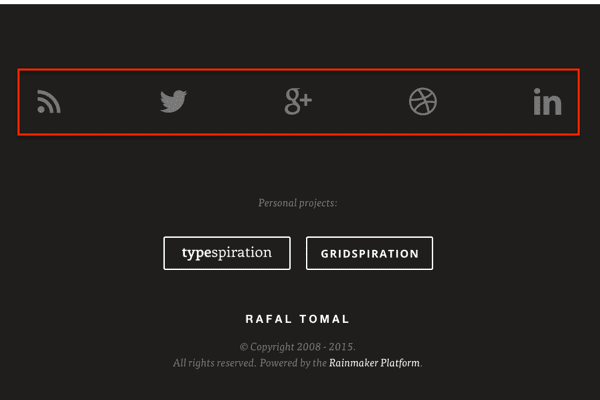
9. Social icons
We love visitors from social networks. But we don’t love it when our visitors leave and go to Facebook, Twitter or YouTube. If they do… they ain’t coming back. That’s why our designers almost never put social media icons in website headers.
The footer is the best place to add icons that scoop visitors over to social networks. When we analyzed the top 50 marketing websites, we found that 72% included social media icons in the footer.
Here’s a good example from Rafal Tomal.
10. Social media widgets
Some footers go beyond the icon and use an actual social media widget. These show the latest post from a social media network, embedded right in the footer.
This makes sense only if you are active within that network and have solid editorial standards about what you’re sharing.
Caution: If you use such a widget in your footer, social media posts will appear on every page on your websites. Especially risky if you’ve got an intern running your social channels. Applebee’s famously learned this lesson the hard way.
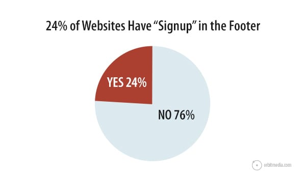
11. Email signup
The website footer has become a very common place to let visitors subscribe. Our website standards study found that 24% of top marketing sites have a signup box in the footer.
True, email sign ups are more likely to occur on a page where the visitor got value, such as a helpful blog post, it’s still not a bad idea to let visitors subscribe from the footer.
Footer signup boxes should still follow email signup best practices, offering social proof (how many have signed up before?) and setting expectations (what with the subscriber receive? how often?).
A lonely little email address box with a submit button isn’t likely to convert very well, like this guy…

12. Login
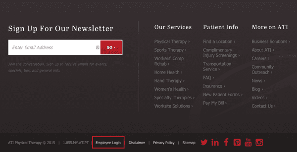
Not all visitors are prospects. Some visitors may be employees, partners, affiliate or resellers. If there’s a login area for these people, the footer is the best place for it.
These people come back often and know where to find things. No need to use valuable marketing real estate in the header for them. A little login link in the footer is fine, like ATI does here.
13. Press
Another type of non-prospect is the press. Realistically, only a fraction of 1% of your visitors are journalists and editors. So don’t waste precious space in your main navigation with a press link.
If someone from the media does happen to visit, they’ll scroll down and find it.
14. Site search tool
If they didn’t find it in the header, in the content area or in any of the footer links, a site search tool is the ultimate safety net.
Search tools are not as common in website footers as email signup forms, so if you use one, make sure it is clearly labeled.
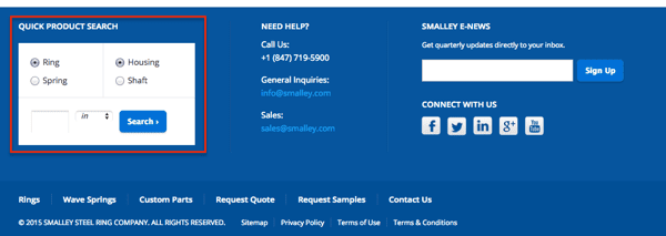
The Smalley Steel Ring website features a quick search tool for products, helping visitors jump right into the catalog from any page.
15. Images
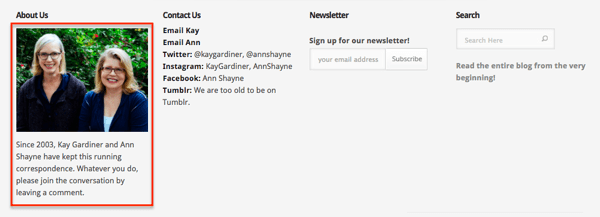
If you really want to dress up your footer, add an image to it. Here’s a chance to add personality to the site.
The Modern Daily Knitting footer features a picture of Kay and Ann, the two founders.
16. Mini gallery
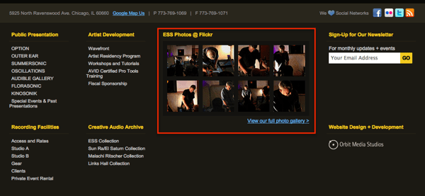
Why not go for the full pedicure? Rather than one image, add an entire gallery.
Experimental Sound Studio has a gallery of photos in the footer. Clicking a photo brings up the image within a lightbox.
17. Branding
Images are another chance to reinforce the brand. This is a good place to use an alternate version of your mark or use your logo in a different way.
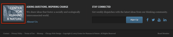
The Center for Humans and Nature website uses the original version of their logo in the footer, where the header contains a simple, legible text treatment of their name.
18. Your mission. Your values
Logos are good. But why not tell visitors why you’re in business? The footer is an excellent place to plant your flag and tell ‘em what you stand for.
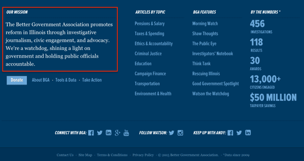
The Better Government Association website footer not only restates their mission but shows the impact they’ve made using numbers down the right side. It’s impossible to miss why or how they do what they do.
19. Keywords for Search Engine Optimization
Text in the footer is text on every page. So it’s an excellent place to indicate your relevance to Google. If you do include your mission, your value statement or an “about us” blurb, use this as an opportunity to include your primary keyphrase.
Caution: Footer text for SEO has been abused by search optimizers for years. This is probably why Google doesn’t put a lot of weight behind SEO keywords in footers. So don’t overdo it. Just use the phrase once as text, not a link, and move on.
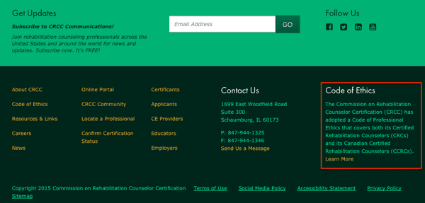
The footer of the Commission on Rehabilitation Counselor Certification website includes their code of ethics, which happens to include two of their most important keyphrases.
20. Awards and certifications
These little logos instill confidence in visitors. They are a form of social proof and a powerful way to leverage the “Halo Effect.” If you’ve ever won an award, adding the logo for that award to your footer is a quick way to add credibility to every page of your site.
ProTip: Combine all of your awards, certifications and membership logos into a “trust box.”
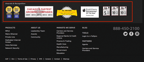
Nitel has won many awards over the years. Gathering up those logos and putting them together in the footer of the website, helps build trust in a very competitive industry.
Certifications also come with logos. Here are a few that often appear in footer designs.
- Security certificates for ecommerce websites
- BBB certificate for businesses with local audiences
- Adwords certifications for digital marketing firms.
- GSA certificates for companies that work with the government
- MWBE certification for minority and women-owned enterprises
- B-Corp certification for socially and environmentally conscious businesses
21. Association memberships
Membership has privileges. One of those might be a logo that can be used in a footer. Chambers of commerce, industry associations and even online directories can provide logos that look good in a footer.
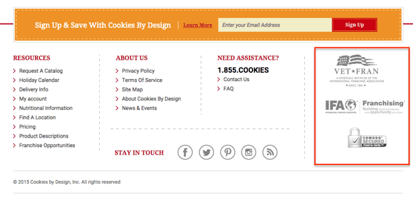
Cookies By Design shows their associations in the lower right corner of their footer.
22. Testimonials
It’s never a bad time to let your happy customers say a few words. Including testimonials in footers is a good way to add social proof throughout the site. Here are a few guidelines for using testimonials:
- The best testimonials support the specific marketing claims of the page they’re on, so they’re not added generically to the footer on every page.
- The worst place to put testimonials is on a testimonials page. Check your Analytics, visitors just aren’t visiting that page.
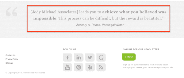
The Jody Michael Coaching website includes a testimonial at the bottom of every single page. It’s right above the footer, allowing for a different testimonial on each page.
23. Latest articles
If you’re active in content marketing, you can give your site a “pulse” but having your latest content pushed directly in your footer.
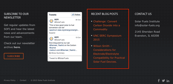
Solar Fuels Institute does this on their website, along with the social widget.
Or you may want to control which articles are featured in the footer. Then you can select those that answer common questions for visitors, or those that convert visitors into newsletter subscribers at the highest rates.
24. Upcoming events
If you run a lot of events, the footer is a good place to promote them, since anything in the footer is likely to be seen. But don’t add this unless you always have an upcoming event, or you’ll have a hole in your safety net.
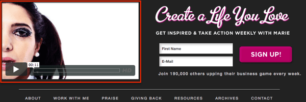
25. Video: Your welcome message
Text is overpowered by images. Images are overpowered by video. As a general rule, video is the most compelling format for content. So if you really want to go all out in your footer, add a video.
The Marie Forleo website takes full advantage of video, include a video enhanced footer.
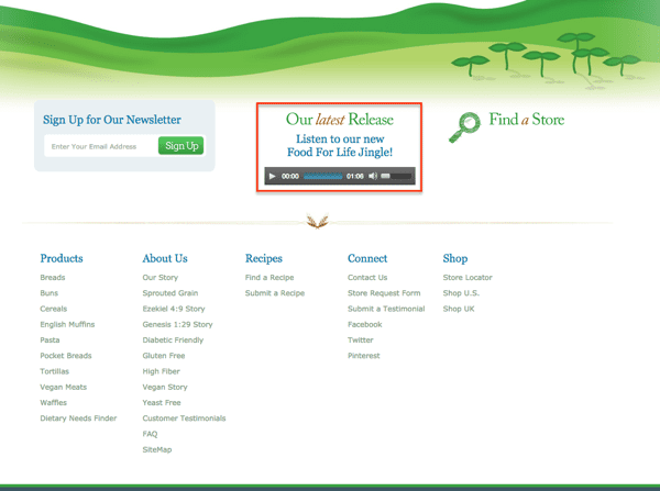
26. Audio: Your jingle
It’s rare but possible to add an audio file to a footer. If anything it would likely be a clip that you’re repurposing from somewhere else, such as a radio spot.
The Food For Life website embeds a little audio player with their jingle into their footer. Charming!
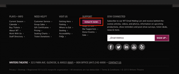
27. One… Final… Call-to-Action
Every marketing page should have a call to action. So adding one to your footer is a way to make sure it appears everywhere. You should never leave visitors wondering how to take that desired action.
The Writers Theater website follows best practices for nonprofits by adding a prominent “Donate” button to the footer.
More footer design ideas
Here’s a bit more inspiration for designing your next website footer.
Footer color schemes
Notice how many of the examples above show light text on a dark background. Reversing the colors is a good way to let visitors know that they’re at the bottom, and it’s the beginning of the end of the page.
ProTip: Caution reversing the color scheme (from dark text on a light background to light text on dark) in the content area of a page. Doing so may create a “false bottom,” causing visitors to believe they’ve hit the footer, and possibly missing the rest of the page.
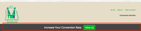
Sticky footer
In the same way that navigation can “stick” to the top of the page, regardless of how far down the visitor scrolls, footers can stick on the bottom. It’s always there, no matter the scroll depth.
Our friends at Conversion Sciences use a sticky footer that is always visible on every page.
Want your own sticky footer? Using WordPress? Here’s a plugin that create sticky footers.
The infinite page… no footer at all!
Every website has a footer, right? Actually, some news and media sites don’t have footers because there is no bottom to the page! The pages just go on forever.
The “infinite page” approach to web design just loads the next piece of content as the visitor scrolls down. Look at the Quartz website or ESPN for examples. These sites never end.
What should you include in your footer design? Our guidelines for what to include in your footer
It all depends on the goals of your site and the needs of your visitors. Are you a big ecommerce site? Lots of links may be useful. Is customer service busy? Add that info down there.
Ask yourself: Do visitors have an important question that isn’t answered in the header? If so, add it to the footer.
 |
Expert Insight: Kurt Cruse“This pretty much all boils down to using this valuable real estate to serve your sites goals. Be purposeful. Be helpful. Be mindful. Put yourself in the user’s shoes and then make sure it’s well organized. Give ‘em what they need but don’t overwhelm them.” |
So there are your 27 footer design ideas. But please don’t use them all or you’ll have the fattest fat footer of all time. Think about your visitor and what might catch them before they hit the bottom of the page!
Special thanks to Kurt and Ben for their help researching this article!