Great webpages are great in different ways; bad webpages are bad in the same way. They lack specificity.
A page with details and specifics works hard at all three of its main jobs:
- Provides the key info that converts human visitors (clarity)
- Uses phrases that drive search rankings (relevance)
- Trains the AIs on the details of your offer (accuracy)
A vague page is less likely to do any of those things well. And it’s less likely to perform in every important way.
Of all the little AI audits you can run on a webpage, this one may be the best. It checks for specificity in five places where vague pages tend to fail:
- Headers
- Hero image
- Subheads
- Navigation labels
- Calls to action
We’ll start with the prompt, then we’ll explain the logic behind it in each of the five areas. At the end of this article, I’ll show you a mini-report that you can generate from the prompt’s response.
The Specificity Audit Prompt
This prompt has a special feature. Not only does it check the specifics of the page, but it also checks whether the call to action mismatches the text on the page. This is a type of path analysis, which is easy to miss when you check pages individually.
But to do that, it needs to run in an AI (Claude, ChatGPT, or Gemini) with web access enabled so that the tool can follow the CTA link to the destination page.
The inputs are the full-page screenshot of the page and the URL. That’s all it needs. No need to even upload your persona for this one.
Audit this webpage for vague language in the five elements that most affect clarity: H1 header, hero image, subheads, navigation labels, and CTAs. Provide the URL (and a screenshot if helpful).
For each element, return a markdown table with four columns: Element | Score | Current | Rewrite.
Use this scoring format, where 1 = generic (could apply to any company) and 5 = specific to this business: 1 🔴 · 2 🔴 · 3 🟡 · 4 🟢 · 5 🟢
The Current column shows what’s on the page now. The Rewrite column shows the exact replacement — not advice about what to change. Flag any word that could apply to any company in any industry (“solutions,” “services,” “learn more,” “get started”). For the hero image, describe what a more specific image would show.
Then follow the primary CTA link to its destination page. Compare the promise made by the CTA to what the visitor actually lands on. Is there a message match, or a gap? If there’s a gap, name it in one sentence.
Prioritize the single highest-impact fix at the end.
[Provide a URL and a full-page screenshot of the page]
The analysis is both enlightening and practical. It includes the problems and the remedies. We’ll show an example report below. But first, let’s look at the five areas we audited, side-by-side with examples…
1. Write Descriptive <h1> Headers
Every page (in fact, every scroll depth on every page) has a visual hierarchy. One element is always the most visually prominent. It attracts the visitor’s attention first. A second element comes next and so their eyes move there next, and so on down the page. That’s your visual hierarchy and it is the key to web design and usability.
We’ll start with the <h1> header because it’s at the top of the visual hierarchy. If it’s generic, vague and boring, that’s bad. If it’s specific and descriptive, that’s good. You’ll pass the 5-second test (more on that below).
The first question of every visitor to every webpage is “Am I in the right place?” The header should answer that question. Compare these two and ask which does a better job of answering that question…
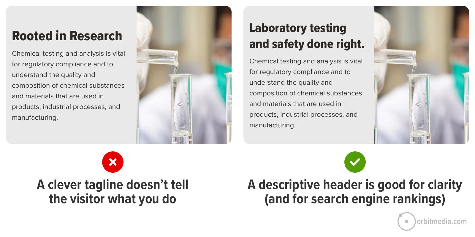 The difference is huge. And it’s an easy opportunity to improve. Making your header more descriptive may take just a few minutes. If internal stakeholders push back, tell them it’s just a test (all changes are, really) and that you’ll change it back if it doesn’t perform well.
Clear is more important than clever in headers. The most helpful, compelling thing should also be the most visually prominent thing. But on websites everywhere, the header is vague but the small text below it is specific. Just flip that and you’ll have a better page for visitors, search engines and AIs.
2. Use a relevant hero image
Also at the top of the visual hierarchy is the featured area image. If the header is specific, then the image doesn’t have to work as hard. The visitor may already know they’re in the right place.
But a relevant image can show what you actually do. But a generic image (often a stock photo) is a missed opportunity to be specific (and authentic). A stock photo doesn’t hurt, but it doesn’t help either. It tastes like water.
 Take a look at that image at the top of your page. Ask yourself: “Is this specific to my business, or generic to millions of businesses?”
The hero image doesn’t need to be a picture at all. Sometimes a texture or looping background video. These are fine options that reduce the prominence of that element. The visitor gets clarity from other elements.
Other times, the hero area is the perfect place to show the product (example), show the product in context (example), show the team (example) or show a video where you explain the value of the offer (example).
3. Rewrite (or remove) generic subheads
Once they know they’re in the right place, the visitor starts scrolling and scanning for answers to their questions. That’s why you have <h2> subheads. They are typically the most visually prominent element at every scroll depth. So they should be compelling, specific and descriptive.
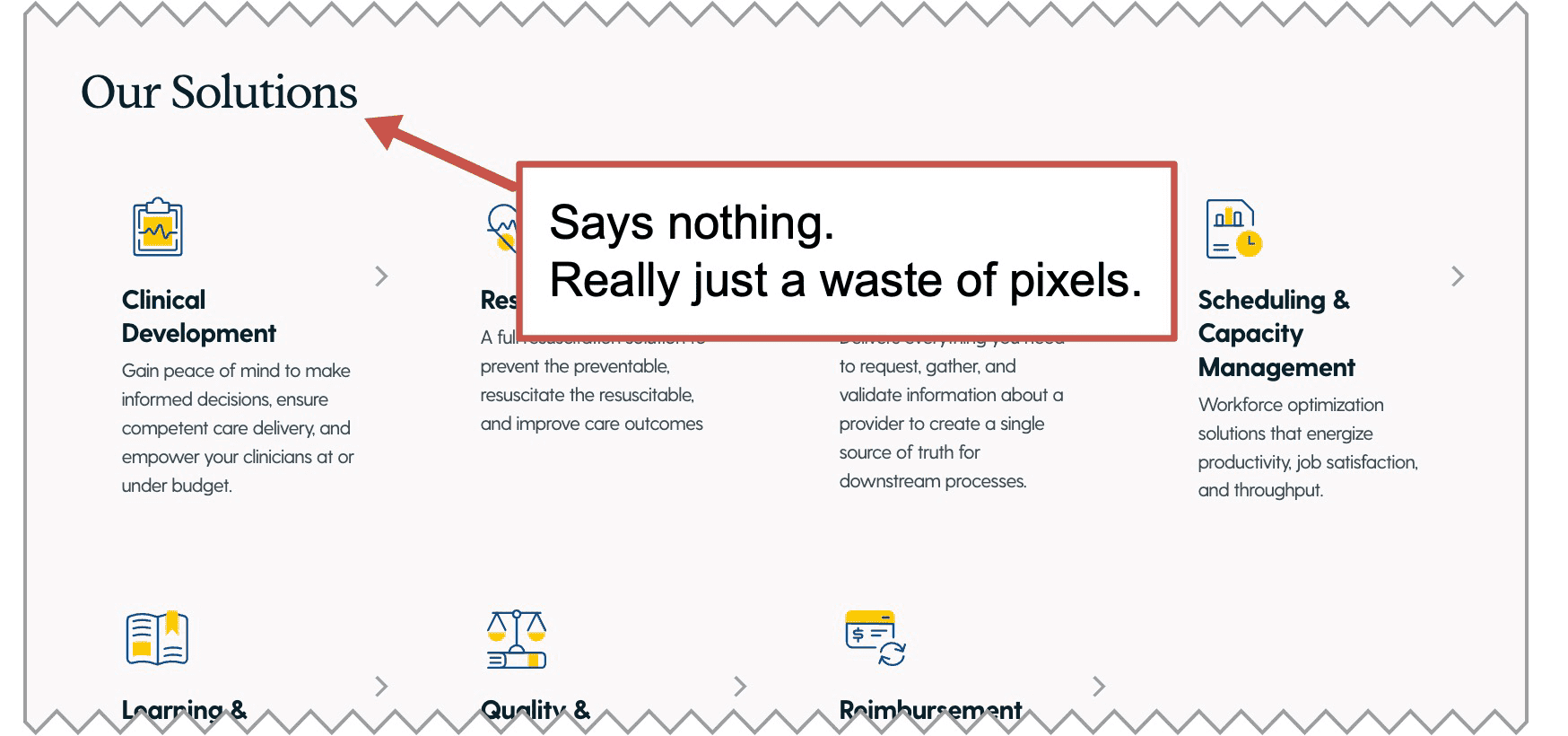
Generic subheads just take up space without adding any value at all. They simply push down the rest of the page. Look at your subheads and ask yourself: “Could this be more specific? Would this page be just as helpful if I removed this completely?”
 Subheads are an opportunity to put something relevant and helpful into view for the visitor. The best subheads are specific to your business. They communicate quickly, adding value to the experience of the visitor.
Ironically, “What we do” doesn’t actually say what you do. It’s not helpful. “Our solutions” is just as bad. If you ran the prompt above, you already have ideas for more descriptive subheads.
Testimonial subheads are another good example. The subhead “What clients say about us” doesn’t actually show what clients say. Far better to use the subhead to showcase a compelling part of a testimonial.
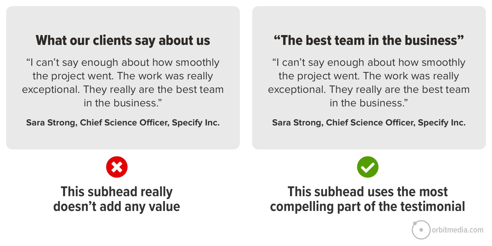 In the first example above, the visitor isn’t likely to read those super compelling words in the actual testimonial. Again, the most compelling thing is the least visually prominent thing. In the second example, the visitor is very likely to read that part of the testimonial, because the visual hierarchy aligns with the messaging priorities.
 |
Talia Wolf, GetUplift“Often, brands stay on the surface level instead of actually going deeper. Social proof is a prime example. We all know it matters, so everyone uses it, but usually that just means slapping a few logos on the page and adding a generic testimonial like ‘they’re the best.’ But no one is sitting there thinking, “I just need to know they’re the best”. They’re thinking: “Will this work for me? What if I get blamed for this? Am I about going to lose my job?” Social proof is your best chance to reduce that risk, so it has to be specific.” |
4. Use descriptive navigation labels
The navigation labels in your menu are another opportunity to be specific (or super generic and vague). On a homepage, the navigation bar is always near the top of the visual hierarchy. Eye tracking studies always reveal this. Most visitors scan the main menu first, even before scrolling at all.
The goal of your homepage is to get your visitor off the homepage. And of course, the copy is absolutely critical for keyphrase relevance (search rankings) and training LLMs on what you do (AI recommendations).
Specific, descriptive nav labels are part of website navigation best practices. They both tell the visitor what you do and guide them toward deeper pages, help the visitor segment themselves, finding pages more specific to their needs.
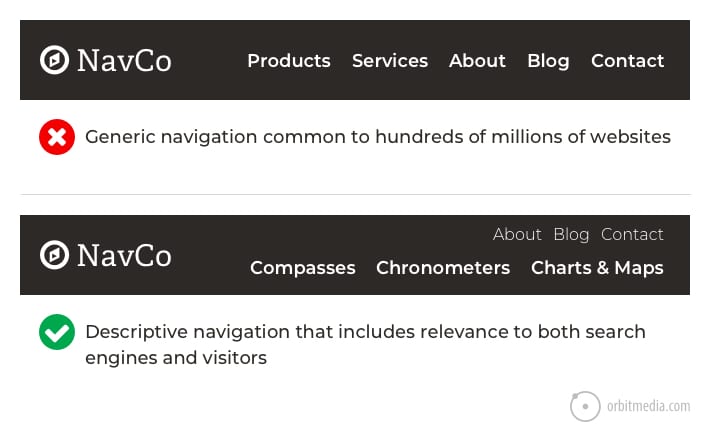
Labels such as solutions, services, products and industries are generic, vague and unhelpful. Literally any business could use these.
Scan through your website navigation and ask yourself: Are these labels specific to our business? Or are they common to millions of businesses?
Of course, businesses with many offers may have a good reason to use generic labels at the top level of the navigation. It makes sense. But even huge companies can be very specific in the sub-navigation labels within their mega menus.
5. Craft calls-to-action with compelling verbs
Finally, we get down to the CTA. It’s in your header navigation, partway down your page, and probably, in its own page block above the footer. You’ve got several. But how specific are these CTAs? Are they relevant to your business, or generic to all businesses?
Compare the difference in these two examples. The first is generic and common to every website on the internet. The second is specific to the visitor. It gives them a reason to click.
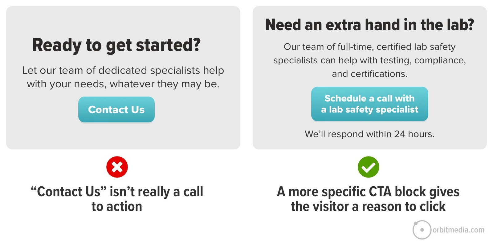
Look closely at the verbs on your page. Verbs are key. Some calls to action have common verbs like contact, read, learn and click. Great CTAs have specific verbs like schedule, chat, check, download and watch.
For ideas and a helpful prompt, here’s our guide on creating high click-through rate CTAs.
Remember, no one clicks anything until they’ve done a split-second cost/benefit analysis. You can increase the clickthrough rate of anything by making the perceived cost smaller or the benefit bigger. That’s why low-commitment CTAs often work well.
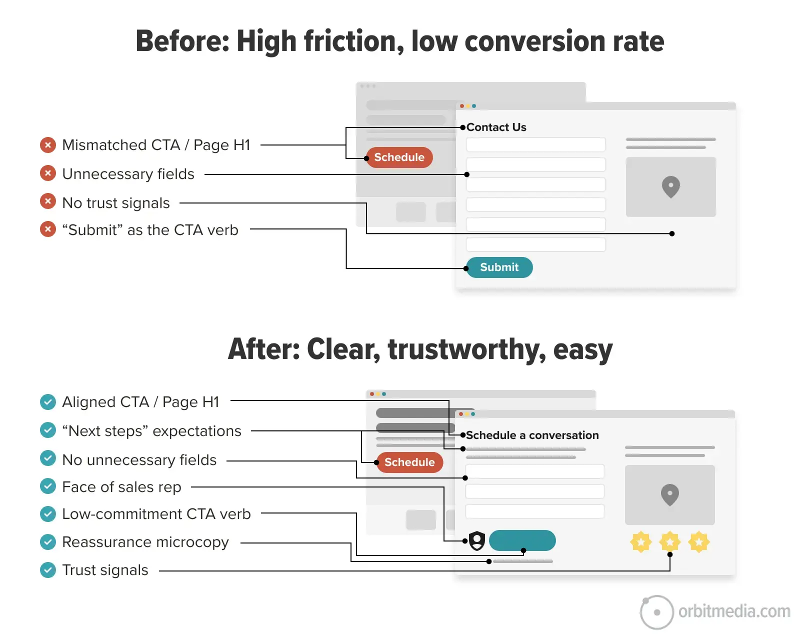
When they click the CTA, the words on the contact page should match the words they just clicked on. Otherwise, the mismatch may cause a bit of friction at exactly the wrong moment. This is one of our best practices for contact pages.
 |
Pam Didner, B2B marketer and Copilot Trainer“Good writing is in the details. In a novel, you need specific moments, tension, and turning points to keep people reading. The same applies to business content if you want storytelling to land. Too many blog posts and eBooks stay at the surface. They sound right, but they don’t help. They rely on clean frameworks and tidy steps that look polished but don’t solve real problems. If you want storytelling to work, go deeper. Be specific about features and benefits. Show exactly how something works and why it matters. Walk your audience through the logic, and give them a reason to care – your emotional hook. Start with why it matters. Then show how it works. Then make it clear what to do next.” |
The Output: A Specificity Audit Report
Once I got the response from AI, I used this simple prompt to convert the response into a mini-report.
Make this into a simple HTML report.
Why HTML? Because it’s lightweight, portable, easy to edit and universally viewable. You could make a DOCX file or a PPT, but why burn the credits? These are heavy file formats requiring a lot of processing for the AI to generate and edit. Besides, why use PowerPoint unless you absolutely have to?
The report is more visual and interesting than the AI response. Now you’ve got something you can bring to a meeting.
When I create reports, I do it in a little automation (Claude Project, custom GPT, etc.) that knows the Orbit Media styles, so everything aligns with our brand. Here’s part of what it looks like…
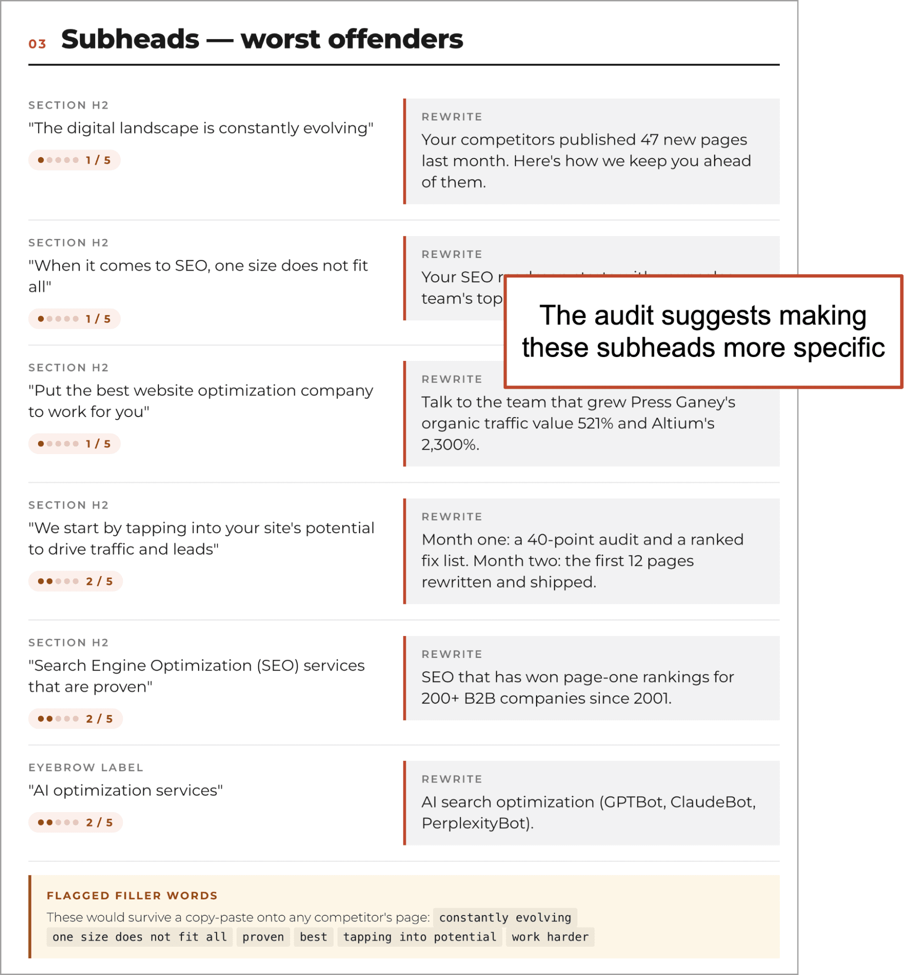
Ouch! AI doesn’t like my subheads. It suggests more detailed and specific alternatives. And it has a recommendation for each deficiency it identifies.
As always with AI audits, we should always feel free to dismiss any advice that we find off-target or irrelevant. Better yet, talk to the AI about the report. The audit is really just a point of view, not prescriptive instructions. You, the human marketer, decide what to do next.
The 5 Second Test: Check your revisions with actual humans
You’ve made some changes! The draft looks good. You’re ready to publish …but if it’s a high-stakes page, you may want one final check to confirm that your page communicates quickly and clearly.
The “5 Second Test” is a clever and simple way to test. Upload a screenshot to Lyssna and enter one question: “What does this company do?” The tool then shows the screenshot for five seconds to real humans who then answer the question. You pay $1 per response.
Spend $25 and in a few hours, you’ll see 25 answers.
If the answers look like these, you have a problem…
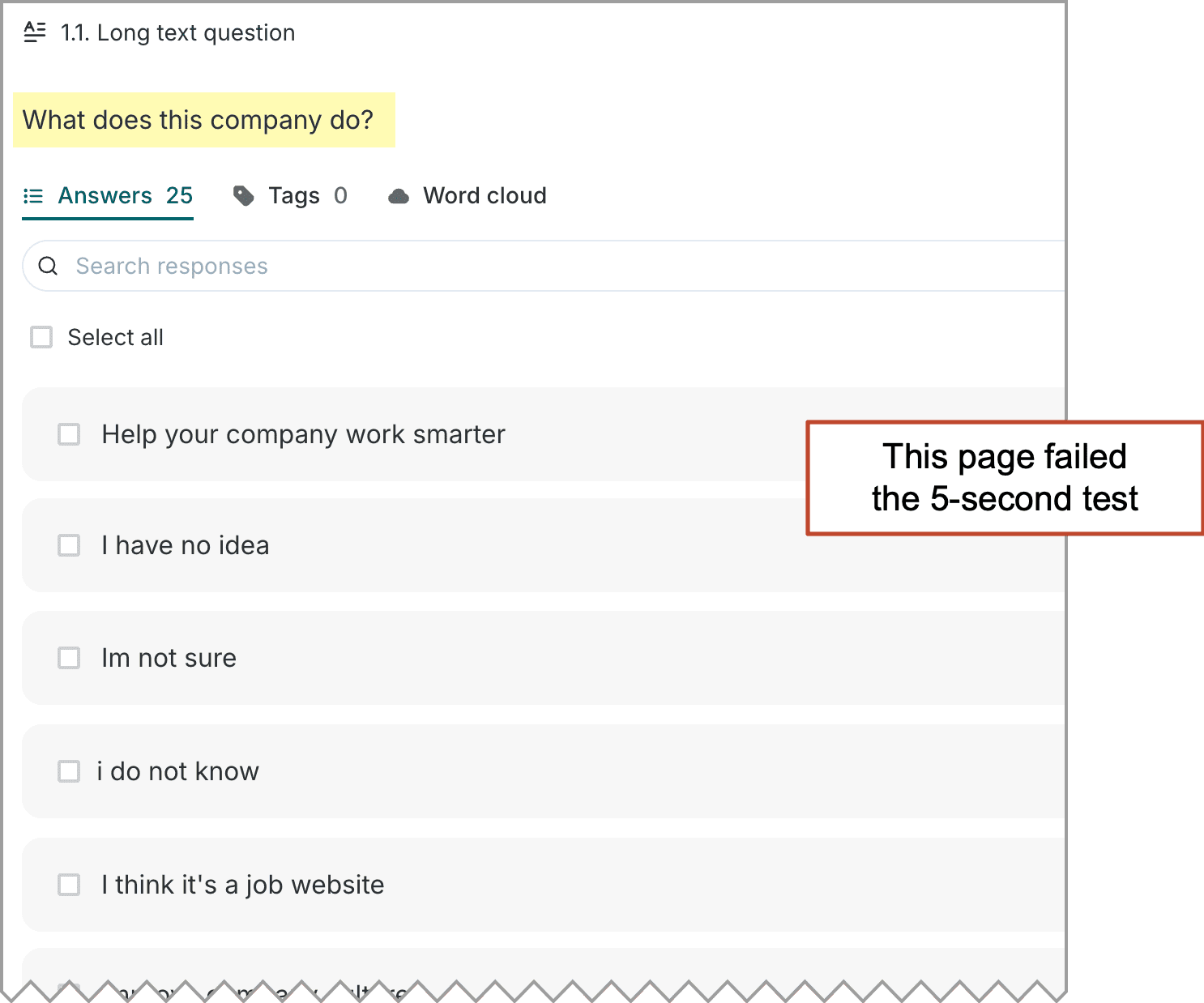
When we show the results of these tests to clients, everyone suddenly feels urgency to fix the problem. And the fixes add specificity and clarity. Sometimes the fixes are to remove distractions.
So why do marketers use vague language?
If using specific, descriptive language is good for converting humans, ranking in search engines and training the AI models, why is vague language so common on websites?
The main reason is fear.
Marketers are often afraid of excluding one of their audiences. They want to address many different markets. To do so, they water down their language. Ironically, they are so worried they’ll exclude someone that they end up excluding everyone.
Let’s ask Doug. If you don’t know Doug, here’s my standard introduction: Doug Kessler is your favorite writer’s favorite writer. He’s that good. And he has an explanation for vague copy:
 |
Doug Kessler, Velocity Partners“The urge to try to be all things to all people is so strong it’s almost the default setting for marketing teams. Excluding a potential buyer (no matter how unlikely it is that they actually do buy) just feels wrong to marketers. And it can be hard to convince stakeholders (especially voracious sales carnivores) that laser-focusing only on ideal prospects is actually a better strategy. The all things to all people mindset leads to fuzzy, flabby, lowest common denominator copy that just doesn’t resonate with anyone.” |