Every website has a menu. But some are much better than others.
Your website navigation menu is absolutely the key to success in digital marketing. It’s one of the most important elements on your website because it affects the most important outcomes:
- Navigation impacts traffic through search rankings
- Navigation impacts lead generation through conversion rates and usability
And if those top two factors weren’t enough, your website navigation affects virtually every other success factor of your website:
- Navigation impacts brand perception. Those labels communicate your positioning.
- Navigation impacts website updates. Some menu styles are harder to update.
- Navigation impacts accessibility. Some menus are more difficult for users with disabilities.
- Navigation impacts analytics. The navigation structure can make measuring user flows difficult.
Little choices have a big impact on your results, especially for your navigation since it’s on every page of your website. So careful planning is key.
Here is a checklist for website navigation best practices. These are design ideas and tips along with examples of what to do (and what not to do) with your website’s menu.
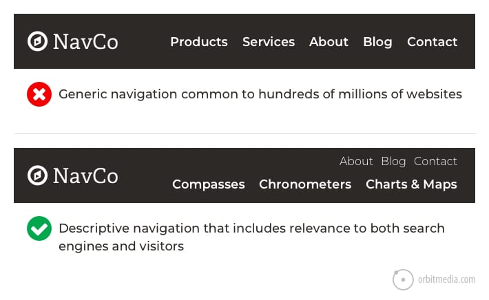
1. Use descriptive navigation labels
“What we do” doesn’t actually say what you do. Neither does “Products,” “Services” or “Solutions.” Descriptive navigation that uses keyphrases is better for two reasons: rankings/traffic (SEO) and usability/conversions (UX).
- Descriptive navigation labels are good for search engines
No one is searching for “products” or “services,” so these labels don’t help your rankings. The navigation bar is a key place to indicate relevance to search engines. Your navigation appears on every page giving those links special importance. - Descriptive navigation labels are good for visitors
Use your main navigation as a place to tell people and search engines about what you do. Your navigation bar is visually prominent. Everybody sees it. So it should communicate instantly. When it lists the names of your main products or services, it will be obvious, at a glance, what your company does. Your visitors will know that they’re in the right place.
Compare the difference. The first example is vague. No clarity. No differentiation. The second example is specific. Any visitor (or robot) can tell, at a glance, what the company does.
 |
Dan Brown, Information Architecture Lenses“One trick I use is to ask whether the navigation makes sense on another website. If the navigation fits on another site, I know I’m not telling a unique story.” |
Pages with generic labels also have an SEO disadvantage. If you have one page listing all of your services, it will never rank. That’s because it’s not focusing on one specific topic. Every page on your website has a chance of ranking, as long as it’s focused on a topic, on a keyphrase.
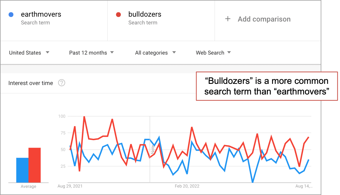
If you’re not sure what to use, put a few possible options into Google Trends. It will show you the relative popularity of any two search terms over time. It also shows geographic differences. It’s a quick way to use keyphrase research to guide sitemap decisions.
This is why your website architecture, not just the navigation, is key for SEO. A search optimized website has a page for each service, each product, each team member and topic. Avoid making a “services” page unless there are also other, search optimized pages for each service.
Above all, it’s good for visitors.
Descriptive labels help the visitor predict what they’ll get if they click. They guide the visitor to the deeper, more specific pages.
Every click is segmentation.
Each click brings the visitor to a page that speaks to them more specifically.
2. Avoid format-based navigation labels
Navigation labels tell visitors the format of the content. Other labels tell visitors the topic of the content. Here are some examples that show the difference.
Formats:
- Articles
- Videos
- Whitepapers
- Webinars
- Infographics
Topics:
- Wilderness Navigation
- Marine Navigation
- Survival & Safety
- Cartography Tips
It may seem natural to organize your content into formats. If you suggest it in a marketing meeting, everyone will say it makes sense. But these labels are actually not very helpful for your visitors.
Compare the difference in a navigation menu. Ask yourself which of these are more helpful to a visitor:
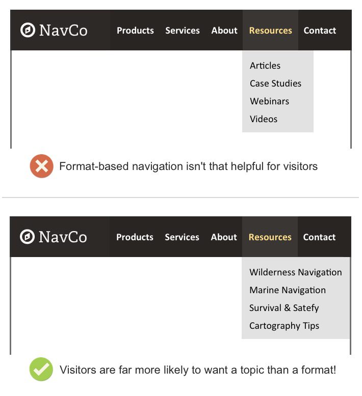
The difference is huge. The reason is obvious. People don’t go to websites looking for videos or whitepapers. They visit websites looking for answers and information. Imagine yourself saying:
“I want to read a whitepaper today. Any topic will do!”
Labels indicating the format aren’t descriptive and therefore, less helpful to visitors. That’s why Aurora Harley from the Nielsen Norman Group recommends against using format-based navigation.
 |
Aurora Harley, Nielsen Norman Group“Users interested in a specific topic usually don’t care in what format the information will be delivered to them; they are focused solely on finding answers that will address the question they had in mind.” |
Case studies may be the exception. When a visitor is looking for a detailed example of a problem solved, they may seek out case studies. These are a special format of bottom of funnel content and may be an effective navigation label.
Of course, case studies should also appear on the service pages for which they are relevant. Don’t just tuck them all away on one page.
3. Avoid little drop down menus
Popular, yes. But not usually a great idea. Usability studies show that those little drop down menus can be frustrating.
Here’s why: visitors move their eyes much faster than they move their mouse. When they move their mouse to a menu item, they’ve already decided to click…and then you gave them more options. It’s a hiccup in the mind of the visitor. A moment of visual friction.
More importantly, drop downs encourage visitors to skip important pages. If you’re using drop downs, you can easily see this problem in your Analytics.
But the research shows that one type of drop down menu performs well in usability studies: The “mega menu” which is a very large drop down with lots of elements, almost like a mini site map. These offer so many options, making that moment of friction worth it.
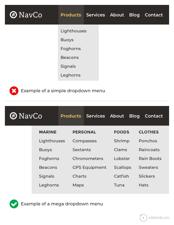
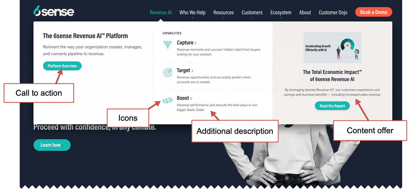
If you have a big site with lots of pages and a very diverse set of products or services, a mega menu may be a good idea. Also, besides the menu itself, mega menus give you the opportunity to add descriptive text, groupings, icons, content and calls to action.
Just look at how much we fit into the mega menu on 6sense:
|
Dan Brown, Information Architecture Lenses“With great screen real estate comes great responsibility. A mega menu is not an invitation to incorporate every last link on your site. The paradox of choice says that too many options are more paralyzing for users than too few. Instead, think about how you can use this space to tell a succinct story about your business.” |
 |
Kurt Cruse, Creative Director, Orbit Media“An additional thought on small fly out menus — while we don’t recommend them for main navigation, they can be an effective tool for secondary navigation, where a large mega menu wouldn’t make sense. But as Andy points out, they can be cumbersome for users to interact with, so try and keep them to one or two at max. We also recommend including plenty of padding and whitespace in your design so users don’t accidentally mouse out. And be sure to include a visual indictor on links that have a fly out vs do not, so users are not surprised.” |
4. Add a call to action to your header
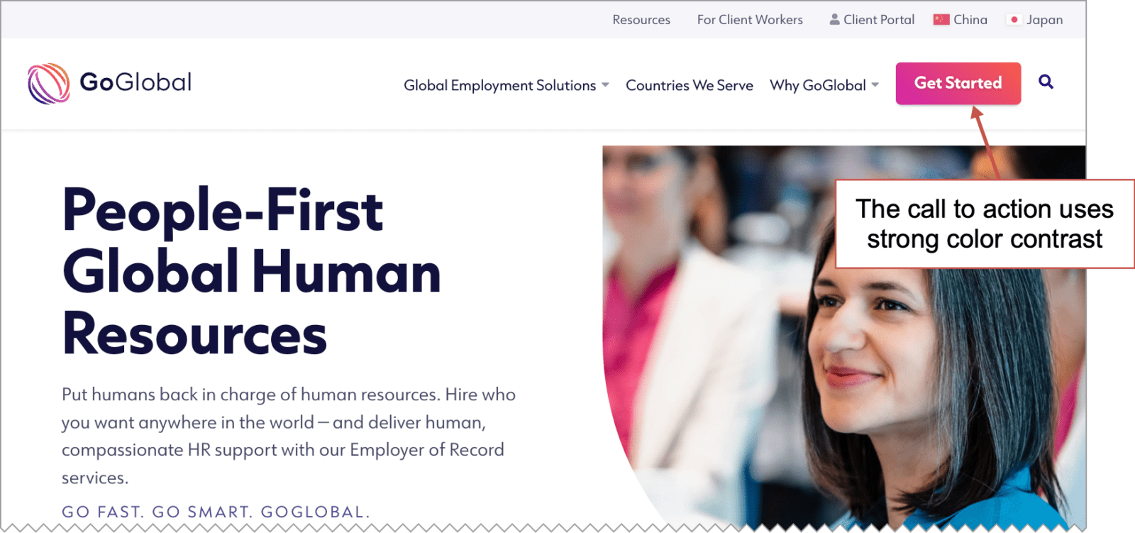
Visitors who are ready to reach out will look for a way to contact you in the header. It’s a common location. In fact, 55% of marketing websites have a contact button in the top right, making it a web design standard.
You can make this button more visually prominent by using a contrasting color. Take a look at the header of this global human resources website. The contact button actually says “Get Started” which is more of a call to action (CTA).
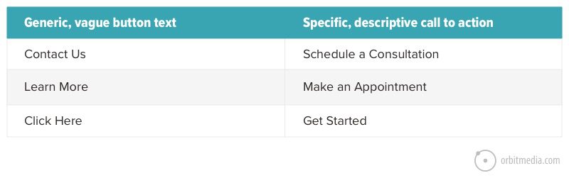
The words you choose can make a difference. Here again, specificity correlates with clickthrough rates. Specific, descriptive button labels can make a difference. Compare:
If you’d like more tips for improving clickthrough rates, we have an entire post about how to design a button.
Test your primary navigation CTA
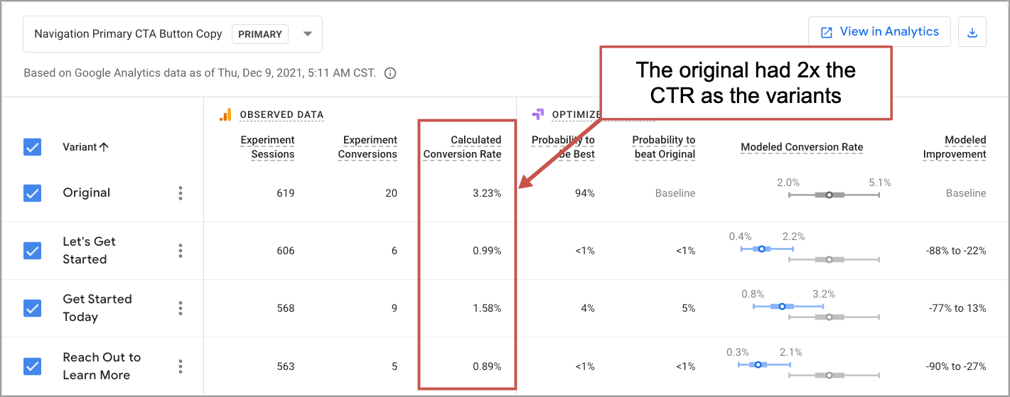
You can use Google Optimize to run an A/B test on the clickthrough rate (CTR) of your primary call to action. Without any software or costs, you can create variants and check their performance against the original in real time.
If you’ve never seen one, here’s what a Google Optimize report looks like. We run these tests routinely as part of our website optimization service.
You’ll find more about using data to improve your website navigation in the final step below.
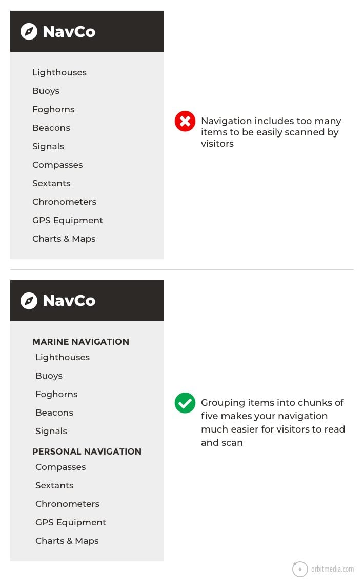
5. Groups items when there are more than seven
Some websites have literally hundreds of links on the homepage. That’s usually bad. Limiting the number of links in your main navigation is good for two reasons. These are the same two reasons to use descriptive labels:
Fewer items in your navigation are good for search engines
Your homepage has the most “authority” in the eyes of a search engine. This is because more sites link to your homepage than to any of your interior pages. This authority flows to your interior pages through your navigation.
If your navigation includes 50 items and combined with every other link and button on the page, your home page links to a total of 100 pages. This means the amount of authority passed from the homepage to each of those pages is divided by 100. This is how information architecture affects SEO.
If you cut the number of links in half, you’ll double the amount of authority passed from the homepage, and increase the chance that your interior pages will rank high.
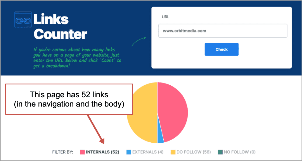
How many links are on your homepage? Check The WebFX Links Counter to find out.
The more concise your navigation, the more authority will flow to each interior page, making your interior pages more likely to rank. (Read Internal Linking Best Practices for more details)
Fewer items in your navigation are good for visitors
The more items in your navigation, the more difficult the information is to scan and process for your visitors. Visually, eight is a LOT more than seven. If you have too many, visitors’ eyes may scan past important items.
If you need to use more than seven items, consider breaking them up into groups.
Tip! Each time you remove a menu item (or any other element) from a page, everything left becomes more visually prominent and is more likely to be seen and considered.
It takes discipline to make tough decisions. You can do it. Challenge yourself to trim it down to five!
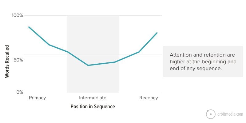
6. The order of your website navigation is important
The number of items matters, but so does the order of those items.
In website navigation, just like any list, items at the beginning and the end are most effective, because this is where attention and retention are highest. It’s called the serial-position effect, and it combines two cognitive biases:
- Primacy effect: Items at the beginning of a list are more easily remembered.
- Recency effect: Items at the end of a list (or things that just happened) are more easily remembered.
For this reason, anything you put at the beginning or end of our navigation becomes more prominent. So make the most popular items or those that are most important to your business, the first or last items in the navigation.
7. Keep social icons out of your header
Imagine you run a little boutique store. You hire an interior designer to spruce up the place. When they finish, you walk through the front door, excited to see the new look. And the first thing you see is …big colorful exit signs.
That’s what social media icons are: exit signs. With only a few possible exceptions, they do not belong in the header of a website. This is website navigation that reduces your traffic by suggesting the visitor leaves.
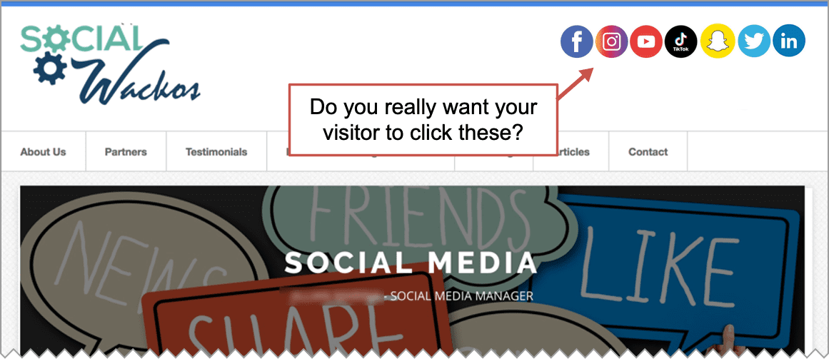
Not only are you showing them the door, you’re sending them to a place with a million distractions. The instant they click, they’ll see ads, competitors and notifications. They’ll see fun events, interesting shoes and cute kitties.
They’re not coming back.
They probably forgot they were on your website.
These little icons are extremely visually prominent for three reasons: the color (high contrast), high position (top of the page) and they’re global (on every page).
Amazingly, 13% of websites still put social icons in their headers. We strongly recommend against it. Why? Because traffic is hard to win and easy to lose. And Facebook has plenty of traffic already.
8. Website navigation on mobile devices
So far, all of our examples have been of desktop websites. But maybe we’re looking at the wrong website? Check your Analytics to see what percentage of your visitors are looking at your mobile menu.
In Universal Analytics, the report is in Audience > Mobile > Overview. In GA4, you can find it under Reports > Tech > Tech overview. Here I’ve moved the relevant summary cards to the top.
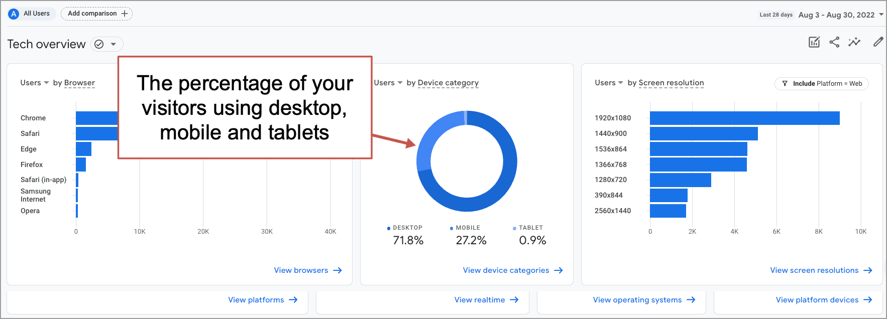
Virtually every marketing website has a significant percentage of visitors on mobile devices. These visitors may not be as critical to business outcomes (maybe they’re mostly low-converting blog readers) but you still need an easy to use mobile menu.
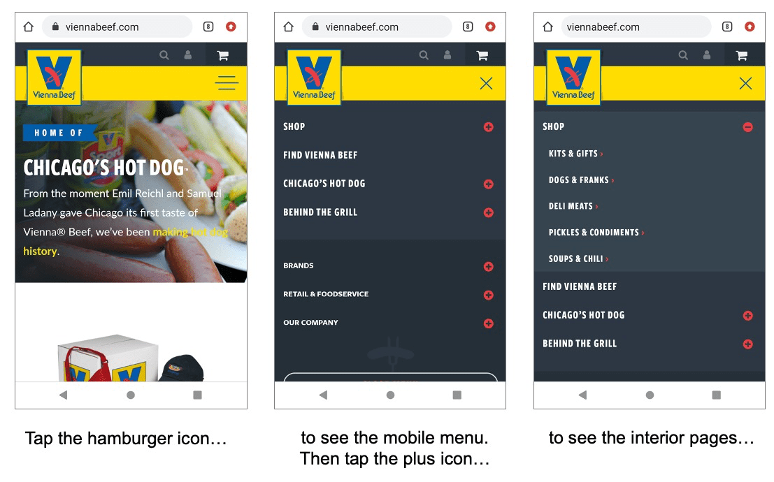
This generally means a “hamburger icon” which are the three little lines in the top right of the mobile screen. Here is an example of mobile navigation:
Tapping the hamburger icon reveals the menu, then a second tap expands the section categories.
It’s a classic responsive web design challenge to design an intuitive mobile menu. It needs to be easy for every visitor on every sized screen. This requires close collaboration between designers and programmers, followed by real-world testing.
Make the phone number tappable in mobile menus
If you’ve got a phone number in your mobile website header, visitors will expect to be able to tap to call. But web developers often miss the opportunity to make this interaction simple.
The only difference between a text phone number and a phone number you can tap to call is a tiny bit of HTML code. Here’s what that code looks like:
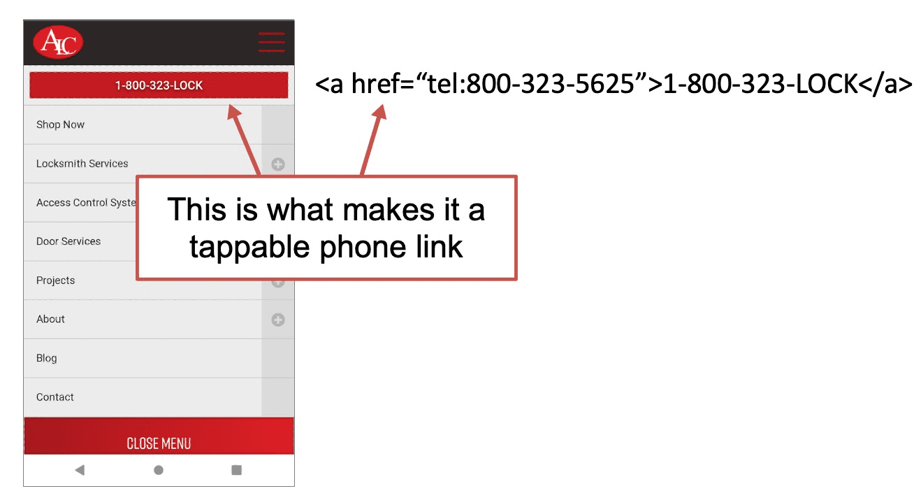
<a href=”tel:773-348-4581″>(773)348.4581</a>
A good responsive mobile website makes your phone ring.
9. Optimize your navigation using Analytics
Designing your navigation is the beginning, not the end. Digital ink is never dry. A few weeks after creating your navigation, use Analytics to see how visitors are using it. Look for ways to improve.
Warning! Keep in mind that your home page may not be the entry point for many visitors. A search optimized website has many entry points. Many (or even most) visitors won’t start from the home page.
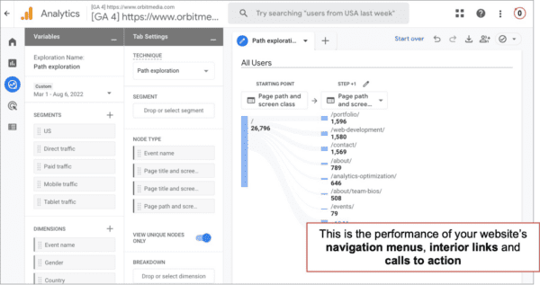
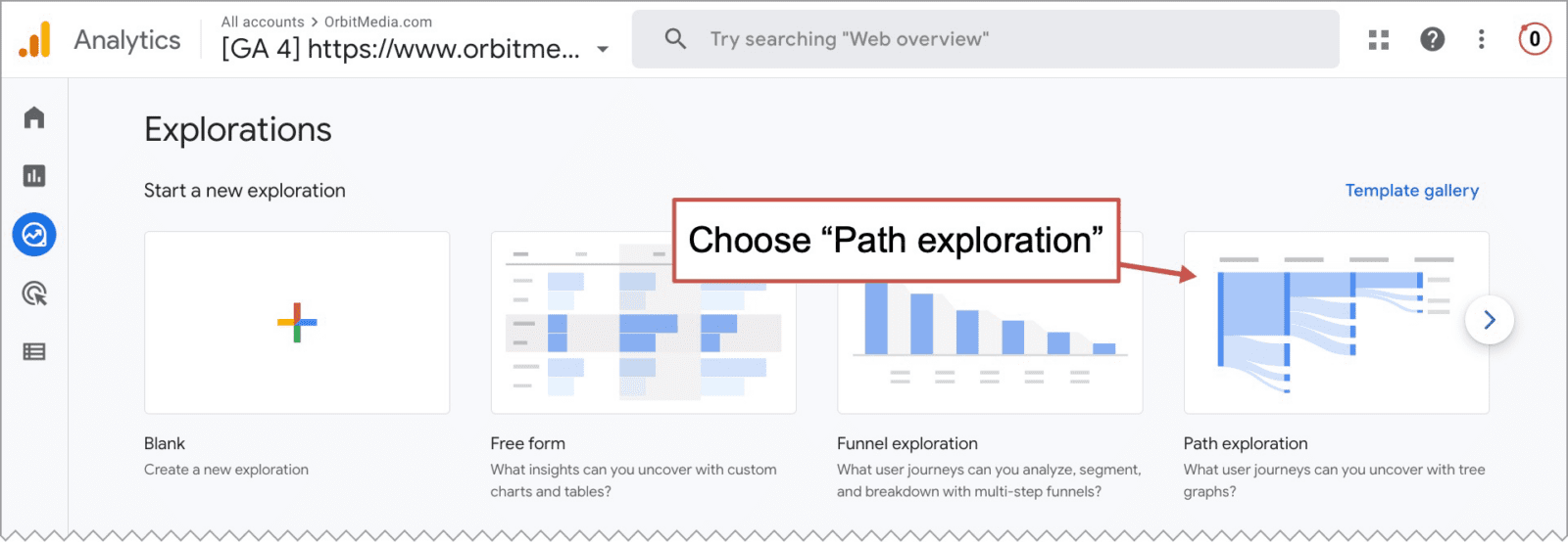
It takes just a few clicks to see how visitors are using your navigation menu. Here’s how to use a Google Analytics 4 (GA4) Exploration to measure website navigation performance.
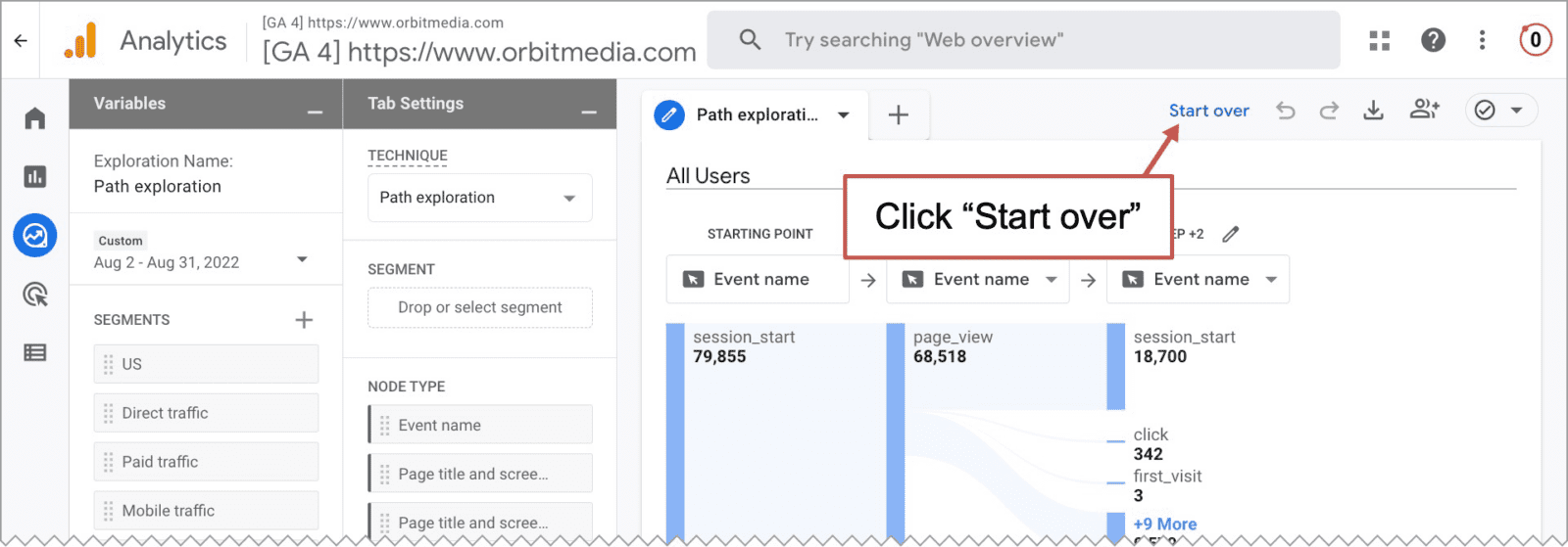
- From the Explorations section, click on “Path exploration” because our goal is to see the paths that visitors take through the site.
- By default, the path explorations have “Event name” as the starting point, or “node.” But we’re looking for the pages not events. So click “Start over” in the top right.
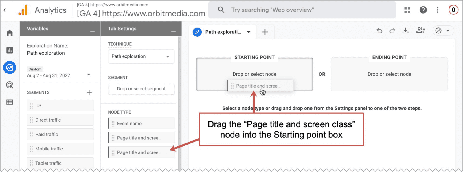
- We need to tell Analytics to use pages as our starting point, or node. So drag “Page title and screen class” into the Starting point box.
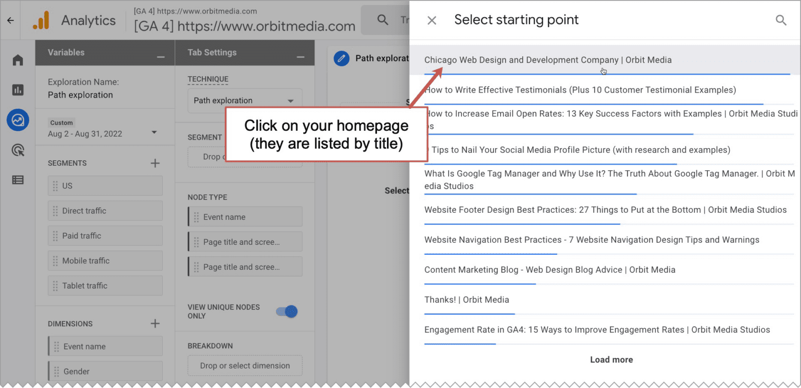
- Next, it will ask you which page is your starting point. Select your homepage.
- Voila! There it is. You are now looking at the performance of your navigation.
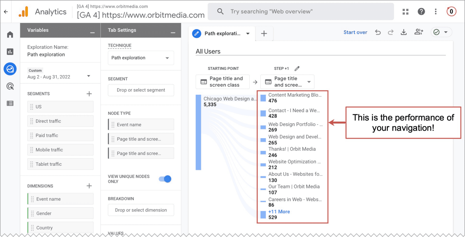
Scanning through these reports, you can instantly answer all kinds of interesting and important questions:
- What is getting clicked the most?
- What almost never gets clicked?
- Do big things get missed?
- Do little things get clicked a lot?
- How effective are your calls to action?
Answering these questions is the first step in the process of analysis and improvement. Here are thoughts you might have and actions you might take
“Whoa, 20% of our visitors are looking for a job!”
…then you make a segment or filter to exclude those visitors while doing analysis for lead generation marketing.
“Wow, people really want to see our team members.”
…then you polish up those bios and start featuring your talent on your homepage.
“Hey, no one really cares about our industry pages.”
…then you turn that section into ‘case studies’ and rework the content accordingly.
The basic idea is to remove things that rarely get clicked if they aren’t important, rename them if they aren’t important, or move things around to help visitors get where they’re trying to go.
Charting (and changing) your course
We hope these tips give you new ideas and inspiration for your menus. Ideally, you can implement your ideas quickly in your content management system. A good site is flexible, letting you adjust the labels and order of your menus in minutes.
There are exceptions to every rule. Not sure if you should make a change? Ask your web strategist to review your Analytics with you.