Imagine you’re a shopkeeper. You’re in the store, standing behind the counter, watching as people come in and walk around.
Today is like most days. Everyone comes in, goes straight to aisle four, then immediately turns around and goes to aisle two. After a minute or so, most of them go back to aisle four.
Aisles two and four are crowded with people, jumping back and forth. As usual, aisle one is empty.
If your site were a physical store, you’d be watching. Where do people go first? When do they then turn around? Which aisles are crowded and which are empty? Are your signs confusing?
Few website owners look this closely at the navigation summary reports in Google Analytics. And they miss the opportunity to fix problems with their navigation.
Here’s a quick guide to using Analytics to improve your navigation menu and labels.
Less useful: Users Flow report
There’s a report in Google Analytics that shows the navigation patterns at a very high level. It’s good because at a glance you can see the top path through your site. It’s bad because it’s not detailed enough to find insights. But since it just takes a few clicks, it’s a good place to start.
Go to Audience > Users Flow.
Suddenly, you see all the traffic flow through all of the pages. To get a closer look at the performance of your navigation, we can focus on the homepage first. Click on the green box with the slash (that’s home) and select “Highlight traffic through here” from the menu.
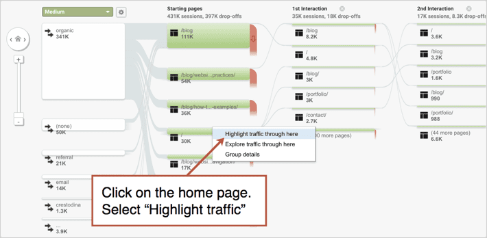
Now you can see where they went next. Their first, second, third interactions and so on.
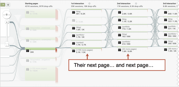
The problem here is that it only shows the top five pages. All other pages are grouped into a big bucket called (>100 more pages), which you have to click to see “Group Details.” It’s too high level to guide decisions.
So here’s a better way to check the performance of your navigation menu, find usability issues fast and see how visitors are flowing through your store.
More useful: Navigation Summaries
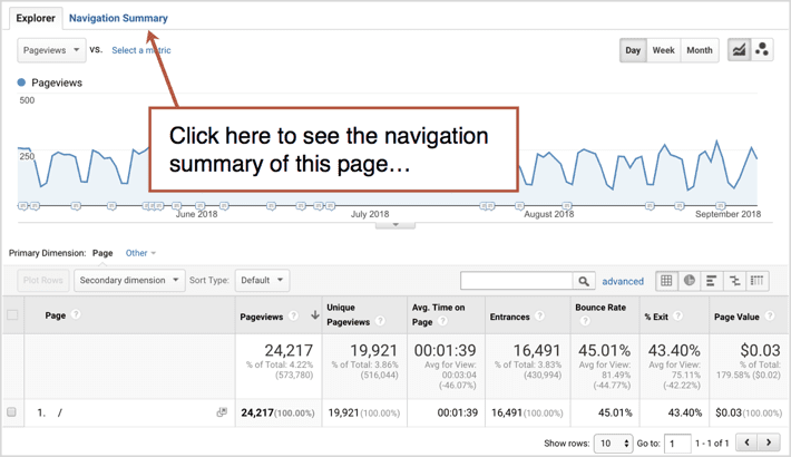
One of the best reports in Analytics is hiding from you. To find it, go to your Site Content > All Pages report. Then click on a specific page to “drill down.” Use the homepage (the slash) or any page you’re curious about.
Now you’re looking at the same report, but with just one row and just one page. There are no additional insights here. It’s pretty boring until your next click, which is up at the top on the second tab: Navigation Summary.
Eureka! You can now see what percentage of visitors left from this page, and what percentage of visitors went to any other page from here. This is a goldmine for user experience pros or anyone who wants to understand the performance of their navigation.
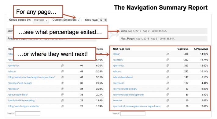
This report shows just 10 pages by default. To really see what’s working, click the “Show rows” dropdown at the top and select 25 or 50. Now you can see much more. There are still some blind spots, which we’ll address below. But first, let’s jump into the analysis.
Here are five examples of insights and actions.
1. Big things rarely get clicked
If some of the main items in your navigation aren’t getting clicked, or big buttons are getting ignored, try changing the text in the labels or remove them completely.
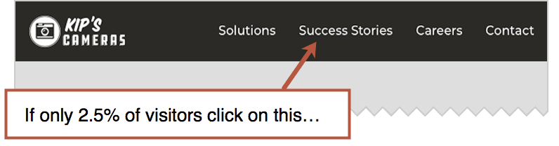
- Insight: “Success Stories” is one of the five big menu items in the navigation menu. But only 2.5% of visitors go there from the homepage. It’s the 12th most popular click. Not good.
- Action: Change the label to “Our Work” and see if it gets clicked more often
- Action: Remove the section and move the content to other pages. Put a relevant success story on each of the service pages instead of hiding them in a separate section.
2. Little things get clicked a lot
If little things are the most popular, you may be able to help people find what they’re looking for faster by making them more visually prominent.
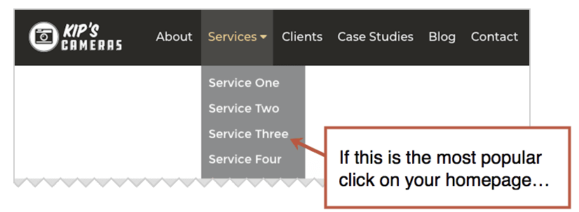
- Insight: The most popular click is in the third item listed in the second dropdown menu.
- Action: Get rid of the dropdowns. Make the items currently within “Services” into the primary navigation, so visitors can see everything at a glance and get to things fast.
- Action: Feature the most popular services high on the homepage. Add them as blocks of content with calls to action. Or even make it the hero in the featured area at the top of the homepage.
ProTip: Those vague navigation labels aren’t helping you. Here is our best advice for making your navigation labels more useful and descriptive.
3. Calls to action aren’t clicked
You worked hard to make it and you want the visitor to see it. It’s a case study, a whitepaper or just a great page with examples of your best work. But are they going there? What percentage of visitors click through? Do your CTAs have low CTR?
Suppose you’re promoting a case study.
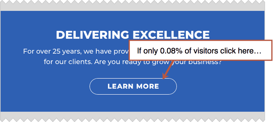
- Insight: Less than 1% of visitors click on the button and go to this content.
- Action: If the headline is vague, change it. Try a very specific headline that uses the most compelling words of the case study, such as “37% cost savings for a logistics company.”
- Action: If the button label is generic and boring, change it. “See how we did it” may get a higher click through rate than “learn more.”
- Action: Adjust the page layout and move the page block higher up on the page.
Note: A 1% clickthrough rate isn’t always bad. The few people who click may be your best visitors. If it’s sales-focused, conversion-driving content, don’t remove it. Keep it there. Promote it well and accept that it’s not for everyone!
4. Lots of back button activity
When visitors go to a page then quickly hit the back button, it’s often a sign that they aren’t finding what they’re looking for. You evaluate the popularity of the back button by comparing the two columns of the navigation summary.
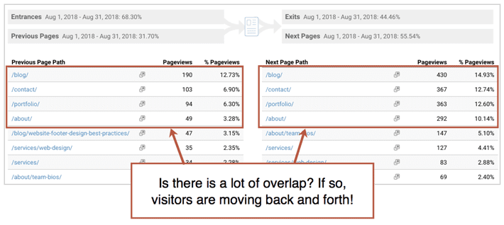
But not all back button clicks are bad. If visitors spent minutes on each page, they may be having a great experience, finding everything they need. So check the Behavior > Site Content > All Pages report to see if the time on these pages is low. If so, your visitors may be struggling to find something.
- Insight: Two of the main pages on your website are top referrers to each other, and each has very low time on page.
- Action: Add specific answers, especially answers to questions that prospects often ask.
- Action: Add content. Make these both longer more detailed pages. Because thin content triggers back button clicks.
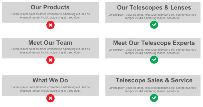
- Action: Add descriptive subheads and more formatting. This may keep the readers who scan flowing down the page. Here are some examples of descriptive vs. generic subheads:
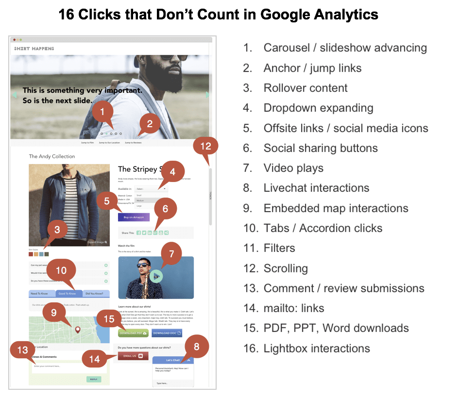
Warning! These clicks don’t count. What Analytics won’t tell you…
By default, Google Analytics only tracks visitors as they move from page to page. It tracks pageviews. But there are all kinds of ways in which visitors interact with pages that Analytics doesn’t report.
Unless you have event tracking set up, the following “non-pageview interactions” won’t show up in your navigation summary or anywhere.
 |
“Google Analytics packs a powerful punch right out of the box. Even with the most basic implementation, you can find insights that help identify areas where user actions don’t match your expectations. When you’re ready to take it to the next level, event tracking and custom dimensions enable you to customize your reporting to your particular business needs – a little bit of setup on your site will go a long way to unlocking deeper insights towards a better user experience.” – Jon Meck, LunaMetrics |
They’re leaving?! Where are they going??
One type of non-pageview interaction that you should track carefully is the exit click. That’s #5 on the chart above. Does your page have buttons or links that take the visitor away from your site? If so, are people clicking it a lot?
Here’s a step-by-step process for tracking exit clicks in Google Analytics using Google Tag Manager.
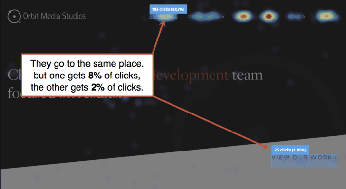
Two ways to get there? Which did they click?
Another gap in Analytics happens when there are two ways to get somewhere. Analytics won’t show you which of the two items were clicked unless you have “enhanced attribution” set up, which almost no one does.
This is where Hotjar is useful. It creates lovely little heatmaps, showing all click activity, including all of those non-pageview interactions listed above. It even shows clicks on things that aren’t clickable, which is sometimes interested.
Here’s how a Hotjar click heatmap shows which of two options were more effective at sending people to the same page.
Without this tool, redundant navigation is harder to measure.
Clean up in aisle four
Website navigation labels are very easy to change. A few keystrokes in your content management system and your menu options have changed. Redesigning your navigation make take more effort, but might make a huge difference.
Every click indicates a visitors’ intent. And every click is a clue. Your navigation summary report is a fast way to get key insights into your visitors’ actions and ideas for quick fixes. It might be time to make a few changes to the store.