Click! The page loads. A visitor has landed on your website. What happens next? One of these two things:
- The page succeeds. The visitor falls in love, goes deeper into the site, subscribes or becomes a lead.
- The page fails. The visitor is confused, frustrated or annoyed. They leave and don’t return.
Lots of little factors determine the success or failure of your page. From copy to keyphrases, from headlines to human psychology. Making that page great means keeping a lot of things in mind at the same time.
This post is a list of questions you can ask your top pages. They will force you to:
- Sharpen your focus on the visitor and results.
- To create clarity, not just beauty.
- To think beyond your brand and your personal opinions.
Put all of your top pages to this test, not just your homepage. If you don’t have a great answer for each question, you have an opportunity to improve results.
Instead of using real examples of less-than-stellar websites, we’ll use a fictional company, Stella’s Optics. Stella offers telescope products and services…
Visitors, Context and First Impressions
Empathy is everything in marketing. Understanding the perspective of your visitor is step one in making an effective page.
1. What’s going on in the life of this visitor?
There’s a true story happening in the life of every visitor to every page. It’s why they came. What are they looking for? What problem are they trying to solve? What have they likely already done to solve that problem?
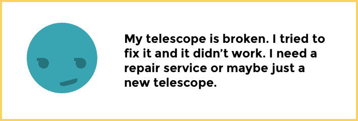
Everything on this page must flow from here.
2. Can visitors tell what you do at a glance?
Every visitor starts with the same question: Am I in the right place? So a great page answers that question in the first split second of the visit. The visitor can tell, at a glance, where they are and what you do.
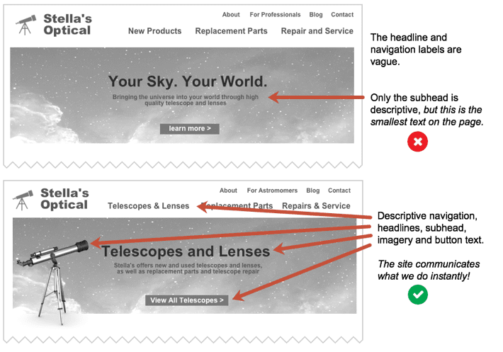
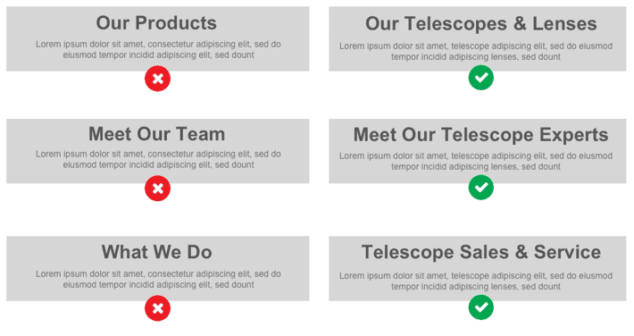
Notice how vague headlines and navigation labels make it harder for visitors to tell what you do at a glance:
For a lot of sites, the small text right below the headline is the most descriptive part of the page. Ironic, isn’t it? The smallest thing is the most important thing. For these sites, simply flipping the header and text below it will make the page communicate what it’s about much faster.
Your page has three opportunities to tell the visitors what you do:
- The navigation. Descriptive navigation can indicate what you offer at the top of every page. Keyphrase focused navigation also gives you a small SEO advantage.
- The headline. If it’s clever and unclear, it doesn’t help visitors know where they are.
- The subhead or body text. If none of the above tell them what you do, visitors may need to look closely and start reading to see what you offer. Not ideal.
Not sure if your page is explicit enough? Take the 5-second test.
Upload the page to UsabilityHub to have it reviewed by a bunch of people. Ask up to three questions, such as what do you remember? What was this page about?
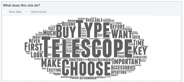
Any gaps will show up in the report, which is viewable as raw data or a word cloud. Here’s a sample report on the word cloud view for the question “What does this site do?”
If the big words aren’t descriptive, you’re in trouble. There are other fun versions of the 5-Second Test:
- The Squint Test (squint your eyes)
- The 10 Foot Test (stand back from your screen 10 feet)
- The User is Drunk Test (give someone a bunch of drinks then ask them to review your page)
The goal for each is the same: verify that the page communicates fast with perfect clarity.
Content, Prominence and Page Structure
Now we know why they came. We’ve told them where they are. The next job is to give them what they came for.
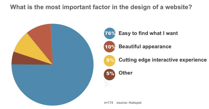
Your visitors aren’t here for the pretty pictures or fancy features. Most visitors are here for one reason: answers. Take a look at the research.
They came looking for specific information. So we need to provide that info in a way that’s easy to find or they are likely to leave and look somewhere else.
3. Does this page answer the visitor’s top questions?
Visitors won’t take action until they find answers to their biggest questions. Almost immediately, they begin scrolling and scanning. They want answers, and they’re moving fast.
If you aren’t sure what visitors are looking for, ask the sales team or anyone who works on the front line with customers and prospects. Better yet, talk to customers yourself.
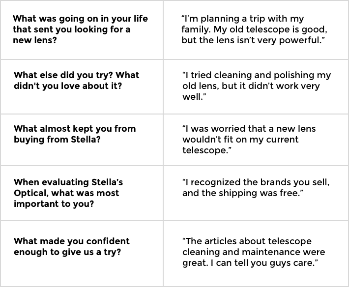
Joel Klettke, of Business Casual Copywriting, is an expert at interviewing customers. He has an excellent set of questions he asks when researching an audience. If Stella worked with Joel, here’s what he might ask when interviewing customers who buy lenses.
Now you have a good idea for what information to include on the page about lenses.
4. What is the best order for the information on this page?
Not all answers are equally important. Some things are deal-breakers, some things are nice-to-haves. Some things matter to everybody. Some things are relevant to only a few visitors.
Prioritize the of messages and visuals with this in mind.
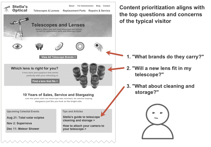
For visitors to Stella’s page about lenses, we know from our research what visitors need:
- Most visitors want to see that trusted brands are available.
- A lot of visitors are worried about the sizes of lenses.
- And cleaning and storage is another big concern for some people.
A great page emulates a conversation with a sales associate. It anticipates the visitor’s thoughts and provides answers in the general order in which the questions would be asked.
5. Are the sections for headers meaningful? Are they helpful?
All webpages are divided into sections with headers. These headers tell the visitors what that section is about. But often, they are too big and too vague, distracting from the items in that section. They aren’t helpful.
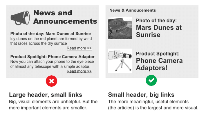
Here are two examples of a news box on Stella’s telescope website.
The first has a big, visual header that pulls attention away from the more important, clickable elements below the articles. The second header is quieter, making the more meaningful element below it more prominent.
Ask yourself if each header (and every element) is helpful and necessary. If not, remove it or make it smaller.
6. Is everything visible? Or is anything hidden behind a click?
Are important things tucked away behind tabs, a carousel or a slideshow? If so, those messages are invisible until the visitor clicks, taps or waits. That content is hidden by default.
If you’re using a slideshow and the second and third slides include important messages (or calls to action!) not all of your visitors will see them. But if you stacked those messages as rows of content on a taller page, they’ll be seen by more people. Here’s why:
Visitors are more likely to scroll than to click.
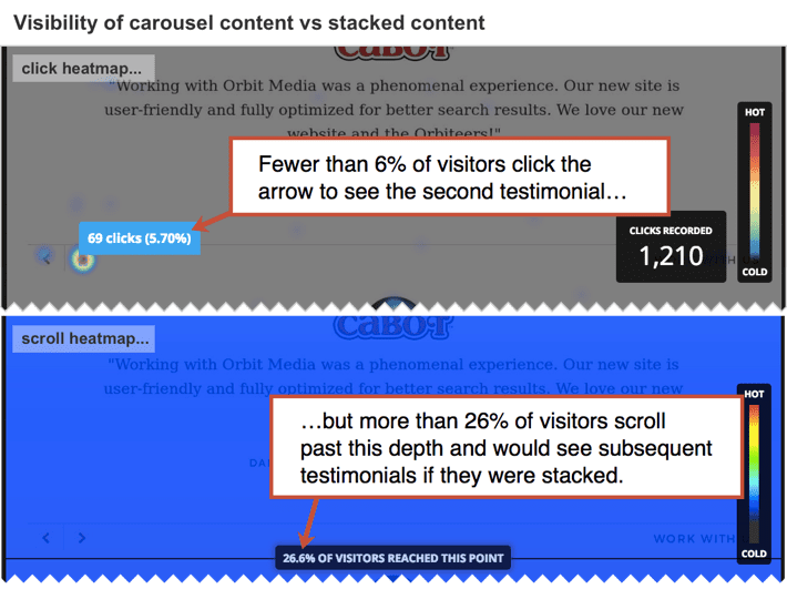
Tom Bowen found seven different research studies that support this finding. But here’s a more recent example from the homepage of this website.
We have a mini-carousel of testimonials at the bottom of our home page. A click heatmap shows that only 6% of visitors click on the arrow to see the second slide. But a scroll heatmap shows that 26% of visitors scroll past the carousel.
In this example, more than four times as many visitors would see the second testimonial if it was stacked, rather than hidden behind a click.
Note: Google Analytics doesn’t show click heatmaps. It’s possible, but not easy, to track clicks on carousels and other “non-pageview interactions” in GA using event tracking. The heat maps shown above were created using HotJar.
An expert web designer may recommend a carousel in certain cases for good reasons (ask me in the comments and I’ll give you an example). But this is always true: 100% of your visitors have their fingers on a scroll wheel (mouse), a trackpad (laptop) or piece of glass (mobile device). It’s easier for them to scroll than to aim and click/tap on a target.
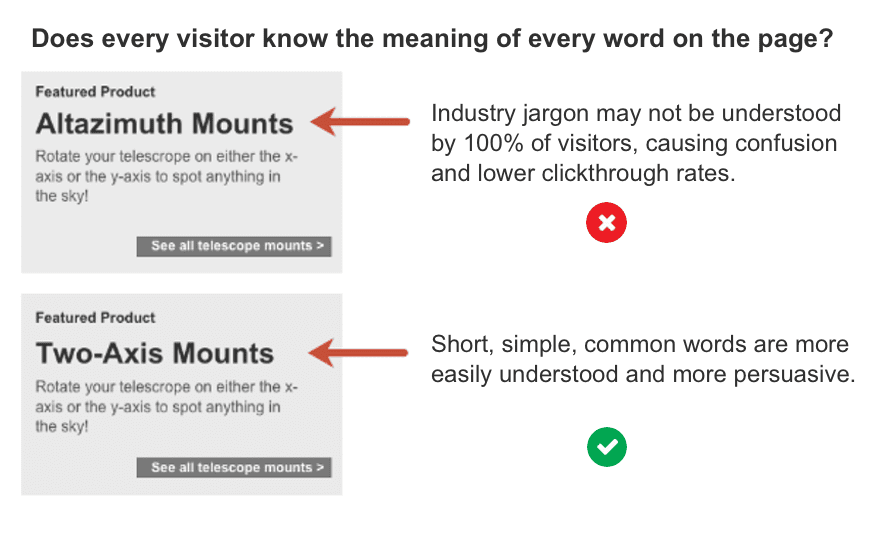
7. Do 100% of visitors know the meaning of these words?
You’re an insider in your industry. And your industry has words and phrases that only insiders will know. But a percentage of your visitors are new in this world. They don’t know the jargon.
Short, simple words are better for clarity and conversions. Check out the research on word choice and persuasion.
So ask this question of each word on your page. Does every visitor know what this means? If not, what percentage of visitors may be confused by it?
As a rule, avoid jargon. The only exceptions to this rule are:
- If your goal is to speak specifically to industry pros and using specific language will build trust with this audience. In that case, go ahead and use jargon but keep in mind that others won’t understand that part of the page.
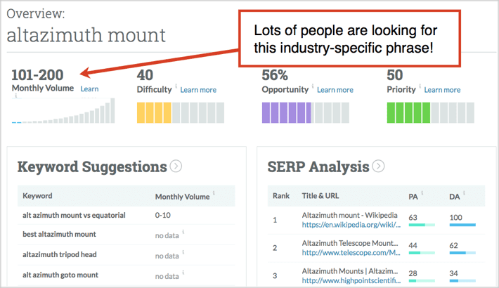
- If your goal is to rank for a phrase, then of course make a page on the topic and indicate relevance through your writing. This will attract visitors who know the phrase. People search for industry-specific niche phrases all the time!
8. Is the content formatted for people that scan?
Your visitors are scanning more than reading. With this in mind, you can make a page that works for scanners by adding formatting that makes the page easy to browse through.
If you don’t adapt for scanners, visitors will be less likely to see something of interest, less likely to slow down, less likely to read something in depth.
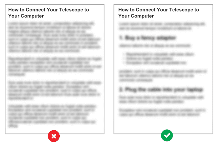
Compare these two pages. Even with the content blurred out, you can see which is easier to consume.
It’s easy, fast and free to make your page scannable. Just add any of these types of formatting:
- Short paragraphs (as a rule, never write a paragraph longer than three lines)
- Headers and subheads
- Bullet lists and numbered lists
- Multiple images
- Bolding and italics
- Links, buttons and calls to action
Each of these is on our web content checklist. You can also see examples throughout this post and on every page and every post on this website.
Conversion, Evidence and Calls to Action
You’ve given them what they want. Now give them what you want them to have. This page has a purpose for your business. Let’s sharpen the focus on that purpose and maximize the marketing impact.
9. What do you want your visitors to do?
Educate, build trust, grow your email list, generate leads, get donations, attract job candidates, sell products. Every website has goals and every page must support those goals.
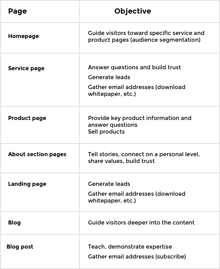
Think about the page in context of goals. Here are examples of typical goals for standard types of webpages:
Stay focused on the desired action for the visitor as you consider the next two questions.
10. Did you add evidence to support your marketing claims?
A marketing website is basically a downloadable brochure filled with marketing claims. A great marketing website supports those claims with evidence.
Look through the page and ask how many of the claims are unsupported. How many claims lack any of the following types of evidence.
- Qualitative
Stories from customers, reviews, testimonials, case studies - Quantitative
Number of happy customers, years in business, return on investment, hours saved, best seller
Weak pages lack evidence. Strong pages are supported with the stories from the target audience. Testimonials and reviews are some of the most powerful evidence. Review these examples of effective testimonials.
11. Does the page have a call to action?
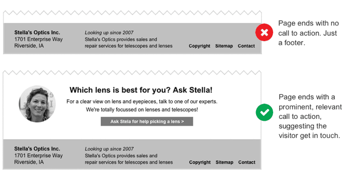
A lot of marketing pages are dead ends. The visitor scrolls to the bottom where they find …nothing. No link, no button, just a simple footer. No call to action.
Oli Gardner, conversion optimization expert and Co-founder of Unbounce, has written a lot about calls to action. This is Oli’s First Rule…
 |
“The first rule of CTAs is to have a (expletive) CTA!” – Oli Gardner, Unbounce |
So make sure your page has one. The contact link in your navigation doesn’t count.
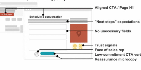
It should be visually prominent (big, surrounded by whitespace or uses a contrasting color) with a specific button label (relevant to the page, indicates the benefit of clicking).
Compare these two examples:
Look at the bottom of your top pages. Are they a dead end and a sad little footer? Or, do they feature a visually prominent, relevant, specific call to action?
12. Did you miss a chance to be personal and human?
Look again at the example above. What caught your attention? The face? Of all the imagery you can use, faces are unique. They have special powers. Studies have shown that from the time we are born, we gaze at faces more than any other image.
They draw our attention, make a brand human and build trust.
So many pages miss the chance to add humanity and personality. There are no people or fake people. Add people to every page. But keep it real. Never use stock photos of people. Authenticity is more important than production value.
Search, Keywords and Linking
13. People looking for this page are searching for what phrase?
Right now, as you read this sentence, someone is looking for your services and expertise. They need your help, and they are trying to find you!
The key to helping them find you is to first ask this question: if someone were trying to find this page, what would they type into a search engine?
Got a few ideas? Now go search for the phrase. Look at the search results. Does this look like the right neighborhood for your page? Here are some clues.
- If you see a lot of general definitions and wikipedia-type pages, try a longer phrase.
- If you see a lot of famous brands, try a more specific, less competitive phrase.
- If you see a lot of competitors, you’re probably on the right track!
This is just the start of the process. But here’s an article with a detailed process for keyphrase research.
14. Did we miss any opportunities to use relevant phrases?
Once you’ve picked your battles and selected a target keyphrase, it’s time to indicate the relevance of the page by using the phrase in your headers and body text. Our goal here is to make sure you don’t miss any chances to show what the page is all about.
Compare the example section headers below. Notice how easy it is to miss opportunities to indicate relevance.
Good news, this is an easy problem to fix. Just log into your content management system and update the text in the headers and body text.
Caution: Search engine optimization isn’t about sprinkling keyphrases around a website. It’s about making highly informative pages that are focused on specific topics. Keyphrase-focused headers are only one aspect of SEO best practices.
15. Would people on other pages on our site be interested in this page?
Our final tip isn’t about the page itself. It’s about how the page fits into the rest of your site. If there are other pages that mention the topic of your page, you have the opportunity to guide visitors here through internal links or calls to action.
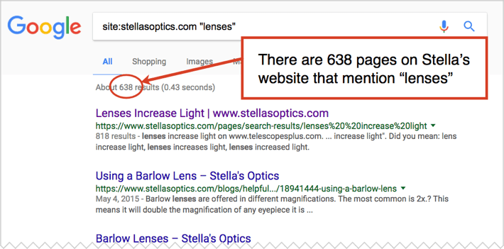
To find other pages that are relevant to your page, use the “site:” operator in Google. This will search just your site for any phrase or topic.
For example, Stella can find every page on her site that mentions lenses by searching Google for this phrase… site:stellasoptics.com “lenses”
We can see that she has 638 pages that mention lenses. Some of these will be opportunities to link to her lenses page, guiding visitors to these products and closer to becoming her next customer.
How did your page do?
There are a lot of little things that make a page effective. Content and keywords, structure and psychology. Every little gap may be a problem, but it’s also an opportunity to improve.
We hope you found at least one or two opportunities here. And as always, we’d be grateful if you shared any other questions we should all ask about our pages. Leave a comment to help us and your fellow readers make our pages the best they can be!

