Hola, bonjour, gutentag, hello!
If you’re reading this, you’re likely considering or currently working on designing a multi-language website. This can be an expensive and time-consuming undertaking, but one that can provide many benefits. Not only is a multilingual site more accessible to a wider audience, but providing content in more than one language is sometimes necessary for your business model or legal requirements.
There are many reasons you may need to design a multilingual website:
- You or your client are a multinational organization.
- You or your client have customers or clients who speak multiple languages.
- You or your client offer a service or product that has global appeal and are hoping to target a global audience.
- You or your client have a legal obligation to provide content in more than one language
Planning your multilingual website
There is a lot of important planning you’ll need to do before starting your project if you want to avoid additional rounds of revisions and added costs. Before you jump in, there are a few key questions you should ask yourself and your team:
- Should we translate or localize the site?
- Does all of the website content need to be translated, or just some of it?
- How is content going to be managed now, and moving forward?
To set yourself up for success, you’ll want to know the general scope of your project from day one and be very conscious about your goals from the start. What parts of your site need to be translated? How many languages do you need to translate? How will you be doing the website translation(s)?
Keep all of your answers to these questions in mind throughout the writing, design, and development phases, and you’ll have an easier time creating your multilingual website.
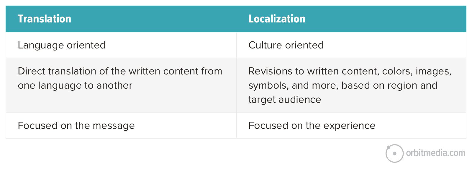
Translating vs. localization
Translating a website means translating text from one language to another verbatim. Localizing means tailoring content to the specific geographic area or language of the audience viewing the content.
When deciding between the two, ask yourself the following questions:
- Is any of your content specific to a region, dialect or culture?
- Do you have certain services or offerings only available to certain regions or countries?
Some content, such as a history page, can be translated without localization. However, specific site navigation or service offerings available in one geographic area, and not others, will need to be localized. The deciding factor is if you’re speaking the same message to all audiences or crafting it to the culture and audience reading it. This is why content localization is so valuable.
In many cases, you’re translating the bulk of your content but adding or removing some based on local laws or culture. For instance, your site may require a page of SEC disclosures that wouldn’t apply in Europe. Or you finally have a home for that David Hasselhoff testimonial because, you know, Germans love David Hasselhoff.
Where you are on that spectrum can influence whether you’re building one site and translating it or building several sites that are separately managed.
Questions to consider:
- Does the business operate under the same brand worldwide?
- Does marketing vary by region or country?
- Do the products and services vary by language or country?
- How are the organization and marketing efforts structured?
- What percentage of the target audience does not speak English?
- Are you speaking to different audiences within the United States, or is this a global effort?
Content management and upkeep
As nice as it’d be to design a site and forget about it, content management is a must. With multilingual website design, this presents some unique challenges.
One trap to look out for is anything time-related. If part of your site involves a news or calendar section, maintaining that in several languages over time can turn into an expensive proposition. Unless you have fluent speakers in-house, you would have to engage a translation company every time a news article or event is posted. This is why some people choose to keep certain sections as English only.
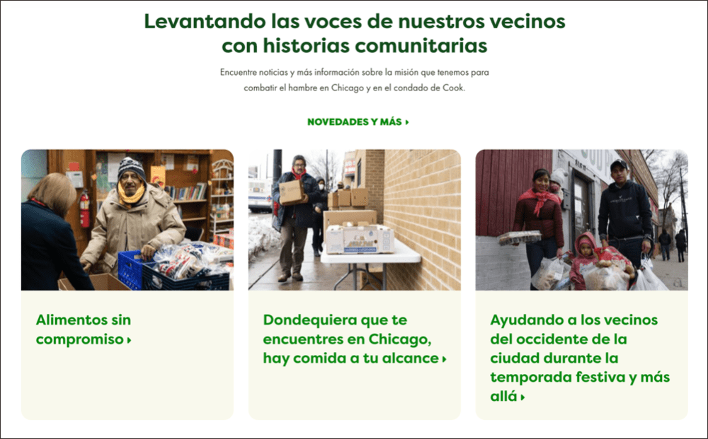
Here’s an example of news stories in English and Spanish:

Static content such as the homepage will presumably need to be updated in every language. If these updates are a common occurrence, the translations can quickly become out of date. A workflow process needs to be established that keeps track of what has changed, who has changed it, and if the translations are now out of date.
The content management system should have a mechanism for managing that, but some internal workflow will also need to be established. Keep in mind that updating your site can already be a daunting task if you’re not familiar with the CMS, and doing so in a different language (especially if you don’t speak the language) can prove to be very difficult.
Finally, some of your content may not need to be translated. If products or locations are the same in all languages, there is no need to spend the effort or introduce the overhead of managing several copies of them.
Questions to consider:
- What are the content management expectations?
- Does all of the content need to be translated, or just some of it?
- What about time-related content such as news?
- Will one group be handling all the content management or is it on a regional/language basis?
- Is any of the content shared or language-agnostic?
- How often will the content be changed after going live?
SEO considerations
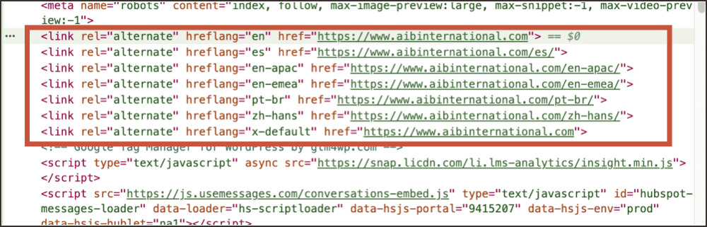
One benefit of a multi-language site is the ability to boost your organic traffic in more than one country. If your site is set up with hreflang tags, you’re telling the search engine that your website (or certain pages) is/are available for different user’s preferred languages. This will lead to Google or other search engines indexing your page(s) for these languages, supporting your website’s SEO for different regions, countries, and languages.
Example of hreflang tag attributes:
While there are some automatic SEO boosts you may see with a multilingual site, it can be more difficult to manually optimize for search in another language. There are nuances when it comes to SEO, and you’ll need to make sure your keyphrase research is focused on your target countries and languages.
Multi-language SEO deserves its own article, so for now, we recommend checking out Semrush’s guide to multilingual SEO and this article on country-specific domain names.
Designing your multilingual site
Now that we’ve covered some of the initial considerations of planning multilingual content, let’s discuss some of the factors that contribute to the actual web design.
Layout considerations
One of the first steps of how to plan a website is the information architecture. This is true whether the site is in one language or many. You create a sitemap, then lay out your templates in the wireframe process. This is the first place you might run into trouble.
Your wireframes will have defined spaces for navigation, calls-to-action, forms, headers, imagery, etc. However, the length of the words in those spaces will vary across languages.
For instance, an email signup field might have a “Sign Up” button to submit. But in French, it translates to “Inscrivez-Vous” – twice as long. Because there are no spaces in these words, they won’t wrap at the end of a line and can cause layout issues. It can also cramp your navigation if you have links arranged horizontally.
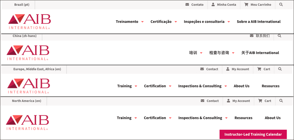
Here’s an example of how heading navigation on one site can change based on language and localization:
Another consideration is if all of your languages will be reading from left to right. In most cases this will be true, but if you’re translating into RTL languages, such as Arabic or some Asian languages, your site will need to mirror itself to be correct. While this is a programming and CSS challenge unto itself, you can save yourself some grief by making your site symmetrical.
The solution to these issues is to consider the translations while designing the site or accept that there may be differences in the site between languages. You might reduce the size of navigation text in the CSS or remove an item altogether to make it fit.
Design considerations
When designing a multilingual site, you need to keep some limitations and potential cultural differences in mind. This means reviewing all of your design choices carefully, including your colors, font choices, image styles, and more. One color, theme, or collection of images may resonate well with one audience, but fall flat with others.
Additionally, some fonts may not include all the characters you need when switching to another language, especially those not using the Latin alphabet. Likewise, CSS transformations on headings such as Small Caps or Proper Case look great in English but don’t have the same meaning or style in other languages.
This is why having a native speaker review your content can be very beneficial. They’ll have the nuanced knowledge that an automatic translation tool can’t provide.
Here are some examples of what colors can mean in various countries:
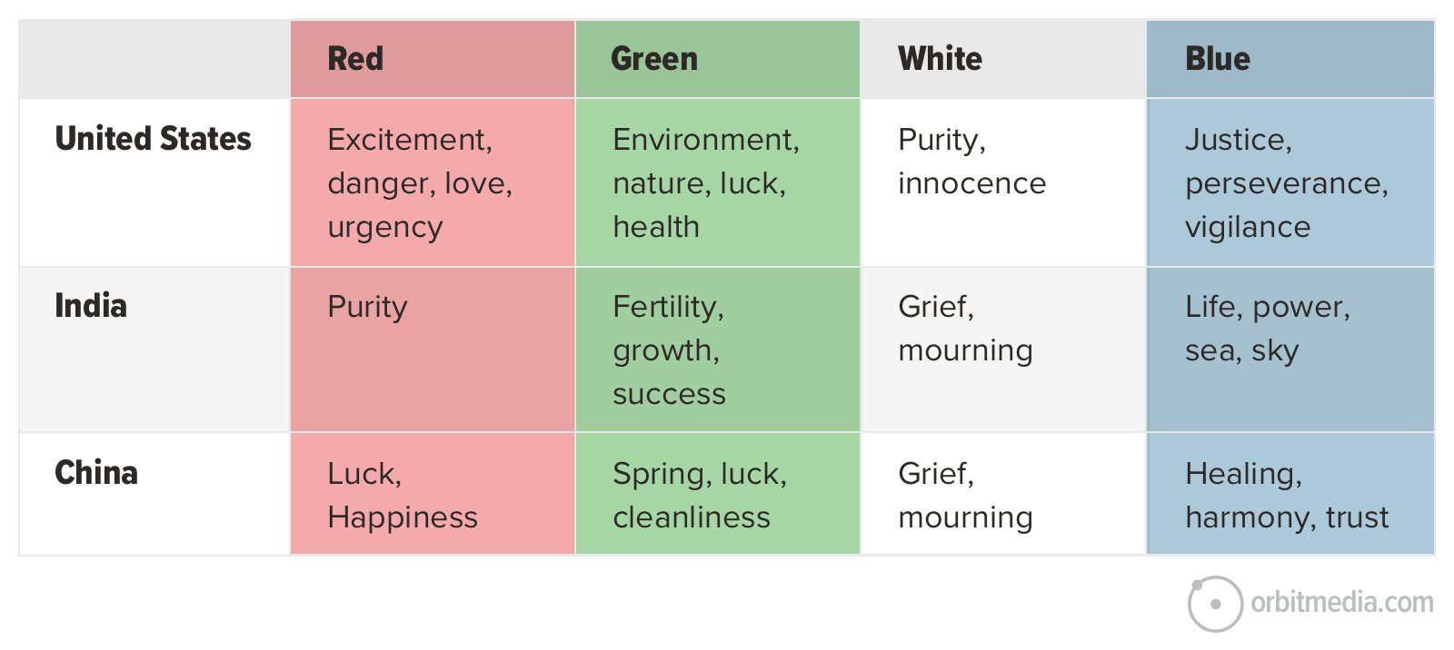
Key takeaways:
- It’s best to stay as neutral as possible with your design choices
- Some colors, fonts, images, and text cases don’t translate well to other languages
- Allocate the necessary resources for reviewing and editing your design choices across multiple languages and cultures
Read through some web design standards
Technical considerations
Once you’re in a good place with your layouts and design, there are still landmines you may run into. Often these will be specific to your site, but there are a few factors we’ve seen in multiple projects.
Forms
The most common place to have an unexpected issue is in forms or other user input. It’s easy to forget that error messages need to be translated and that input might follow a different form across languages.
For instance, if you limit your ZIP code field to 5 characters or require a certain phone number format, users in other countries will be unable to submit because theirs follow different conventions. Likewise, dynamically generated error messages may not follow the same sentence structure and will need to be retranslated entirely.
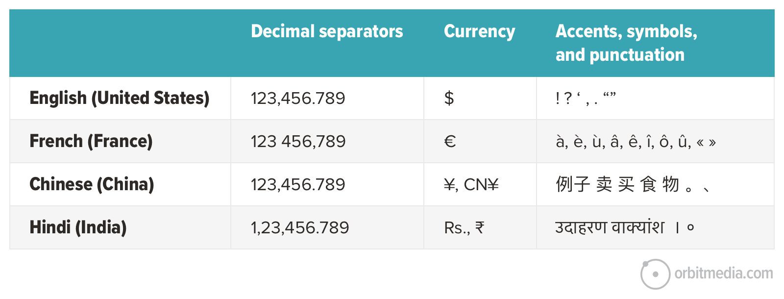
Special Characters
A recent issue we’ve run into is the different use of decimal points across cultures. Americans use a period to distinguish between the integer and decimal parts of a number (e.g. 3.14) while the French use a comma (e.g. 3,14).
Characters used for thousands separators have similar disparities (e.g. 3,000 vs. 3’000 vs 3 000). If users are entering numbers on your site, such as quantity or size, you’ll have to account for these differences in user interaction.
The cost of ownership
Creating and owning a high-performing, high-quality website isn’t cheap. This is especially true if you’re putting time and effort into SEO, design, copywriting, hosting, managing and on top of all of that, building a multilingual website. Some factors can quickly increase the price of ownership:
- The time, expertise, and money spent editing your website every time you have a content update (and then multiplying that cost by the number of languages you offer)
- Paying for outside help or tools to help with translation service and localization service.
- Creating new content for website localization
- And more!
It’s important to have an understanding of all of these factors while you’re planning and managing your site.
Multilingual on a budget
What if you don’t have translators on staff? Or you’re looking for a budget-friendly option? There are some free or lower-cost platforms and tools available, including:
These tools typically use machine translations, which are fast, but can lead to more errors. Machine translations may not be optimized for search, and often miss certain nuances that can lead to misconstrued or unclear information. These are all things to keep in mind when determining your budget, scope, and goals.
Orbit multilingual website examples
All of these examples have come from real projects at Orbit. Each project brought its fair share of new challenges, and we aren’t naive enough to think we’ve seen them all.
The Orbit team has had the pleasure of working with many different organizations and industries to create accessible and multilingual websites that are search and conversion-optimized:
- Greater Chicago Food Depository: Spanish and English site options to reach more neighbors in need.
- GoGlobal: This multilingual WordPress website uses machine translation with human editing to cater to Japanese and Chinese users.
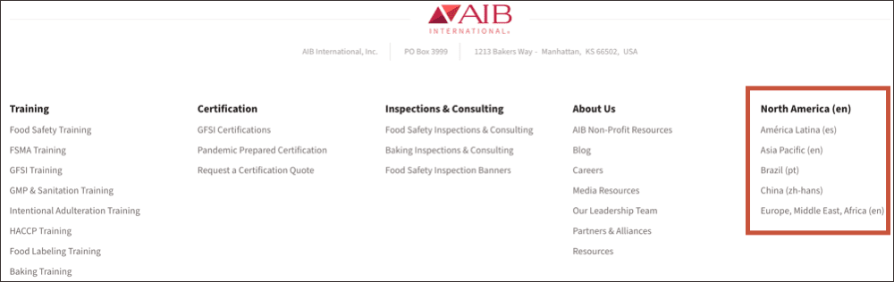
- AIB International: Human translation and localization efforts offer language selection to users in China, Brazil, Latin America, Asia-Pacific, Africa, the Middle East, and Europe.
- Solinftec: Use of WordPress Multilingual (WPML) plugin to cater to English, Spanish, and Portuguese speakers.
If we can give you one piece of advice, it’d be to plan ahead for unexpected snags, questions and edits. A multi-language website is a big undertaking, but one that can provide many benefits to your audience and organization. Reviewing some of these questions and considerations preemptively can help prepare your team for what’s to come and which path you should pursue.
Editor’s Note: This post was co-authored by Ben Steinbuhler, Project Manager at Orbit, and Barrett Lombardo, Technical Director at Orbit. Updates and edits by Mackenzie Pelletier, SEO Copywriter at Orbit.