If you’re a marketer… you probably don’t think about design standards every day.
If you’re a web designer… you know that standards can help you do your job.
If you’re the visitor… you just know the site is confusing and where the back button is.
Your visitors are not blank slates. Your website is the millionth site they’ve visited, so they come with strong ideas about what they’ll find and where they’ll find it. So conforming to standards is generally a good way to help meet your visitors’ expectations.
What are web design standards?
The World Wide Web Consortium publishes a set of standards, but these are mostly technical web standards (HTML, CSS, file formats and JavaScript), privacy standards and accessibility standards. They are not focused on the actual design of websites.
But if you’re a designer, standards are about website features and designs, not code or content.
Web design standards are norms and models for web page layouts and UX features, used by marketers and web designers in comparative evaluations. They are guidelines for usability.
- What web design features are standard?
- What elements should be included? And where?
- What elements should be avoided?
This little research project answers those questions.
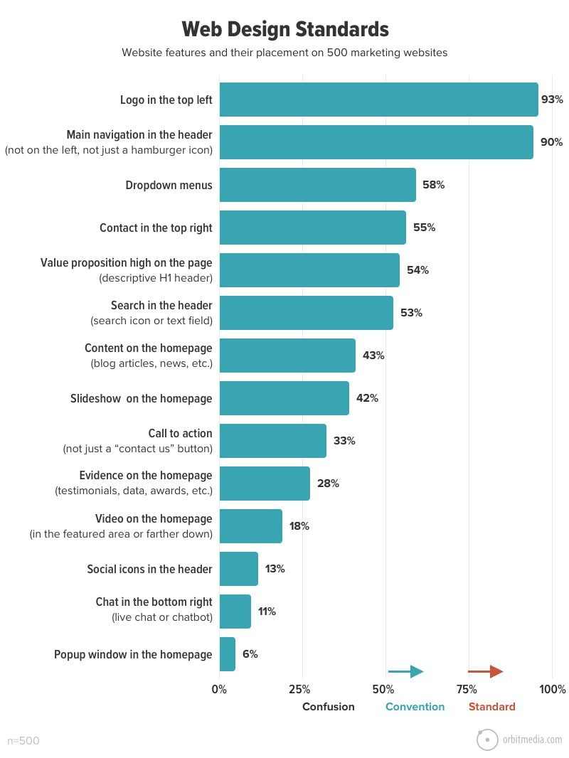
Which features are standard on websites?
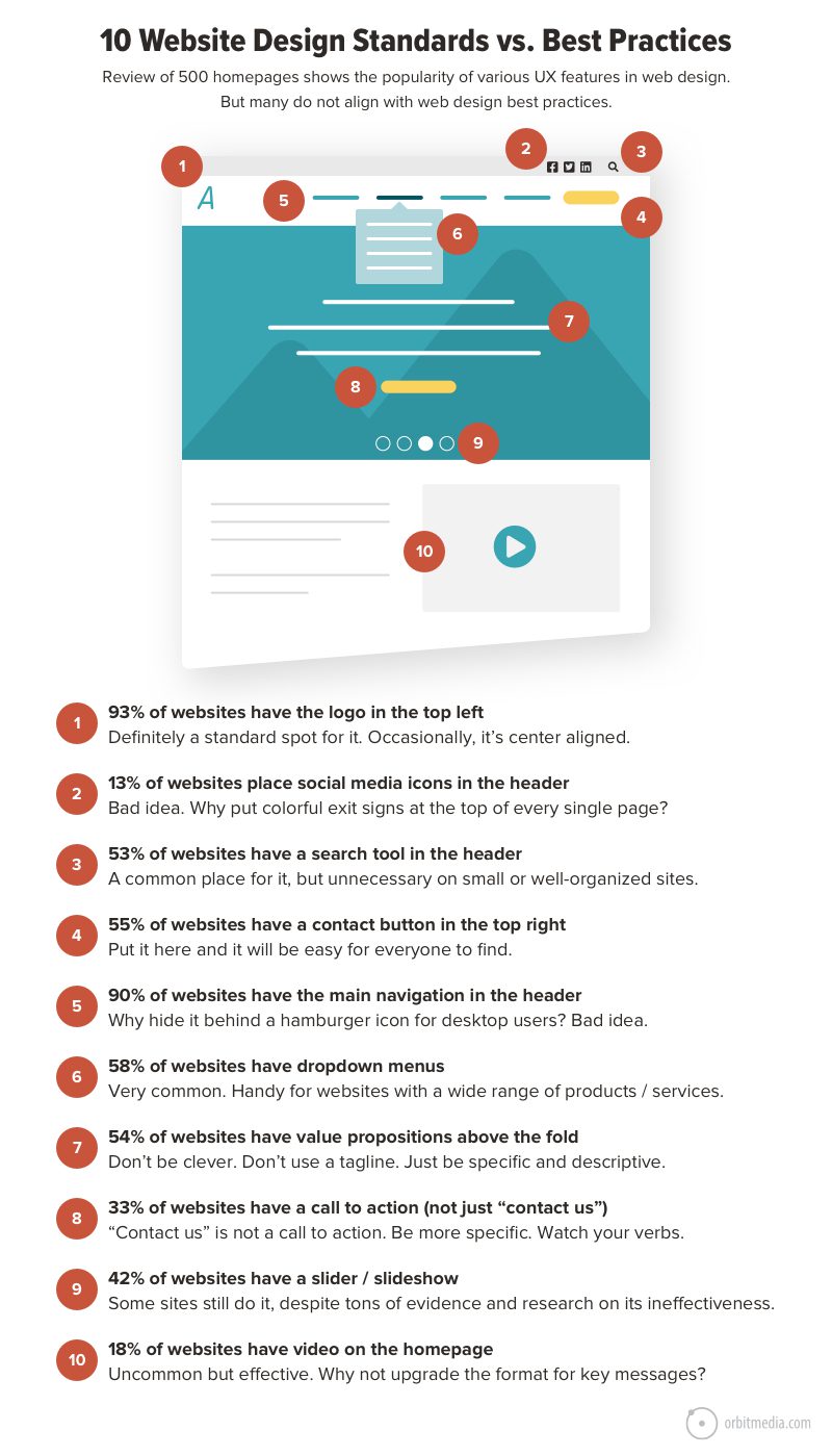
To answer this question, we created a checklist of 14 web design elements, then looked at 500 marketing websites to see just how standard these standards really are. Using guidelines from an earlier NN Group article, we use the following thresholds:
- Standard: 80% or more of websites use the same design approach
- Convention: 50 – 79% of websites use the same design approach
- Confusion: 49% or fewer websites conform, no single design approach dominates
Note: The dataset was mostly B2B marketing websites from five major industries: finance, tech, manufacturing, food and construction. Websites were reviewed in desktop view with a focus on homepages.
We learned that there are surprisingly few standards, but quite a few web design conventions.
Conforming to standards is usually a good thing. We all visit a lot of websites, so we have a lot of expectations. When something works the way we expect, we’re happy. When something doesn’t work the way we expect, we feel friction and frustration.
So conforming to norms is generally a good way to meet visitors’ expectations for usability.
But standards can let us down.
We shouldn’t do something just because a lot of other people do it. Often the popular features don’t even align with best practices. Many of the most common features consistently test poorly in usability studies.
Let’s look at the features in context on a page. This chart shows both their popularity and our input on how well these align with lead generation website best practices.
The data comes from our review of 500 websites.
The recommendations come from our experience building and measuring patterns of visitor behavior on 1000+ websites.
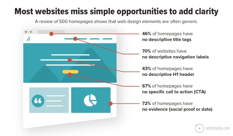
So clearly, web design standards and web design best practices are not the same. This becomes even more evident when you see just how common it is for websites to miss simple opportunities to add clarity.
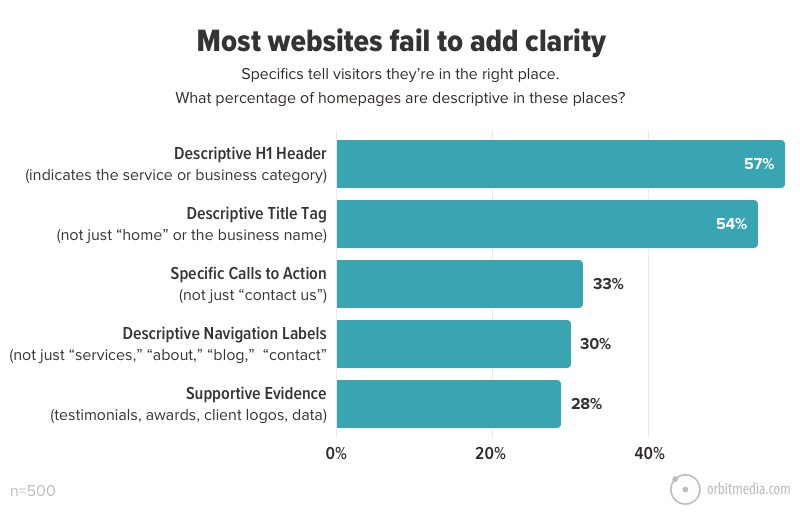
Are websites communicating quickly and clearly?
The first job of every webpage is to tell visitors that they’re in the right place. This can be done simply by being specific and descriptive in several places: titles, headers, navigation labels, calls to action and evidence.
The majority of websites fail to be descriptive in at least one of these elements, even though each of these elements could be addressed in minutes at no cost in any content management system.
This may be simpler to review in context. If we show each of these in a sample layout, you can clearly see just how prominent these elements are in user experience.
If your website doesn’t tell visitors what you do in these visually prominent areas, your visitor is likely to be confused or even frustrated, especially when it’s their landing page.
Now let’s look closer at each UX feature and web design element we looked for:
1. Logo in the top left corner
93% of websites have a logo in the top left corner.
Where else would it go?
This is really one of only two web design standards. Center aligned is the alternative, which can work well, but you need to plan the navigation around it carefully.
Recommendation:
- Don’t make it too big. That’s unnecessary.
- Don’t use the version with the tagline locked in. That’s illegible, especially on mobile.
- Don’t forget to compress the image to reduce page speed. It’s one of the first things to load.
2. Social media icons in the header
13% of websites have social media icons in the header.
That number is half of what it was five years ago.
The top of every page is definitely the most prominent place to promote your social media presence. Social icons in the header are especially common on B2C websites and niche publisher websites, where brand awareness and pageviews are life and death.
But on a B2B lead generation website, it’s a weird idea. These are candy-colored exit signs.
Traffic is hard to win and easy to lose. If the visitor clicks one of those icons, they’ll land on a site that does everything possible to keep that visitor. They’ll be distracted. They’ll forget about you. That’s why this is on our list of things to remove from your website immediately.
Recommendation: Remove the social icons from your header. Put them at the very bottom of the visual hierarchy, down in the footer.
3. Search tool in the header
53% of websites have a search tool in the header.
About half of all websites have a search tool available on every page in the header, which is unchanged from the first time we conducted this research five years ago in 2016.
Site search is a very common feature, but it’s not necessarily helpful to visitors.
- If your site has a lot of pages or an active content marketing program, a site search tool may be helpful to visitors
- If your site is small and the navigation labels are descriptive, you probably don’t need one.
A site search tool that no one uses is a cost with no benefit. It adds visual noise for no reason.
Recommendation:
- If you have a site search tool, check GA4 to see if visitors are using it. And if so, what they are searching for. This can be a quick way to find content gaps.
- If your site search reports are blank, follow these steps to set up site search reports in GA4. Then optimize your site based on those reports.
4. Contact button in the top right
55% of websites put a contact link or button in the top right corner of the header.
Most websites put “contact” in the top right. It’s sometimes a link with the same treatment as the other navigation. Sometimes it’s treated like a button, with a contrasting color, increasing its visual prominence.
Visitors expect to find it there. So it’s a good spot for it.
Here’s an example of a web design standard (or convention) that aligns with best practices. In this case, website navigation best practices, along with a bunch of other global elements.
Recommendation: If you’ve got a contact button in the top right, keep it there. But don’t expect this little guy to do all the work. Make sure there are other, more specific calls to action in other key locations. See #8 below.
5. Main Navigation in the header
90% of websites have a horizontal navigation bar in the header.
This is another true standard. The vast majority of websites have horizontal navbars in the header, which collapse into the three-lined “hamburger icon” for the mobile visitor looking at the responsive design.
Horizontal navigation saves pixel width for content, compared to the left-side navigation menus in earlier eras of web design. It’s expected and space efficient.
For the secondary navigation menu, it’s common for designers to put these above the main menu across the very top. This is sometimes called the “eyebrow.”
Recommendation: Stick with the standard and use a horizontal main navigation bar. But be specific in the navigation labels. See #12 below.
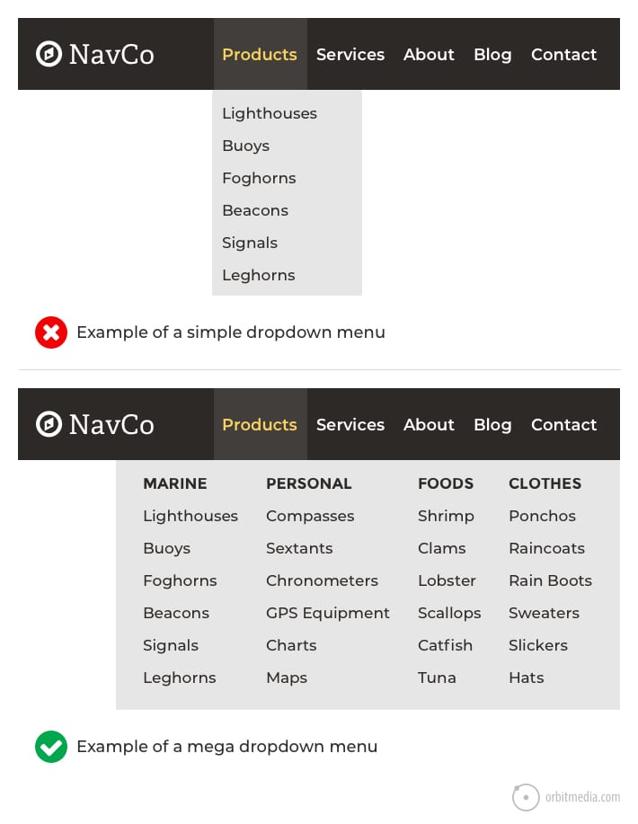
6. Dropdown menus
58% of websites have dropdown menus.
Most marketing websites have dropdown menus. The idea is to let the visitor go anywhere from anywhere. Dropdowns “save a click.” The alternative is to make them visit the top level page before seeing sub-navigation, thereby deliberately guiding the visitor through a series of pages.
Why are dropdown menus so popular?
Because they work for everyone. For the visitor, they’re a shortcut. For the marketer, they are segmentation.
Every click tells you more about the visitor’s intent, allowing you to speak more directly to them based on their needs. Dropdowns get them to the right page faster, where the chance for conversion is higher.
Recommendation: Use dropdowns only if the section has a lot of pages and subsections. (Avoid little dropdowns with few options because they don’t test well in UX studies). These really big dropdowns are called “mega menus.”
7. Value proposition above the fold
54% of homepages put the value proposition in the H1 header.
Those hard working words at the top of the homepage…
The homepage H1 header is the single most prominent bit of text on a website. The web copywriter has four options:
- State the value proposition, as in “We do X for Y” (simple, direct, specific)
- Repeat the business name (unnecessary)
- Use the tag line (often clever but vague and unhelpful)
- Push an ad, announcement or content piece (current promotion)
The majority of homepages use the first option. The header is the value proposition, the business category or the services provided.
Recommendation: Use the H1 header on the homepage to simply say what the business does. Don’t miss the opportunity to tell the visitors they’re in the right place. Some of your visitors don’t know you yet. Plus, a keyword-focused H1 is also an SEO best practice.
8. Calls to action (CTAs)
33% of homepages have a call to action (not just ‘contact us’).
The contact button may be standard, but calls to action are not. Two thirds of websites do not have an actual call to action on the homepage.
A call to action is more than “contact” or “read more.” It has a more action-focused verb and it’s more specific. When the visitor reads it, it makes the benefit feel high or the commitment feel low.
Consider the difference:
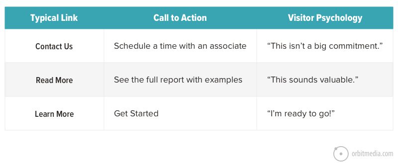
Source: How to design a button that wins clicks
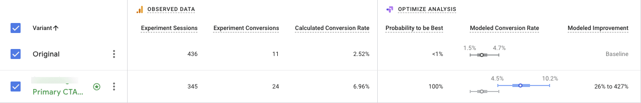
Recommendation: Set up an A/B test to see if your CTAs have room for improvement. For the variant, try something longer and more specific. Use words in the CTA (or nearby) to let the visitor know that this isn’t a huge commitment.
Here’s what an A/B test of a call to action looks like. Although this test wasn’t done running, you can already see the variant pulling ahead from the original.
9. Slideshows and carousels
42% of homepages have slideshows or carousels.
They are timed to advance after a certain number of seconds (slideshow) or they can be navigated by clicking a label or thumbnail (carousel).
This is an alarmingly high number, considering the overwhelming evidence showing the poor performance of homepage slideshows.
Probably, slideshows are still popular because they are built into cheap website templates. Or it may be because they help resolve conflicts in meetings when every department wants a little piece of the homepage.
The slider was invented to keep people from stabbing each other in conference rooms.
Recommendation: Rather than hide content in a second (or fifth) slide, make each slide a section on the page and stack them on a tall page. Prioritize them based on their likely importance to your visitor.
 |
Kurt Cruse Creative Director, Orbit Media“Actually, sometimes sliders are a great idea. If it’s really just a photo gallery and the content is outside of the slides (i.e. the same for all), they can work really well. It’s just a way to add more visuals to a hero area. Great for design firms, architects, etc.“ |
10. Video on the homepage
18% of homepages feature some kind of video, not just a looping background video in the hero area.
When we first conducted this research, very few homepages had video. Now in 2021, times have changed. Video isn’t a web design standard, but it’s become far more popular.
Changing the format of a message from text to video is the ultimate format upgrade, especially effective when the message is critical. Here are the three big opportunities
- About us video (who we are, what we believe)
- Testimonial video (“they are legit” social proof)
- Explainer video (what this is, how it works)
These are all conversion-focused, bottom-of-the-funnel videos, not content marketing videos on blog posts. Conversion videos are the most important of the three types of videos. For these, it’s worth hiring a pro producer and using a pro hosting/streaming service.
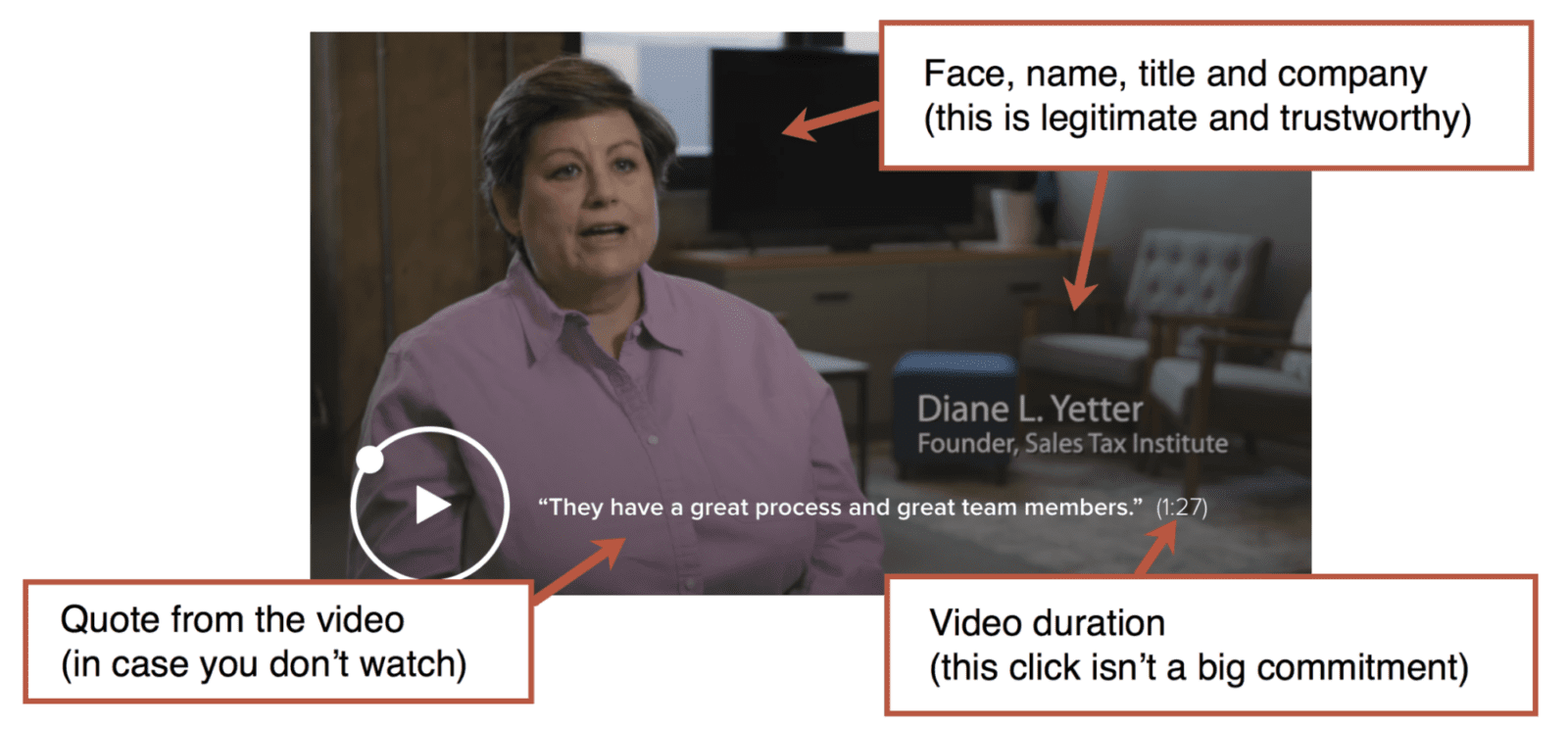
Recommendation:
- To increase the percentage of visitors who play the video, work hard on the thumbnail.
- Use a face and a little call to action.
- Take the best quote out of the video and add it to the thumbnail, so people will get the message even if they don’t play the video.
11. Descriptive title tags
54% of homepages have descriptive title tags.
Close to half of all homepages fail to be descriptive in their title tags. Many just show the business name, include the tag line or simply say “home.”
This is a missed opportunity to say what business the company is in, similar to putting the value proposition in the H1 header. It’s especially important for search.
The homepage title tag is the single most important piece of SEO real estate on any website. It’s the strongest place to indicate relevance on the page with the most ranking potential (homepages almost always have more page authority than any other URL on a given domain)
Recommendation: Use the title tag on the homepage to indicate the value proposition, the business category or the name of the main service. Do it in 55 characters or less if possible, to avoid truncation in search results.
The worst possible homepage title tag? “Home.”
A unicorn cries every time a web developer makes “Home” the homepage title tag.

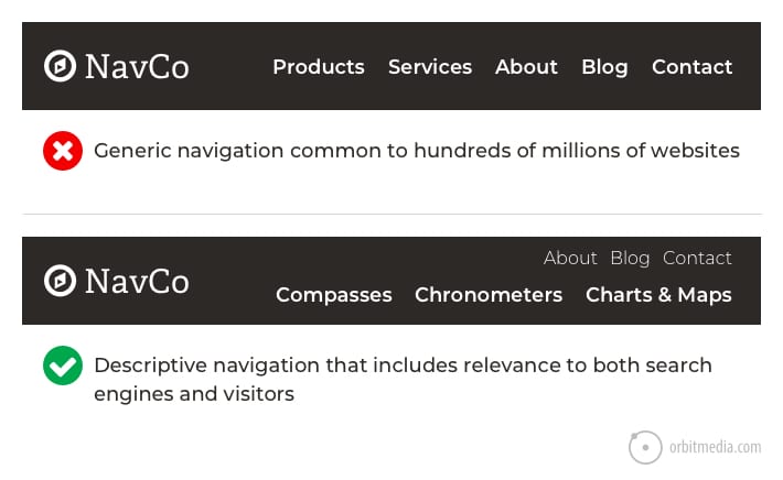
12. Descriptive navigation labels
30% of websites have descriptive navigation labels, as opposed to “services” “products” “about” and “contact.”
That means 70% of websites have generic navigation labels. Again, this is a missed opportunity to both indicate relevance to a search engine and to tell visitors they’re in the right place.
Compare the difference:
Recommendation:
- Be descriptive in your navigation labels. Help the visitor accurately predict what they’ll get when they click.
- Avoid generic labels (“services”), branded terms (“Retro Encabulator”) and formats (“ebooks”). Remember, visitors are looking for answers. Meaningful nav labels help them quickly get where they’re going.
13. Social proof or other supportive evidence
28% of homepages have testimonials, awards, or other evidence.
Most homepages contain no evidence whatsoever. That’s not good. Adding social proof and evidence isn’t a web design standard, but it’s definitely a best practice.
A page without evidence is really just a big pile of unsupported marketing claims.
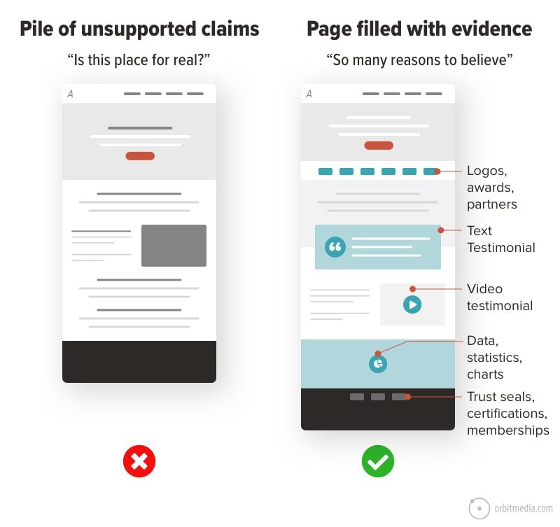
Ideally, every marketing claim is supported with one of these forms of social proof or it’s backed with quantitative (data) evidence. Here’s a list of types of evidence you can add to any marketing website.
- Testimonials
- Client logos
- As-see-in press logos
- Awards
- Certifications
- Endorsements from influencers
- Years in business
- Number of customers, clients
- Success data (ROI, dollars saved, time saved, etc.)
Recommendation: Back up every marketing claim with some form of evidence. Ideally, the evidence appears near the marketing claim it supports. Fill your pages with reasons to believe!
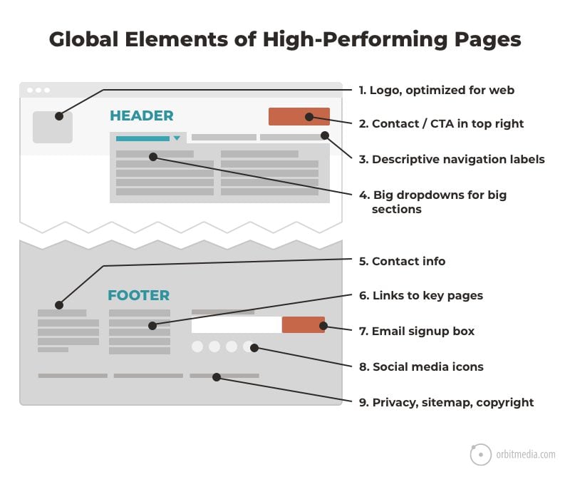
Custom design is dominant
Obviously, not all design standards are standard after all. Except for the placement of the logo, the main navigation and the placement of the header, there really aren’t strong standards for website design.
The nice thing about standards is that you have so many to choose from. – Andy S. Tanenbaum, Computer Scientist
Web design conventions include contact in the top right, dropdown menus, value proposition high on the page and a search tool in the header.
Other common design features may still be considered best practices, but may not be used by the majority of websites. Custom web design, with wireframe designs specific to the business and its audience, rules the day.
Practical insights for web designers
Why make your site different?
If a design element is expected in a certain place, then that’s where it should go.
Note: Not all sites follow all conventions, even sites we design break conventions from time to time. However, there are strategic reasons behind breaking those conventions. A good design company will work with you on these strategic decisions throughout your project.
Beyond design elements (and your own brand guidelines) there are types of web design standards that all good designers understand:
- Brand standards
Colors, type and tone are specific to every business. You should have a style guide for your website and stick to it. - Coding standards
Websites should be built using the programming standards agreed upon by the W3C. This makes them more likely to display and behave properly in browsers. - Accessibility standards
Access to information is a basic human right. This has been recognized by the UN Convention on the Rights of Persons with Disabilities. Follow these standards to make your site accessible to everyone, including the visitor using a screen reader.
Standard web conventions are shorthand for good design, same as any digital marketing best practice. If you break any of these rules, you should do so intentionally and with a very good reason. And you should plan on measuring the impact of being unexpected.
Does your site align with standards? Follow best practices? Or break the rules?