What is the purpose of your website in one word? Answer.
From your visitor’s perspective, this is why your website exists. They have a question. The website’s job is to answer. The navigation, the headers, the content, it’s all there to help them get to the answer.
One common place to answer common questions? The FAQ page.
Marketers don’t talk about these much, so we’re taking it on. We’re answering the most frequently asked questions about FAQ pages*.
- Why are FAQ pages important?
- Where to put FAQ on a website?
- How to design an FAQ page?
- What questions to include?
We’re also answering some rarely asked questions and finding hidden opportunities.
- How to use heatmaps to improve your FAQ page?
- How to use FAQ page analysis to improve your website?
- Can you do SEO for FAQ pages?
- What about FAQ schema?
This post answers all of these questions, has best practices for design, analysis and optimization. Plus we’ll show you 7 examples of FAQ page design, good and bad.
*Actually, we checked and the top questions are “what does FAQ stand for?” followed by “Can you use FAQ in Scrabble?” No.
Why are FAQ pages important?
There is a true story in the life of your visitor. Something happened, they opened a browser and they found their way to your site.
Their first question is “Am I in the right place?”
That question is answered at the top of the page. Just use a clear, descriptive h1 and navigation labels and you should be all set.
Their second question is some variant of “Would this product/service work for me?”
That question is answered in the content of the page: the text and visuals below the first page block. If they don’t see their answer, their eyes move back up to the navigation.
The FAQ page is a safety net. It’s a catch all where’s-my-answer navigation item. As long as the visitor thinks their question is common, they click and look there.
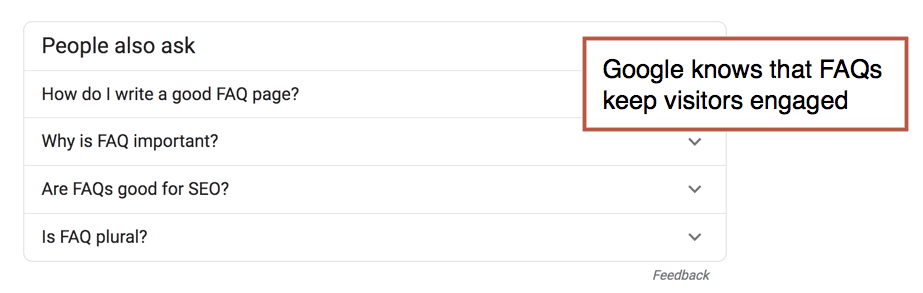
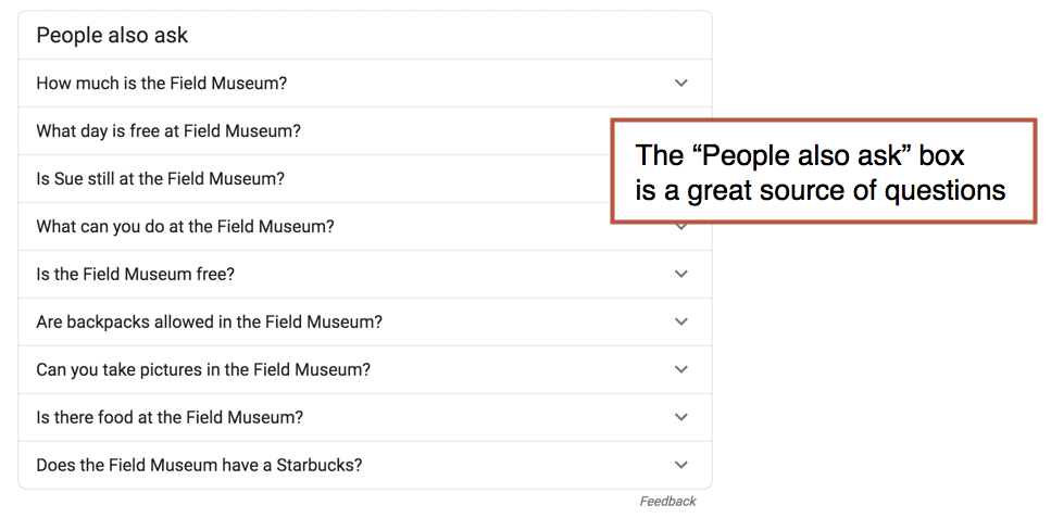
The question-and-answer structure is so intuitive, you see it everywhere. From the first Dear Abby column (1956) to the latest answer on Quora (there are 100M+), Q and A is a winning format. Google knows this. The PAA box (People Also Ask) appears in 88% of all searches.
People Also Ask
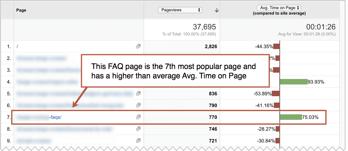
They are often top-visited pages on websites, attracting lots of long pageviews. Here’s what your FAQ page might look like in Analytics (Behavior > Site Content > All Pages report, comparison view for the Avg. Time on Page metric)
I am actually not suggesting that every site should have an FAQ page. See below.
Where to put FAQ on a website?
The most common place is in the main navigation. Because the navigation label is just three letters, it doesn’t take much space.
Here are the places your visitors will look for their answer, in order.
- On the page where that question popped into their mind.
- If they don’t see the answer on the page, they’ll look at the navigation.
- If they don’t see a navigation label that looks like it holds the answer, they may click on FAQ and start scanning through the list.
Ideally, the question is answered on the page, but by adding FAQ in the main navigation is the “if all else fails, look here” option for the visitor.
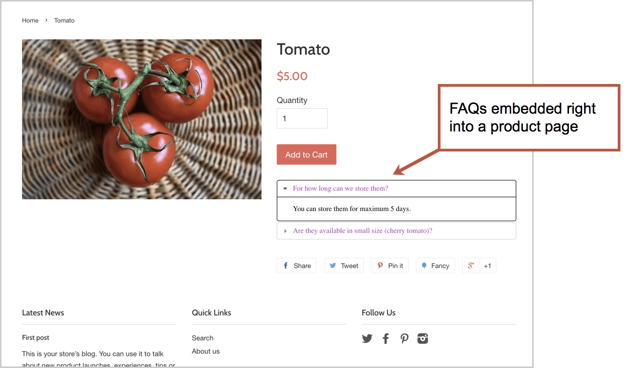
Here’s an example of how questions can be answer, in an FAQ format, on an ecommerce product detail page.
How to design an FAQ page?
The FAQ page design, layouts and features all depend on the number of questions and depth of the content. Design the container with the content in mind. If you’re working with an FAQ page template, make sure it holds everything together nicely.
Here are our five FAQ page design best practices:
- Use clear, descriptive navigation labels
- Prioritize questions based on popularity
- Keep the design simple and easy to scan
- Show contact information in case visitors get very frustrated
- Add features (search, categorization and accordions) if you have a lot of Q and A. Here are some guidelines:
If you have fewer than 20 questions
Just make a list
You don’t need to group them. Prioritize them by importance.
If you have 20+ questions
Group similar questions together
That’s because it’s hard to scan through long lists. Subheaders make content scannable. No group should have more than seven questions, if possible, because long lists are much harder to scan.
If you have 50+ questions
Add expandable content areas or jump links
The visitor clicks to “open” each question and see the answer. In UX, these are often called “accordions” because they push down the rest of the page (unlike “overlays” which appear on top of the page)
Accordions are that bit of HTML (Javascript, actually) that let you put more questions into the browser viewport, letting the visitor see more questions without scrolling through a long list. It should be possible for the visitor to see 10-20 questions without having to scroll.
If you have 100+ questions
Add a search tool
Beyond grouping and accordions, you may need to add a search tool for this section. Although visitors would prefer to click (or tap) than type, search is the only way to find needles in haystacks.
The site search offers a hidden advantage for the UX analyst: it’s a listening tool. As long as Google Analytics is set up properly, you can use the Behavior > Site Search > Search Terms report to see what people are typing into that little box …and then make sure those questions are on the page.
Later in this guide, we’ll show you how to use Analytics to improve both the design and the content.
What questions to include?
The idea is to answer questions that your audience literally asks you a lot. The best way to find these questions? Listen to your audience directly or interview the people who do.
Here’s a list of seven sources of the questions your audience is frequently asking, starting with the best and most empathetic:
- Join sales calls/meetings
- Interview the sales team
- Join customer service calls
- Interview the customer service team
- Read website chat log
- Site search search terms report
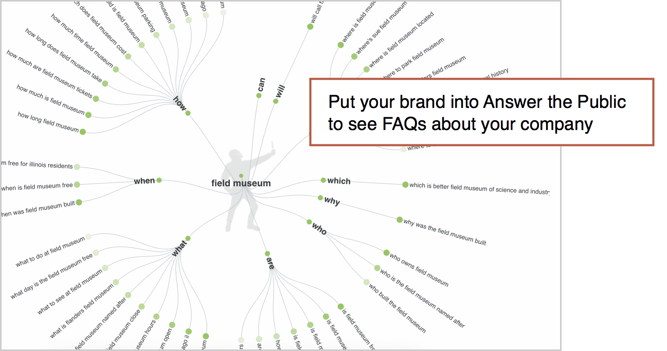
- Use online research tools (Google and Answer the Public)
That last approach works great, but only if you are a well-known brand. Do a little branded keyword SEO and you might find common questions about your company right there in Google search results.
These are questions people are asking Google. So these are questions that should go on your FAQ page.
Answer the Public is another source. It pulls questions from around the web.
In the end, you’ll make assumptions about which questions to add and what order to list them. Later, you’ll be ready to do some analysis and make improvements.
Here’s how…
How can I use heatmaps to improve my FAQ page?
If your FAQ page design has click-to-expand accordions, then you can track those clicks and see which questions are getting clicks.
Tracking this isn’t super simple in Google Analytics, because Analytics (by default, at least) only tracks movement from page to page. Clicks that open questions and reveal answers aren’t “pageview interactions” so you’ll have to use another tool.
Add Hotjar, Lucky Orange or Crazy Egg to the page. These tools give you “click heatmaps” of where people click, even if they don’t leave the page.
You’ll instantly see some questions are more frequently asked than others. Some questions never get asked.
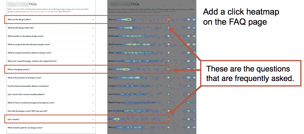
Now that you can see, in full color, which questions are popular and which are not, you have the perfect opportunity to improve the page:
- Move the popular questions to the top of the list
- Remove (or move down) the questions that rarely get opened
- Rephrase questions that aren’t getting opened
- Add questions to the mix
In my experience, it’s rare for website owners to ever optimize the design of these pages. They follow a few FAQ page best practices and then never go back to check on performance.
Note: It’s possible to track non-pageview interactions in Google Analytics using event tracking, usually set up through Google Tag Manager.
How to use FAQ page analysis to improve the rest of your website?
That’s a question no one asks.
But every FAQ page is a potential gold mine for analysis. Use Analytics to find which pages are missing information. If a visitor leaves a page to go to FAQ, then that page has a content gap.
To find these gaps, find your FAQ page in the Behavior > Site Content > All Pages report. Click on it to bring you to the report for just that page. Then click the Navigation Summary tab above the trend line.
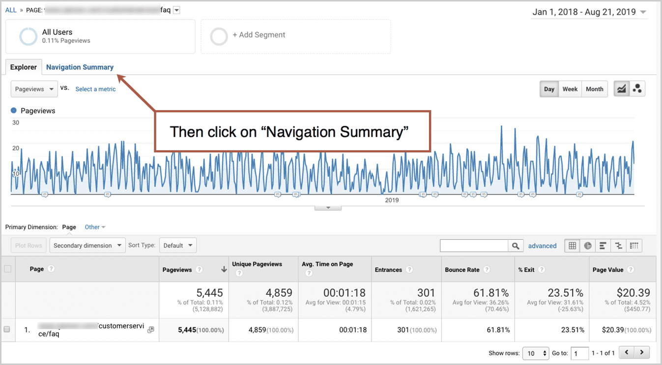
The navigation summary will show you the Previous Page Path for your FAQ page, which is basically a list of unsatisfying pages. The visitor looked, couldn’t find their answer, gave up and looked somewhere else.
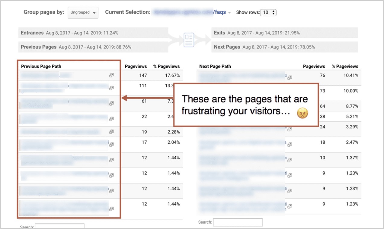
Go back to each of those pages and ask yourself what questions were left unanswered. What info could be added. Make that a better, more detailed page and keep the visitor in the flow.
Can you do SEO for FAQ pages?
Mostly, FAQ pages are terrible for SEO.
SEO is about making a great page on a topic. More specifically, SEO is about making one of the top 10 pages on the internet for a topic, with the hopes of winning one of the top 10 placements in Google.
FAQ pages are neither focused on a single topic, nor are they the best page on any of those topics.
- They don’t pass the “is someone searching for page this?” test.
- They don’t pass the “is this the best page online for the topic?” test.
On the other hand, there may be content on your FAQ page that people search for all the time. If so, that content should get it’s own page with a very detailed, comprehensive answer to that frequently asked question.
If you go down that path (most companies don’t) you’ll end up with a FAQ section (a set of pages, each page answering a question in detail) rather than a single FAQ page.
What about FAQ Schema?
In early 2019, Google started showing questions and answers from pages right in the search snippet when a page ranks. It looks pretty sweet.
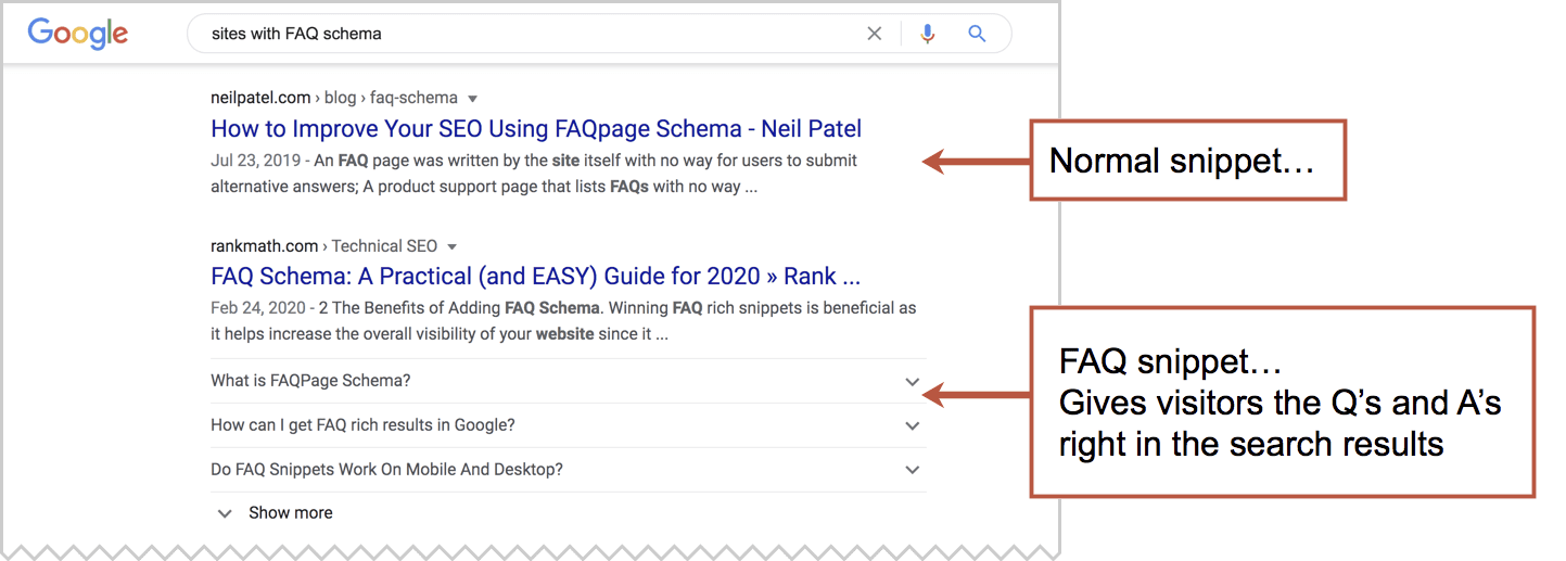
It’s like a mini-People Also Ask box just for your page. To make this happen for your FAQ page, you’ll need to add the FAQ Schema to the page. Ask your developer.
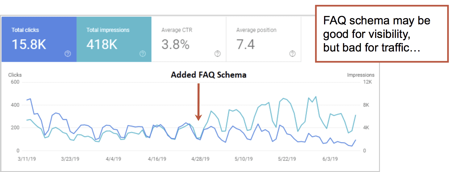
But first, consider the impact. Although it may help the visitors get to the answer faster, it may also make it unnecessary to visit your site. Why leave Google? The answer is right there in the SERP.
Lily Ray reported this in a now-famous screenshot of Google Search Console. Impressions may go up, but clicks may go down. Consider it a warning.
See the Path Interactive guide to FAQ Schema for ideas on how to minimize the negative impact.
 |
Lily Ray, SEO Director, PATH INTERACTIVEJust because you added the structured data to your page, and assuming that it is marked as “eligible to appear in the SERPs” by the Rich Results Testing Tool, these two requirements are still not sufficient for Google to display FAQ Schema in the search results. Google has continuously tested how it chooses to display FAQ Schema since it unveiled this type of Rich Result in early 2019, with one of the biggest updates rolling out on July 15, 2020, when Google significantly rolled back the number of FAQ Schema results it displays in the SERPs. |
FAQ Page Examples
Here are seven of the worst and the best FAQ page designs we looked at.
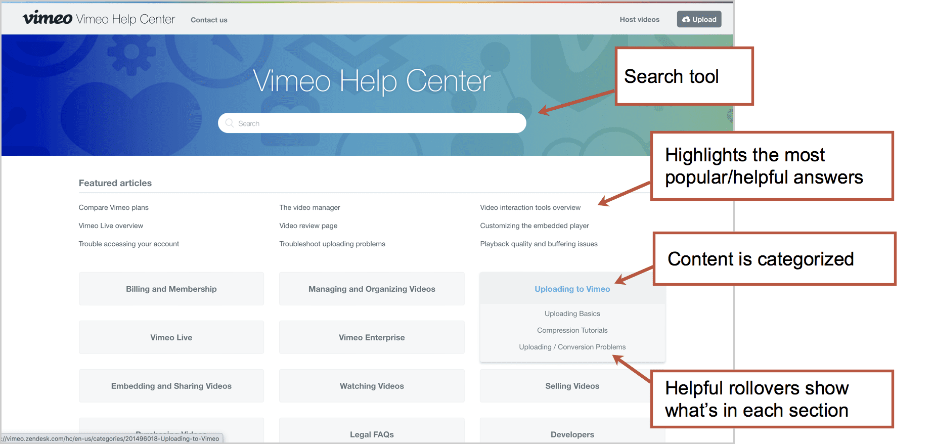
Vimeo Help Center
This section has answers to 375 questions. That is definitely enough to merit a search tool and categorization. It’s powered by the ZenDesk FAQ system, so of course it’s good!
- Good: We like the clean design, lack of visual noise (who needs icons?). We also like the helpful rollovers, which give you a sample of what’s inside before you jump in.
- Bad: We’re skeptical that they’ve done analysis on this. Is “watching videos” really a popular section? Also, they would get better Analytics if this was on their own domain, which is possible with ZenDesk.
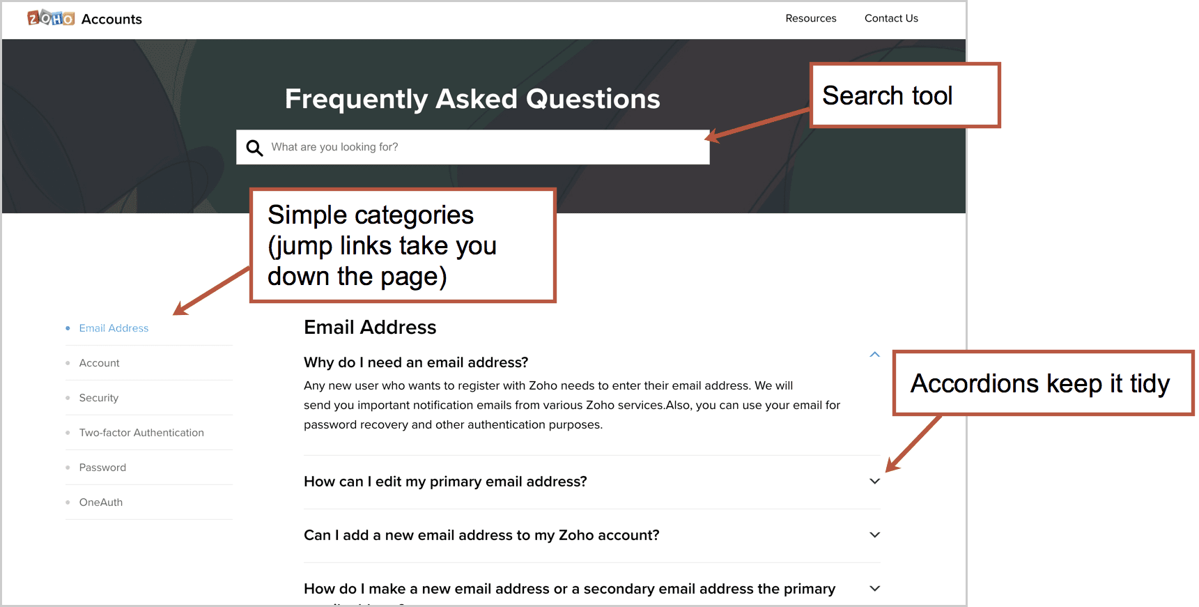
ZOHO Accounts FAQ
This page answers 47 questions. They all fit on one page and the left-side subnavigation is really just jump links. It’s so clean and scannable, the search tool may be unnecessary.
- Good: Simple and easy to scan.
- Bad: We wonder about the prioritization of the questions. Is “why do I need an email address” really the number one question? Most of the rest of the answers are for people who are having trouble logging in.
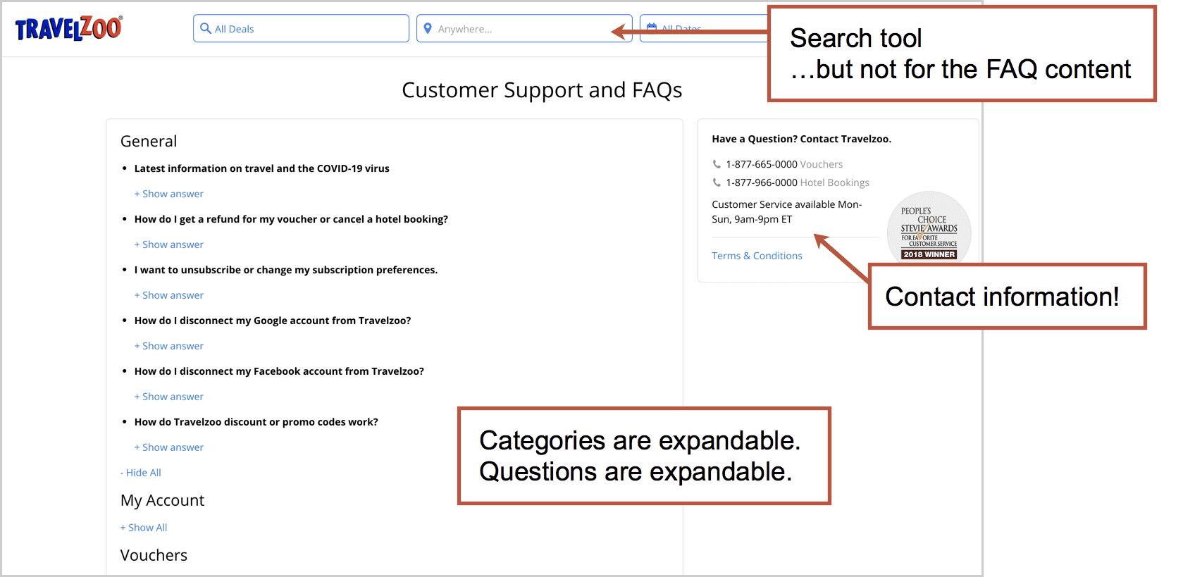
TravelZoo
This page answers 68 questions. Each category is an accordion and within each, each question is another accordion. So everything is tucked away nicely.
- Good: We love the contact information on the right. It’s a great safety net. Can’t find your answer? Don’t want to bother? Just call us. Also, one question is “I am still confused!” and has a phone number.
- Bad: The search tool at the top is part of a global header and searches for deals, not answers. That doesn’t align with the intent of visitors on this page.
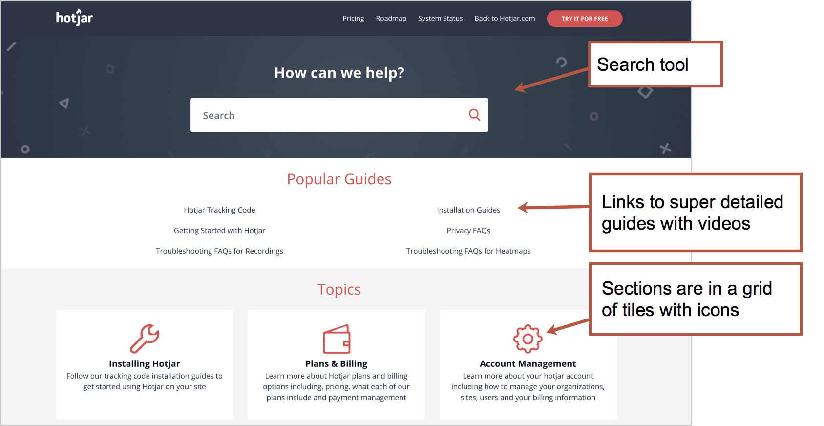
Hotjar
This section has 226 answers, so the search tool definitely makes sense. It’s big, good looking and goes deep into the content. This one is also powered by ZenDesk.
- Good: The “Popular Guides” at the top bring you to very detailed content, including the “Getting Started Hub” which has piles of videos. It’s the best we’ve seen. And the “Still need help?” section at the bottom has contact information. How nice!
- Bad: Categories are in a grid of tiles, so the scanner has to move their eyes left to right and up and down. Not ideal. And the red icons look nice, but they don’t add much value. They add to the pixel height pushing categories down. A simpler design without the icons might be easier to scan.
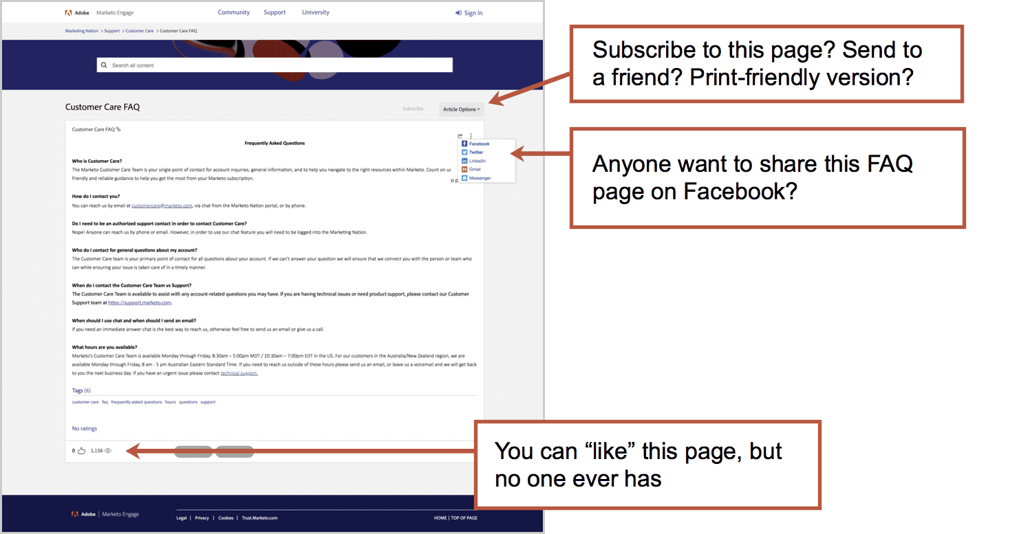
Marketo Customer Care FAQ
If you have questions about contacting Marketo Customer Care that weren’t answered on the contact page, this page is for you! It has seven answers.
- Good: Maybe it was easy and cheap to make?
- Bad: This page is trapped in the wrong template. It has a lot of features that are mostly irrelevant/useless: social share, send, print, upvote, etc.
And look at the content. Really a contact page disguised as an FAQ page. Can I contact you? How do I contact you? When can I contact you? This page probably shouldn’t exist.
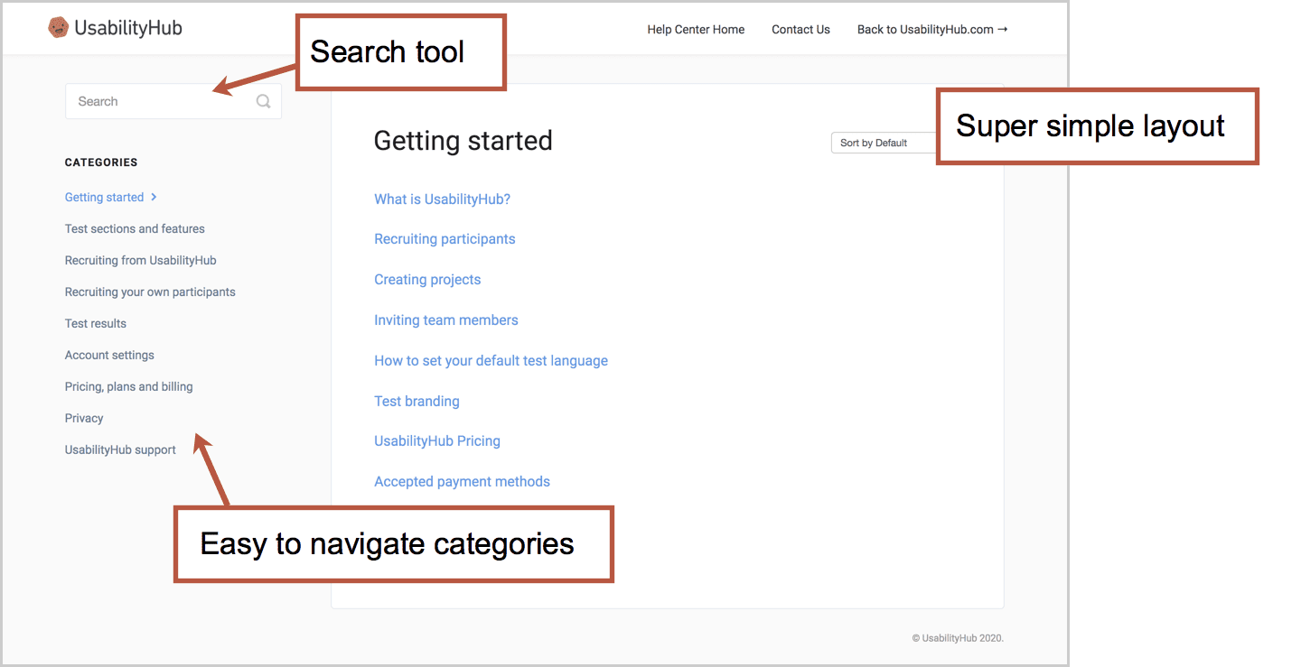
UsabilityHub
This little help center contains 75 questions and answers. The design is stripped down to the minimum with hardly a pixel wasted. This is a UX testing tool company so they’ve probably confirmed it’s utility.
- Good: Lightweight design. Easy to use. Couldn’t be simpler.
- Bad: It’s not winning any fancy design awards, but who cares?
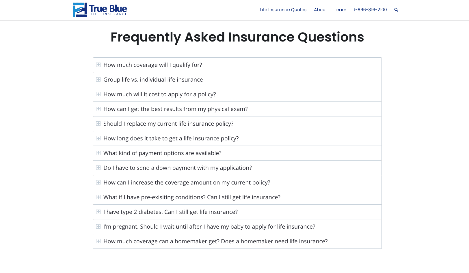
True Blue Life Insurance
When you have a short list of questions, you don’t need search. You don’t need navigation. Just a simple list of accordions will do. This life insurance company does it well.
- Good: Easy to scan
- Bad: With so few questions, the visitor may not find what they need
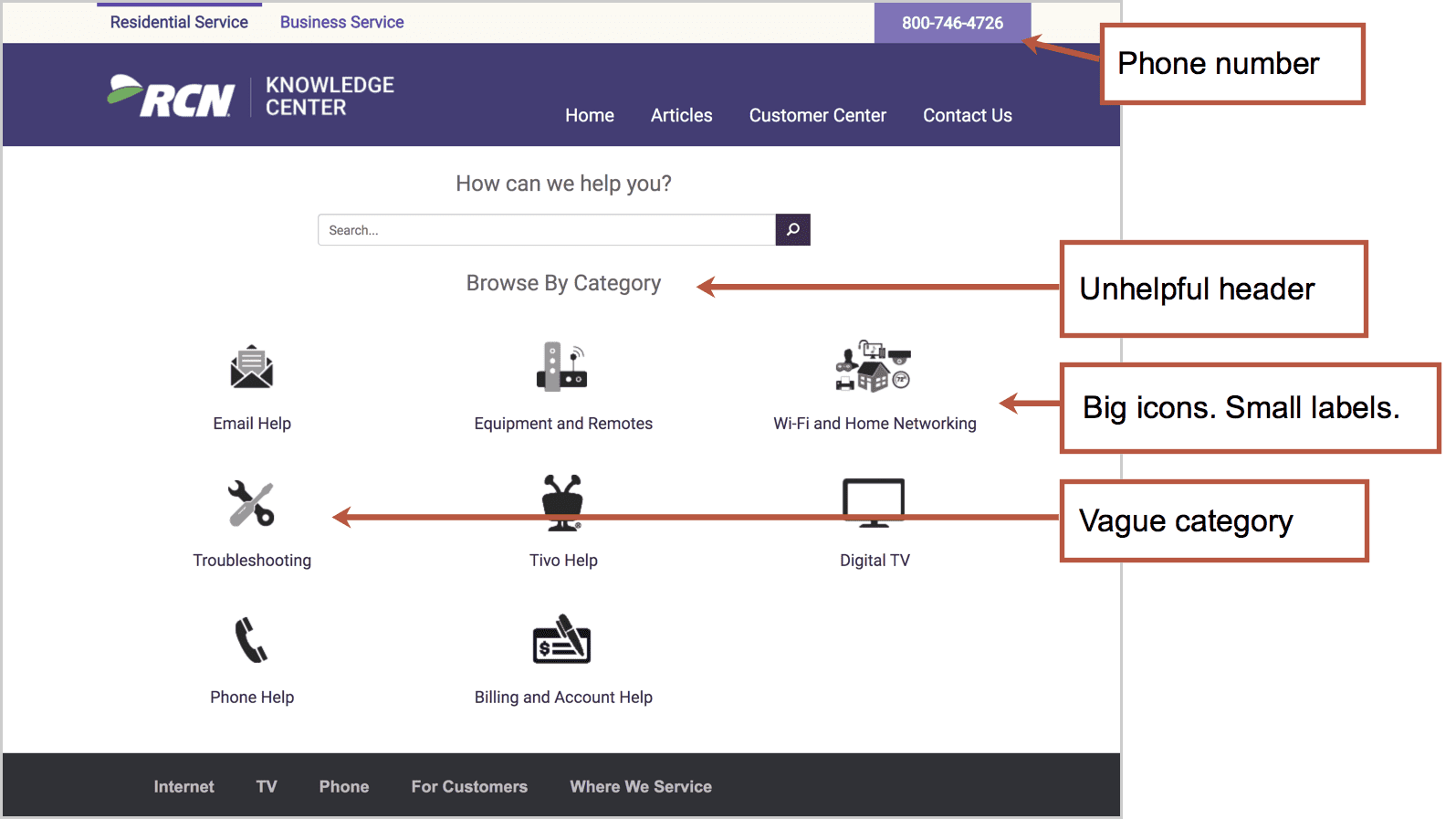
RCN Telecom Knowledge Center
On the other end of the spectrum, we have RCN. It’s a design-heavy help section with bold colors, strong contrast and big icons.
It holds 371 FAQ articles including “How to power cycle your equipment” (turn it off and on) and “How to find out which remote control you have” (there are 16 different remotes so use the guide to find yours).
- Good: Phone number in the top right, just in case! Plan to wait a while…
- Bad: It’s necessarily noisy.
The most important information is the category names, but those are the smallest thing on the page. And a few of the labels are vague, such as “troubleshooting.”
They don’t have a page for “cancel service” which is likely a top question. Search for this and you’ll find a “How to change your service” page with nothing more than a phone number.
But wait, should you have an FAQ page at all?
Of course, FAQ content is what every website needs. As we said, the website’s job is to answer questions. Visitors visit to get information. But that doesn’t mean that every site should have an FAQ page.
It’s the job of the website to make information easy to find. When a visitor clicks on a navigation label, they are telling the website what they want. That page should then serve up those answers. Ideally, answers to their questions should be right there, on that page.
A page called “Frequently Asked Questions” has a vague name, not specific to any topic. It says “Here is a lot of important information in one big pile.”
The best sites answer top questions on every page, in the flow and in context for the visitor. Visitors’ questions should be answered on the pages where the question popped into their mind.
If you have a complex offer and a visitor with lots of information needs, it may be a great idea to design an FAQ page. But do so thoughtfully. And then check it. A little bit of analysis goes a long way toward a better experience.