Some websites are tools for content marketing. Others …not so much.
Every marketer has a horror story about how a website problem destroyed their best efforts. Broken contact forms, bad URLs, long waits for simple updates.
Websites either work with or against the marketing team. Good sites make marketing easy; bad sites make every effort a struggle.
Yes, websites should look good and be easy to use. But it goes beyond that. Here’s a checklist for ways in which sites can play nice.
Tip! Use this checklist as a shorthand way to add requirements to your next website redesign RFP or to give specs to your designer or developer.
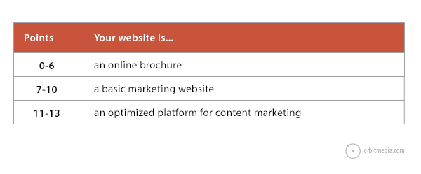
Score Your Site
As you go down the list, check the boxes. How did your site do?
Conversion Optimized
The marketer attracts visitors; the website converts visitors into leads. The two numbers that matter most in your marketing are total traffic and conversion rates. Here’s how the website will do its half of the job:
1. Mobile Responsive
The site looks good and is easy to use at every screen size on every device. There isn’t a separate website for mobile visitors, it’s one site that resizes itself depending on the width of the screen.
Here are the basic features of a mobile responsive website
- Site navigation collapses into the “hamburger icon” for visitors on phones
- Buttons are at least 57px wide
- Phone number turns into a call button
- Address turns into a map/directions button
- Website displays in a single column layout
 |
“Work with your web developer to create an information architecture where content can be added in a seamless way. Your content is like water flowing into different sized containers. Plan at the beginning for what variable displays and content you may want and you’ll build a system you can live with for years to come. |
My website is responsive and mobile-friendly. |
If there are any problems for mobile visitors, you’ll see their frustration in your Analytics. Check the Audience > Mobile > Overview report. If the engagement metrics (bounce rate, pages / session, avg session duration) are much worse than average for phone and tablet users, you’ve got a conversion problem.
2. Calls to Action (CTAs)
Every page has a purpose, an intended outcome for visitors. Every page calls the visitor to act.
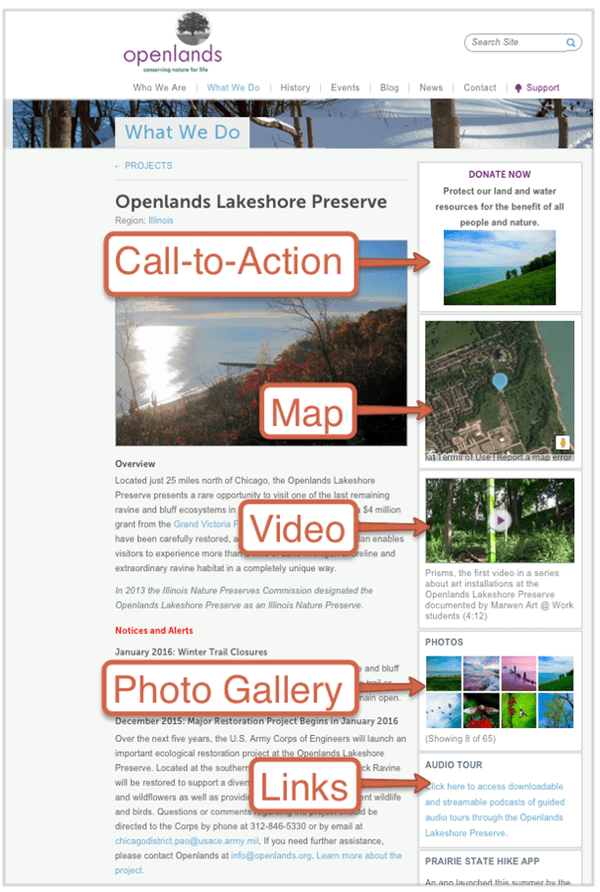
Calls to action should be easy to add throughout the site. They are easy to test and then easy to change. CTAs can be added in several places, in the content, at the end of pages and in right-hand “sidebars.”
My pages all have calls-to-action. No pages are dead ends. |
3. Social Proof and Testimonials
Your site is filled with evidence that you are good at what you do. Every marketing claim is supported with a testimonial or other social proof. These testimonials look good and allow for pictures, names, companies and job descriptions if available.
Adding next testimonials is a snap, so when you get a happy email from a customer, you can get permission and add it to the site that day.
My pages all have testimonials. |
4. The Blog’s Email Signup Box
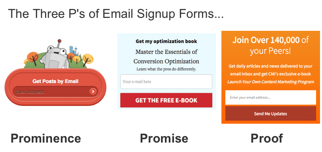
The size of your email list next year depends on the design of your signup form today. Is your signup box optimized to convert? Check it against the following elements:
- Prominence: It visually stands out through color (it contrasts with the rest of the page), stickiness (it’s visible no matter how far down the visitor scrolls), it pops up (the visitor has to close it to read the content), or it appears more than once (it’s in several places on the page)
- Promise: It tells the visitor what they’ll get in terms of topics and frequency.
- Proof: It indicates that others have subscribed, either by showing the number of total subscribers (“join the 1000 marketers…”) or with a short testimonial (“I’ve learned so much from this…”)
If you use all three of these email signup best practices, you can expect a steady stream of signups. If not, you’ll be hearing crickets.
 |
“Here’s a 4th P of email signup: Progressive profiling, Don’t ask for everything on the “first date” — capture the required info and keep it short to keep friction low. Then, on page two or as part of the email welcome series, offer further value to subscribers who add more information about them to their subscription, i.e. location, area of interest. |
My email signup form is optimized to convert readers into subscribers. |
5. Footer Design
Your site is designed to catch visitors who fall all the way to the bottom.
Add lots of options to the footer, including conversion options such as subscribe and follow. Add navigation to guide visitors deeper into the site. The goal here is to keep the visitor moving by creating paths to other pages, so they don’t feel that they reached a dead end.
Follow these footer design best practices and build up a “fat footer.”
My footer offers additional navigation and actions. |
Easily Updated
Adding, tagging, moving, managing content takes no more time than necessary thanks to the magic of content management. Anything that can be editable text or an updatable image, should be.
Making a change to a page or post should take less time than asking someone to make the change.
6. Landing Pages
The site has a flexible template for creating and testing landing pages from any campaign you can dream up. Or it integrates with an Unbounce-style tool for doing so.
Note: Landing pages are important ONLY IF the marketers are doing campaign marketing with advertising or email. Landing pages are always specific to an offer. Don’t plan a landing page until you know your specific offer, and you have a plan to drive traffic.
My website makes it easy to create landing pages. |
7. Scalable for All Content Types
Your may have a new video next week. A new podcast next month. Long-form resources or easy to browse galleries. The site should support all future content types with minimal cost implications.
My website lets me add any format of content easily. |
8. Flexible Team Pages
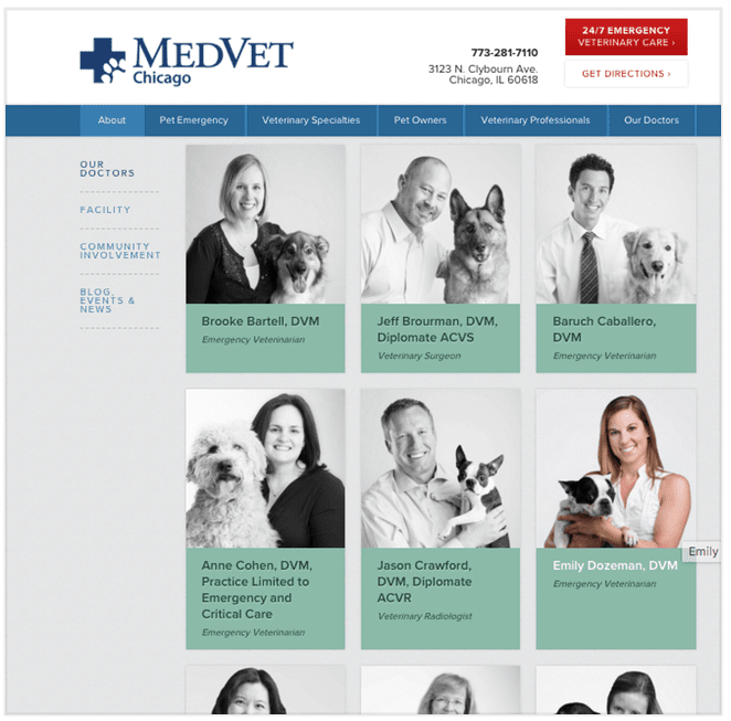
Your website shows the human side of your company. It shows your people. Faces and names. Showing your team builds trust, giving you a slight conversion rate boost.
But don’t just put everyone on one page. You have a team page that lets visitors click through to get to a detailed bio for each person. These bio pages will rank for the names of the team members, giving you a slight traffic boost.
If there isn’t a page for each team member, the site is unlikely to rank for people’s names.
The downside to a page-per-person is turnover. Even at the best company, people come and go, which means these pages will need to be updated. Here are two web design tips for keeping those people pictures updated:
- Don’t use group photos anywhere on the site. If one person leaves or gets hired, the entire picture is out of date.
- Consider using black-and-white headshots. It’s easier to match lighting later if these pictures aren’t in color.
My site is filled with people, faces and names. There is a page for each person, not just one page with everyone. |
Search Engine Friendliness
Sites are search optimized, or they aren’t. It’s part of the DNA of the website and can’t be retrofitted later. So it must be done right the first time.
9. URL Structure
Your URLs can affect search rankings. It’s a place to indicate relevance for a keyphrase…or it can indicate a deep, buried, irrelevant page. A good URL structure for a website meets a few criteria:
- It is short
- It has few slashes (indicating that content is close to the root)
- It includes the target phrase for the page
A good content management system lets you choose a specific URL for every page. A bad website chooses something arbitrary for you.
My website has a search-friendly URL structure. |
10. Technical SEO Files in Place
There are two key SEO-related files, sitemap.xml and robots.txt. Your website should have them in place, so they can communicate basic information to search engines.
- sitemap.xml
List of all the pages and media on the site, in a format easy for search engines to read
- robots.txt
Special instructions for search engines, telling them what areas to not crawl or index.
Not sure if your site has these two files? Just go to yourwebsite.com/robots.txt and yourwebsite.com/sitemap.xml to check.
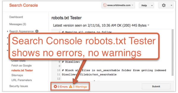
These should be easy to manage if a change needs to be made. Google Search Console confirms that they look good and they’re error-free.
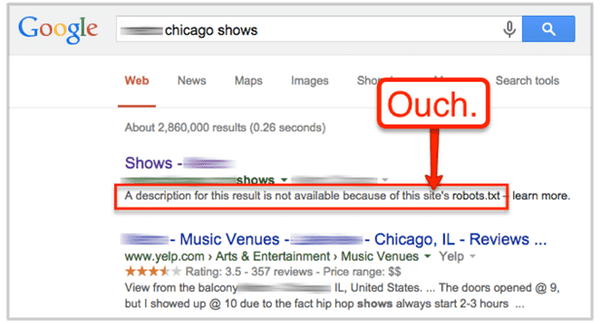
You may rank like a champion without these files, but they are best practices for SEO. Also, mistakes in these files can be disastrous. Here is the search listing for a popular music venue in Chicago.
Why doesn’t Google show any information? It’s because their robots.txt file tells Google not to crawl the website.
This robots.txt file tells every search engine (User-agent: *) to ignore (Disallow) everything (/)
My website has both a robots.txt file and a sitemap.xml file. |
Simple Measurement and Testing
Ongoing improvements to content strategy are only possible if analytics are available and set up properly. The website can make using Google Analytics hard or easy, depending on how it’s built.
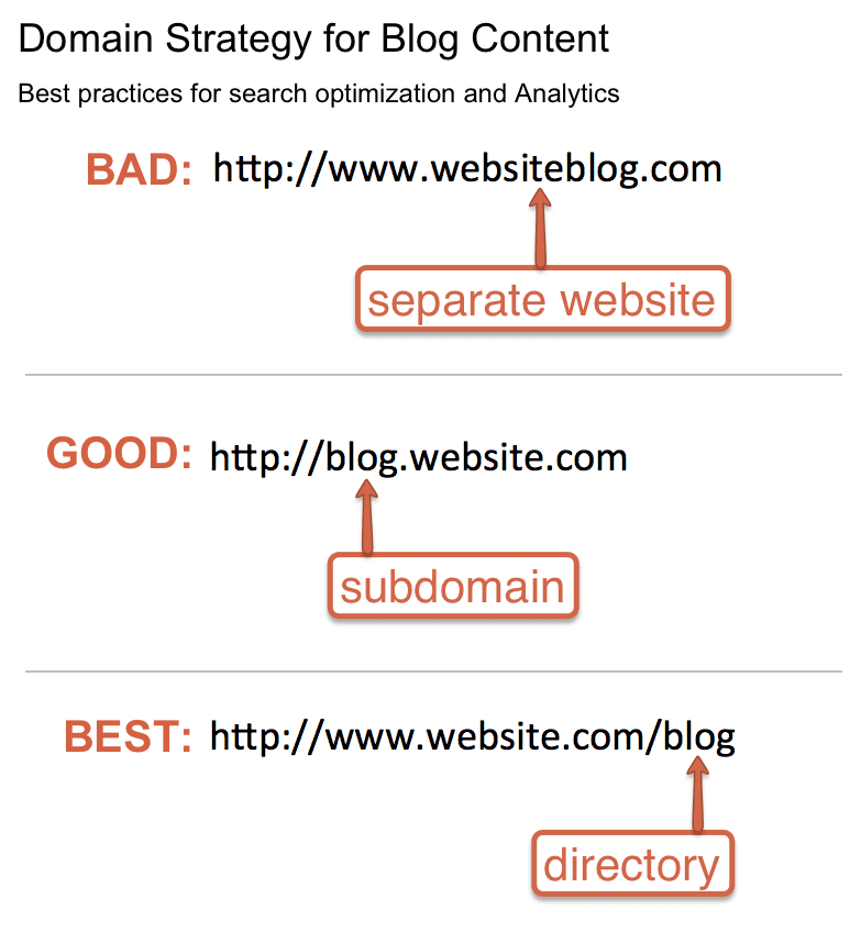
11. The Blog is in a Directory (not a subdomain or separate site)
If you don’t have a blog or a place to post articles, then you aren’t able to do content marketing. There is no easy way to publish the kind of helpful, useful content that gets visitors to visit. If you do content, you have a blog. But where it is?
If the URL of every post starts with /blog/ measuring the performance of your blog content is a piece of cake. This means the All Pages report can show you just the blog posts if you add a simple filter. But if the blog posts are not in a directory, it’s much more difficult.
The website has a blog, and it is in a directory. |
12. The Site Search Tool
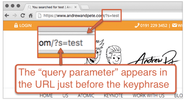
Got a search tool on your site? Great! That little search box is a helpful tool for visitors. It’s also a listening tool for you. But only if it’s connected to Analytics.
Search for something using your search tool. Now you’re on your search results page. Do you see your keyphrase in the address bar? If so, you can setup the Site Search report in Google Analytics.
Now you can look at the Behavior > Site Search > Queries report to see what your visitors are searching for.
The search tool shows the search term in the URL of the search results page, after a search parameter. |
13. Thank You Pages
When a visitor becomes a lead, your website says thank you. But do those two little words appear as a message on the contact page? Or does the visitor see them on a separate thank you page?
It’s an important difference.
If the visitor arrives at a thank you page, then setting up goal tracking in Analytics is a snap. You can create a “destination” goal by simply telling Analytics the URL of the thank you page. You do this in Reports > View > Goals.
Now Analytics will be able to report on conversions, giving you all kinds of data about lead generation. But this type of destination tracking isn’t possible if the site shows a thank you message, not a thank you page.
ProTip! Ideally, your thank you page is more than a dead end. They should offer visitors more content or a new call-to-action.
My website has a thank you page and a goal is set up in Analytics to track the conversion. |
There are Two Kinds of Websites…
Every marketing website is either a content platform or an online brochure. There isn’t much in between. The key is to make sure that website is flexible and aligns with marketing goals.
There are two main mistakes that content strategists make regarding their websites:
- Build a marketing platform, but then don’t fill it with useful, strategic content.
- Build an online brochure, but then try to use it as a content marketing platform.
These are the marketers that get the worst ROI.


