Let’s start with a shameless plug before sharing our website design idea. Buy your running shoes at Fleet Feet Chicago.
They are not only one of our favorite clients, but they are really good at what they do. They work with you to evaluate your individual needs and natural biomechanics to help select the running shoes that offer the best fit and function for you.
They ask you for some basic information about your running habits, look at how your current pair of shoes are wearing, and then they watch you run. Then they find the best shoe in their stock to match your specific needs, your legs, and your feet.
What they will never ask you is, “What color shoe do you want?” In fact, they might even look at you funny and give you directions to a big box sporting goods store if you make too big of a deal about color.
Why do they do this? Because they are in the business of helping your running, and they are laser focused on that goal. The color doesn’t help your feet endure a couple more miles, run faster, or avoid an injury.
What does this have to do with a website?
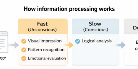
We employ a similar tactic for designing websites. We have realized over the years that people can’t think clearly about how their website will function when they have colors in front of them. Especially when those colors are in the form of pretty pictures. The attractive pictures trigger parts of their brains that don’t allow them to focus on the layout and usability.
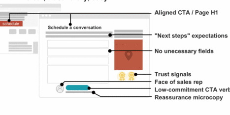
A website is highly dependent on a successful layout in the wireframe – or template – design process. At this stage, color is a siren of bad decisions or, at least, a major distraction during the decision process.
Like Fleet Feet, we structure our process and client approvals to help them focus on the right decisions to get a website that fits their business and, more importantly, their clients.
We are a little different than Fleet Feet because, obviously, we think an attractive website is important to its success, so we add color into the process after we’ve nailed down the wireframes. We want to look good AND function well.
Remember, the next time you buy running shoes (or build a website), don’t focus on the colors!


