Typography is one of those things that lives firmly in the realm of design people. And for the most part, it is best left in the hands of your designer. But what happens when you have to add content to your website? There are some things you need to know to keep your site looking its best.
Are you ready? In web designer speak, we are going to use existing CSS Styles and a WYSIWYG editor to create semantic markup, which will take your content from well-written to effective body copy.
Wait, what? It means that there are styles available in your text editor, and to keep things looking consistent, visually appealing, and search engine-friendly, you should use those. I am going to show you how and why to use all of those.
What is a WYSIWYG?
WYSIWYG stands for “What you see is what you get,” and it refers to the text editor in your Content Management System (CMS), because, for the most part, what you see there is how the copy will look on the live site.
First things first
When you are crafting your content, you are going to want to make sure that you are using short paragraphs with a combination of section titles, bulleted lists, and maybe a pull quote or a short punchy introduction. Here is an excellent web content checklist that you should use as a guide.
But you are only halfway done once your content is written and broken up. It is time for the making-it-pretty part.
Laying out your content
It is important to understand why you should apply a style from the content editor and not just change the size, color, or font without changing the style/formatting tag.
Those styles, besides being set up to look good and help you maintain the design of your site, tell a search engine what information is more important on the page, since the programs can’t decipher how size and color inform importance or priority.
This is the important bit…
It has nothing to do with my designer brain wanting to keep you from muddying up your design. You should always start by assigning one of the pre-set styles in your WYSIWYG editor, even if you are going to change the color or size further. For the most part, the page design is about the end user, but you have to help search engines understand, too.
What the styles are & how to use them correctly
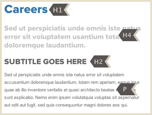
In your WYSIWYG, you will see styles called Paragraph, Block Quote, and H1 or Header 1 through H6 or Header 6. These are the HTML elements that tell the search engine how important different items are. The browser also uses this information to determine which styles apply to which text. This happens so you do not have to assign the font, size and color each time you add copy.
H1
You should avoid using this in your main content area at any cost. Almost all CMS and blogging platforms request the text from a title field and tell the browser and search engine that the title is in an H1 automatically, and you will confuse Google about what is most important on the page. Even worse, a visitor will be confused about what is the main topic of the page when scanning.
H2
This is your secondary heading. If you have two or more main sections to your page, you should use this tag to subtitle each section. I would caution you against using this immediately following an H1. No one likes to read headlines all lined up. (See H4 for a way to avoid headline stacking).
H3
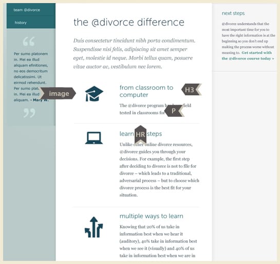
This is probably the most versatile of all the subhead styles available for you to use. If you need labels for lists or sidebar items, this should be your go-to tag. The type won’t be too big, but it will offer enough differentiation in size to indicate its importance.
H4
While an H3 is the most versatile, the H4 is my personal favorite. It is also one of the styles that can be used for the most design impact. It is great for breaking up an H1 and an H2 – by using it for a short synopsis of your page content, you are getting keywords into a header tag for the search engine gods, and you are making your designer happy that you are not stacking an H1 and an H2.
The H4 is a special tool. If you abuse it, your visitors will see a visual mess, and that is exactly what we are trying to avoid.
H5
When the headers get this small, they stop being good for labeling sections, but rather for adding some extra emphasis to a sentence that a simple bold or italic can’t achieve.
And sometimes you need that. Trust me. If it is something important that shouldn’t be missed, but it isn’t a headline and would be silly to use the H4 style for, the H5 will work brilliantly.
*For example, the H5 is great for things that would be added as an asterisk.
H6
I implore you to ignore that you have this option available to you. Designers will often use this style to label sections of a page, perhaps to indicate a type of content that appears in an area of the page. It is pretty much worthless in the crafting of well-laid out content.
Paragraph
This is the majority of your content. The work horse. Don’t forget to make sure that you choose this as you enter your page content (most editors default to this, but it is worth double checking).
Block Quote
Do you have a testimonial that would complement the text on your page? Use a block quote and make it stand out. Or a quote from a famous author. Or your brother. If you have words or an excerpt from someone or somewhere, a block quote is a stylish way to dress up the content.
Tips to make your content look like it was laid out by a pro:
- Insert a line break at the end of paragraphs before headers. This gives your headers some breathing room. It also helps break up the sections by giving more space after the end of one and the beginning of another.The extra space before a new section creates some visual rest and reinforces what content goes together. But be cautious, too much space can look like a mistake.
- Similarly, do not add a line break after a headline. Headlines should be closer to the content below than above them, if you insert a line break after a header, it could cause the viewer to not be able to easily connect the two elements.This is something that I even see some designers doing. Headers and sub heads are not paragraph dividers. They inform a viewer about what content the next section contains.
- If you have more than three paragraphs of text and no headers, lists, or block quotes, go back and see what you can do to add a little visual interest.This is probably the most important layout tip. Subheaders and varying type styles make the pages more user-friendly and more attractive. Adding 2-3 different styles to the copy on a page can make a world of difference.
- Learn the power of the <hr />. By adding a ruled line between sections, you can create better definition for sections.A headline, image and paragraph separated by <hr />s will then be visually grouped together. You can repeat sections with similar layouts broken up by the <hr />s to create a visual rhythm. It creates the illusion of a custom layout, all because you got a little crafty with your type styles, a few images, and the <hr /> tag (example below).
- Never underline text. Ever. Never ever.An underline on the web indicates that the text is a link. If your link style has an underline, the CSS will take care of that for you. If it isn’t a link, an underline will confuse a visitor. So please, just pretend like that isn’t an option.
By understanding what the available styles are and how to use them, you will be able to lay out and format better looking pages, which will, in turn, keep your website looking like it is fresh out of the hands of your designer longer.


