In the last year or so, we’ve seen a change in the approach to web design. The ubiquity of smartphones and steady increase in mobile traffic is beginning to set an expectation with users that their experience will be optimized for the device they’re using. The result is commonly referred to as “responsive web design.”
In a nutshell, responsive involves taking the same content and features and rearranging them so they’re easily viewed on a mobile device. Because we now need to think of how our site is going to be rendered in multiple dimensions, some of the old tricks people previously used no longer work.
Perpetrator #1: table-based layout.
Avoiding Tables for Layout
A properly built website is rendered by taking the HTML and combining it with CSS. The CSS will tell the elements within the HTML how big they are, where they should go, and how they relate to the other elements on the page. It is this approach that allows us to change the size and positioning of elements between a desktop and mobile experience by only changing the CSS.
What frequently happens, though, is a website administrator will use a table to achieve the look and layout of the page. What this means is they’ll create a table, use its rows and columns as a grid, and put their content in the appropriate cells.
For instance, some people want a two column look for their content and will use a table to get it. But because this layout is in the HTML, we can’t change it using CSS between devices. The slick two column look on your desktop is unreadable on your phone.
The point is to avoid using tables for the layout of a page. Tables should be reserved for displaying tabular data.
For instance, a size or pricing chart is commonly represented in a table. There is no other practical way to show it. But even though it’s an appropriate use, you still have the same problem as before. Either the table squishes itself to fit the width of the phone or horizontal scrolling is necessary. Neither solution is very good. What we need are responsive tables.
How to Create a Responsive Table
Fortunately, some enterprising people have figured a way around this. I recently implemented one of the solutions described at CSS Tricks’ website.
It requires a little HTML/CSS savviness to understand, but the gist of it is that the header row containing the labels is shown on the desktop but hidden on mobile. The labels for the data are replaced with a special attribute in the <td> cell called “data-title.”
When the table is rendered on mobile, each row on the table is shown as two columns; the first column shows the data-title, which is the same as what would be in header row, and the second column shows the data. The result is a perfectly responsive table. The images below illustrate the meaning.
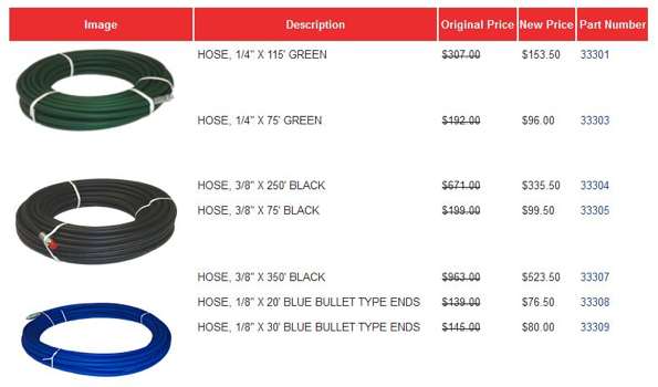
Desktop Table
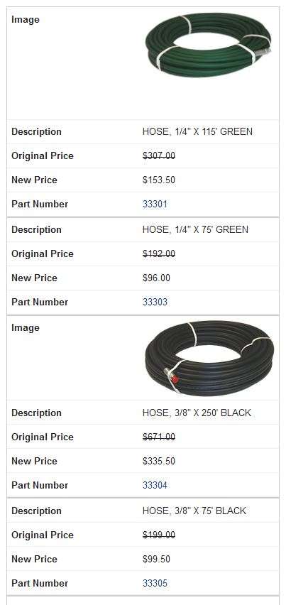
Responsive Table
Takeaway
It isn’t important you understand the inner workings of responsive tables; the takeaway should be that tables should only be used when you have content that is appropriate and never for layout purposes. If you (or your web developer) are using tables properly and implement the special markup described in the linked post, you can keep your optimized mobile experience intact.