In real life, you are a confident professional.
You have a firm handshake, a friendly smile and all the answers to impress your future customers, to dispel their doubts and to win their trust.
But on the internet, you are your content. Those static paragraphs, pictures and buttons speak for you now.
On your website, you need to connect with people you can’t see and answer questions you can’t hear, fighting for their attention one line at a time.
How do you impress without being there in person? How do you keep your visitors engaged? And how do you make them trust you enough to buy?
Here are 11 proven tips that will help you create web content that gains trust and converts visitors.
Make sure your pages load fast
I’m sure you’ve heard this often enough: Your website should load fast enough for your visitors.
How fast is fast enough?
For e-commerce websites, Google recommends a threshold of 2 seconds. In any case, monitor your page load time and bounce rate to see if any of your pages load too slow.
The easiest wins you can achieve are:
- optimizing your images
- using a cache plug-in
- enabling gzip compression
Other steps that will take a bit more effort but will spare you several seconds of page load time include, among others:
- combining all CSS files in one
- combining all Javascript files in one
- minimizing the number of HTTP requests
- using an CDN
Deliver important and relevant information right away
- Make sure the page content is relevant and keeps the promise of its headline. Nothing betrays the trust of your visitors faster than a click-bate headline and irrelevant content.
- Make sure your homepage clearly states what you do and how it benefits your visitors (more on this in a second).
- Make answers to frequently asked questions (for example, contact information, opening hours, shipping costs, etc.) easily accessible.
- Make as many of your CTAs as possible work out of context. If your CTA says “Info” or “More”, you are creating an unnecessary friction and forcing your visitors to read more text to understand what that button does.
![]()
Make your message crystal clear
“Just do it.” “Think different.” “Taste the feeling.”
The slogans of world famous companies are often praised as examples of copy to look up to.
Wouldn’t it be great if your business had a catchy tagline?
Not really.
Your website visitors won’t act on things they don’t understand. So, it’s important that your copy is clear on every page, but especially on your homepage.
The first questions most of the people visiting your homepage ask themselves are:
- Who are you?
- What do you offer?
- How will it benefit them?
Fail to deliver the answers instantly, and you lose them.
![]()
How to spot (and fix) unclear copy:
- Look at your website tagline. Would you use the exact same words to describe what you do to a friend in a conversation? If not, you may need to change it.
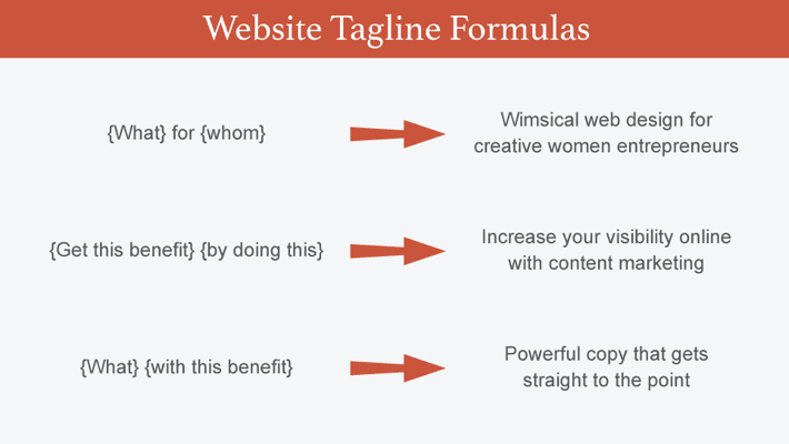
Follow these simple steps to create a clear website tagline:
1). Define your target audience.
2). Decide what the biggest benefit of your product or services is.
3). Use one of these formulas to create a clear website tagline:
- For every sentence you suspect is unclear, write it using as many words as you need. Then, highlight all meaningful words and work around them removing weak words. (I picked up this tip from Henneke Duistermaat)
Here’s a great tip to spot unclear copy if you are multilingual:
Autotranslate your page into another language you speak. Your brain won’t be able to trick you by automatically filling in the blanks, so you’ll easily spot the missing information. Besides, as Google doesn’t do well with metaphors, you’ll know if you are being too clever if the translation won’t make any sense.
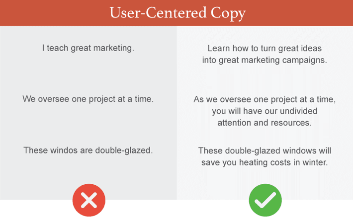
Make sure your copy isn’t “me”-focused
If you are:
- using “I” in your copy more often than you use “you,”
- describing the features of your product or service without mentioning the benefits,
- or rambling about your journey and life philosophy on your About page,
…your copy is “me”-focused.
But as most of your visitors care only about what you can do for them, you need to center your copy around their needs.
How to better address your customers’ needs in your copy:
- Make sure your tagline and subtagline focus on how you can solve their problems.
- Describe the features of your product using benefits.
- Look at your About page as a landing page with a clear action you’d like your visitors to take – contact you, check out your services, etc. Don’t over blow the part where you tell them about yourself.
Regardless of the page, focus on building trust and describe the ways you can help your potential customers solve their problems.
Make your content easy to process
Your website visitors will skim your page. Once they find something they are interested in, they’ll start reading.
To help them find what they are looking for faster and to keep their attention when they dive into it, you need to make your page easy to scan and text, easy to process.
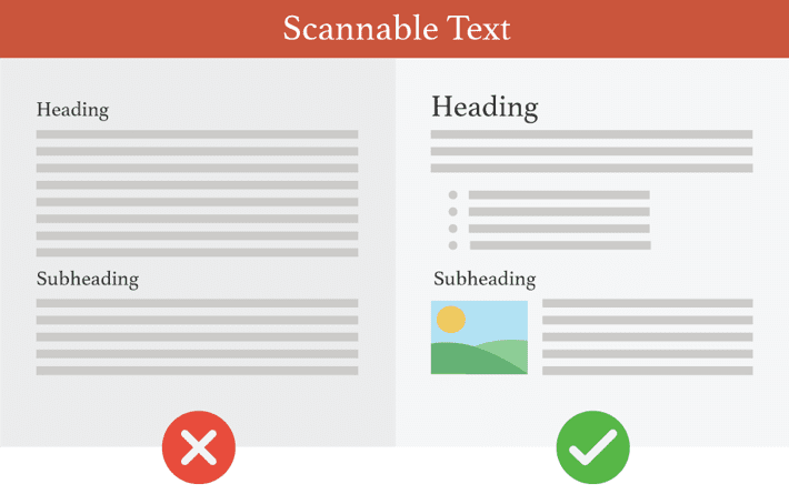
How to improve readability of your content:
- Use a minimum of 16px as body font size, with possible minor adjustments based on your font’s properties. If your target audience is older, consider using a larger font size.
- Don’t make your paragraphs longer than 4 lines, but don’t overdo it with one-sentence paragraphs either. If you have 5 one-sentence paragraphs in a row, the layout becomes monotonous.
- Use headings and subheadings to make your page easy to scan while paying attention to their visual hierarchy. If both section and subsection headings have the same style, your visitors will need to spend extra effort to understand the structure of the text.
- Use bullet points, italic or bold highlights or block quotes to break the visual monotony and preserve the attention of your readers. Don’t overdo it, though. Too much of “the other thing” is again boring.
It doesn’t mean that your website visitors will never have time to read anything on your website. They will make time for your content, but only if you manage to convince them fast enough that your content is worth their time.
Make your navigation concise
Navigation has a premium location on your website. So, it’s tempting to put as many links as possible there.
Yet, the more options your navigation offers, the less is the probability that your visitors will click anywhere.
How to improve your navigation:
- Don’t use more than 7 items in your navigation (the maximum number of items we can hold in our short-term memory).
- Make sure the labels are short and descriptive. People won’t click if they aren’t sure what to expect.
- Make the most important links as the first and the last links in your navigation menu, as those will be the ones your visitors will remember more easily. You can also highlight one label that would be your preferred choice for your visitors to click putting it last.
- Avoid drop-down menus. Studies show that website visitors find them irritating and are likely to skip the top-level pages.
Show your face on your homepage
If you or your company works with clients face-to-face, showing your face on your website is a must.
Seeing a likable and trustworthy picture or video of you gives your visitors a better idea of who you are as a person and whether they can trust you.
But don’t rely on your prospects to visit your About page to “meet” you. They might not make it there. Start building a relationship with them where they are most often – on your homepage.
Use photographs of real people from your team wherever possible, as your visitors will react differently to stock photos.
Don’t put design before functionality
Although your visitors will initially judge your website based on its design, whether they will stick around and buy depends on how well your design supports your message and how easy it is to use.
Unfortunately, too often design gets in the way of bringing out the important information.
The most common example used on even simple websites are the elements that move by themselves.
Whether it’s a blog post, a testimonial or a client logo carousel, studies show that the elements that move uncontrollably frustrate your visitors and cost you valuable clicks.
What to add a hip design feature? Ask yourself why. If your only argument is “because it’s pretty”, it shouldn’t be on your website.
Don’t put your goals before the goals of your visitors.
Pop-ups, sliders and welcome mats. Users loathe them, yet, website owners proceed using them.
No wonder. Numerous case studies show that pop-ups help you grow your email list.
But here’s another piece of data:
If you are a small or medium business owner, on average, you need 1319 people to see your opt-in interstitial to get 1 email subscriber who clicks on a link in your newsletter.
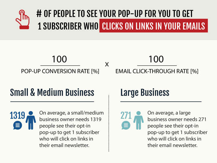
How many clients does your pop-up cost you?
Use this formula to determine how many of your prospects may be getting annoyed and abandoning your website before you get one engaged subscriber:
[100 / Popup Conversion Rate%] x [100 / Email Click-Through Rate%]
If you can live with this number, great.
But if it’s your traffic over several days, consider trying a non-intrusive way to grow your list:
- A sticky footer or header with a sign-up form.
- Lead magnets placed within the relevant content.
- A dedicated page for a lead magnet that ranks well in search.
Avoid visual clutter
The more text columns, images and CTA buttons are competing for your visitors’ attention, the less attention will each of them receive.
Also, if your page is visually cluttered, your visitors won’t be able to recognize what’s important and may not take that action you want them to take.
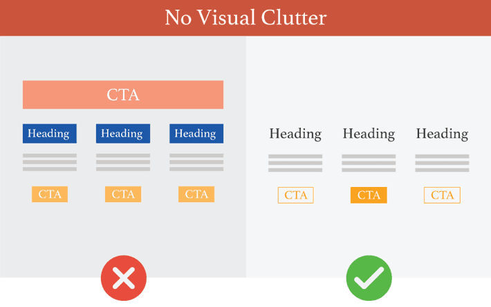
To beat visual clutter:
- Use enough white space.
- Make what’s important visually prominent.
- Maintain the visual hierarchy to communicate the relative importance of the elements.
Use only effective customer testimonials
Your prospects have no reason to take your word for it. That’s why it’s crucial to back up your claims with credible customer testimonials.
Yet, not all customer testimonials are created equal.
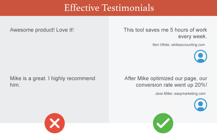
How to make customer testimonials more effective
- Include a head shot, a real name and a company name.
- Make sure the testimonial addresses a problem or a fear and shows how it was eliminated, or uses numbers to show improvement.
- Use testimonials in context every time you need to back up an important claim, for example, next to your call to action.
- Ideally, use video testimonials. They are the most powerful, because your prospects can also perceive the non-verbal information, in particular, positive emotions about your product.
- Check your Google Analytics and consider removing Testimonials page from your navigation. Testimonials without the context lose their power, and you may find a better use for that valuable spot in your navigation.
How to create web content that wins trust and converts visitors
Winning trust with web content may seem different from how you would do it in person. But it’s really all about the same things.
On the web, as well as in real life, trust is built upon:
…what you say (your copy),
…what you do (web design you expose your visitors to)
…and how it makes your visitors feel (user experience).
Sure, every website is unique, and somewhere in the online universe there is a horribly cluttered website with five pop-ups and three exclamation marks in a tagline that brings in good money.
Yet, these tips work more often than not. And as much as creating web content that resonates and inspires to take an action is about knowing your audience,
- making your copy clear and concise,
- staying relevant and delivering important information right away,
- making everything easy to process and use,
- and putting the goals of your visitors first
…will get you a long way towards winning their trust and, ultimately, converting potential clients into paying customers.