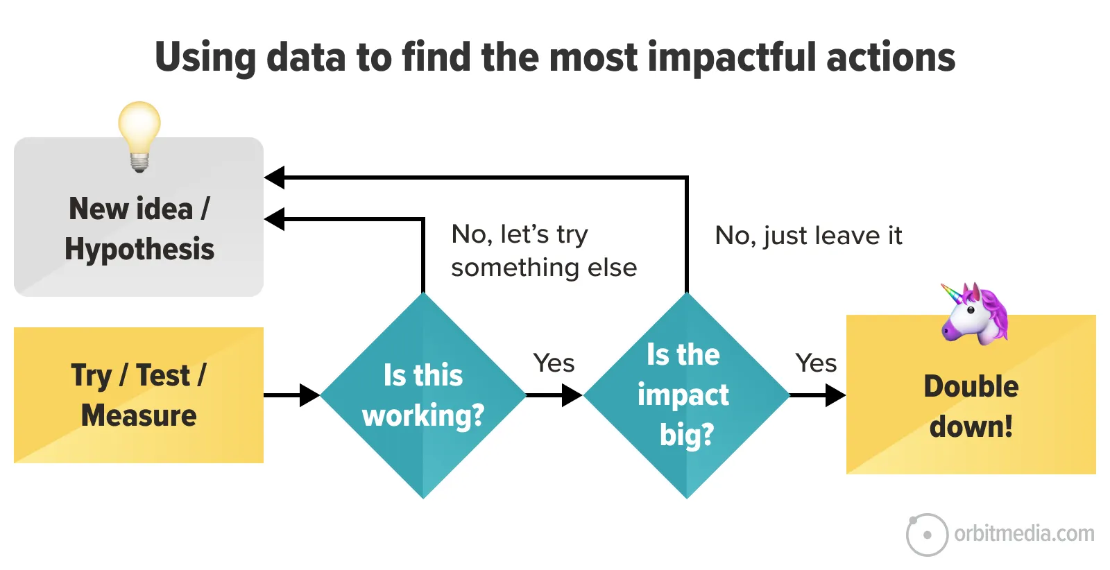
Lead generation is a chain. It starts with the traffic source and ends on the thank you page.
Each step in that process is a link in the chain, with its own success factors and metrics.
A weak link at the end of the chain can ruin everything. Any confusion or friction in the final steps makes all of the previous steps less effective.
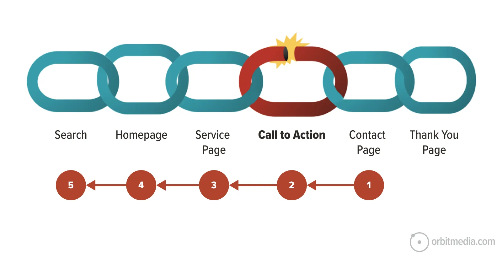 That’s why it’s smart to start at the end. Check for issues at the end of the process, then go backward through the steps, looking for issues and opportunities with each preceding link in the chain.
Your call to action is one of the last links in your lead generation chain. So it’s a great place to start. If you can improve the clickthrough rate on your call to action even a little bit, you may see better lead generation forever after.
Here is a little guide for conversion rate optimization (CRO) to improve the clickthrough rate (CTR) on a call to action (CTA). We’ll cover three things:
- The CTA Generator Prompt that suggests new calls to action for any page
- How to measure the clickthrough rate of your calls to action in GA4
- Five best practices for high performing CTAs
We’re starting with the prompt because it’s quick. Later we’ll cover the best practices that are built into this prompt and learn why it makes certain recommendations.
The AI prompt that suggests calls to action
As with everything in AI, better inputs mean better outputs. If you give the AI more details, you’ll likely get better recommendations. In this method, that means two things.
- Upload a detailed buyer persona (rather than just a job title)
- Upload a full-page screenshot (rather than just a link)
Either way, a quick check with a simple link or deep research with detailed uploads, give your inputs to the AI along with this prompt:
✨Here is the CTA Generator Prompt
You are a conversion copywriting expert skilled at creating high clickthrough rate Calls to Action (CTAs) for B2B lead generation websites. Based on the input provided, create CTAs for the page.
1. Primary Navigation Button (Top-Right): Write 5 short button text CTAs (2–4 words) that fit in the top navigation. Prioritize strong action verbs and clarity. It must feel low-friction and high-reward.
2. Primary Hero CTA Button (Page Block): Write 5 larger, primary button text CTAs for the main page block, such as the hero area. This can be slightly longer (up to 6–7 words). Beneath each button, include supporting subtext (kicker) that reassures or answers a likely objection or fear (e.g., fast response time, no obligation, transparent pricing).
3. Secondary CTA ideas for soft conversions: List 5 secondary CTA buttons or links for visitors who aren’t ready to contact sales. (Download a guide, View case studies, Try a demo) Focus these CTAs on reducing commitment but keeping engagement high.
Be direct, specific, and persuasive. Avoid passive or generic wording. Use clear, benefit-focused verbs (not vague words like “Submit” or “Learn More”) and favor verbs that suggest gain, ease, or security. Where useful, trigger cognitive biases like:
- Certainty (“See the full process”)
- Loss aversion (“Don’t miss the demo”)
- Social proof (“See how companies like yours solved this”)
- Time sensitivity (“Get started today”)
[Upload buyer persona or job title, and upload full-page screenshot or a link to the page]
Want more prompts for improving lead generation? There are four more in our AI for Conversion Optimization Guide.
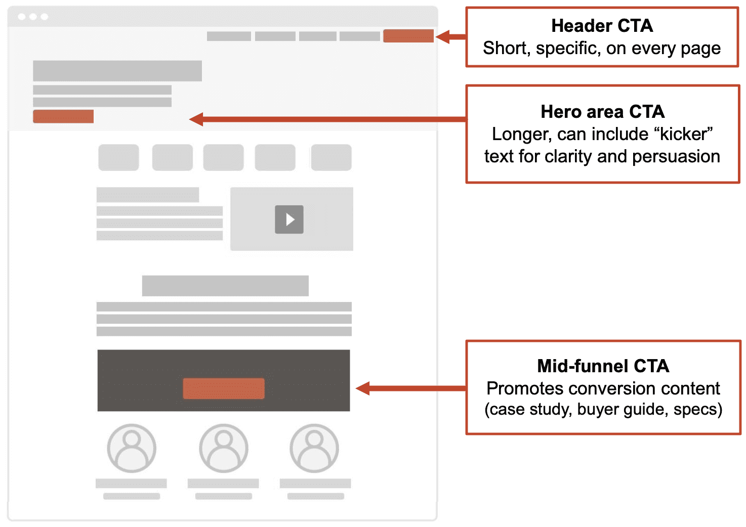
The prompt is built to give recommendations for three different calls to action:
- Header CTA, which is in the main navigation. It needs to be short.
- The hero area CTA, which is the first page block on the page. There’s room to make it longer and even to add a “kicker” which is a bit of text below it that may help trigger the click.
- Mid-funnel CTA, which is for visitors who aren’t yet ready to talk to sales. It’s usually farther down the page and guides visitors to a buyer guide or case study.
 As with all prompts, if you plan to make this part of a process, test and revise it carefully first. Try different inputs. Ask the AI how it could be better. Tweak it for your specific use cases and workflows.
Every CTA the AI suggests to us is based on best practices, found in its training data and in the prompt. But remember, best practices are just good hypotheses. The job of the digital strategist is to prioritize those hypotheses, usually based on their level of effort and likelihood of impact. Then they make the change and measure the lift.
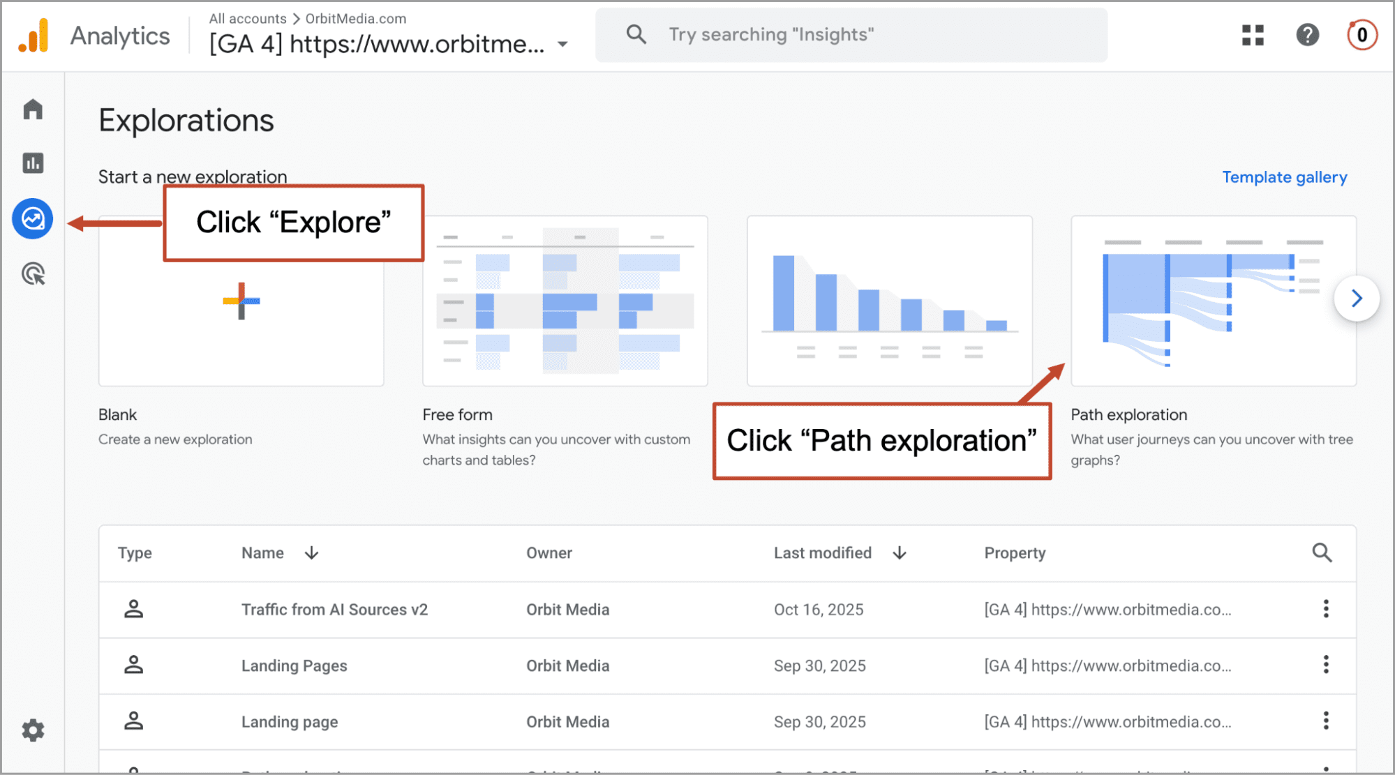
 How to measure the clickthrough rate of your calls to action in GA4
 How to measure the clickthrough rate of your calls to action in GA4
Marketers should really know the clickthrough rates of their calls to action. It’s a very important number. Your current CTA clickthrough rate is your benchmark. And it’s waiting for you in GA4. Here’s where to find it.
- In the “Explore” section of GA4, click on “Path exploration”
- Click “Start over” in the top right (I think it’s weird that you have to do this)
- Click in the STARTING POINT box and select “Page path and screen class” (or drag it in from the Settings column)
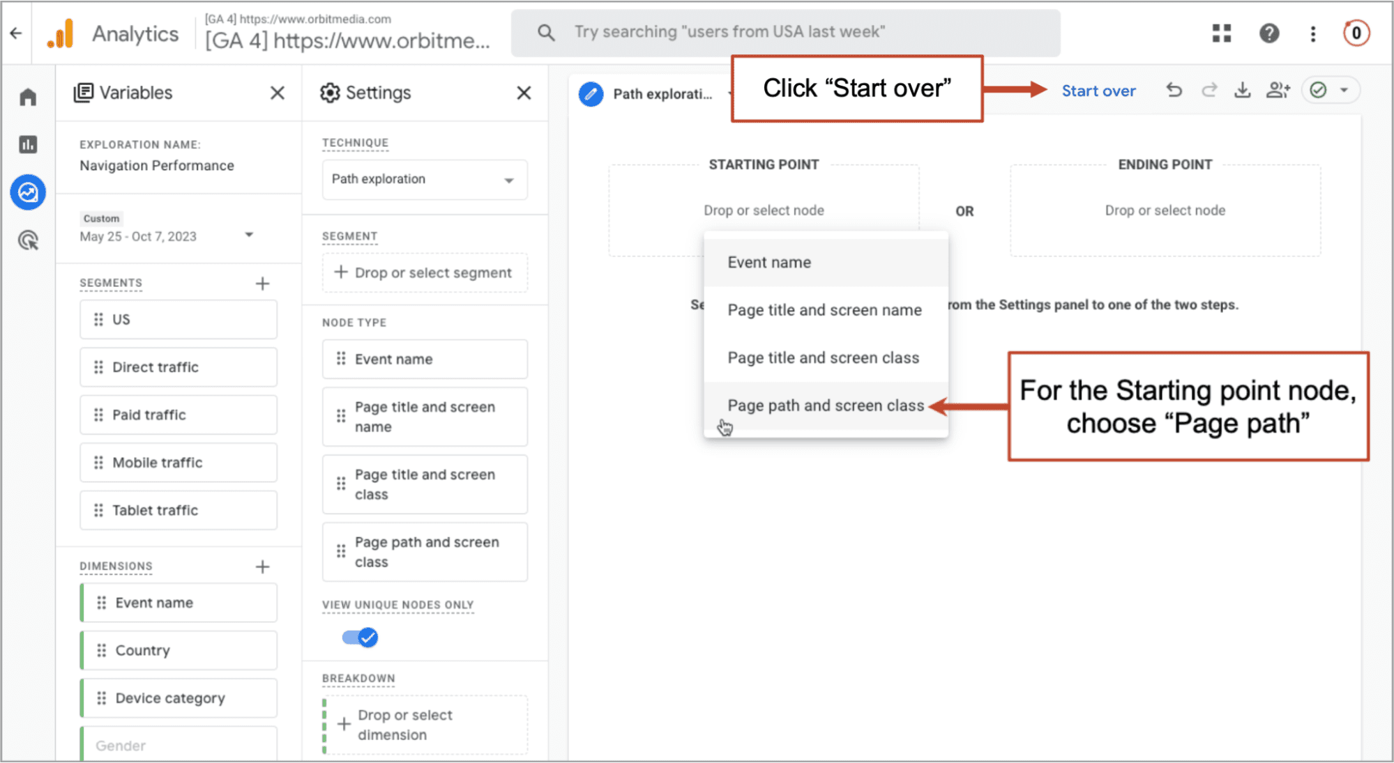
- Choose the homepage (or any page with a CTA) from the “Select starting point” menu that slides in from the right.
The report will show you the number of people who went from the starting point page to the next link in the chain, the contact form. Divide the second number by the first, and you have the clickthrough rate of the call to action.
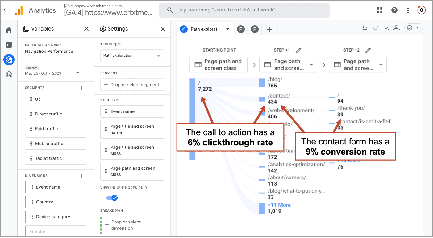 In just a few clicks, you found your clickthrough rates. How does it look? Did you find a weak link? Any changes to your CTA should be designed to impact this number.
In just a few more clicks, you can find lots of other interesting insights and benchmarks.
- Click on the contact page and you can see the percentage of visitors who made it all the way to the final link in the chain, the thank you page.
- Add the “Mobile traffic” segment to see your clickthrough rates from mobile devices.
- Remove irrelevant clicks (i.e. current customers clicking “Sign in”) by right clicking to “Exclude node.”
- Set your contact page as the STARTING POINT to see your conversion rate more accurately
- Set your contact page as the ENDING POINT to see which pages send visitors to the form
Notice that there is no such thing as an “overall clickthrough rate” for a call to action. It’s 100% specific to the page it’s on. The same button may have high clickthrough rates on one page and low clickthrough rates on another.
⚠️Caution: if there are several CTAs on the page that go to the contact form (for example, one in the header nav and another in the hero area), this report doesn’t show which they clicked. It just shows visitors flowing from page to page. A click heatmap is a very beautiful way to see which CTA they clicked.
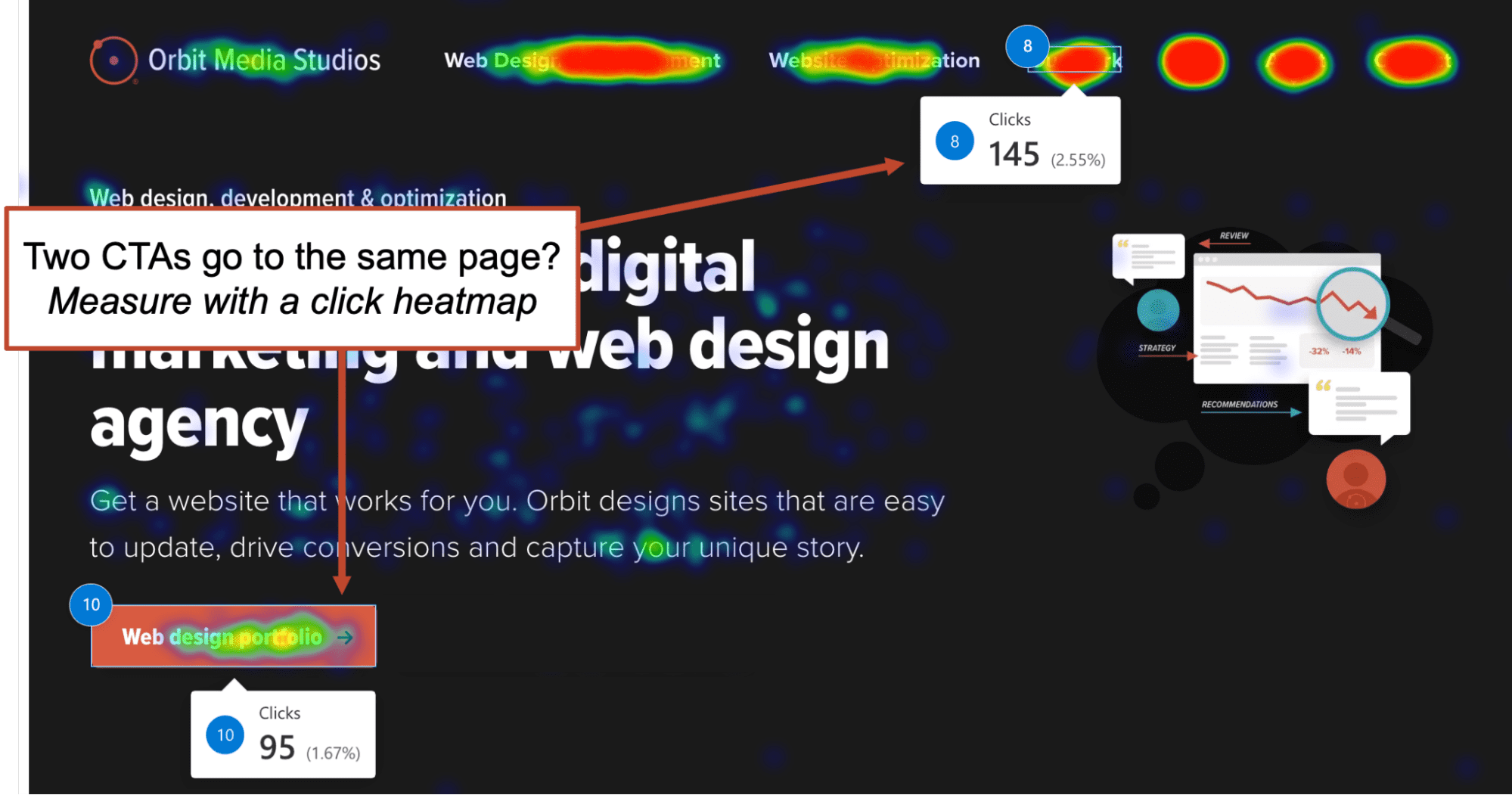 Even without heatmaps, any clicks that move the visitor forward, from one URL to another, is easily tracked in GA4 without any fancy setup required. This kind of user flow analysis is a smart approach to conversion optimization.
5 ways to improve clickthrough rates on your calls to action
Now that we know our baseline, we can start to form hypotheses and improvement ideas. Here are some best practices to jumpstart those ideas. Most of these are built into the prompt above.
- Write a CTA that specifically indicates value
- Write a CTA that reduces the perceived commitment
- Align the CTA with the intent of the visitor
- Leverage cognitive biases to trigger action
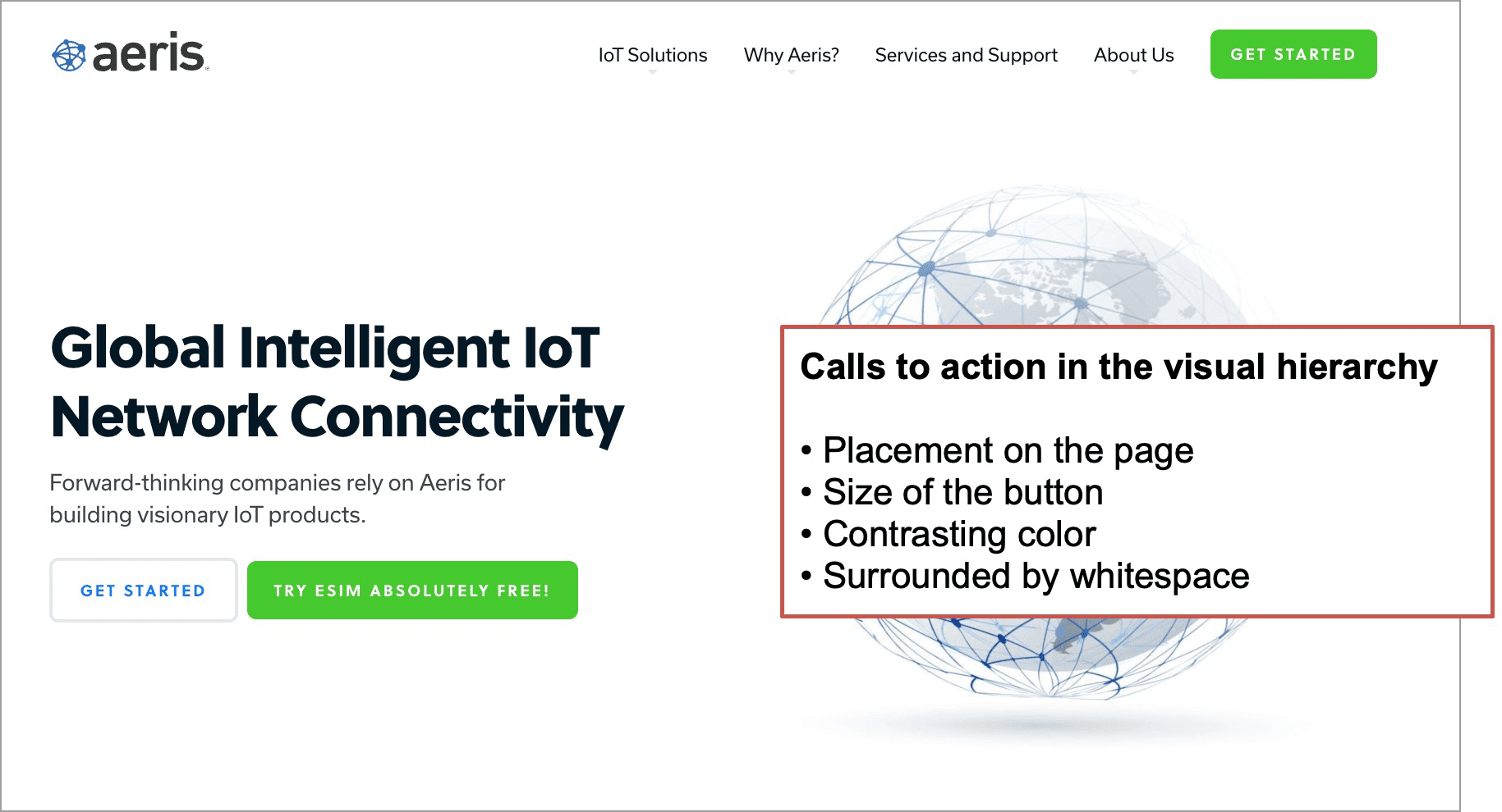
- Make the CTA easy to see
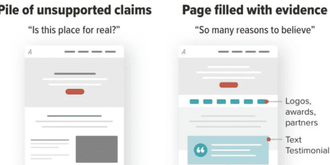
We can show the first two ideas in a single image:
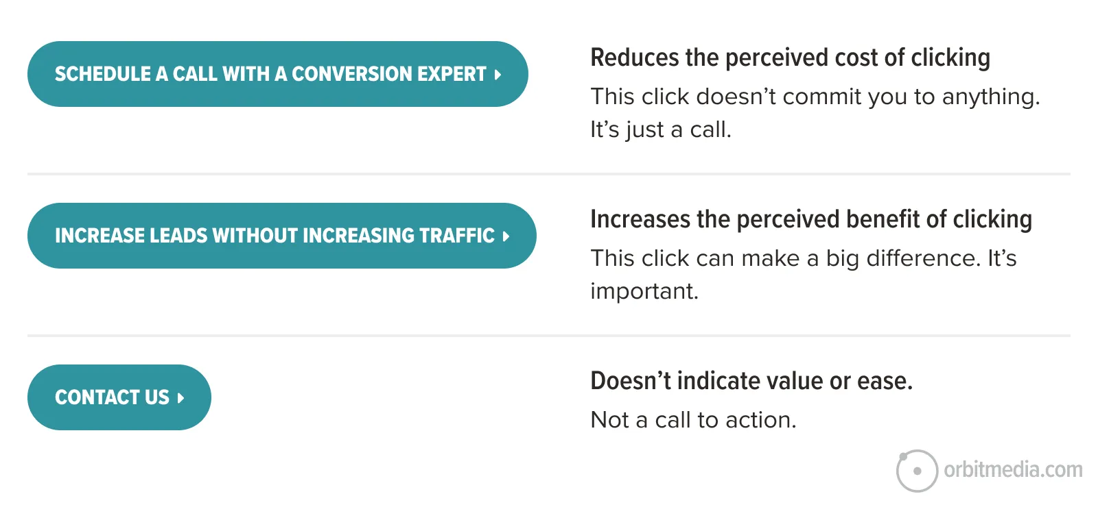
Here’s the idea: your website visitor (and really all internet users everywhere) click only after they’ve done a split-second cost/benefit calculation. If they believe that the benefit of clicking exceeds the risk of wasting their time, they click.
So when you make a button for a website, you can improve CTRs by making the benefit seem bigger or the cost seem smaller.
Now we’ll look closer at each of those five best practices for calls to action. Each can help align your button with visitor psychology and triggering “the money click.”
1. CTA indicates clear, specific value
There are millions of “Contact Us” buttons on the web, and I’m sure that many of them work well. But there are more compelling words than “contact,” “learn” and “read.”
Look at your verbs.
Ask yourself if they could be more specific. Every click is actually symbolic of another action. With this in mind, look at any button on your website and ask what the click really indicates. Is the verb accurate? Is it specific? What do they actually get by clicking?
The text on the button sets the visitor’s expectations about what they’re really doing. Use concrete, benefit-driven language (“Check availability,” “See Pricing”). More than the visual elements of the CTA (color, shape, size, placement) the text is the key factor for the visitor. Compare these examples:
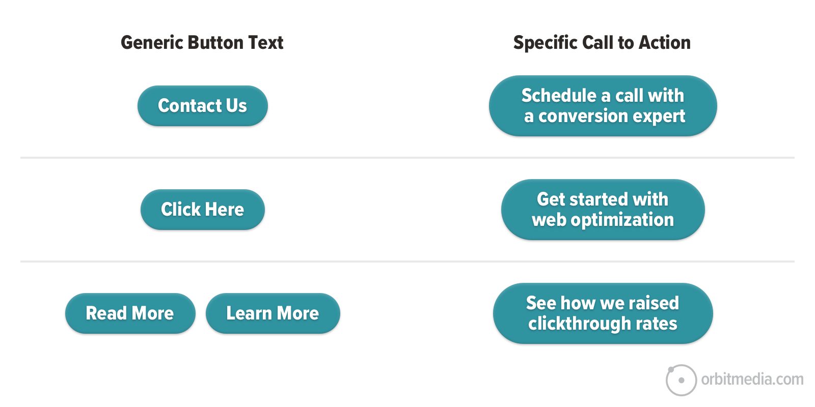
Yes, specific CTAs are longer. Web designers may cringe at the idea of an 8-word button, especially when it starts wrapping on mobile devices. But it’s worth testing.
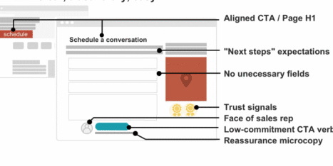
Look at the difference in a hero area or CTA page block. This example comes from our guide on website specificity.
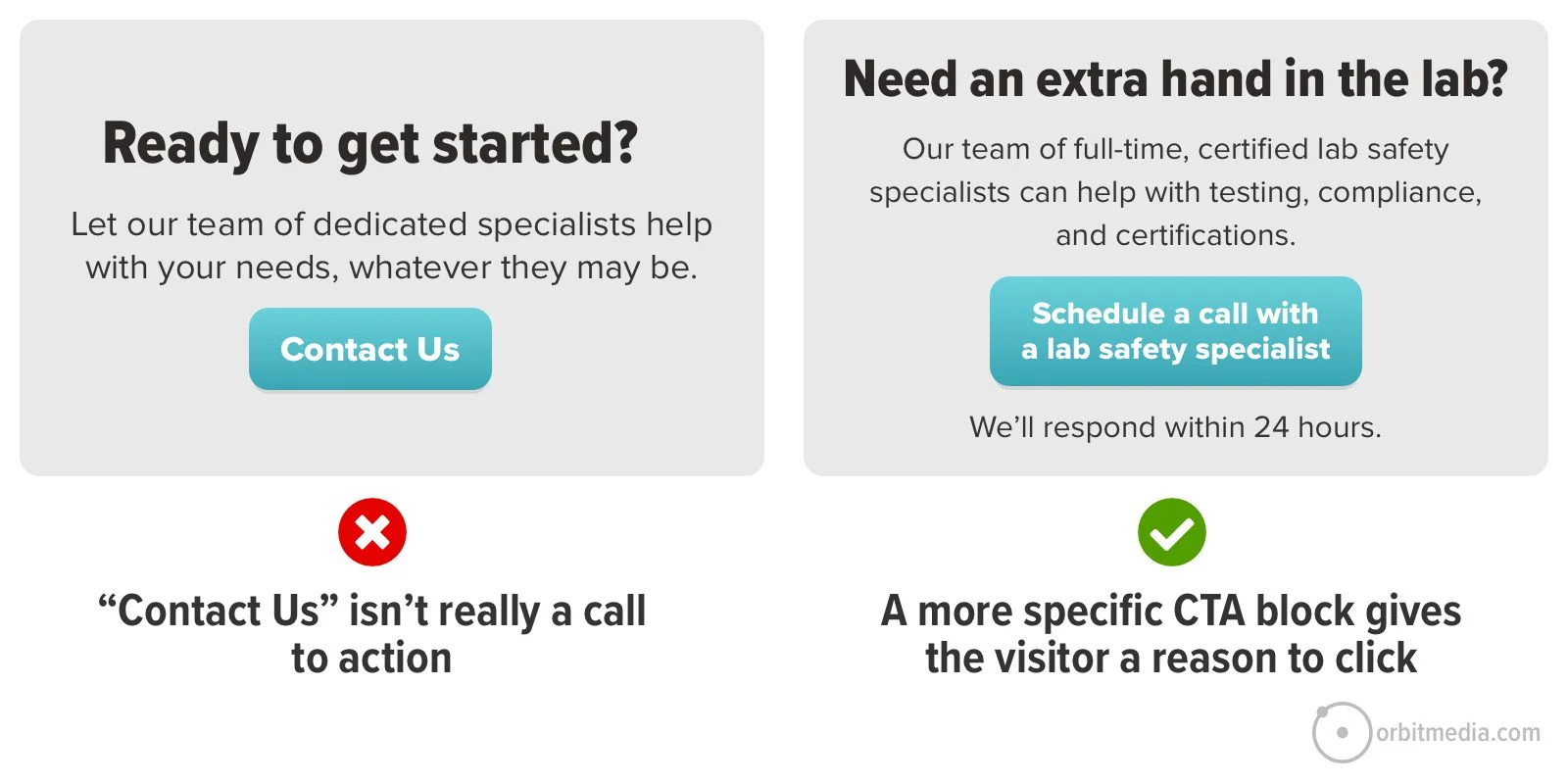
Notice the “kicker” in the example above. When these micro-reassurances appear nearby, the extra message may nudge the visitor into action. Use them to set expectations (“We’ll be in touch within 24 hours”) or defeat a common objection (“Takes 2 minutes”).
The more valuable the button sounds, the more likely they are to click. Highlight how taking action actually gives them value. Each of these examples is specific to an industry, a service and the impact of the action the visitor can take.
- Discuss your project with an web design expert
- Got a question? Connect with a UX professional
- Submit your website for a complete audit
You can make the CTA block more visually prominent by adding a face. Humans are hard-wired to look at faces. Show the person that the visitor is likely connecting with, and then it answers an unasked question: who will I talk to if I get in touch?
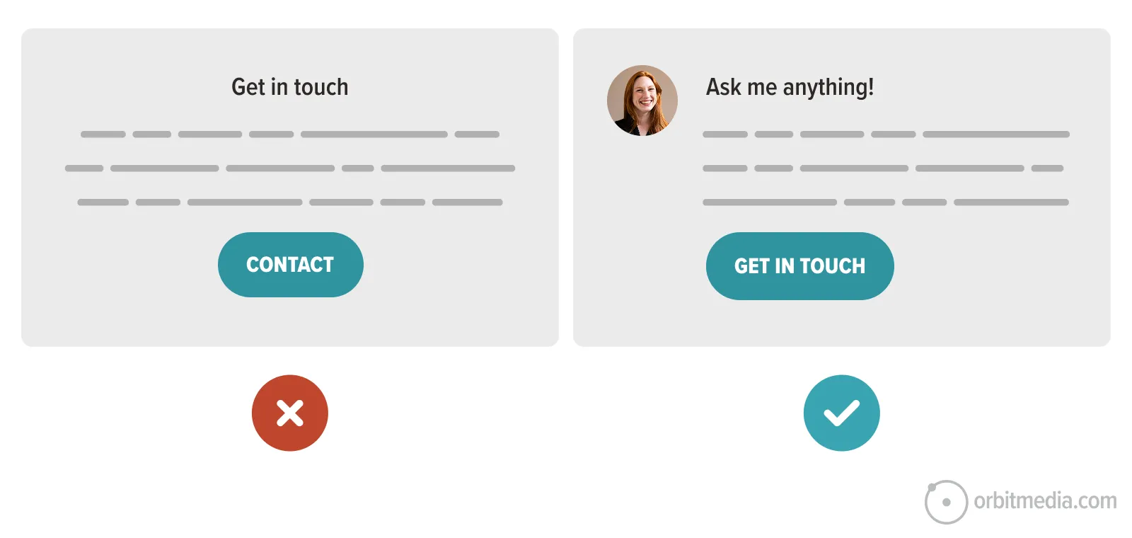
2. CTA reduces the perceived commitment
If tapping that button feels like a big step, the visitor will hesitate. But you can lower their perceived risk by letting them know that they aren’t making a big commitment.
Calls to action like “Preview the demo” or “Schedule a conversation” can make the click feel easier. It’s not a big step. It’s maybe a half step. They’re not committing yet. They’re just starting a conversation. The click requires less trust and motivation, which can increase clickthrough rates.
- Book a call with an associate
- Chat with a web design professional
- Schedule a quick call with a consultant today
For a content (signup or download) call to action, remind them that there’s no waiting or effort required.
- Download now
- Get instant access to the guide
- Send the weekly tips to my inbox
 |
Justine Jordan, Postmark“We’ve tested several variations of the ‘low commitment performs better’ hypothesis—on blog posts, in emails, and directly on our pricing and sign-up page. We’ve found that low commitment almost always increases clicks, but isn’t always better for the bottom line—so choose your success metrics wisely. While a specific button treatment may result in more clicks, a better measure of success for other experiments may be visits, sign ups, conversions or revenue.” |
3. The CTA aligns with the visitor’s intent
Often, the only thing we know for sure about the visitor is that they clicked on something that brought them to the page and the traffic source or previous page is our best clue.
If the click indicates that they were expecting content, we shouldn’t expect them to convert into a lead. If the click indicates their interest in a specific service, then we shouldn’t suggest that they should subscribe.
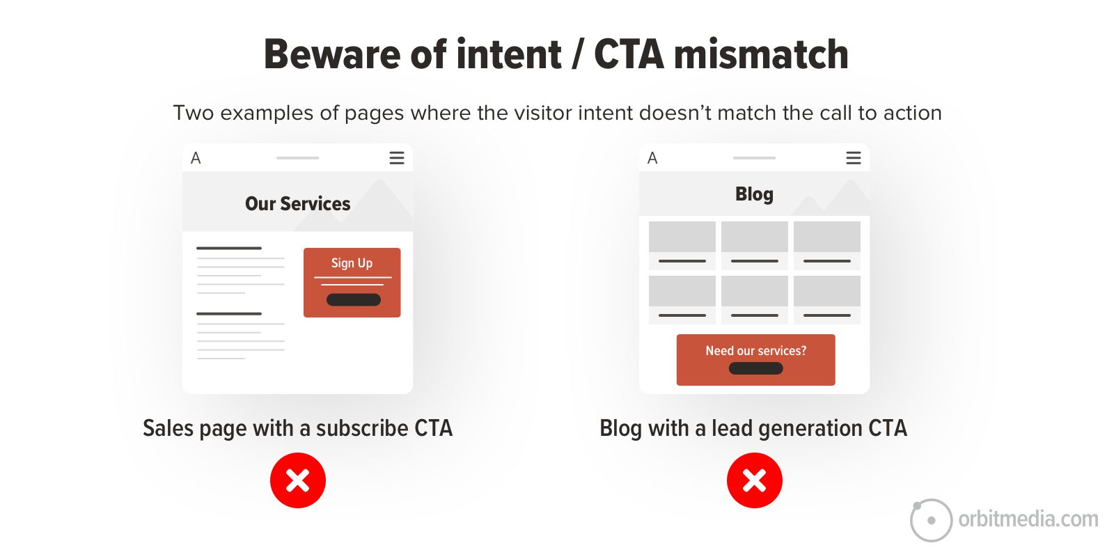
The biggest factor in clickthrough rates is the motivation of the visitor, not button design. If the visitor doesn’t want or need what the page offers them, nothing is going to get them to click. It’s that simple. There’s really nothing you can do to fundamentally change the motivations of your visitor, except try to attract more qualified visitors.
Are you attracting the right visitors? Look at the traffic source for any page. That could be a navigation label, a keyword, a PPC ad or a social ad. Does what they clicked on align with the page header? And the CTA? Of course, the homepage has the most diverse traffic sources and types of visitors, so CTA clickthrough rates may be low.
There’s a true story in the life of every visitor to every webpage. Think about this visitor. Now look at the page and make sure there isn’t a mismatch between their needs and your CTA.
The call to action gives the visitor the opportunity to simply continue the conversation that’s already happening on that page.
4. CTA triggers cognitive biases
We all have built in biases. No one wants to miss an opportunity (loss aversion). We all tend to do what others do (conformity bias). A conversion optimizer may look for little opportunities to trigger the biases that may trigger action.
Loss aversion: Urgency and scarcity
Never miss the chance to remind the visitor what they miss, risk or lose by not taking action. Let the visitor know if there’s a deadline (i.e. school applications) or a limited supply (i.e. space is limited). Any indication that something is scarce (i.e. check waitlist) will trigger loss aversion.
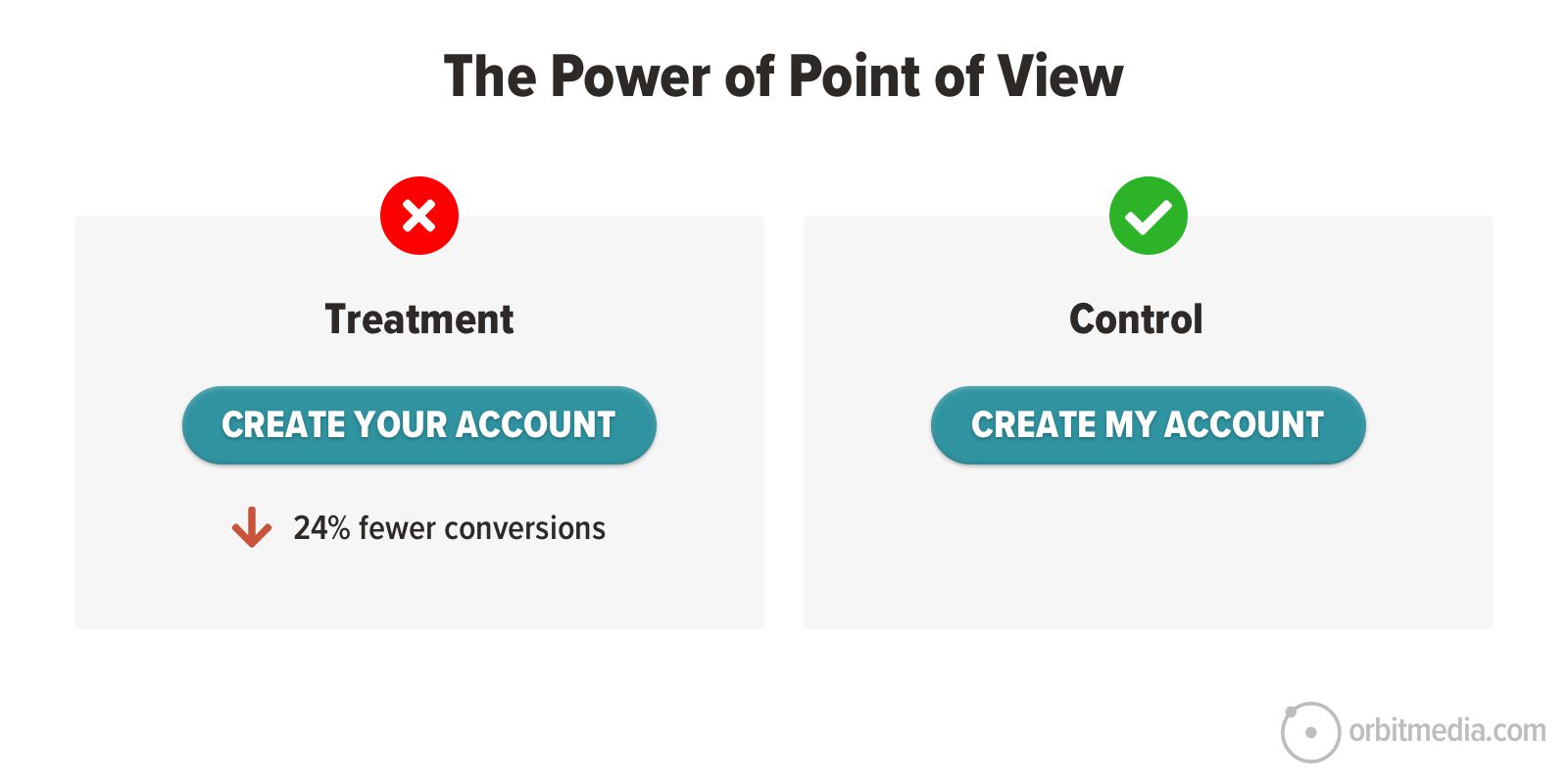
Self-referencing effect: First person pronouns
The voice of website copy is typically second person. The writers of the page are speaking to the visitor as the brand. “We have been designing website buttons for 20 years. We can help you design your buttons.”
But calls to action are the exception.
People are more likely to act when they see themselves in the message. Using “my” instead of “your” in CTAs helps the visitor imagine themselves taking the first step. Some studies have shown a significant lift from a simple pronoun change. Now it’s almost a best practice.
 |
Robert Collier, Copywriting Legend“You need to enter the conversation already taking place in the customer’s mind.” |
5. CTA is obvious and accessible on every device
If it’s hard to see or tap, it doesn’t matter how persuasive it is. CTAs are typically near the top of the visual hierarchy. They are visually prominent, either because of nearby whitespace, or color contrast, or placement on the page.
55% of websites have a contact button in the top right corner. It’s standard. It’s also standard to add a CTA block at the bottom of all service pages. More CTAs means more prominence.
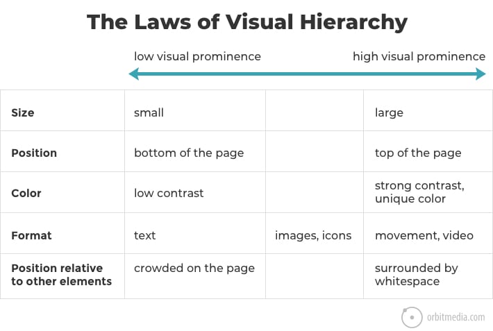
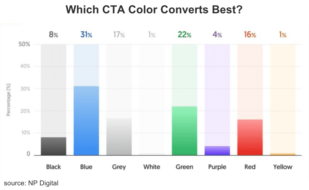
Contrasting colors attract our attention. This is because the human eye is attracted to pattern interruptions. This is called the von Restorff Effect, and it’s another cognitive bias. Contrasting buttons are well-aligned with accessibility standards.
The strongest contrasts are colors that are on opposite sides of the color wheel. These are called complementary colors. Warm colors (red, orange and yellow) contrast with cool colors (green, purple and blue).
In the context of cool colors, a drop of warm color jumps out. Some web designers even pick one color to be the “action color” using that color on all links and buttons and for nothing else.
But conversion pro Justin Rondeau warns us against focusing too much on color, because button color is not the most important factor.
 |
Justin Rondeau, Search Atlas“For a CTA to do its job it needs to describe the action & actually stands out. Yes, even in the year 2025 you’ll get people asking “What’s the highest converting button color” and, frankly, that’s the wrong question. The job of a CTA button is to look clickable and to catch the eye. That’s it. So ignore those button color conversion rate studies. Funnily enough, the lowest converting button color according to NP digital is Amazon Orange…if the coloration actually mattered…don’t you think Amazon would have made that change by now?!” |
Button size is also important for accessibility. And it’s good for all users, especially mobile users. Your thumb is about 57 pixels wide. If you struggle with a mobile site, it’s not that you have fat thumbs. Blame the tiny tap targets.
![]()
Buttons are small experiments in persuasion science
A low clickthrough rate CTA will hurt everything else you’re doing in marketing. That weak link makes all traffic driving efforts (and advertising costs) less efficient. The CTAs performance directly affects demand. The big players know this and it’s obvious that they optimize for maximum clickthrough rates.
But any marketer, especially one with access to AI and GA4, can quickly find ideas for harder working CTAs. A little lift can make a big difference in lead generation.