It’s the moment of truth.
They landed on your site. Looks good. They scanned the page. Looks legit. They got some answers. Looks like your business could be a fit. They clicked the call to action… now they’re on your Contact Us page.
Depending on how your contact page is written and designed, one of two things happen:
- If it’s clear, trustworthy and easy, they complete the form. A lead is born.
- If it’s generic, confusing or difficult, they hit the back button or bail completely.
This is “Money Click.” If they take action (fill out the form or use the scheduling tool) you’ve been qualified for the finals. Proceed directly to the sales funnel. The lead is waiting in your CRM.
And yet, for many websites, the contact page is an afterthought. The header says “Contact.” The form has a lot of generic fields. The button says “Submit.” It gets no love whatsoever.
Not only should this page be optimized for conversion, it should be the first thing that gets optimized. After all, if it’s so bad that the completion rates are low, you need a LOT more traffic to get a few more leads.
Why put cheese on a broken mousetrap?
Fix the mousetrap. Then make more cheese.
So let’s make a better contact page. It’s possible that this single exercise could drive a big impact with no other changes to your marketing.
The 7 Contact Page Best Practices
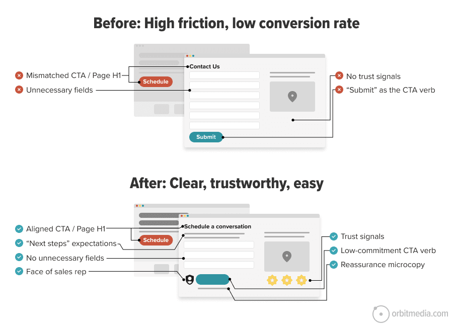
What do top-performing contact pages have in common? Quite a few things. Let’s put them all into a single diagram. Here you can see the contrast between two “Contact Us” pages. One vague and one specific. One difficult and one easy. One good and one bad. Compare:
Let’s break down these best practices above in more detail. Then we’ll share the AI audit prompt. Scroll past this if you’re in a hurry.
- Call to Action / page header alignment
The words in the call to action are the same words in the H1 header of the contact page. If they don’t match, then you’ve added a moment of dissonance. Use the text (especially the verb) from the call to action as the header on your contact page. - “Next steps” expectations are set
The text on the page tells the visitor when and how someone will be in touch. Commit to a turnaround time for new leads and publish it on this page. “We typically respond within one business day.” - Simple form with the minimum number of fields
Omit needless fields. If you don’t need that information to respond to the lead, remove it. You can get more data for your CRM later. Besides, anything they’d give you can be generated using AI data enhancement services. Less work for everyone. - Trust and credibility
It’s always a good time to remind the visitor that you’re legitimate by adding awards, certifications, logos, etc. …unless it pushes down the form. Remember, the verb they just clicked indicates they already have strong intent. Get everything out of their way. - Human face
Add the face and name of the sales rep, if possible. This builds trust, makes the experience more personal and answers a key question: who will contact me? - Low-commitment call to action
The final button doesn’t just say submit (which is the technical term used by programmers). Instead it makes the click sound easy. It reduces the perceived commitment. “Schedule your discovery call”.
It feels less salesy. Here is a prompt for generating high click-through rate calls to action. - “The Kicker” final microcopy
Under the button, there’s a bit more text. A final nudge. A bit of “microcopy” that gives final reassurance, either by adding clarity (discovery calls take 30 minutes) or trust (rated 4.9 stars by 300+ clients)
 |
Justin Rondeau – Search Atlas“Optional fields aren’t really optional at all. The second you put them on the form, people hesitate. They wonder if they should fill it out, if they’ll miss something by skipping it… and boom, momentum dies. And honestly, optional fields usually show up because someone “might want the data later.” That’s lazy marketing. Forms are for conversions, not wish-list segmentation. If the field doesn’t create value right now, it shouldn’t be there.” |
The audit prompt for contact page best practices
Now that the elements are clear, we can carefully construct (then diligently test) an audit prompt that checks for all these elements. This is a great approach to AI for marketers: turn your knowledge into best practices, and turn those best practices into audit prompts. Codify your best thinking and standardize quality.
We’ve done just this for you, dear reader. Today we’re sharing our AI audit prompt for checking your own contact pages.
Like many of our best audit prompts, this one requires a screenshot of the contact page. You’ll also need to tell the AI the text call to action that brings people to the page. Drop those into your favorite LLM with the following prompt:
B2B Contact Us Page Audit Prompt
You are a senior B2B brand strategist and conversion-focused UX copy editor. Audit and improve a B2B Contact page for clarity, trust, low friction, and form completion. I’m giving you a screenshot of a contact page and the text of the button/link that brought the user here: [insert button / link text]
Create the following deliverables:
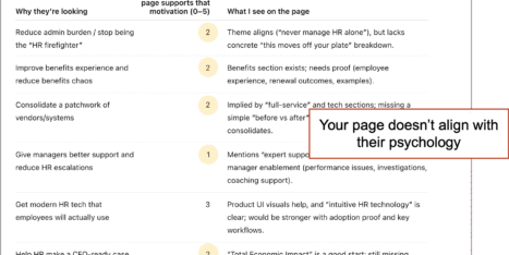
1. Quick diagnosis: What conversion the page is driving, what’s working, and the biggest gaps (friction, proof, reassurance, CTA, next steps).
2. Message-match + page audit (with table): Check whether the page matches the CTA promise and rate key elements (1–5) in a markdown table: headline match, above-the-fold clarity/value, form simplicity, field order, CTA clarity, reassurance near CTA, above-the-fold proof, human connection, mobile friction risks. Include evidence, gap/risk, and exact recommendation.
3. Final CTA + reassurance combinations: Generate the 5 best submit-button + reassurance-line pairings (not generic “Submit”). For each, include:
• CTA button text
• reassurance microcopy
• why it works
• best use case4. Short-form field recommendations
Recommend the shortest effective form for this page. List fields in order, mark required/optional, and justify each. Also list fields to remove/avoid. Default to minimal fields; only add fields that are clearly needed for follow-up or routing.5. Above-the-fold rewrite + top fixes
Rewrite the above-the-fold area (headline, supporting copy, proof/trust line, CTA, reassurance, what-happens-next microcopy), then give the highest-impact recommended edits.Rules: Use plain language. Prioritize above-the-fold clarity, proof, reassurance, and low-friction form design. Keep recommendations specific, practical, and credible.
[Upload full-page screenshot, pasted copy, or URL] + [CTA that brought visitor here]
This prompt tells the AI to provide an audit in five sections. But the table in section two is most of what you need. Here’s an example of the output:
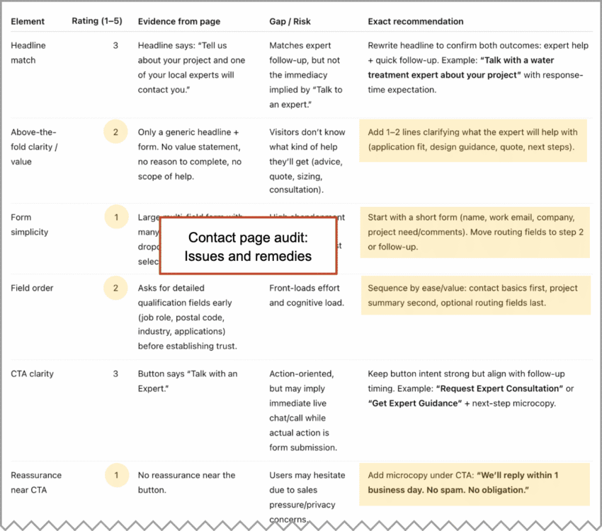
In this case, the top recommendations are to set expectations for responses, remove two of the form fields, change the button text and add a bit of reassurance microcopy: “We’ll reply within one business day. No spam. No obligation.”
As always, review the recommendations critically. Disregard anything irrelevant, inaccurate or impossible to implement.
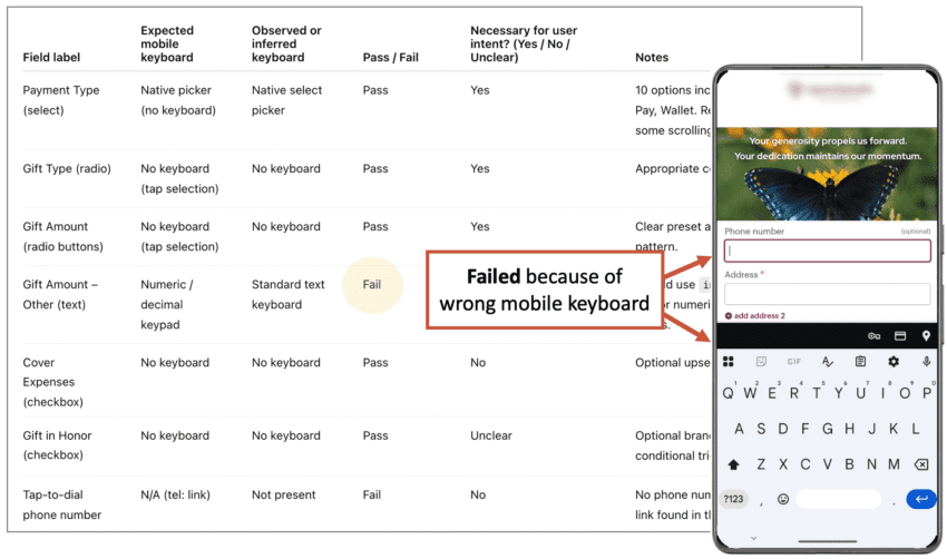
The prompt that audits your forms for mobile visitors
You’re on your phone, trying to complete a form, but the wrong keyboard keeps popping up. Frustrated, you decide to call. But the phone number isn’t clickable. This is too much. You give up and leave the site.
When’s the last time you took out your phone and filled out your contact form? Have you ever done it? Everyone should, at least once!
Here’s a quick mobile form AI audit. This is one you won’t use often. Check it once, fix the issues and then it’s done. Do it every time you make a new form.
Because this audit needs to see the code of the page, it has a different input. It requires that you upload the HTML of your contact us page. So go to the page, click “File > Save Page As” then drag that file into your AI of choice with this prompt:
Mobile Form Usability Audit Prompt
Audit this page’s HTML for mobile form usability. First, infer the page’s main purpose. Then review each form field and determine whether it is likely to trigger the correct mobile keyboard in iOS Safari and Android Chrome based only on the HTML attributes (type, inputmode, pattern, autocomplete, input vs textarea, and select).
Output a table with these columns:
| Field label | Expected mobile keyboard | Observed or inferred keyboard | Pass / Fail | Necessary for user intent? (Yes / No / Unclear) | Notes |
Use these rules:
• Email → email keyboard
• Phone → phone keypad (type=”tel” preferred)
• Numeric-only → numeric keypad
• Decimal → decimal keypad
• URL → URL keyboard
• Name/message/text → standard text keyboard
• Select → native picker, not keyboardMark Fail if the field uses the wrong keyboard, uses type=”number” for phone, or makes mobile entry harder than necessary. For select fields, also note mobile friction if they create unnecessary scrolling, too many options, or feel unnecessary for the page’s likely purpose. Also add one row for tap-to-dial and note whether visible phone numbers use tel: links.
Base the audit only on the supplied HTML. Do not assume fields that are not present. Be concise and practical.
[Upload HTML file here]
How did you do? Spot any issues? Does everything look ok? Or is it time to make a support ticket?
It’s worth two minutes of your day. Giving your mobile users the proper keyboard is just common courtesy, even if it doesn’t affect conversion rates. But maybe it does! Little things often make a big difference.
How to measure the impact of your contact page improvements
You had some good ideas. You made some changes. You’ve optimized your contact page for conversions. Two weeks have passed. Did it work?
As long as you have a thank you page with a URL (not a thank you message on the same page), GA4 shows the percentage of people who made it from the contact page to the thank you page. Because it’s just based on URLs, you don’t even need to set up “key events.” This data is already in your account!
In GA4, “path explorations” show the flow across all of your pages. But when the path is a series of steps toward completion, use a “funnel exploration.” You can make big funnel reports for long multi-step processes. But here it’s just two steps (contact → thank you) so the report looks very simple.
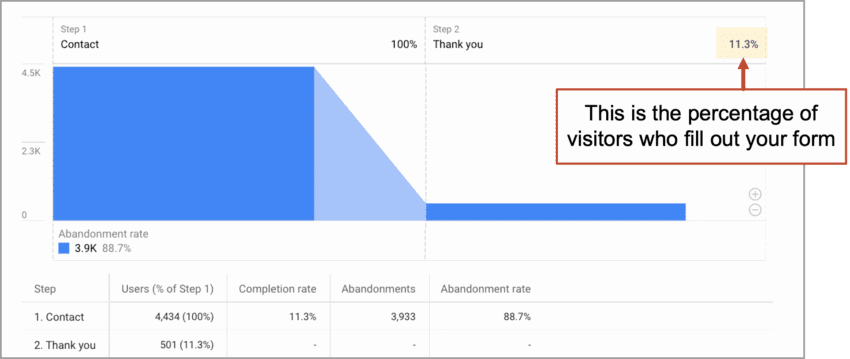
You can see the completion rate right there at the top.
Why is the form completion rate so low?
Not all contact page visitors intend to fill out the form. The page does several jobs. Often, it’s the best way to answer the “Where is this business?” question. Or maybe they were looking for a phone number or email address. This dual-role naturally reduces the conversion rate of form fills. That’s fine.
Forget AI and watch human visitors use your page
There’s plenty that this audit won’t reveal. Some things aren’t in your Analytics. They’re not in any report. They’re the actual experience of users, which you can’t fully understand until you watch them use your site. Here’s where session recording tools (Microsoft Clarity, Hotjar) are indispensable.
Once, while watching some session recordings for the Orbit website, I noticed an issue with the form validation. That’s when the site checks to see what’s in each field and gives the user a little message if something isn’t right. Ours was causing confusion and a few users had actually abandoned the form. Leads were lost.
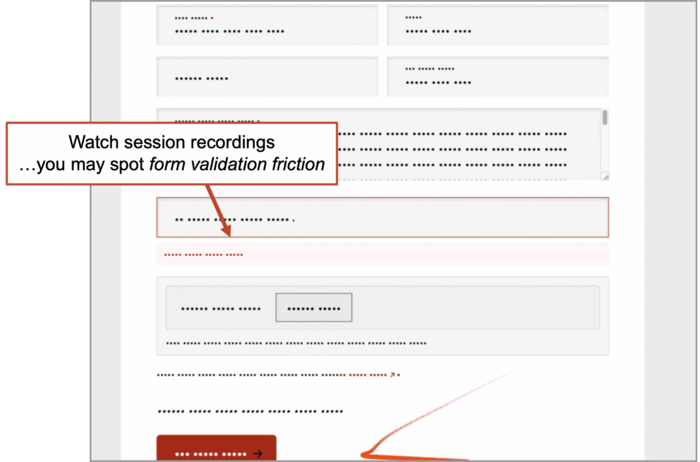
There is no substitute for this method. No tool or prompt can do this for you. Did they read that? Did they pause? Did they jump past something important? The insights are often excellent. Yet I know many marketers who have never seen a session recording.
These little videos are so compelling, the trick is to not get too triggered by the first recording you watch. Watch at least 10. If you’re focused on contact form optimization, just filter the tool to only show you visits to your contact page.
A lead is born! What happens next?
The form submission is the end of the marketing funnel and the beginning of the sales funnel. That little handoff is a critical moment. At least five things should happen when that final button gets clicked:
- The lead is added to your CRM, scored and routed
- The rep gets a notification (email, text alert, etc.)
- The lead gets an email notification (“Here’s what happens next and when…”)
- The lead lands on a thank you page (“Check out these success stories”)
- Analytics records a key event
Miss one of these and you’re missing an opportunity. It’s about clear communication, follow-up, tracking and measurement. All the key traits of a successful lead generation program.
There may be a visitor on your contact page right now
As you read this sentence, someone may be on your contact page, thinking about reaching out. Imagine their mouse cursor may be hovering over that final call to action. Will they…? This is why we should all feel some urgency to polish this page. Improve the performance and you’ll improve all of your results from digital marketing forever after.
Go check for yourself. Go to the GA4 “Realtime pages” report. Anyone on that page? If so, keep watching and you may see a thank you page visit.
If you’re lucky, you can literally witness the birth of a lead.
I’ve actually seen this with my own eyes.