We spend so much time creating content.
But we spend so little time on email list growth.
The success of any email program depends on the quality and size of our email list. And list growth depends on the success rate of our email signup call to action. But have you looked at your email signups CTAs lately? Could those work harder? Could your list grow faster?
The sad fact is that most email signup CTAs are terrible. The good news is that they are easy to fix. That’s because there are really just a few factors in the success of that little email signup box. And they all start with the letter P.
These are the Three P’s for email signup forms:
- Prominence: how visually obvious the email signup box is
- Promise: how specific is the offer (what topics, what formats, how often)
- Proof: some indication that others find it valuable (list size or testimonial)
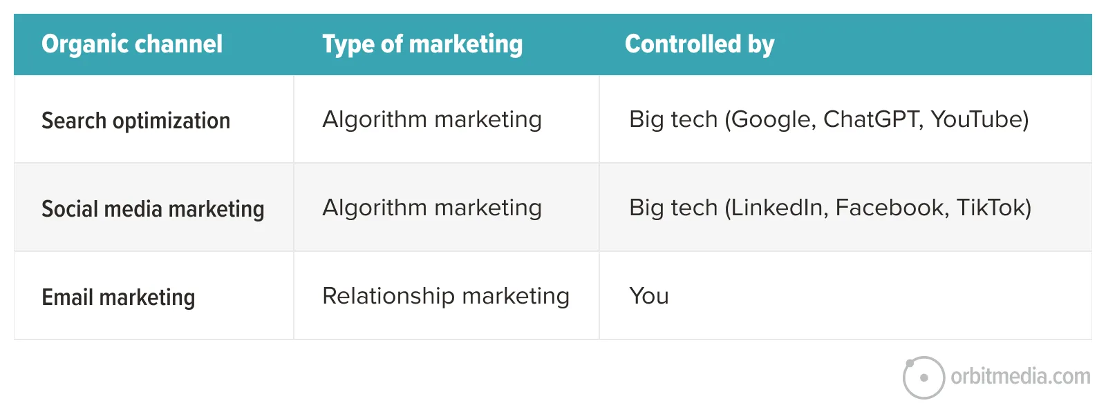
This little guide may have a transformational impact on your email list growth, which is critical if you want control access to your audience. Email, unlike search and social, is owned by you. You control it. Big tech isn’t between you and your audience. You connect with them directly. There is no intermediary. Email marketing is disintermediation.
Here is a breakdown of each of the three P’s. In the next few minutes, you’ll learn exactly how to get more email subscribers for your blog by improving your email subscriber form.
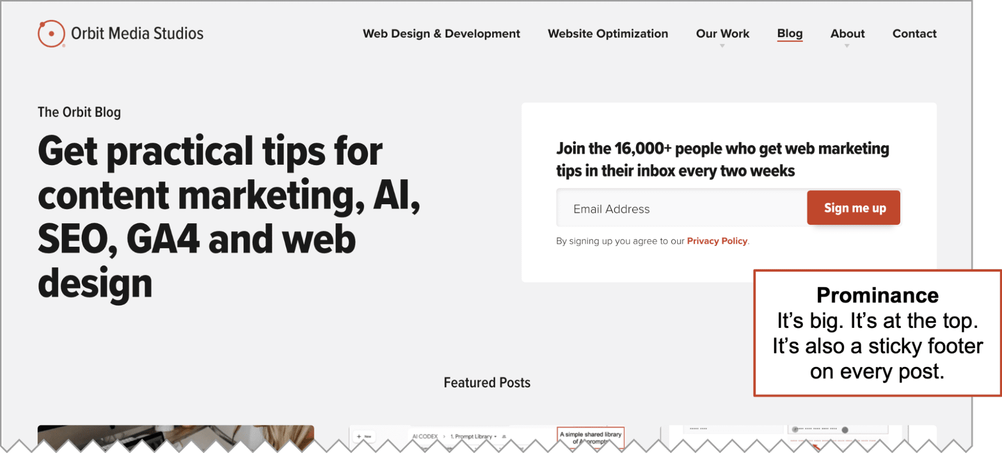
1. Prominence
Every webpage on the internet has a visual hierarchy. Deliberately and strategically constructing that hierarchy is called web design. Web designers guide the eyes through a series of elements and messages, each with its own visual prominence.
Start by making sure the signup form is visually prominent on the page. You can’t miss it. That probably means it’s big, but it’s more than that. Here are a few ways to make your email signup box more visible.
- Color contrast
The color contrasts with the colors around it, especially the subscribe button. You can increase contrast by making the colors brighter (sometimes visually noisy) or by adding white space around the signup form (often feels cleaner). See a few examples below. - “Sticky” elements
It’s a “sticky” element, so it’s always visible no matter how far down the visitor scrolls. Notice the sticky footer on this page. - Many locations
The signup form is all over the place, starting with the top of the blog main page. You can also add it to the bottom of every post. Or try an in-line CTA partway down each article. Or on the about page, in the footer, even on thank you pages. We get a lot of subscribers from the signup box on our contact form thank you page. This is one of many amazing things your thank you pages can do. - The Popup
You see email signup popup windows (aka lightbox, aka modal window) everywhere. Of course, 0% of visitors like them. But 100% of marketers report that they are effective for email list growth. At Orbit Media, we’ve never used them because we prioritize user experience and we can meet our goals without them. But it’s your call.
The signup form at the top of this blog is a good example. On desktop, it’s about 400 pixels tall and that’s a 56-point bolded font. Can’t miss it!
Now that everyone can see your email signup form, let’s take a look at what’s inside…
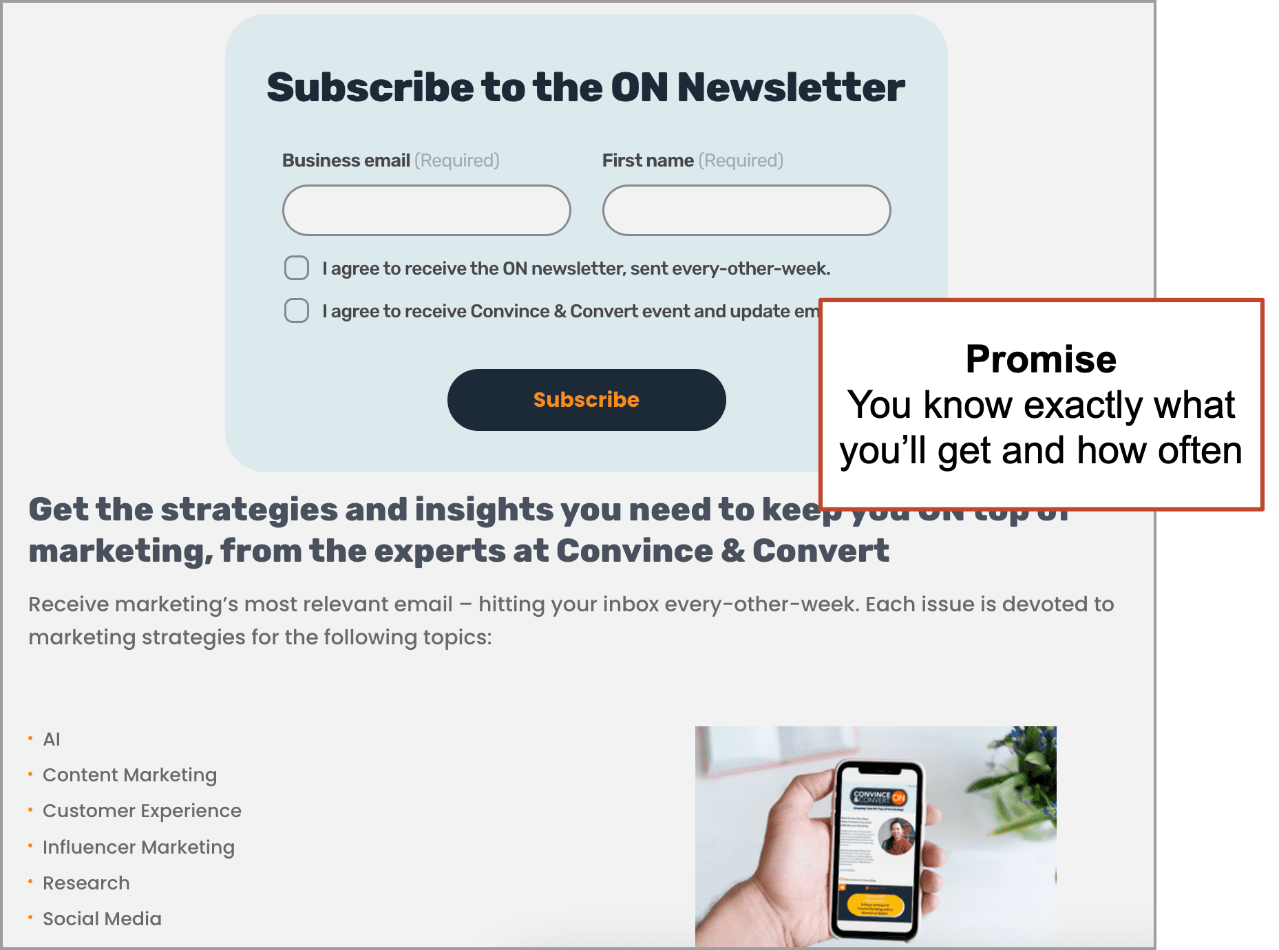
2. Promise
The second P is making a promise to your visitor.
Give people a reason to do something and they’re much more likely to do it. So tell them what they’ll get if they subscribe.
 |
Joe Martin, Conversion Director, Orbit Media“Give someone more of a reason than ‘Stay in the Know.’ Be specific. Be value oriented.” |
The best newsletter signup forms tell the visitor specifically what topics you cover. Actually, there are three things you can add to your promise:
- The topics of your email newsletter (Sign up to get laboratory testing and safety…)
- The formats in which you publish (guides and invitations to our webinars…)
- The frequency that you send your emails (every two weeks!)
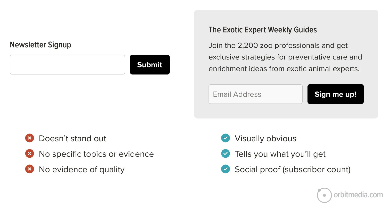
Sadly, many signup forms don’t do this. But if you don’t tell them these things, why would they subscribe? You need to answer the question, “what’s in it for me?” and tell them the benefits of being on the list. Keep reading to see good and bad examples of this.
If you have a documented content marketing mission statement, this is easy. Simply repurpose the middle part (the “information y”) into your email signup CTA.
![A template showing: "Our content is where [audience x] gets [information y] that offers [benefit z]," with an arrow pointing to a box saying, "Turn this into your email signup CTA.](https://www.orbitmedia.com/wp-content/uploads/2025/06/mission-statement.png)
Take a look at the email signup form for Convince & Convert. It’s crystal clear what you’re signing up for and how often you’ll get it.
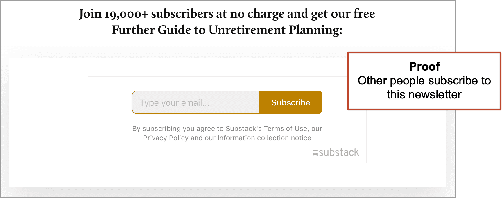
3. Proof
The third P is proof, as in social proof.
To get visitors to act, you need to add evidence that the blog is worth reading and the newsletter is worth subscribing to. Like any evidence on any webpage, this triggers a cognitive bias (the conformity bias / bandwagon effect) and improves the conversion rate from visitor into subscriber.
There are two kinds of proof you can use:
- Number of subscribers (quantitative)
Really, you should have at least 1000 subscribers before this works well, so this is best for established blogs. - A testimonial from a fan (qualitative)
A quote from a fan who loves your content is effective because it’s personal. If it comes from someone well known to your readers, it’s more than a testimonial – it’s an endorsement.
This is the signup offer from Futher, Brian Clark’s “Unretirement Guide”. Signing up feels like joining a community,
Tip! Don’t have a large list? No problem. If you have at least one fan who likes your content. Reach out and ask if they would give you a little testimonial. A single, genuine testimonial can be just as compelling as a large subscriber count!
Let AI audit your email signup CTA
With a simple prompt and an uploaded screenshot, AI can score your email signup box.
I’m giving you a screenshot of a page with an email signup call to action. Evaluate it based on the “Three P’s” framework. For scoring, give each P a letter grade (A–F) and then give a final overall grade. Don’t hold back.
1. Prominence: Is it easy to find and visually prominent? Is it placed in a high-visibility area? Does it stand out from surrounding content?
2. Promise: Does it name the topics and explain the benefit of signing up? Is the value specific and relevant? Is it enticing to the visitor?
3. Proof: Is there evidence to build trust (e.g., subscriber count, testimonials, privacy statements)?
What grade did you get? Did you get an A+ on all three P’s? If you flunked, ask AI how to make an email signup CTA. After you’ve tuned it up, take the test again.
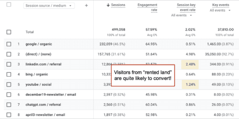
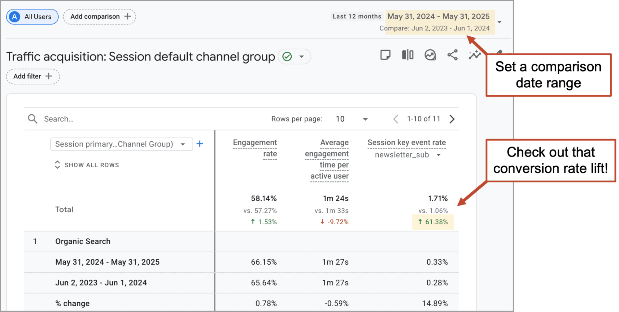
Using AI to audit fast and fun, but the real test is with your visitors. Assuming you have key events properly set up, you can easily check the before and after impact. Just set a pre/post date range in your Traffic acquisition report and pick the signup goal in the dropdown under “Session key event rate.”
Here’s what a conversion rate lift looks like:
Bonus P’s!
Beyond those three, those most important basics, there are other ways to make your signup boxes even more effective, pushing conversion rates even higher. And yes, they all start with P.
Presents
Offer a present or a gift for the subscriber. This is often called a “content upgrade” or “lead magnet.” It’s really an ethical bribe. You’re trading high-value content for their email address.

Chris Ducker offers you this “Personal Branding Roadmap” This incentive to give an email address will increase the percentage of visitors who subscribe. Technically, they’re not subscribing to the newsletter, but visitors know that you’ll be sending them email.
Our friend and conversion expert Justin Rondeau has tested everything and found the presents that work the best – and the ones that don’t work so well.
- Good: toolkits, reports, case studies, free downloads, assessments, quizzes, cheatsheets
- Bad: ebooks, long whitepapers, webinars, generic info, contact us
Some gifts have higher perceived value than others!
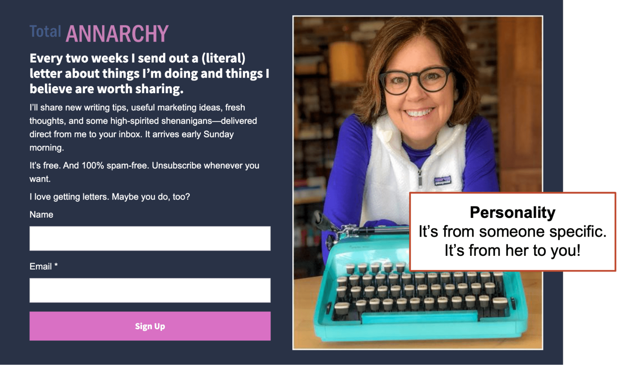
Personality
Images of faces make the site more human and more personal. They also help increase prominence because they pull in the visitor’s attention. People tend to gaze at faces more than other imagery from the time we are infants.
Using a face also let’s them know who it’s from. Here is Ann Handley’s signup form. Her newsletter feels 100% like a personal letter from her to you.
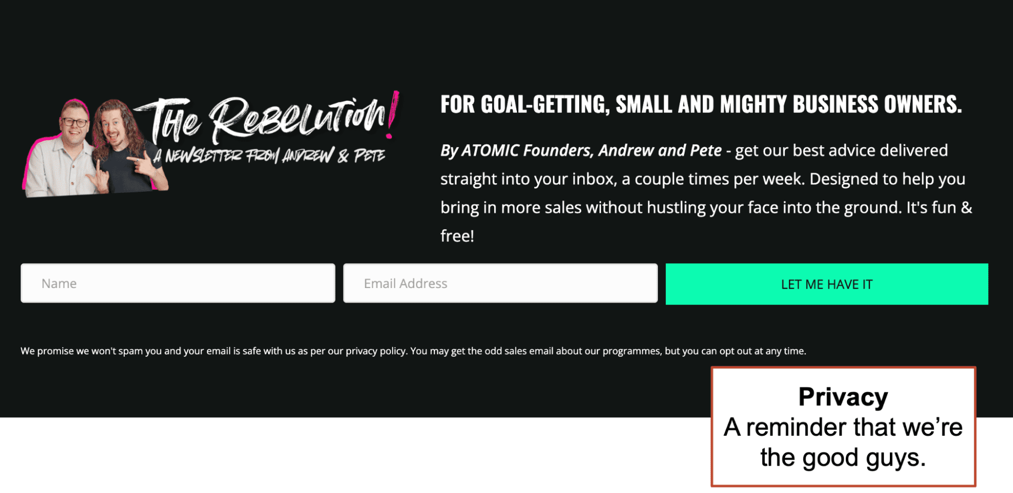
Privacy
The final P is for privacy. If trust levels are low with your audience, you can add a note that reassures them that you won’t share or sell their information with anyone else.
Take a look at Andrew and Pete’s Atomic signup form. That little nudge at the bottom reminds the reader that you’re a good internet citizen and that they’re in control. You’ll never spam them. They can unsubscribe anytime.
 |
Jessica Best, Better-ave.com“Frankly, since the Privacy Apocalypse (aka privacy laws in dozens of states and countries), this last P could also be called Permission: the intent of all these laws is that we the marketer have to put the user in the driver’s seat. They get to choose what they sign up for and what they skip. That means putting a checkbox on webinar registrations or eCommerce checkout forms (unchecked please). We shouldn’t assume an opt in for anyone that fills out a form, donates or buys from us.. Permission is 9/10ths of why email marketing continues to drive the highest ROI of any channel!” |