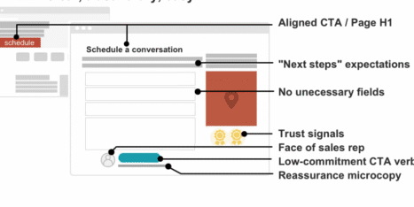
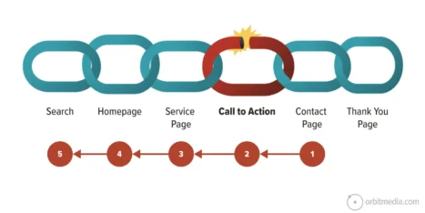
I sincerely hope that you are reading this when you are creating content for your new website. Because what you put into and how you format your sidebar is just as important as your main page content. Why? It supports what is there, gives you a way to create clear calls to action, and is a way to turn a boring, text-filled page into a page that looks and feels custom.
But be warned, sidebars are so often abused. You most definitely should never have a sidebar that is longer than your page content. Visually, it just looks off. When it comes to the usability, people are going to miss anything that comes after the content ends. They’re not going to scroll just to see supplementary content tucked into the sidebar.
Sidebars are exactly that, supplementary content. They should not be a repository for content you can’t find another place for. Sidebars should not be packed full of elements that look like ads – visitors don’t see those – and it is obnoxious. Does the page really need to list out every conference or trade show you have attended? Or every service your company has? No. No. No.
So, how do you decide if you should put something in your sidebar? You ask yourself three questions.
1. Does it add value to the page?
Web visitors have notoriously short attention spans, and they need to be guided to the important stuff. A sidebar is a great place to show visitors what you want them to do next. Maybe you have success stories somewhere on your site; the sidebar is a great place to tease those stories and drive a site visitor to the correct page. Related products, services, and testimonials are all value-adding content.
Sidebar content that does not add value to the page are things such as “badges” for events and certifications or awards, and they’re best suited to be on their own page.
Pro tip: Do you have a certifications/expertise page? Adding a link in your sidebar about your award-winning work that takes a visitor to a page full of honors gives you credibility and keeps your sidebar clean.
2. Do you have details that should be called out or highlighted?
Things like a location and map when writing about an event or business can be incredibly useful information that can supplement the natural flow of reading. Is there a particular statistic or measurable goal you achieved that you can highlight? A number paired with a call to action makes an excellent use of sidebar space.
Pro tip: Adding content that leads a visitor to take action or leads them through your site is a useful addition.
3. Could it be a page?
If the content in your sidebar could be a page itself, then it needs to be a page and not sidebar content. Sure, you can tease the content in the sidebar of a relevant page, but if it is strong enough to be a page, don’t force it into a sidebar.
Pro tip: I see this happen most often when websites have an entire list of awards or certifications in their sidebar. Give those items a home of their own, and craft a short blurb and then link to your new page.
What rules do you follow for curating the content in your sidebar?


