AI-powered tools are everywhere. They promise to analyze your funnel, build your content strategy, and write your marketing copy in a fraction of time.
But AI also gets things wrong. And the more complex the context, the higher the probability you’d fall for an answer that sounds credible but is actually false.
When it comes to website optimization, blindly trusting AI’s feedback, your gut feeling or whatever worked for someone else’s website can cost you real money (or your job).
But what if you could confidently tell which variant is stronger or which change has a higher probability to move the needle within minutes? No prompts, no AI double-checking required.
This post walks you through 7 neuroscience principles that directly affect conversion rates and shows you how to apply them to both copy and design so you can make smarter CRO decisions (reliable and fast, no tools involved).
But first, here’s what you need to know about the brain’s structure and information processing.
Brain science for marketers: What you need to know
The brain structures that matter for conversion
Ever heard someone mention the “prefrontal cortex” or “amygdala” and wondered what the hell they’re talking about?
Here’s a quick translation:
- Sensory cortex = processes sight, sound, touch, etc.
- Amygdala = emotional responses, threat detection, fear/safety signals. The immediate “something feels off here” alarm.
- Hippocampus = pattern recognition and memory formation.
- Language centers (Broca’s, Wernicke’s areas) = process words.
- Prefrontal cortex = executive functions including attention control, decision-making, working memory, and switching focus based on goals. Handles both rapid attention shifts and slower conscious deliberation.
Fun fact: In Greek, “Hippocampus” means “horse sea monster.” Hippocampi were the fish-tailed horses that pulled Poseidon’s chariot across the sea in Greek mythology. The Italian anatomist who discovered it ca. 450 thought it looked like a seahorse, so here we are.
How information processing works
Here’s the sequence your prospect’s brain goes through when they land on your page (whether they realize it or not):
- Sensory input: They see your page, read your headline, notice the layout. The visual impression—clean or cluttered, professional or amateur, premium or cheap—forms instantly, before they’ve read a single word.
- Pattern recognition: Their brain scans for familiar patterns and anything that looks off. Is your page prototypical of your niche? Is your pricing page structured in a similar way as dozens of pricing pages they’ve seen before?
- Emotional evaluation: The instant “can I trust this company?” gut check. The split-second “something feels off” reaction and instant alarm.
- Conscious processing: The prefrontal cortex starts doing the logical analysis. “Does this solve my problem? Is this worth the price?”
- Decision: Reaching out or leaving. Often the conscious brain is justifying what the emotional brain already decided.
Now when someone says “emotional processing happens before logical,” you know that it actually means “the amygdala responds faster than the prefrontal cortex.”

One critical constraint that affects information processing
Your brain has two types of memory:
- Working memory holds information you’re actively using right now. It’s temporary and has limited capacity.
- Long-term memory stores information you’ve learned and can retrieve later. It has much larger capacity than the working memory.
When someone lands on your page, everything happens in working memory first. Every element—text, images, buttons, forms, navigation—competes for the limited space.
The total mental effort required to process information in working memory is called cognitive load.
Cognitive load fluctuates constantly based on how the brain interprets the information you present your prospects. Increased cognitive load can lead to decision paralysis, increased processing errors, or abandonment of the task entirely.
Ok, now you’re all set. Let’s talk about the juicy part of it: principles that affect cognitive load and how you can use them in your copy and design to increase your conversion rates.
Principle 1: Processing fluency
The neuroscience
When information flows smoothly, the brain interprets that ease as a safety signal. But when something requires effort to process, the amygdala triggers a subtle alarm—the emotional threat response—before the logical brain evaluates the offer.
This is called processing fluency (or cognitive fluency).
Why it matters for conversions
Research shows that easier-to-process information gets judged as more trustworthy, even when the actual content is identical. So, when your page is hard to process, by the time conscious evaluation begins, trust is already compromised.
Easy to process = feels right = trustworthy. Hard to process = feels off = risky.
How to increase cognitive fluency
In your copy:
- Use simple sentence structure. Shorter sentences with a clear subject-verb-object relation reduce cognitive effort. “Track your expenses” is easier to process than “Enable systematic tracking of all financial outflows across your organization”
Chunk information into digestible sections:
- Break long content into clear sections with headings, and keep paragraphs to 2-4 sentences. Each break allows working memory to process and consolidate information before moving on, rather than forcing continuous processing of one long stream.
- Use progressive disclosure. Show prospects only what they need at each step, revealing additional information as they move through the page. This goes for input forms, too. Multi-step forms that show 3-4 fields at a time create less cognitive load than one long form showing 15 fields simultaneously.
In your design:
- Group related elements visually. Place related items close together with shared styling (borders, background colors, or spacing). This leverages chunking—the brain processes the group as one unit instead of multiple individual elements.
- Do not center more than two lines of text. Centered text is harder to process because the brain needs to make an extra effort to find the beginning of the next line.
- Use clean layouts and clear visual hierarchy. Headings, subheadings, and distinct sections let prospects find what they need faster, unlike cluttered designs or dense, uniform text.
- Use high contrast between text and background. Any way that makes the text hard to read negatively impacts cognitive fluency.
- Add white space between sections. Visual breathing room separates distinct pieces of information, reducing the number of elements competing for simultaneous attention.
Two real-life examples
Example #1:
Codarity ran an experiment for one of their clients, where they tested a short, direct headline against one stacked with redundant descriptors.
The longer version made visitors work harder to process multiple similar phrases just to extract the main idea, increasing cognitive load. The shorter, clearer headline, which still retained the key message, resulted in 16.9% more conversions.

 |
Dan Charles, Founder, Codarity “The pattern shows up in copy, in design, in structure. Simpler wins. Not because simple is lazy. Because the brain rewards messages it can process without effort. When a headline is clean and direct, it feels clearer. When it feels clearer, it feels truer. And when it feels true, it converts. The technically developed headline, packed with keywords and descriptors, makes the reader work. The simple one that speaks straight to the outcome they want doesn’t.That’s the test worth running. Strip it back. See what happens.” |
Example #2:
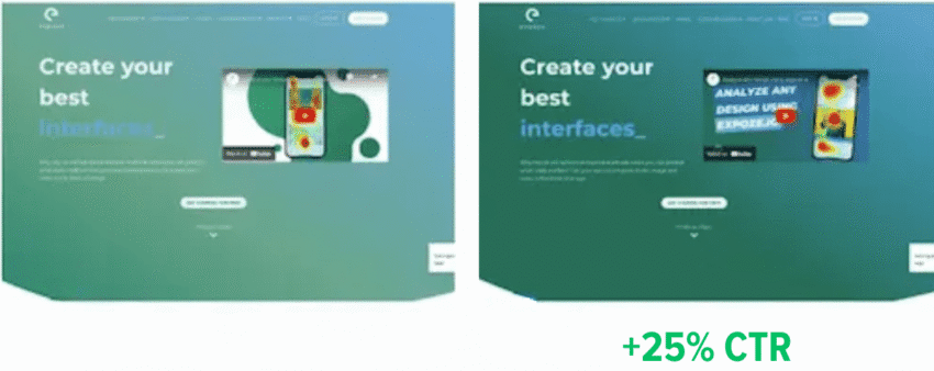
When Expoze.io increased the contrast between text and background on their homepage, making it easier for their visitors to read and process the content, they saw a 40% increase in attention to key sections and a 25% lift in CTA clicks.
What seems like a trivial change addressed an important issue: text readability. So, it’s not surprising that making the text easier to read resulted in a substantial performance improvement.
(Source)
Key takeaway:
Easy to process = trustworthy. Hard to process = risky. Removing friction from comprehension should be your first priority.
Principle 2: Specificity
The neuroscience
The brain processes concrete language differently than abstract language.
Abstract language only activates language centers. You read the words, you understand their meaning, that’s it.
Concrete language (specific numbers, tangible outcomes, sensory details) activates sensory regions of the brain and creates mental imagery.
Brain imaging studies show that your brain treats imagined scenarios similarly to real ones: When you vividly imagine an experience, it activates many of the same brain regions as during a real experience, evoking an emotional response.
Why it matters for conversions
Emotions are the strongest drivers for action.
If your prospects can picture what you’re talking about—be it their current problem, your solution in action, or the outcome they’ll experience—they feel the emotional weight of that scenario as if it’s already happening.
“Better results” gives your prospects nothing—no imagery, no emotional response.
“5 new clients in the first week” makes the relief of hitting their quota and the satisfaction of early success feel tangible—before they’ve even considered signing up.
How to use pattern specificity to your advantage
In your copy:
Whether you’re describing your prospects’ problems, benefits of your offer, or how it worked out for your past clients, make sure your prospects can visualize what you’re saying:
- Use specific numbers. “Reduce meeting time by 40 minutes per week” beats “save time on meetings.”
- Be specific with context. “I write copy for B2B SaaS homepages and landing pages” beats “I write conversion copy.” Both are specific, but one paints a clear picture of what you actually do.
- Use names and specific details when talking about past work. “Slack reduced onboarding time from 3 days to 4 hours” beats “major companies saw faster onboarding.”
In your design:
- Show actual product screenshots, not abstract illustrations. Prospects need to see themselves using it.
- Use before/after photos with real results. Visual proof of concrete outcomes reinforces what the copy promises.
- Display charts with actual data points, not decorative graphics. If you’re claiming results, show the specific numbers visually so prospects can picture the positive development.
A real-life example
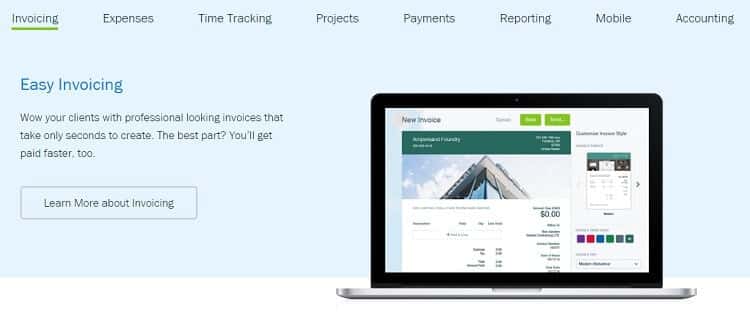
FreshBooks noticed visitors were exploring their Product Tour and Features pages but not signing up. They tested a clearer, more specific version that:
- Highlighted the 5 features users cared about most (instead of listing everything)
- Added concrete context: “get you paid 2x faster” instead of vague “get paid faster”
- Explained what features actually do: “Automate invoicing and watch FreshBooks instantly send them to clients on your behalf”
- Made the product screenshot larger so visitors could see the actual interface
- Added a specific “Try it free” CTA instead of vague “Learn more about invoicing”
Once people could picture the specific outcome instead of processing abstract promises, sign-ups increased by 4%.
Control:
Variation:

(Source)
Key takeaway:
If they can’t imagine it, they won’t buy it. Replace vague descriptions with specific situations and outcomes your prospects can visualize.
Principle 3: Pattern recognition & expectation
The neuroscience
Pattern recognition happens automatically in the hippocampus and sensory cortex. Matching stored patterns requires minimal cognitive effort. Violating expected patterns forces the brain to slow down and consciously analyze what’s different.
Why it matters for conversions
Unfamiliar patterns increase cognitive load. Your prospect’s brain has to work harder to understand what they’re looking at, which pulls cognitive resources away from evaluating your offer.
Breaking patterns strategically can work in your favor, for example, when using an unexpected color or size for your primary CTA makes it stand out and captures attention. But breaking patterns in infrastructure that should support information flow (navigation, forms, standard UI elements) just creates unnecessary friction.
How to use pattern recognition & expectations to your advantage
In your copy:
- Match expected category language in your header section. If someone searches “project management software,” make it clear that’s what you offer in the headline, subheading, or tagline. Don’t make them decode “Transform collaboration paradigms” to figure out you sell project management software.
- Stick to conventional navigation labels. “About,” “Services,” “Pricing,” “Contact” require zero mental effort. “Who We Are,” “How We Help,” “Let’s Connect” make visitors pause and decode.
- Use the same words your audience uses. “I wish I could achieve customer acquisition enhancement”, said no prospect ever. But they do want to get more clients.
In your design:
Unless you’re strategically breaking a pattern to make something stand out (like an oversized CTA), stick to prototypical elements—standard UI conventions that match what people have learned from every other website they’ve used.
- Use prototypical navigation placement. Logo top-left. Navigation across the top or left side. Search icon in the top-right corner.
- Follow standard color conventions. Blue for links. Red for errors or urgent actions. Green for success messages.
- Make clickable elements look clickable. Buttons need borders, background color, or hover states. Input fields need visible boundaries and placeholder text. Text should look like text, not like a button.
Keep in mind expectations specific to your context
What elements show up on nearly every site in your niche? What sections do they all have? What functionalities do they offer? That’s what your prospects expect from websites like yours. Make sure to fulfill them as well.
A real-life example
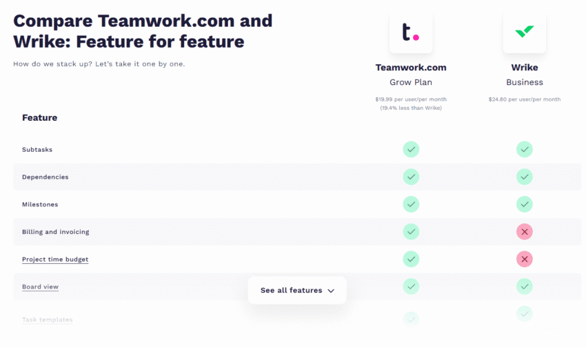
Teamwork’s comparison page lacked the one thing visitors expected to find: a side-by-side feature comparison table. Instead, people had to jump back and forth between sections to compare Wrike and Teamwork feature by feature.
When GetUplift redesigned the page, they added a standard comparison table that matched what people had learned to expect from seeing dozens of comparison pages across the web. As a result, conversions increased by 54%.
 |
Talia Wolf, Founder and CEO, GetUplift“After running thousands of A/B tests and observing how people behave on real webpages, we’ve identified 4 types of readers on every page. Each has learned specific patterns for how to consume content: where to look for proof, what headlines should do, how subheads should work, etc. When pages violate these learned patterns, conversions drop simply because people can’t find what they expect to find where they expect to find it.” |
Key takeaway:
Identify what needs to be familiar (navigation, page layouts, form structure) versus what should be distinctive (your offer, key benefits, primary CTA). Make infrastructure invisible. Make your message stand out.
Principle 4: Attention & the Von Restorff effect
The neuroscience
Your brain is wired to notice what’s different. When you see a list of similar items with one that stands out, that distinctive item gets more attention and is remembered better.
The prefrontal cortex automatically detects the difference in context, triggering enhanced memory encoding that makes the distinctive item easier to recall later.
This is called the Von Restorff effect or isolation effect.
Why it matters for conversions
On your webpage, this means one distinctly different element will dominate where your prospect’s eyes go and what they remember.
Think strategically: what do you want to stand out? Your primary CTA? A key benefit? That’s what should be distinctly different. Everything else should blend into a consistent background.
How to use the Von Restorff effect to your advantage
In your copy:
- Use numbers in headlines when surrounded by text. “Reduce costs by 47%” stands out in a text-heavy section because the number breaks the pattern.
- Use power words strategically. If your copy is straightforward and factual, one emotionally charged word (“devastating,” “secret,” “forbidden”) will pop.
- Vary paragraph length. One short paragraph surrounded by longer ones stands out and signals emphasis.
- Use visual hierarchy to guide attention. Size, color, and position should make it obvious what to look at first, second, third, making the decision as to what to read next intuitively easy.
In your design:
- Create color contrast for your primary action. If your page is blue and white, your main CTA should be orange or green—distinctly different from the base palette.
- Use a single icon or graphic among text-only sections. When surrounded by paragraphs, one relevant visual element draws the eye and breaks the monotony.
- Add a background color to one section. If your page sections flow on white background, put your key offer or CTA section in a light colored box to make it visually stand out from the continuous scroll.
- Reduce animation and movement. Moving elements, auto-playing videos, or animated banners compete for attention simultaneously with static content, increasing cognitive load. Use motion sparingly and purposefully.
A real-life example
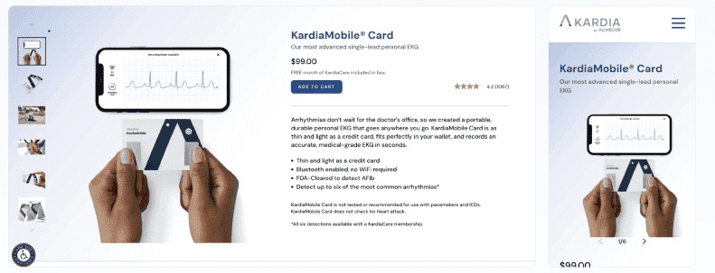
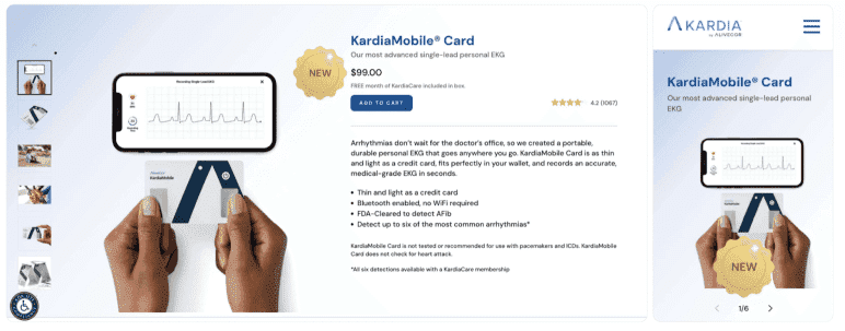
AliveCor added a “New” badge to their product, KardiaMobile Card, on both the product listing and detail pages. The badge created visual distinction, making one element stand out while everything else remained consistent.
Result: 25% increase in conversion rate and 30% increase in revenue per user.
Control:
Variation:
(Source)
Key takeaway:
When everything stands out, nothing stands out. Choose one element per screen to dominate attention—make only that one distinctly different. Keep everything else visually consistent.
Principle 5: Loss aversion & the pain-pleasure axis
The neuroscience
Our brain feels losses approximately twice as intensely as equivalent gains. This isn’t a thinking preference, but a hardwiring.
Originally discovered through behavioural studies, the neuroscience studies that followed showed that losses and gains are processed by different neural circuits, with losses triggering stronger and more widespread activation than equivalent gains.
Why? The scientists’ best guess: our brain evolved in a world where losing your food stash or your mammoth-hunting gear meant death, but finding extra berries just meant… extra berries.
Avoiding loss has mattered much more than chasing gain since long before we invented the internet, and your brain hasn’t updated its operating system.
Why it matters for conversions
Loss-framed messaging activates the amygdala before the logical brain evaluates your offer. “Stop losing 20 hours per week to manual reporting” hits harder than “Save 20 hours per week.”
The pain of continuing their current situation (so called “status quo cost”) motivates action more effectively than the promise of improvement. Your prospects are already experiencing the loss. Your job is to make them feel it.
How to use loss aversion to your advantage
The basic idea is either to make your prospects aware of an actual loss or to remove the fear of a potential loss.
In your copy:
- Frame benefits as loss prevention. “Stop losing customers to slow response times” works better than “Improve customer retention.” Both promise the same outcome, but one emphasizes avoiding loss.
- Quantify the status quo cost. “Your current process costs you $4,800 monthly in wasted hours” makes the pain concrete and urgent.
- Use scarcity and urgency strategically. “3 spots left” or “Offer ends Friday” creates fear of losing the opportunity. But use it only when it’s genuine. False scarcity destroys trust faster than it creates urgency.
- Include risk reversal. Money-back guarantees remove the fear of potential loss.
In your design:
- Use red or orange for urgency elements. These colors signal alert and danger, reinforcing the emotional weight of potential loss (unless orange or red are your primary theme colors).
- Place social proof near loss-framed copy. When you’ve named a pain point, immediately show testimonials from people who escaped that same pain. This proves the loss is avoidable.
- Use progress indicators in multi-step processes. “Don’t lose your progress” is a powerful motivator to complete forms or checkouts. If you ever had to pretend to learn a language for months just because a green owl threatens you with a loss of your 253-day streak, you know how powerful this is.
A real-life example
Leadforce tested a popup for Babuwear that triggered two loss-aversion signals: “stock may run low soon” and “here’s how much you’re saving.” The popup made the potential losses visible, creating urgency without relying on fake scarcity.
Result: 24.5% increase in conversion rate.

(Source)
Key takeaway:
The brain responds more powerfully to avoiding loss than achieving improvement. Name clearly what your prospects are currently losing, not just what they could gain, and frame your value as loss prevention.
Principle 6: Anchoring
The neuroscience
The first piece of information you encounter, the anchor, becomes the reference point for evaluating everything that follows. The prefrontal cortex uses this initial anchor to make rapid comparisons and value judgments.
Why it matters for conversions
Your prospects don’t evaluate your offer in a vacuum. They anchor to the first value signal they see, whether that’s a competitor’s price they saw yesterday, the “original” price you crossed out, or the first benefit you mention.
Present a high anchor first, and your actual price feels reasonable. Start with a low-value anchor, and even a good price seems expensive.
Control the anchor and you control how everything else gets judged.
How to use anchoring to your advantage
In your copy:
There are at least 6 types of anchoring you can use:
- Price anchors: “Most agencies charge $15,000 for this” sets the anchor. Your $6,000 price now looks like a deal.
- Time anchors: “This usually takes 40 hours to learn” makes your “master it in 3 hours” course feel ridiculously fast.
- Performance/results anchors: “Industry average response time: 48 hours” makes your “4-hour response” feel exceptional.
- Effort anchors: “With the common solution X, you need dedicated IT staff” makes your “no technical knowledge required” feel like a jackpot.
- Social proof anchors: “Trusted by Google, Microsoft, Amazon” anchors quality and legitimacy before prospects even know what you do.
- Feature/benefit anchors: The first benefit you mention becomes the baseline for everything else.”50GB storage, 10 integrations, saves 5 hours/week” anchors on “50GB” as the baseline value. When you get to “saves 5 hours/week,” the number feels small, and just like another item in the list, although it’s as valuable as (if not more than) the rest.”Saves 5 hours/week, plus 10 integrations, plus 50GB storage” anchors on “saves 5 hours/week” as the main value. Everything else feels like bonus features on top of that core benefit.
In your design:
- Place the highest price visibly first in price tables. Even if it’s not your recommended option, it sets the anchor. Everything else looks more reasonable by comparison.
- Show the “original” or “list” price crossed out next to your actual price. The crossed-out $199 anchors the value. Your $99 sale price now feels like you’re getting $199 worth of value for $99.
- Display competitor prices or industry averages in comparison charts. Visual anchors work powerfully. When prospects see “$2,500 (competitors)” next to your “$899,” the $2,500 anchors their perception of value.
Why do most SaaS pricing pages list packages low to high?
To anchor or not to anchor depends on your business model.
A typical business model of SaaS—get them through the door with the cheapest plan first, upsell later—outweighs the anchoring benefit of showing the expensive option first.
A real-life example
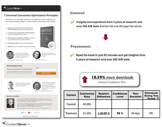
When testing a landing page for his ebook, Michael Aagaard from Unbounce used anchoring to test two different variations of a value-packed bullet point.
The original sentence anchored on credentials: “Insights and experience from 4 years of research and over 350 A/B tests distilled into one 26-page free ebook.”
The variation flipped the order to lead with accessibility: “Read the book in just 25 minutes and get insights from 4 years of research and over 350 A/B tests.”
By leading with the low time investment (25 minutes), the ebook felt like a quick read, whereas, starting with comprehensive credentials made readers anchor on substance and depth, signaling a bigger time investment.
This simple change resulted in an 18.6% increase in downloads.
(Source)
Key takeaway:
The first number or value claim your prospects see becomes the anchor for evaluating everything else. Decide on what to show first strategically to make your offer look like the best choice by comparison.
Principle 7: Social proof & conformity bias
The neuroscience
Uncertainty activates brain regions associated with conflict detection and anxiety, which can trigger avoidance behavior or decision paralysis.
When faced with uncertain decisions, the brain looks to what others have done. This conformity bias is most probably a tribal survival mechanism: if five of your tribe members ate these unknown berries and survived, you can probably eat them, too.
Why it matters for conversions
Every purchase decision involves uncertainty. Will this work? Is it worth the money? Can I trust this company?
When your prospects see that others—especially people similar to them—made the same choice and got results, this lowers their brain’s uncertainty signal. The risk feels lower, and the decision becomes easier.
A note of caution: not every testimonial helps reduce uncertainty
Generic praise (as in “We highly recommend this company”) won’t make your prospects trust you more.
An effective testimonial needs specific, relatable details—job titles, company names, industry context—so your prospects’ brain has enough information to assess whether the results it describes would apply to their situation.
Video testimonials are most powerful because they activate face recognition, facial expression reading, and vocal tone processing—systems your brain trusts to reliably detect authenticity.
How to use social proof strategically
In your copy:
- Include testimonials from people similar to your prospects. The more they can see themselves in the testimonial, the stronger the effect.
- Display usage statistics that demonstrate adoption. “Join 50,000+ marketers” signals that many people have already made this choice. The larger the number, the lower the perceived risk.
- Feature authority endorsements when relevant. Quotes from recognized experts or publications add credibility, especially if your prospects need validation beyond peer testimonials.
In your design:
- Make client logos immediately visible. Recognition triggers trust before prospects read a word. Place logos prominently, not hidden at the bottom of the page.
- Display star ratings and review counts. Keep in mind that volume and authenticity matter more than perfection. “4.8 stars from 2,400 reviews” works better than a perfect 5.0 from 12 reviews.
- Show numbers visually. Graphs showing customer growth, charts displaying satisfaction ratings—visual proof reinforces what your copy claims.
A real-life example
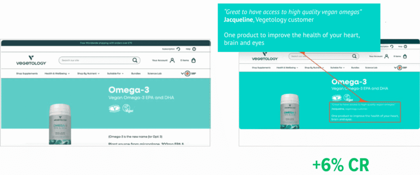
Vegetology had customer testimonials on their product pages, but they were buried at the bottom where visitors rarely scrolled. They tested moving a testimonial above the fold, visible immediately when someone landed on the page.
The change put social proof exactly where uncertainty was highest: the moment someone was evaluating whether to trust an unfamiliar store. Result: 6% increase in conversions.
(Source)
Key takeaway:
The brain treats “people like me succeeded” as proof of safety. Show relatable people who made the same choice and got results to reduce uncertainty in decision-making.
When multiple principles contradict each other
But what to do if making things simpler reduces trust? Or when adding more information results in lower processing flow?
Here’s when knowing your target audience becomes indispensable.
If you know what matters to them most while making a buying decision you’ll know what principle to choose when deciding on the most promising variants to test.
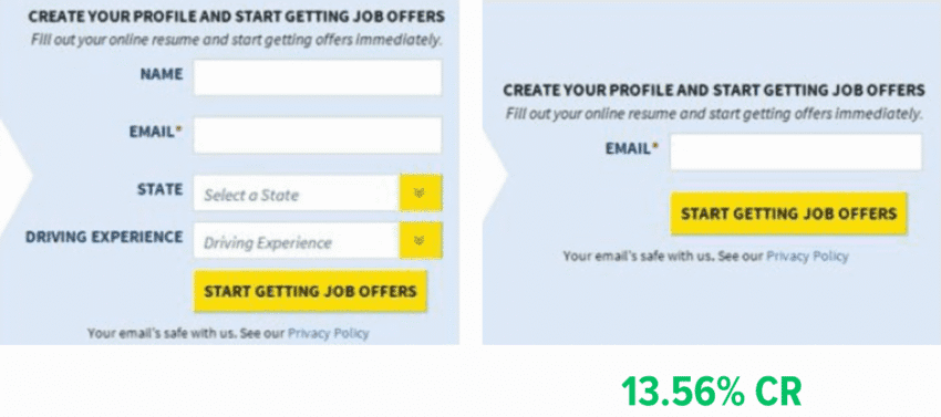
For example, in this A/B test on their website, TruckersReport, a network of professional truck drivers, learned that reducing the number of input fields in their form leads to reduced conversion rate. The control version with 4 input fields outperformed the variation with just one field by 13.56%.
It seems like their target audience valued additional relevancy and credibility (“if they’re asking for my location and driving experience, their offers will be more suited for me”) more than having just one field to fill.
(Source)
All principles at one glance
Here’s a quick reference of all principles and mechanisms behind them to make it easier for you to put them into practice.

How to apply these principles to increase your conversion rates faster
Pick one high-traffic page. Read through it while asking:
- Is this easy to process? (Fluency + load)
- Is this specific and clear? (Specificity)
- Does this feel familiar? (Patterns)
- Does the important stuff stand out? (Attention)
- Do I address their pain? (Loss aversion)
- Do I prove I’m credible? (Social proof)
Identify your 2-3 biggest violations. Then create test variants that fix them.
You’re now optimizing a strong foundation.
Don’t have enough traffic to test? Now you can make an educated guess as to which change will have the biggest effect.
Beyond conversion rate optimization
Understanding these principles doesn’t just optimize your web pages. It changes how you approach every email, every presentation, every sales conversation.
Because you stop guessing what might resonate or defaulting to what “sounds good,” and start building on what your counterpart’s brain is wired to respond to.