Homepages are hard.
It’s a high-stakes page because your homepage is the most visible page on your website. For most companies, the homepage gets more traffic than any other page.
It’s a difficult page to design and write because it’s the page for which you know the least about your visitor. The visitor hasn’t clicked anything yet, so we don’t know much about them. It’s also the page with the most diverse traffic sources and the most mysterious “direct” traffic.
Designing a homepage and writing the copy is one of the great digital marketing challenges and homepage best practices can be a big big help.
Let’s start with the big goals of every website homepage:
- Quickly let the visitor know where they are
- Quickly get them off of the homepage into a deeper interior page
And of course, it needs to check all the other boxes: rank in search for the business category, load quickly, be mobile friendly, integrate with GA4 and other tools, comply with privacy laws, meet accessibility requirements, and be easily updated, be faithful with consistent brand messaging.
It has a lot of jobs to do.
To help your homepage be a better front door, here is a checklist of homepage best practices. This is our how-to guide for writing and designing an effective website homepage. Like all best practices, these aren’t rules.
Best practices are really just good hypotheses. Try them and measure the impact.
This is a framework for considering what to put on your homepage …and what to leave off. Here’s a visual diagram of all of the homepage design elements we’ll cover.
Bonus! At the end of this post, we’ve added an AI prompt for auditing your own homepage based on the best practices listed in this article.
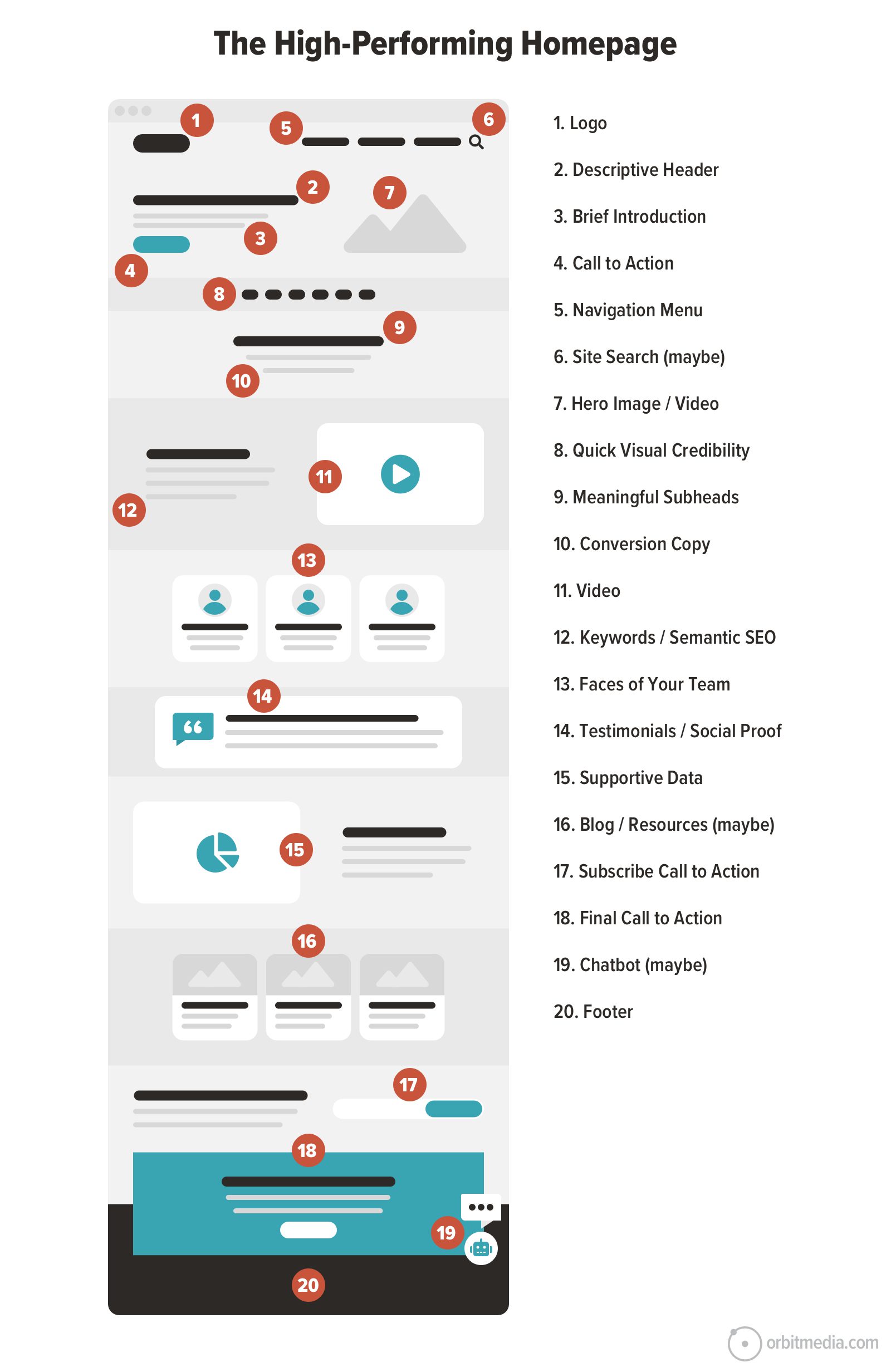
Here is a breakdown of each homepage design element with tips for each, from the top of the page to the bottom.
1. The company logo
We’ll start with the obvious. The logo goes in the top left (at least on 93% of websites) or in the top center. Here are the few best practices for logo treatment:
- Not too big
Big logos add visual noise without actually enhancing the brand. The logo is obvious because of its placement in that key position in the top left, not because of its size. No need to shout. - Beware the tiny tagline
A “lock-up logo” is a logo that includes the logomark and the business name together in one element. These also sometimes include a tagline. But the tagline in the logo image is often too small to be legible, especially on mobile devices. - One logo is enough
Some websites add the logo to the hero area in an image so it appears a second time. Or in an image. Or in a video thumbnail. This kind of over-branded wastes space that could be used for other important things, such as telling the visitor what business you’re in.
2. Homepage headline
The headline is at the top of the visual hierarchy. It is the 6-10 word version of what the company does, formatted with the <h1> header tag.
The job of the header is to tell the visitor (and the search engine) where they are. Remember, the first question of every visitor to every web page is “Am I in the right place?”
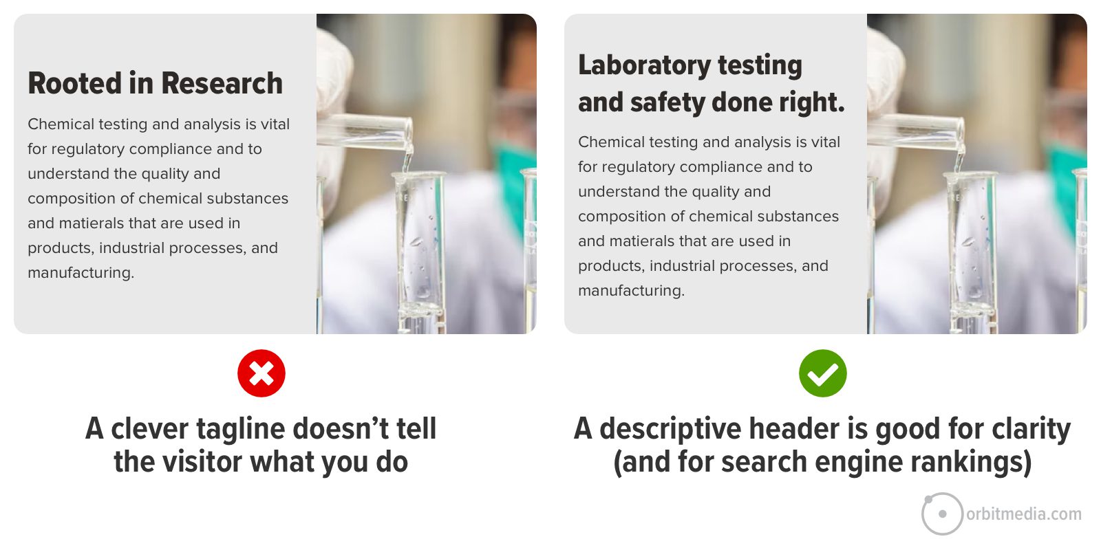
- Be descriptive (no tag lines)
If you’re a world-famous brand, you can use a clever tagline and everything will be fine. But for the rest of us, clear is better than clever. Don’t be vague and don’t use it for announcements. The homepage header is the 8-10 word version of what the company does. - Use “The Backyard BBQ Test
If I met you at a BBQ and asked you what you do for a living, and you replied with your homepage headline …would I know what you do? Or would I be totally confused? The best homepage headers pass this test.
- Include the target keyphrase
This is a key place to indicate relevance to search engines, which means using the primary target keyphrase. Along with the <title> tag, the <h1> header is probably the most important piece of SEO real estate on your website. Using the target keyphrase should come naturally if you wrote a descriptive headline for the not-yet-brand-aware visitor.
Pro tip!
Give AI the link to your homepage and the target keyphrase. The response will tell you if you missed it at any point on the page. Here are 3 AI prompts to make your homepage better.
3. Brief introduction
This is the short text that appears high on the page, sometimes right below the header, summarizing the value proposition of the business. Ideally, this text places the business squarely within a category (positioning) yet sets it apart (differentiation).
The trick is to do it all in just a few lines of text. Any longer and you have a blocky paragraph that visitors won’t read it.
If you were tempted to write a clever headline, this is the place to use those little gems. If you have a clever headline and descriptive intro paragraph, flip them. Results are better when the headlines are clear, but the copy is clever.
4. Call to Action (CTA)
Some visitors are ready to get in touch. This might be their tenth visit, right? When they’re ready, visually prominent calls to action give them a clear path forward.
- Contrasting color, often through color temperature (i.e., a warm color in a cool context)
- High on the page, often in the main navigation, which is a global element
- Surrounded by whitespace (low visual noise)
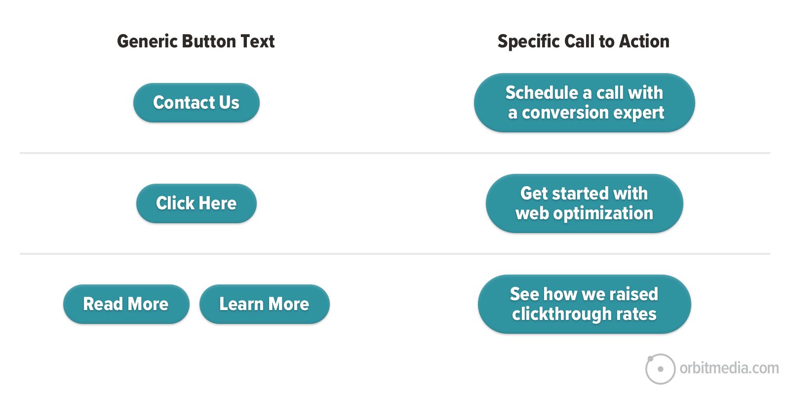
For header CTAs, “Contact Us” is common. 55% of B2B lead generation websites have “contact” in the top right. But consider using a stronger, more specific verb wherever you have room.
In our guide on button design, we showed how specificity correlates with clickthrough rates.
Also, don’t assume that all of the homepage calls to action should bring the visitors to the contact form. It’s possible that the next step in the user experience should be a case study, a portfolio or a service page.
Your GA4 account will show you which pages correlate with conversion. Guiding visitors to these pages, rather than your contact form, may be better aligned with their needs and your results.
We asked an old friend and digital marketing pro for his input on homepage CTAs:
 |
Justin Rondeau, Invisible PPC“Your homepage isn’t a campaign landing page – you’ll cover multiple concepts, different offerings, different products, and link to multiple areas on your site. THAT’S OKAY. Unlike a landing page, your homepage shouldn’t have a 1:1 ratio in regards to your primary CTA and total links on the page. Some folks will be ready to convert right away…those people click the button above the fold because you spoke clearly and directly to their needs. Others need a bit more of an understanding and will dig further. One CTA type isn’t enough. People want to interact how they like to interact. Give them the option and you’ll see more opportunities coming from your homepage.“ |
5. Navigation menu
Next up is the navigation menu. Horizontal menus that collapse into a hamburger icon on mobile devices are standard and used by 90% of marketing websites.
Just like the headline, your menu is at the top of the visual hierarchy. Most visitors will scan it almost immediately.
Here are two tips from a separate article about website navigation best practices.
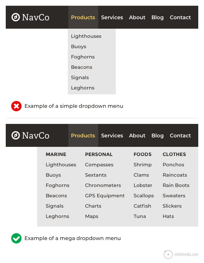
- Use specific navigation labels
Vague navigation labels (services, products, solutions) aren’t super helpful to your visitors. But descriptive navigation labels tell the visitor where they are and tell the search engine what you do. - If you use dropdowns, go big
Little dropdowns create visual friction without much payback for the visitor. Big dropdowns (better known as mega menus) still have that bit of friction, but they offer so many options the UX benefits outweigh the cost.
6. Site search
This isn’t a homepage best practice because not all websites need a search tool. Our research finds that 53% of websites have a site search tool.
Does your site need an internal search tool?
You only need a site search tool if you have a big site. It’s worth considering if you have 500+ of anything: pages, products, articles, resources or jobs.
If you have descriptive and clear navigation labels, visitors will click or tap. Visitors generally prefer to use the mouse rather than the keyboard.
Are your visitors using your site search tool?
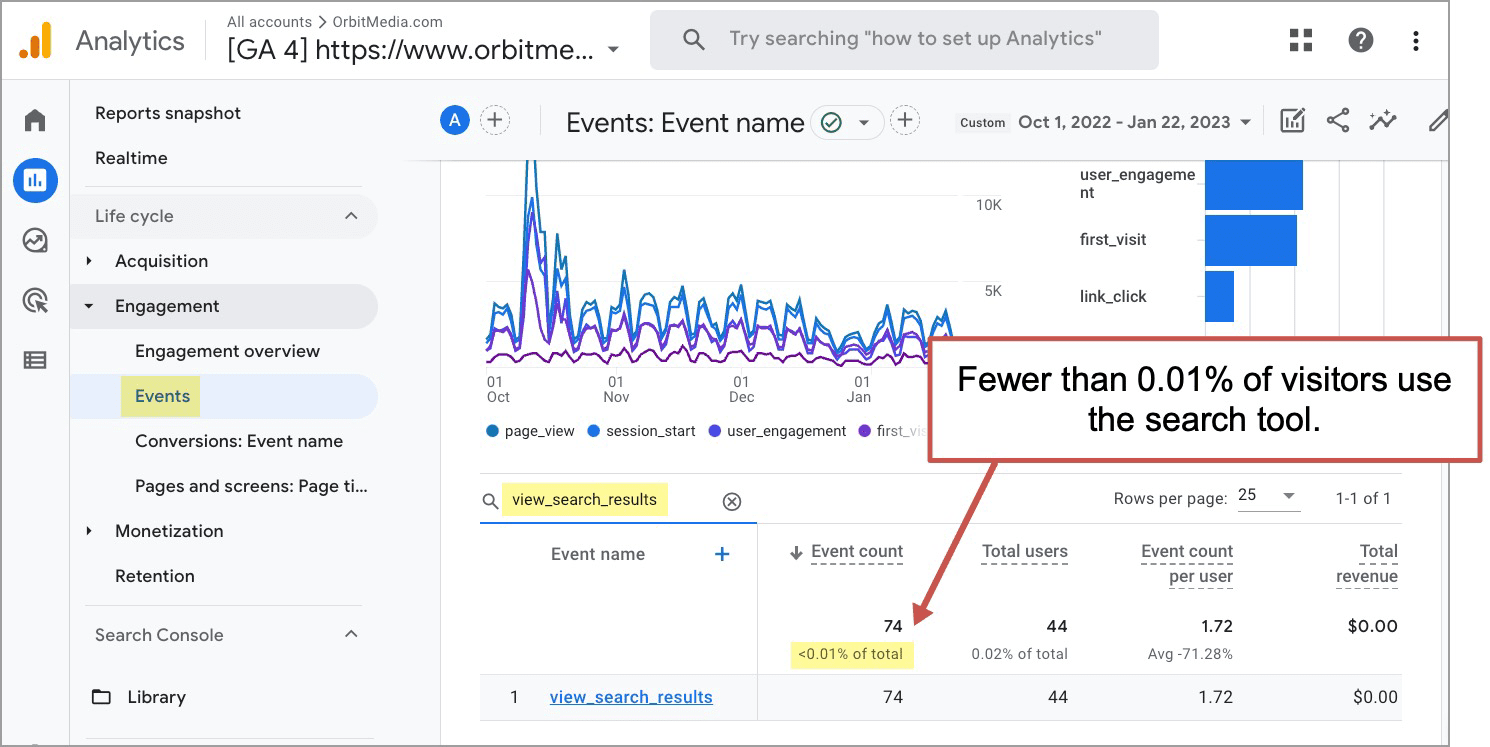
If you have one, you’ll know if it’s useful to visitors by checking Analytics. There is a built-in event in GA4 called view_search_results. Filter for it in the Events report and you’ll see if visitors are using your search tool.
If they using it, you can do some site search analysis, which is like using cheat codes for digital marketers
How to add site search to your website?
When it appears in the header, it’s not just on the homepage. It’s a “global element” which means it’s on every page.
Site search tools are added to headers in one of two ways.
- The little magnifying glass icon
Not very obvious, they add very little visual noise, and they have lower engagement levels. Appropriate for sites when most visitors don’t need to search. - The open text field with a search button
Very obvious, takes more space and often has higher engagement levels. Appropriate when searching is one of the primary ways that visitors interact with the website.
Use the first option unless you have high confidence (or strong evidence) that visitors really want to search.
7. Hero image/video
Usually, but not always, there will be an image or video in the featured area at the top of the homepage. This is the largest visual element. It is in the highest position. It is on the most popular page. So it has a big impact on their impression of the website and the brand.
Here are a few recommendations.
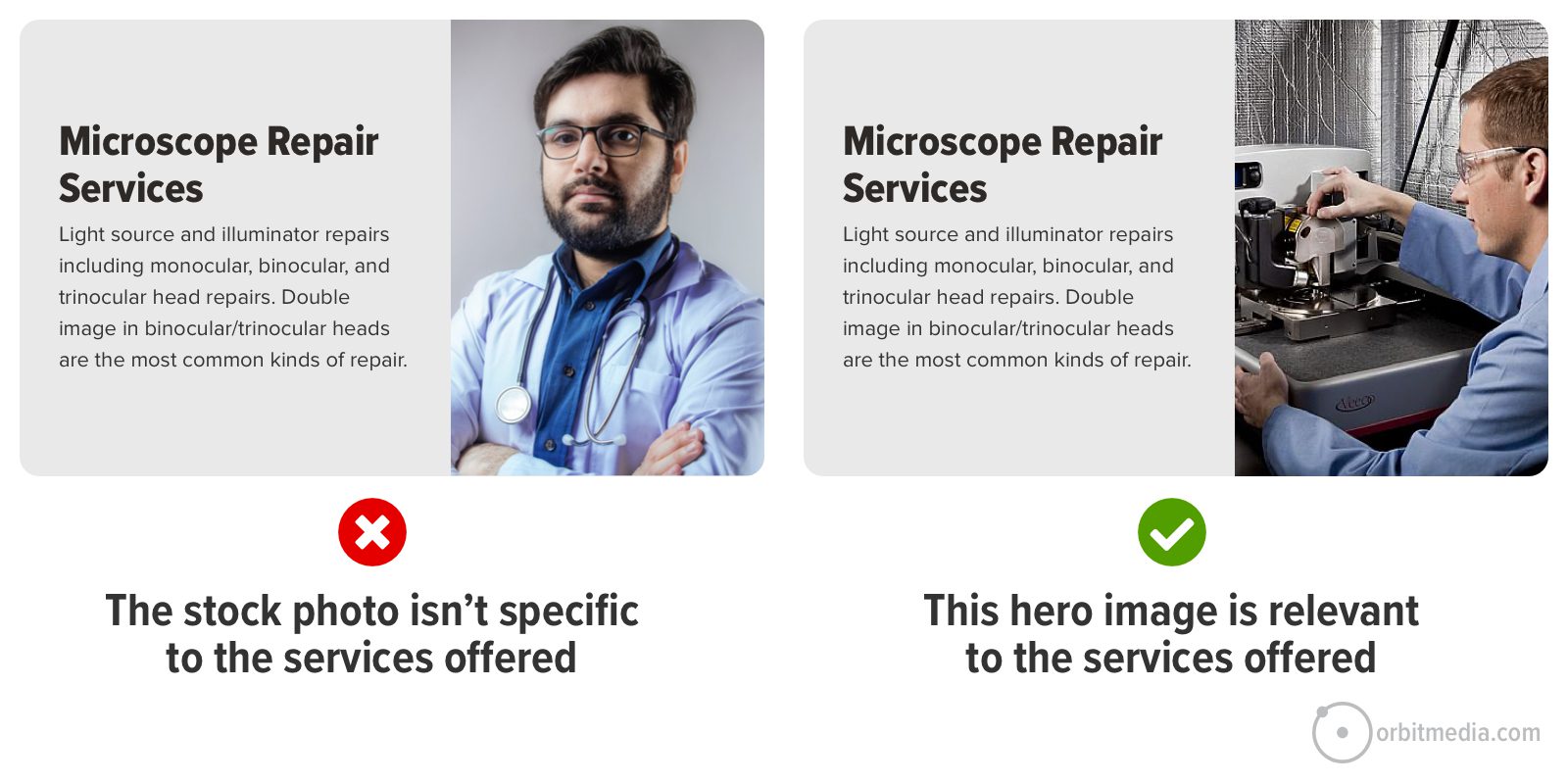
- Keep it relevant
Some visuals are very slick but could be used by a million different companies. They don’t relate to your company specifically. The ideal homepage hero is specific to you. - For products, show it in action
A basic product shot doesn’t tell a story. If possible, show the product in use. When an ecommerce homepage shows the product in context, it lets the visitor know the why, not just the what. - For faces, leverage “line of sight”
People tend to look where other people look. On a homepage, that means visitors may tend to look in the direction that the people in your images look. So use the trick that magazine photo editors have known for decades and use pictures of people whose eyes look toward the headline or call to action. - For looping background video, keep it simple
Movement is very powerful. A looping background video in the hero area can make a homepage more compelling. Just make sure it isn’t distracting from the message or pull attention away from other important elements. If the video hurts the legibility of text or CTAs, screen it back with an overlay.
Bad ideas for the hero area:
- Slider or carousel
The research is clear: sliders hide information. If it’s not on the first slide, it’s going to have ultra-low engagement. So rather than try to do four things in the hero area on four different slides, make the tough decision and pick one.
The exception is the image gallery. If the brand does something very visual (architects, for example) then the homepage featured area may make a nice gallery. In this case, the slides aren’t different topics, they’re just different examples.
- No current promotions
Tempted to use the hero to make an announcement? To showcase that product launch? Your upcoming webinar? Don’t do it. This isn’t the place for that. It can reduce clarity for visitors and your rankings in search engines.
Imagine replacing the sign on the front of your building with a press release headline. Passerbys might not know what you do.
8. Visual evidence
Below the hero area but above the fold, you should have a little room. You can use this space to build trust by adding evidence. Add a few visuals to show that your brand is legitimate.
- Logos of clients you’ve worked with
- Logos of companies you partner with
- Awards and badges
- Certifications and memberships
- Press mentions/As-seen-in
These are often called “trust seals” and they leverage the halo effect, a cognitive bias built into your visitors’ brains. Any positive impression the visitor has of the brands in your trust seals magically transfers to your brand.
Beyond trust, these logos also differentiate your brand. You’re different because your competitors don’t have those same trust seals. Look at your site and ask this question:
Could a startup born yesterday make this same homepage?
No, not if you put a bit of visual evidence above the fold. Those logos set you apart. You’ve differentiated.
We’ll set ourselves apart even more in 11, 14 and 15 below.
A note about “The Fold” on the homepage
We put a lot of emphasis on above the fold homepage elements because elements high on the page are high stakes. Visitors here are less likely to scroll than visitors on other pages because homepage visitors often want to navigate deeper right away.
The majority of homepage visitors don’t scroll, at least according to our research on B2B marketing websites.
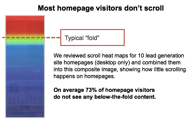
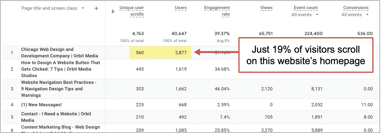
Confirm this for yourself in your own Analytics. In GA4, Unique user scrolls is a metric. You can add it, along with Users, to the Pages and Screens report. Divide one from the other and you’ll have the scroll rate for your own homepage. It’s likely lower than your other pages.
So work hard on your above-the-fold content on your homepage and it will work hard for you!
But don’t cram everything above the fold. And don’t neglect the rest of the page. Even if only 5% of your homepage visitors scroll, that’s thousands of people over time. Why give a dead end to thousands of your potential customers who are asking for more information?
So let’s move down past the fold…
9. Meaningful subheads
As the visitor starts to flow down the page, the subheads are there to help guide their eyes. But these guideposts aren’t helpful if they don’t say anything.
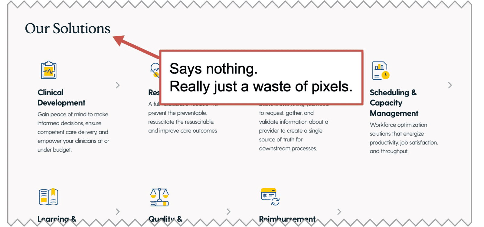
Websites everywhere waste space with bland and obvious words, in large text, all over the place. But it doesn’t take more time, money or effort to write something useful.
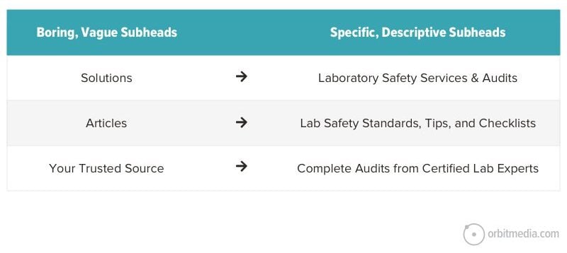
It helps guide the visitor through the page. It also helps indicate relevance to the search engine. Keep this in mind next time you browse around your own website:
Every vague subhead is a missed keyword opportunity.
The homepage is critical SEO real estate. More about search engine optimization below.
10. The copy: Questions answered and objections addressed
Although this is just one of our 20 homepage best practices, it’s really the most important thing on any marketing webpage.
Your visitor has questions. That’s why they’re here. They want to qualify (or disqualify) you as a possible option.
It’s the job of the page to anticipate their questions and provide the best answers. Those answers should be roughly ordered based on their priorities. The copy guides them through the messages, just as if they’re having a conversation with a sales rep.
The best homepages emulate a conversation with the top sales rep.
So it’s not just what you want to say, it’s what they need to hear, even if that means they disqualify you as a potential fit. You don’t want unqualified leads anyway, right?
This is the key to conversion copywriting. The visual hierarchy aligns with the messaging priority based on the visitor’s likely questions and your best, most direct answers.
So the key is empathy, which comes from research, which is usually a bunch of interviews. In the end, you know the true story in the life of this visitor.
- What happened that sent them looking for help? (trigger)
- What problem are they hoping to solve? (motivation)
- What worries them? What would keep them from choosing us? (objections)
- What have they tried and what worked or didn’t? (alternatives)
- What are the most important factors in their decision? (priorities)
It’s impossible to build a high-converting page without this information. But with this information, copywriting flows naturally. The website feels intuitive.
Yes, brand voice and storytelling are important, but they’re optional. Clarity is critical.
11. Homepage video
Below the hero area, there are more opportunities to upgrade the format from text to video.
18% of homepages feature videos and for good reasons. They convey complex concepts quickly. They build trust. They keep visitors engaged.
Here’s an example of the impact on average session duration for a URL with a video. Visitors who watched the videos spent 2x as much time on the page. That’s a big difference.

Here are the basic types of videos that perform well on homepages:
- “About us” (introduces the brand and shows values)
- Explainer video (walks through the offer, showing how and why)
- Testimonial videos (social proof)
These videos can be a big investment with big returns. If you’ve got one, put it on the homepage where it’s likely to be seen. It’s a basic axiom of digital marketing: Put your strongest assets in your most visible locations.
|
Justin Rondeau, Invisible PPC“Some people like to read, others like videos, and some want to just talk to someone. That’s why you need to include different media types and different mechanisms to get them to show interest. You need to articulate similar messages in different ways on the homepage. Copy, videos, and images that convey the same message in a different way will increase engagement on the page and get the visitor where they need to go next. If you aren’t conveying a message in at least two different media types, you’ll miss out on hooking your visitors and turning them into prospects.” |
12. Keywords and semantic SEO
The homepage is the one URL with the best opportunity to rank because it’s the URL with the most authority because it’s the page with the greatest number of inbound links.
You can confirm this for your site by entering your homepage into any of the major SEO tools. These are paid tools. Each has its own metric for page-level ranking potential: Moz calls it “Page Authority,” SEMrush calls it “Page Authority Score,” Ahrefs calls it “URL Rating.”
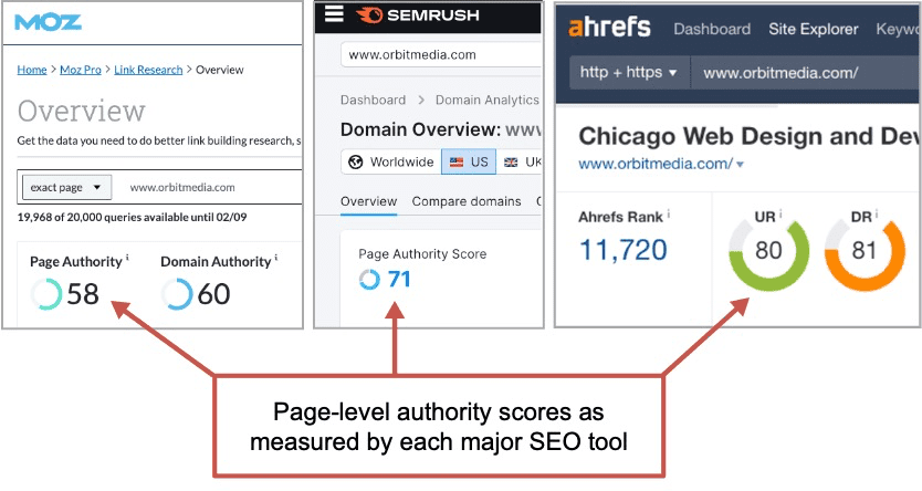
They all have different formulas (their own estimates of Google’s Page Rank), but it’s all the same idea. And the URL on almost every website with the highest score is the homepage. Here’s the takeaway:
The homepage is the page that can target the most competitive keyphrases.
As we saw above in best practice #2, the primary target keyphrase should appear in the <h1> header and the title tag. Now as we write copy for the rest of the page, we can continue to indicate relevance and improve our chances of ranking.
But to do so, we don’t just shoehorn in the target phrase another ten times. That would be keyword stuffing. This kind of spam doesn’t help your rankings, and it wrecks your writing. Don’t do it.
Instead, we want to write a detailed, comprehensive page that touches on the topics related to our target keyphrase. This is called semantic SEO, and it’s wonderful for both rankings and readers.
You can find these semantically related phrases using an SEO tool (MarketMuse, SEMrush SEO Writing Assistant, etc.) or just search for the target phrase and look closely at the search results.
- Suggested searches (you’ll see them before you finish typing your query)
- People Also Ask box (questions and answers Google has identified as relevant)
- Related Searches (at the bottom of the page)
- The bolded text in the search results themselves
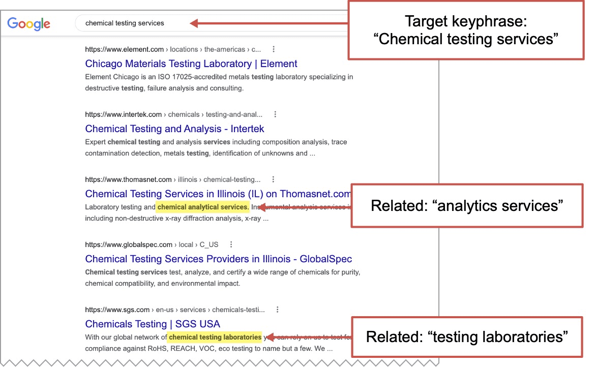
Work these into your copy. Or better yet, use them as inspiration for sections to add.
Ideally, the SEO copywriting (incorporating related phrases) overlaps with the conversion copywriting (answering top sales questions) and your homepage both ranks and converts like a champ.
13. Faces of people
Here’s a less obvious way to set your brand apart from competitors: show your team. Yours is the only company with your people, after all.
In the ideal website visit, the visitor feels a connection. This is unlikely unless your brand has a human face.
For a lot of brands, social media content looks like a party. So many faces! Real people!
But the homepage looks like an abandoned ship. Where’d everybody go?
There are many opportunities to add humanity. Virtually every pageblock at every scroll depth is an opportunity to put a face with the brand.
- Homepage hero
Replace the stock photo with an actual employee, with their name, title and tenure. - Videos
The thumbnail as well as the in video itself. - Team section
Just a row of faces with names under each. Add tenure and title. Let it be a broad representation of your team. Show diversity in every way. - Testimonials
If possible, show their face. If possible, upgrade to video. And if possible, make the testimonial assuage a likely concern the visitor might have. They’re the best messenger for certain messages. - Personal statement
It looks and feels like a testimonial, but the speaker is someone from your company. Here you can get personal about the mission or values. Or simply adapt a boring bit of copy into one that feels real. The key is to put the message in quotes. When a message appears in quotes, it feels more credible. Quotes are the most powerful key on your keyboard.

14. Testimonials/Social proof
These next two best practices are about evidence. We’ll start with the qualitative evidence, social proof, which we touched on above as we added faces to our page.
Social proof is third-party validation from a human. On a product site, it’s reviews. On a lead generation website, it’s testimonials. Social proof from an influencer is an endorsement.
They all leverage the same psychology: the conformity bias. This works best if you…
- Add testimonials near the copy they support
Example: Below a section about your detailed process, add a quote from a customer about how surprised they were at - Make the testimonial as human as possible
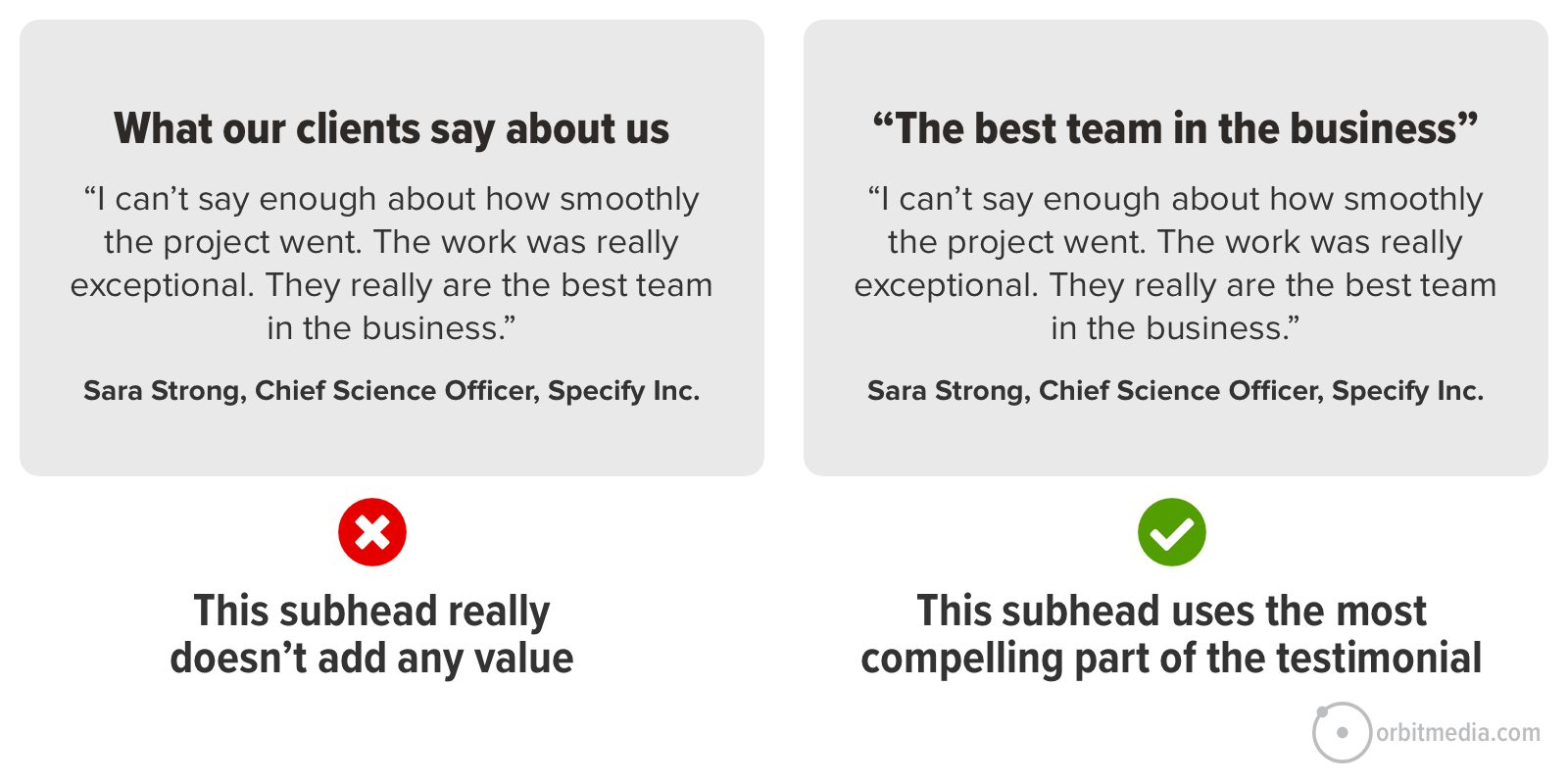
If you can’t shoot a video, add their picture. If you can’t use their name, use their initials. If you can’t use their company, name their industry. Accept your limitations, add it and move on. If you’re struggling to collect these, check out our detailed guide with tips for gathering testimonials. - Make the subhead a quote
If the subhead says “Testimonials” or “What our clients say” then visitors are likely to just keep scrolling and not read the social proof at all. But if the subhead says “Your team really is the best” in big letters and in quotes, they’ll read it even if they don’t slow down.
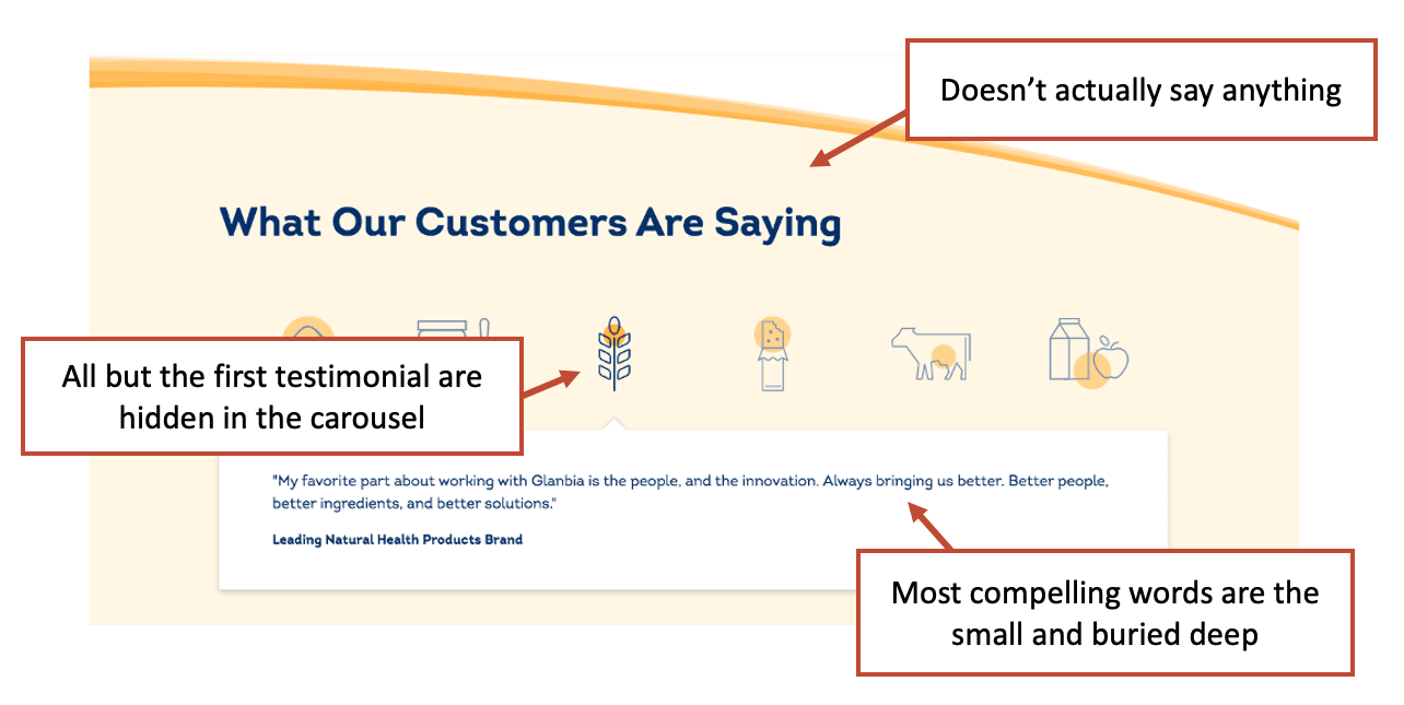
- Avoid testimonial carousels
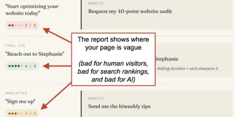
If you tuck testimonials two or three of these behind the first one in a slider, visitors aren’t that likely to see them. They’ve been hidden behind the click. If they were simply stacked, more visitors would see them. You can confirm this for yourself by tracking clicks on the “next” button. Typically, just 5% of visitors will click to see the second testimonial.
Here’s an example of all the mistakes, all in one place. Just imagine how much more effective you could make this.
15. Supportive data
This is quantitative evidence. It’s often easier to add and the “stats block” has become very common on website homepages.
- Years in business
- Projects completed
- Number of happy clients
- Number of locations
- Number of team members
- Return on investment: Revenue generated, hours saved, etc.
The list goes on and on. The best statistics will be those most relevant to your brand. An innovator may show their number of patents. A test preparation may show their college placement rate.
Find out from the sales team what data helps them win in the sales conversations, then add those in a prominent location to your homepage.
16. Blog/Resources
Your homepage is the one place (besides your blog) to feature your content marketing program. Remember, these are the visitors you know the least about. So give everything, including content. 43% of lead generation websites put articles on their homepages.
Warning: They may work on homepages, but be careful adding blog posts to deeper service pages. If the visitor clicks to read an article, they’re moving from a page built to sell to a page built to teach. They’re moving backward, up the funnel.
Add blog posts farther down, closer to the bottom of the homepage. You’ve already told them who you are, what you do and how well you do it. Now share more about what you’re thinking.
- Case studies are better than articles
This is the one content format that directly supports lead generation. Most articles do not. Case studies are little stories that make the service real. The format (problem, solution, result) requires no imagination from the visitor. - Don’t add posts from a dead blog
Especially if dates are visible, this is a negative. Only build blog posts into the homepage if you have an active content marketing program. Better to have no posts than really old posts. - Blog post blocks shift keyphrase relevance
If the homepage automatically shows the last few articles, then the keyphrases on the homepage will change slightly all the time. The page is more relevant for the target phrase if the latest posts mention it in their titles. If not, the page becomes slightly less relevant.
This can explain why homepage rankings jump around, especially if the page doesn’t have a lot of other copy.
You can avoid this SEO issue by using a page block/module that lets you feature specific blog posts rather than automatically showing the latest. Curation is more work, but always better than automation.
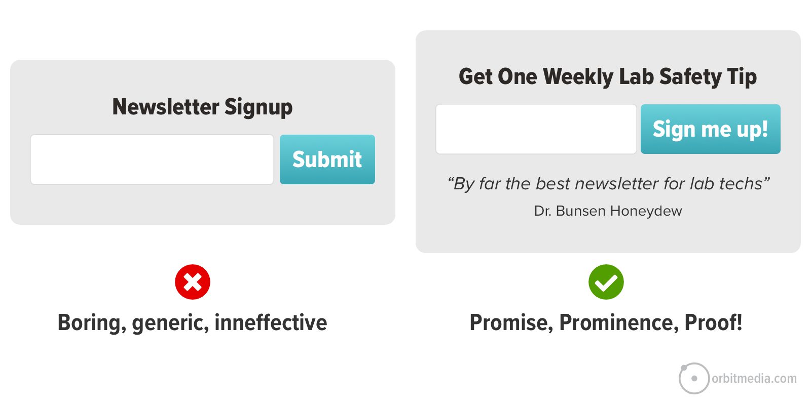
17. Subscribe Call to Action
This is also only for brands with active content programs. Because every signup CTA is a promise. And its success is a huge factor in the success of your email marketing program.
The best homepage designs add a few other elements to the promise and together, they are the 3 P’s of Email Signup Forms:
- Promise: Specify the topic, letting the visitor know what they’ll get if they subscribe.
- Prominence: The form visually stands out by using a contrasting color or surrounding it with white space. Pop ups are prominent but pesky.
- Proof: Add a bit of social proof, letting the visitor know that others have subscribed. If you have a lot of subscribers, show the number (Join the 1000+ lab techs who get weekly tips…). If you have few subscribers, get a testimonial (“This is the one lab safety newsletter I always read”)
Here’s what signup CTAs look like in a great web design, on the homepage or anywhere.
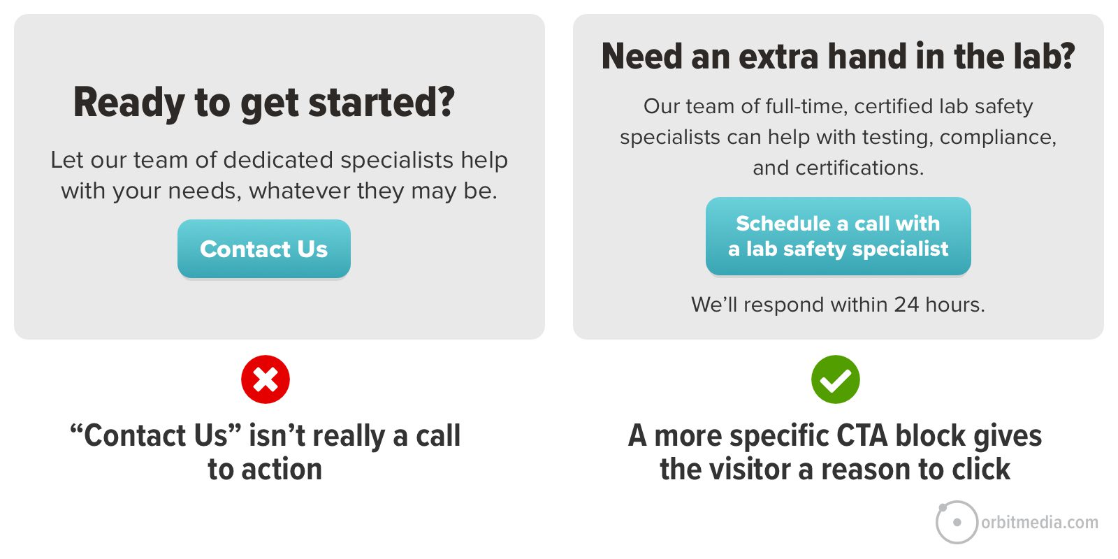
18. Final Call to Action
The best lead generation websites have hard working, high clickthrough rate calls to action. The CTR of your CTA directly impacts ROI.
Adding a CTA block right above the footer has become an almost standard design feature of marketing websites. It’s a smart and simple way to make sure that every URL ends with an offer to help. You never know when a visitor will decide that they’re ready to reach out.
As with the email signup CTAs, specificity makes a difference. Rather than a generic CTA that any website could use, make the CTA specific to your brand. Better yet, they’re specific to the page, if possible.
Here are a few other ways to increase the clickthrough rates of a homepage CTA.
- Reduce the commitment
“Schedule a call…” sounds like no big deal. - Increase the perceived value
“…with a laboratory auditing specialist” sounds high value - Commit to a response time
“We’ll be in touch in 1-2 business days” sounds like your serious
19. Chatbot
You can find chatbots on homepages everywhere. 11% of homepages have chatbots with more coming online everyday. It’s becoming a common feature in marketing automation software.
The idea is to give visitors an alternate way to interact with the website, providing another path toward conversion. More ways to convert may drive a higher conversion rate.
Veteran digital marketer, Alex Birkett, told us about his experience using chatbots at several major digital marketing brands.
 |
Alex Birkett, Omniscient“For B2B homepages, I’ve loved using a hybrid live chat/chatbot widget. In user tests, they tend to be one of the first elements noticed, so if your copywriting is on-point here, it can be a massive driver of leads and conversions. It also doubles as a customer support routing system, often driving increased adoption and retention. Finally, it’s a passive form of customer research. If you mine your live chat and chatbot transcripts, you’ll uncover pain points, common patterns of questions, and the sentiment or valence of a given pain point. This can help inform content, homepage copy, and even product development.” |
So the chatbot is really about more than conversion. Chatbots drive three separate benefits:
- Conversions for lead generation
- Customer service for retention
- Listening for audience research, sentiment, content ideas and product development
The cost to you is the price of the widget. The cost to your visitor is a bit of visual noise. There is another hidden cost in your Analytics. Chatbots that flash a message in the browser tab. This can appear in your Analytics making homepage analysis more difficult.
Chatbots can (and should) have different playbooks for different pages. The homepage chatbot will have the most general playbook and ask the most open questions.
20. Footer
The homepage, like every page, ends with the footer.
Think of a footer as a user experience safety net. It catches the visitors who fell all the way to the bottom without finding what they’re looking for. So it’s your last chance to help them.
A great website footer is like tiny page unto itself, including many of the elements we’ve seen above:
- Navigation: Add links to top pages, along with the less important items such as privacy, sitemap and social media icons.
- Evidence: Add trust seals such as awards and certifications
- Calls to action: Add an email signup CTA
Of course, a footer can include all kinds of other elements. Think big. A “mega footer” can be very helpful, offering as many as 27 different design and content elements.
Things to remove from your homepage
What wasn’t on this list? Quite a few things. Here’s a quick list of things to leave off of your website’s homepage.
- Slideshows
43% of websites use them, even though they test poorly in usability studies. - Social media icons in the header
Do you want your visitor to leave and go to a social site, filled with notifications, distrations and ads? If they click it, they aren’t likely to come back soon. - Pop-Ups
6% of homepages have popup windows, but we generally don’t recommend them. They’re annoying, especially for visitors on mobile devices. Think of all the visual noise between your visitor and your content. I’ve seen sites with piles of it: cookie consent, a chatbot, allow notifications, allow location detection, login with Google and a popup. Don’t make the mobile experience worse than it already is. - Stock photos
Useful as a last resort, but far better to use something of your own - Vague copy
In the headers, the subheads, the body text and CTAs, ask yourself: Is this language specific to us? Or common to millions?
Try this AI prompt for homepage audits
Copy and paste this prompt into your favorite LLM, along with a persona for your target audience (instructions here) and a full page screenshot of your homepage (instructions here). The AI will respond with a scorecard showing how well your homepage aligns with the the recommendations in this post.
You are a web design expert, skilled in using your SEO, UX and conversion copywriting skills to evaluate homepages for their ability to both attract and engage visitors.
I’m giving you a persona and a full-page screenshot of a homepage. Evaluate the effectiveness of the homepage design using the following best practices. Score the pages alignment with each best practice on a scale of 0-5.
- Descriptive Headline: The headline should clearly state what the company does in 6-10 words, using the target keyphrase.
- Brief Introduction: Include a short value proposition that positions and differentiates the business.
- Clear Call to Action (CTA): Prominent CTA should appear high on the page
- Navigation Menu: The navigation labels are clear and descriptive
- Relevant Hero Image/Video: This should be specific to the brand or value proposition. It should be simple, uncluttered and avoid distracting elements like sliders or irrelevant promotions.
- Visual Trust Signals: The page features client logos, awards, certifications or similar badges or evidence high above the fold.
- Answers to Key Questions: The homepage should address the personas primary questions and objections, emulating a conversation with a sales rep.
- Homepage Video: The page includes one or more videos that explain the brand, services, or feature testimonials.
- SEO and Keywords: The copy is keyphrase-focused, using phrases that are semantically related to the business category and service offerings in natural, non-spammy ways.
10 Faces and Human Elements: The page shows real people, like employees or customers, to create a personal connection. It avoids the use of stock photos of people.
- Social Proof: Include testimonials or reviews with visuals, avoiding carousels for better visibility.
- Supportive Data: Present relevant statistics or case studies that strengthen the brand’s credibility.
- Content Marketing: If present, feature blog posts, events or other content formats are near the bottom of the page. If there is content, a compelling email signup CTA is nearby.
You can follow up with a subsequent prompts asking AI to make specific recommendations for improvements or even create a heatmap matrix comparing the scores of your homepage to the homepage of a competitor!
Homepage design trends final thoughts
Over our 23+ years of website design copywriting, we’ve seen a convergence of homepage design trends. The layout of homepages is slowly standardizing. All kinds of web design best practices are converging.
Probably, this is for two reasons. First, usability pros are learning what works best based on user feedback and Analytics. Second, visitor expectations are for easy, intuitive experiences.
When visual complexity is low (the homepage shows one or two things at a time) and prototypicality is high (the homepage conforms to standards and aligns with expectations) the perceived beauty is high.
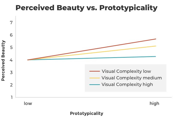
Source: Web Design Tips, Orbit Media
Of course, there are many ways and places to differentiate your brand on your homepage, as we’ve seen above. But don’t reinvent how websites are navigated. That would be frustrating for your visitors.
Set your brand apart through copywriting, evidence and humanity.
Want to see all of these homepage best practices in action?
Check out our homepage at www.orbitmedia.com
✨ BONUS! The AI prompt that turns this article into an audit ✨
Copy and paste this prompt (the whole thing) into your favorite LLM, along with a persona for your target audience (instructions here) and a full page screenshot of your homepage (instructions here). The AI will respond with a scorecard showing how well your homepage aligns with the the recommendations above. Easy peasy lemon squeezy.
You are a web design expert, skilled in using your SEO, UX and conversion copywriting skills to evaluate homepages for their ability to both attract and engage visitors. I’m giving you a persona and a full-page screenshot of a homepage. Evaluate the effectiveness of the homepage design using the following best practices. Score the pages alignment with each best practice on a scale of 0-5.
1. Descriptive headline: The headline should clearly state what the company does in 6-10 words, using the target keyphrase.
2. Brief introduction: Include a short value proposition that positions and differentiates the business.
3. Clear Call to Action (CTA): Prominent CTA should appear high on the page
4. Navigation menu: The navigation labels are clear and descriptive
5. Relevant hero image/video: This should be specific to the brand or value proposition. It should be simple, uncluttered and avoid distracting elements like sliders or irrelevant promotions.
6. Visual trust signals: The page features client logos, awards, certifications or similar badges or evidence high above the fold.
7. Answers to key questions: The homepage should address the personas primary questions and objections, emulating a conversation with a sales rep.
8. Homepage video: The page includes one or more videos that explain the brand, services, or feature testimonials.
9. SEO and keywords: The copy is keyphrase-focused, using phrases that are semantically related to the business category and service offerings in natural, non-spammy ways.
10. Faces and human elements: The page shows real people, like employees or customers, to create a personal connection. It avoids the use of stock photos of people.
11. Social proof: Include testimonials or reviews with visuals, avoiding carousels for better visibility.
12. Supportive Data: Present relevant statistics or case studies that strengthen the brand’s credibility.
13. Content marketing: If present, feature blog posts, events or other content formats are near the bottom of the page. If there is content, a compelling email signup CTA is nearby.
You can follow up with a subsequent prompts asking AI to make specific recommendations for improvements or even create a heatmap matrix comparing the scores of your homepage to the homepage of a competitor!