When guests come to your home, you want to make a good first impression right? You wouldn’t invite people over for dinner with a cluttered house and then not feed them would you? The same should hold true for your website.
You only have a short amount of time to grab a visitors attention. According to Neilson Norman Group, users will likely read 20% of the words on a page. If your website is cluttered and doesn’t have a clear message or call to action, folks won’t be sticking around for the main course.
Here are 15 ways to improve your website, increase conversions, and make your guests want to visit you again.
1. Add a Value Proposition
The value proposition, or mission statement, tells the visitor what you do and why you do it.
Put your value proposition on your home page, in your headline if possible. Add it to your blog or about page. Let the visitors know exactly what they will be getting if they hire you, buy your product, subscribe to your newsletter or read your blog.
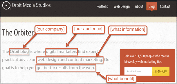
Joe Pullizzi, over at Content Marketing Institute, tells us exactly what we should include in our mission statement:
[our company] is where
[our audience] gets
[what information] that offers
[what benefit].
Orbit’s content marketing mission statement states:
The Orbit blog [our company] is where digital marketers [our audience] can find expert, practical advice on web design and content marketing [what information]. Our goal is to help you get better results from the web [what benefit].
2. Website Navigation
The navigation on your website serves two purposes;
-
it helps the user find what they’re looking for
-
it helps your search engine rankings
Your visitors should come first, search engines second. Be human. Use descriptive navigation instead of generic “What We Do” text. Use words that your visitors would use and words that your visitors are searching for. It’s fewer clicks for the user and helps search engines indicate your relevance.
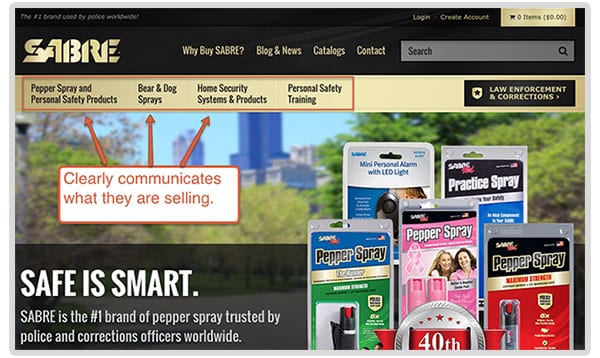
This is a great example. When you get to their website, you know exactly what they are offering; pepper spray and safety products.
Pro tip: Don’t use jargon or internal lingo. Companies try to be clever instead of being empathetic to their visitors. No one knows what “RTT Buzz” means. Is that your blog? Say “Blog” then.
Empathy is the greatest marketing skill.
Here are 9 other tips on Website Navigation Best Practices.
3. Call to Action Text
The call to action, or CTA, is huge. You’ve got your users on the site, they’re interested, now what do you want them to do? Tell them!
Buttons are for actions, like “Get a quote,” “Download,” “Open an account,” “Go to checkout.” The text on the button should begin with a verb. Otherwise it’s not a call to action, just a button with some text on it. “More information” for example, is not a call to action. – David Hamill
Use the 1st person voice (I, me, my) to let the users tell the CTA what to do. Example: Download My Guide. Another effective approach is using the WYLTIWLT (Wilty Wilt) test.
According to Jonathan Richards, “one practical solution is to say that the words on a button must make sense after both the interrogative “Would you like to…?” (where the publisher speaks) as well as the conditional “I would like to…” (where the user speaks).”
You should be able to evaluate every button you create using this test.
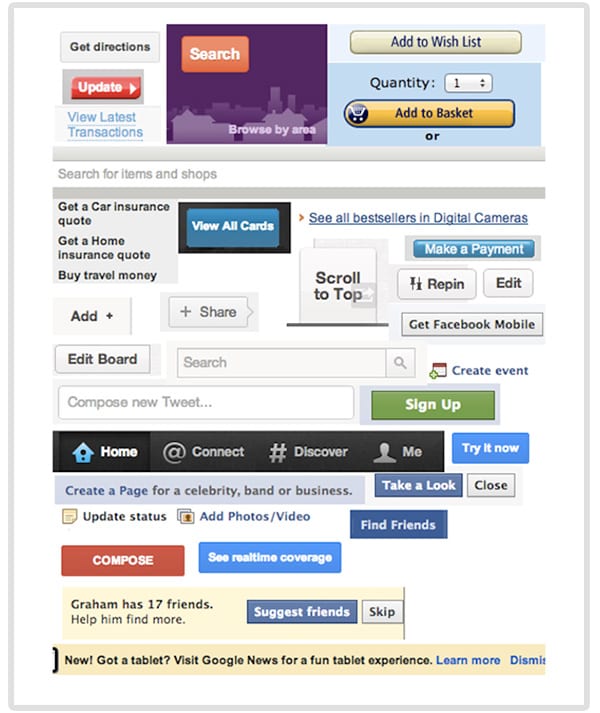
Image credit: The Grammar of Interactivity, UXBooth
Note: every button/CTA on Facebook passes the WYLTIWLT test.
If you’re not sure how to word your buttons, I recommend reading How to Design a Button.
4. Call to Action Colors
Find an accent or contrasting color for your call to action buttons. For example, if your site is predominately blue or light blue, find a nice yellow or a warm orange that accents your color palette, while calling attention to itself.
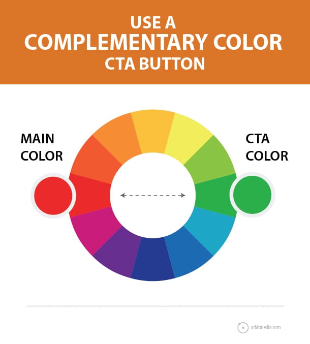
If you can give your user a better idea of what they can click on and what might happen when they do, they’re going to be more likely to take the risk.
5. Try The 10-Foot Test
Ok, time for a little exercise. Pull up your home page. Now get up from your desk and take ten steps back from your computer. Can you tell what your company does at a glance? Better yet, have someone else try it. Can they?
If not, you need to tighten up your messaging. Be specific. Don’t try to be clever.
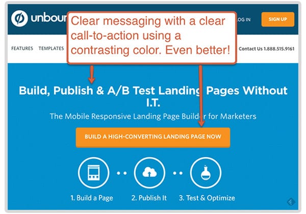
Unbounce does this well. When you go to their site you know exactly what you’re getting: I can build landing pages for A/B testing and I don’t have to be a tech genius to implement it. Got it!
6. Carousels
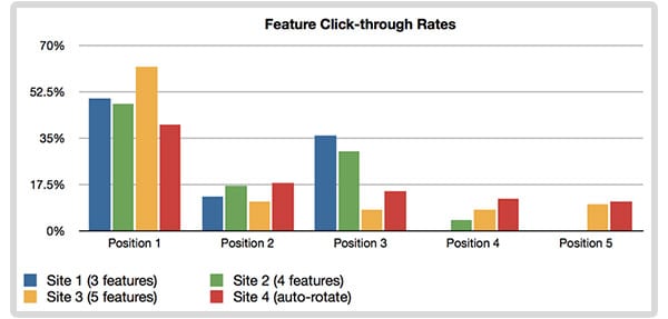
Everyone seems to have an opinion about whether or not you should use carousels on your website. But first, you should take a look at the data and context of which they are used and then make a decision on whether or not they are relevant to your users.
According to this study by Erik Runyon, user interaction greatly decreases after the first slide. Not really shocking, but almost no one makes it to the fourth or fifth slide. If you do decide that carousels are needed on your site, keep it to three at most.
Erik also warns against auto-forwarding slides. Tim Ash, a top conversion rate expert, agrees.
It seems counter-intuitive, but motion actually distracts visitors.
“The human brain is hard-wired to notice the onset of motion, which makes rotating banners especially distracting. We literally cannot tune them out.”
Does that mean you shouldn’t have a carousel on your site? Not necessarily. Take into account the message, context and design.
According to Smashing Magazine, using a carousel for image galleries on a product detail page may be very useful to your visitors that are browsing on a mobile device. An auto-forwarding homepage slideshow with weak calls to action probably aren’t as useful.
Do your slides bring value? If the answer is no, then 86 them!
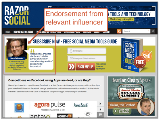
7. Social Proof
Use social proof to entice people to sign up for your newsletter or download an ebook. Have influencers in your industry provide a quote or testimonial like Ian Cleary of Razor Social does.
8. Testimonial Pages
Let’s face it, no one is going to go to your “Testimonials” page. When was the last time you clicked on someone else’s? Exactly.
If you have great clients that say great things about you, that’s amazing and it should be seen. The best way to do this is to scatter it throughout your site. If you use case studies or video testimonials, find a way to tuck them in there, or on product pages.
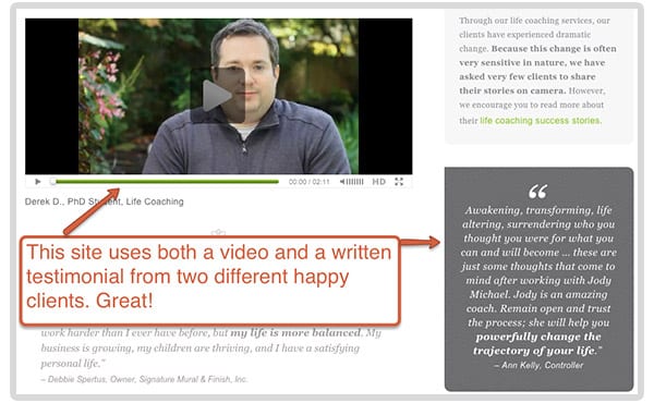
The point is that no one is going to go looking for pages that praise you. You need to find ways to bring the good things folks are saying about you to the forefront. If you need help, read this complete guide to website testimonials.
9. Team Pages
People want to know, like and trust you before they buy from you. Let the visitor know who’s behind the scenes in your company and what your culture is all about. At the end of the day, people do business with people so let your visitors see who they’ll be doing business with.
Using individual team pages also gives you a chance to rank in search engines when people search for your name specifically. If you have all of your team members on one page, there’s no way Google will know which person to rank that page for.
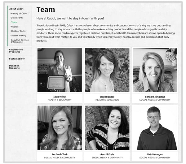
Google doesn’t rank websites, it ranks web pages.
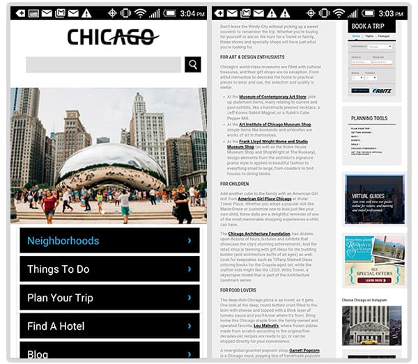
10. Mobile-friendly
Having a mobile-friendly site used to be a “should have,” now it’s a “must have.” On April 21st, Google updated their mobile search rankings algorithm. Mobile-friendly web pages will now rank higher in mobile search results versus non mobile-friendly pages. You can read all about it here.
There’s a reason Google did this. They want the user to have a good experience when they land on your website. If you have a site that has tiny links and the site is hard to navigate, people are not going to want to stay on your site. You’ve done the pinch and zoom. It’s not very pleasant.
Which site are you likely to have a better experience on?
11. Internal Linking
Don’t let your visitors hit a dead end on your site. Always keep them (and search engine robots) moving. On your service pages add a simple call to action with a link to your contact form.
On the home page, you should link to service pages. Include the name of the service page in the link so the user knows what to expect when they click that link.
Check out this complete guide to internal linking for additional tips.
12. Email Sign Up Forms
Your sign up forms should contain the 3 P’s: visually prominent, offer proof and promise something. Make it obvious and clear what they are signing up for. It’s better to have a smaller amount of engaged users who are there because they want to be than a large pool of folks who were baited.
Here’s an example from Content Marketing Institute:
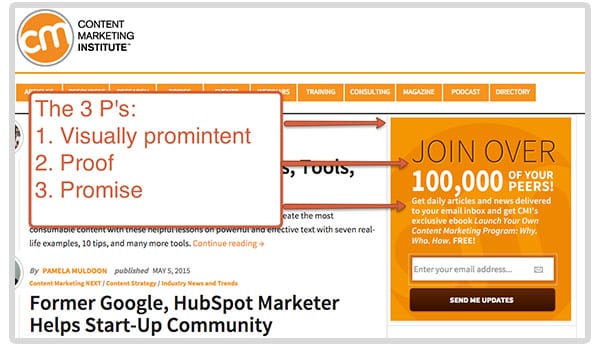
This is very visually prominent on the page, they show proof by telling you that 100,000 of your peers subscribe to their list, and they promise that if you sign up you’ll get daily articles and an ebook. Check!
13. Forget The Fold
People tend to get stuck in this mindset that no one scrolls below the fold. That’s not true and there are many studies that prove this.
Scrolling is the single most natural action users take on the internet. Yes, more attention is paid to things above the fold because it’s the first thing you see, but that doesn’t mean people don’t scroll and it doesn’t mean you have to stuff everything “above the fold.”
Put your most important messaging at the top and give your users a reason to scroll if needed. If you try to cram everything above the fold, you’re going to end up with a page that looks like this…
Unless you really want to purchase a hovercraft, would you want to stay on this page any longer than you had to? Probably not.
14. Email Addresses vs. Contact Forms
If you’re interested in collecting data and tracking conversions, you should be using a contact form. With every form, you should have a unique thank you page. This way you can set up goals in your analytics and track where your conversions are coming from.
Here’s what your conversion tracking will look like in Google Analytics:
![]()
In addition to tracking conversions, it’s easier for most users to fill out a contact form. If the users clicks on an email address on your website, it opens up whatever default email program is on your computer.
I use Gmail, but my default on my computer is Mail. Any time I have to click an email address it automatically opens up Mail. Then I have to copy and paste the email into my Gmail to send a message. Not the best user experience.
Note: there are ways to set your default email options, but for the average non-techy user it’s not as easy as it may seem.
Another user benefit is knowing that your message was received through an “auto response” email. When you send an email directly, you have no way of knowing if they received your message or not until the person responds.
If you’re not sure how to set up goals or track campaigns, check out this post on How to Set Up Google Analytics and How to Track Campaign in Analytics.
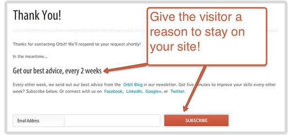
15. Thank You Pages
This is one of my favorites. It’s one of the most overlooked, yet effective ways to keep people engaged (and it’s easy to implement). Thank you pages give you an opportunity to have the user sign up for your newsletter, download an ebook, give them a coupon code, add a video, follow you on social media, etc…
A couple of years ago, we added a newsletter sign up to our contact form thank you page. It looks like this:
Here are the results:
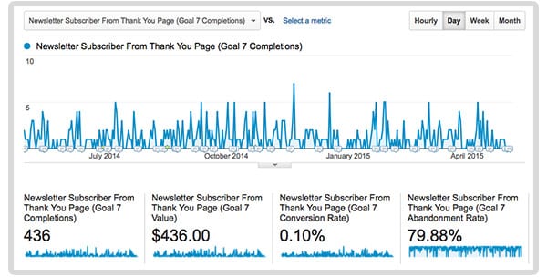
We get almost 500 newsletter subscribers a year, just by adding a simple “subscribe” button. If you’re an ecommerce site, offer a coupon code if they refer a friend. See what the results are. There’s almost no cost to add this, but could pay off exponentially.
Anyone For Dessert?
Hopefully, you gave your guests a good reason to come back and visit or at least stick around for dessert. If you have any tricks or tips, we’d love to hear them in the comments below.