It’s a fancy sounding word, isn’t it? It’s closely related to some even fancier terms like behavioral economics, persuasion research and social psychology. Here’s a quick definition.
Neuromarketing (noun) : The science of using cognitive biases to influence the decision making process of consumers in marketing.
In web design, the goal of neuromarketing is to increase conversion rates and the percentage of visitors who take action by using specific cognitive biases in the design and content of the website.
Neuromarketing from Andy Crestodina on Vimeo.
Here is a list of 15 neuromarketing tactics that any website can use. Each is based on a specific bias. Most of these are simple, subtle, and very common if you know where to look. Every marketing website should be using at least a few of these tactics.
The Conformity Bias: Use Social Proof
We are all naturally inclined to do what others do. It’s called the “conformity bias.” For better or worse, it’s how our brains work. Marketers have played to this bias for more than a century by using social proof.
“When people are free to do as they please, they usually imitate each other.” – Eric Hoffer
Social proof is evidence of legitimacy. Simply show that others have chosen your product or service. The goal of social proof is to make any choice other than buying from you seem abnormal. It would be weird for visitors not to choose your brand.
It’s the most common type of neuromarketing in web design because it’s easy to do. Everybody is using social proof on their websites. You should too!
1. Testimonials
Testimonials use the words of your audience to give evidence of your quality. They are, by definition, more credible than your marketing copy since the language is authentic.
When you say it, it’s marketing.
When they say it, it’s social proof.
The best place for a testimonial is on the page of the product or service it relates to. Here, they can support the assertions you make on that page. Think of them as supportive evidence as you make your case. Your audience is testifying for you.
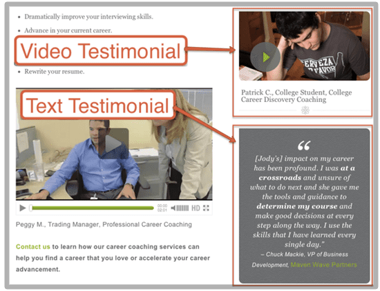
The Jody Michael Associates website has video and text testimonials on every service page.
Pro Tip: Never make a testimonials page. These pages tend to have low traffic since visitors don’t visit websites to read testimonials. Testimonials are weak when you put them all together. They are strong when they appear throughout the site.
More insights in our complete guide: How to Find and Use Testimonials (with 10 Testimonial Examples)
2. Endorsements and the Halo Effect
If someone with a strong reputation likes your brand, show it. It makes you more credible through association. It’s called the “halo effect.” The positive impression the visitor has of them rubs off on you.
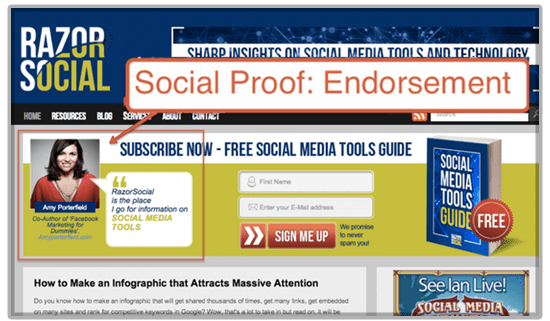
Ian Clery’s Razor Social puts endorsements on the home page.
Endorsements are everywhere these days. A few kind words from a tweet can easily be copied and pasted into a web page.
Pro Tip: In Twitter, use the “favorite” button (the little star) to collect kind words people have said about your brand. When you favorite a tweet, it shows that you’re grateful for the compliment, but also makes it easier to find later. Just go back and look at your favorited tweets. It will be there, waiting to be added to your site.
3. Social Media Shares
This is a common type of social proof found on blogs everywhere. Social media sharing buttons often show the number of shares across your various social networks. Counters that show the number of comments have the same effect.
“Wow, this was tweeted 85 times? It must be good…”
Warning: Do not use widgets that show the shares or comments if the numbers are low.
“Whoa, zero people have tweeted this post? I’m leaving this ghost town…”
4. Social Media Widgets
Some social widgets do more than show the numbers. They show the people. The Facebook box shows who in your network likes that website. This is powerful proof because you know these people.
“Hey, Kurt likes Axe Body Wash? It must be good…”
5. Trust Seals: Certifications, Memberships, and Awards
Faces are great. Logos are good too. Industry associations, chambers of commerce, BBB, certifications, and awards are all trust-building credentials.
Put them all together (in a “trust box”) on an important page (like the home page), but not in a prominent place (the footer is fine). Also, here’s an example of a nice awards page.
“They’re members of all these groups? They’re probably legit.”
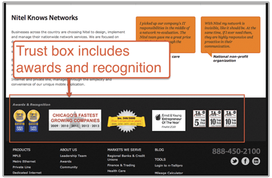
The Nitel Carrier Service website footer includes awards and recognition (also, notice the testimonials).
6. Number of Happy Customers
Think of the McDonalds sign, “Billions Served.” Tell visitors how many customers you’ve helped. Specific numbers look more credible; very large numbers may make you look like McDonalds.
“They launched 72 websites last year? They must know what they’re doing”
7. “Our Most Popular” Best-Seller
The popularity contest is everywhere. Just look at books, music, and movies: New York Times Best Seller List, The Billboard 100, highest grossing movie at the box office. The idea is simply to show that others are buying.
-
Ecommerce sites: create a “best selling” product category. Also add information about popularity to the product descriptions of the best sellers.
-
Software subscription websites: on your pricing page, indicate which option is most popular.
-
Blogs: use a widget showing “what’s hot,” most popular, and most commented.
-
Bloggers: write a roundup of your top posts
8. Studies and Statistics
Numbers sound scientific and build credibility quickly, especially odd numbers. Also, numerals stand out in a line of letters, attracting attention. Find the one statistic that emphasizes the importance of what you do and make it prominent on your site.
Can’t find one? Create your own. Studies used in marketing aren’t necessarily rigorous. A short survey of 100 people can help you find a super compelling statistic. And who knows what else you might learn.
“4 out of 5 marketers recommend using short surveys to create statistics”
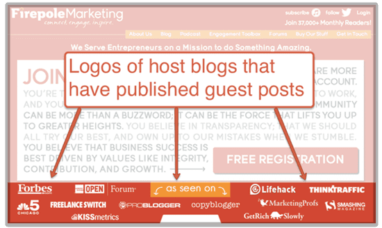
9. “As Seen In” Press Mentions
Just like an endorsement, a write up in the press builds credibility. But press mentions come and goes quickly. In the end, few people in your audience are likely to see the piece.
So the best way to get durable value from a press mention is to add an “as seen in” logo to your website. For web marketers, this is one of the biggest benefits of PR.
Pro Tip: Guest blogging is a type of PR, so the placement of a guest post can also create an “as seen in” opportunity. Take a look at how Danny Iny catalogs his incredible guest blogging career on the home page of his site, Mirasee.
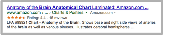
10. Reviews
Star reviews are standard on big ecommerce sites. They show visitors that others like the products. Stars also appear in Google search results, as long as the pages are tagged properly with “microformatting.” This can provide a small traffic boost, since the product pages are more visually prominent in Google when they rank.
The Anchoring Bias: Use Priming
The human brain tends to over-rely on the first piece of information it receives when making decisions. We are “anchored” to this first piece of data. All subsequent information is viewed in the context of the first.
So marketers “prime” their audiences through context. If you see big numbers up front, you’re thinking big. Small numbers? You’re thinking small. This is why priming is important in pricing and negotiations.
11. Plans and Pricing Pages
How did Williams-Sonoma nearly double the sales of their high-end breadmaker? They added an even more expensive model. This set price expectations of shoppers higher, making the second most expensive option seem more affordable.
Consider how these two pricing pages put visitors in different mindsets…

$22 seems like a lot to me…
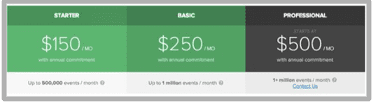
$150 sounds pretty reasonable!
Anchoring can easily backfire on ecommerce websites. A big price discount on the home page may put visitors in a price-sensitive mood. Make sure there is always at least one higher-priced product on your home page.
The Loss Aversion Bias: Use Scarcity
When making decisions, the brain tends to overvalue loses and undervalue gains. We are generally more worried about losing something than excited about gaining something. This bias is called “loss aversion.”
Loss aversion is so powerful, shoppers who are normally courteous will literally trample each other to death during the holidays. According to Black Friday Death Count, there was only one death in 2013, down from two in 2012. Why do we do this? We’re scared we’ll miss an opportunity to buy at a discount.
It’s an easy neuromarketing technique to work into web design. The goal is to remind people what they will lose by not buying or becoming a lead, or to create urgency by indicating scarcity.
12. Limited Supply
Scarcity makes people worried they’ll miss their chance. This is called #FOMO or “fear of missing out.” If you have a limited supply, be sure to let visitors know (“This event sold out last time”).
Many marketers selling products with unlimited supplies, create artificial scarcity. For example, Amazon offers “in stock protection” to many publishers, allowing them to print on demand and ship even if they don’t have a book in stock. That’s an unlimited supply! But they still show inventory to indicate the current physical supplies are limited.
Here’s another company that’s good at using scarcity and loss aversion. (Also, notice the social proof).
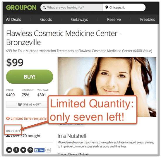
I doubt if this place is really going to run out of microdermabrasion treatments, so it’s artificial scarcity.
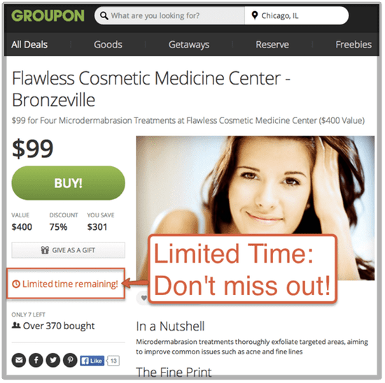
13. Early Bird Registration, Countdown Clocks, Sale Ends Saturday
Time is always scarce. If you have an offer that expires, let visitors know. Ecommerce sites selling holiday gifts can let visitors know how many days they have left to order in time to get it there. This works for every holiday. (By the way, every day is a holiday. Happy Northern Hemisphere Hoodie-Hoo Day!)
Loss aversion is also the psychology behind early bird registration. This second deadline and a second chance to make visitors feel they may lose an opportunity.
Here’s how the same Groupon offer creates urgency…
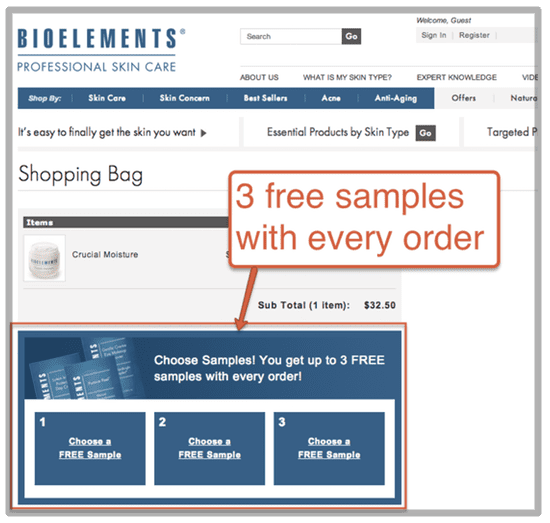
14. Trial Periods, Free Samples, and the Endowment Effect
People will pay more to keep something they already have than to get something they don’t already own. This is called the “endowment effect” and it works both online and offline.
The idea is to get the product or service into the hands of the customer, knowing that once they have it, they’ll feel ownership of it …and they’ll feel loss at the idea of giving it up.
Sites that offer free trials can take advantage of this with a “Don’t lose your access to…” call to action. It’s because of the endowment effect that subscription websites offer free trials. Sites that sell books offer free chapters. Ecommerce sites offer free samples.
Bioelements lets visitors choose free samples in the shopping cart…
The Von Restorff Effect: Use Action Colors
Neuromarketers and usability pros use special cameras to track eye movements on web pages. The goal is to discover what visitors look at (and don’t) to guide design decisions and get better results.
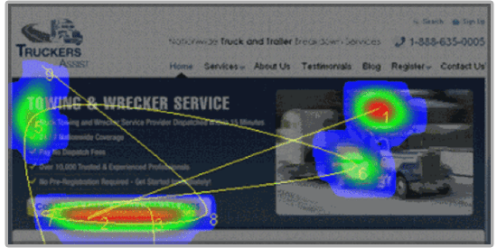
Let’s look at an eye tracking study to see what web design tricks we can learn.
15. Colors and Action
In 1933, psychiatrist and researcher Hedwig Von Restorff published a paper explaining how visually prominent items are more likely to be remembered. It’s called the “isolation effect” and it works because the eye and brain are constantly scanning for interruptions in patterns.
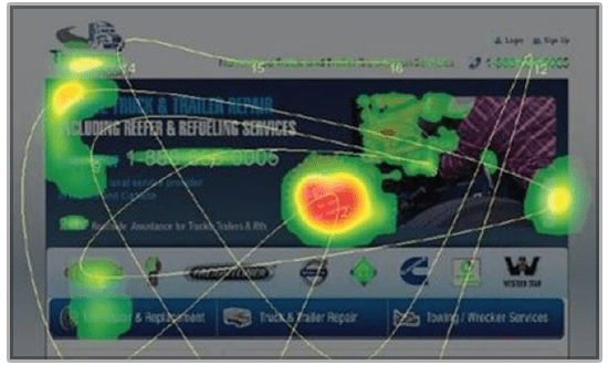
It’s relevant to color selection in web design and supported by this well known eye tracking study. Here is a web page where a large callout is used (NO FEES), a series of logos, and a call to action with a phone number…
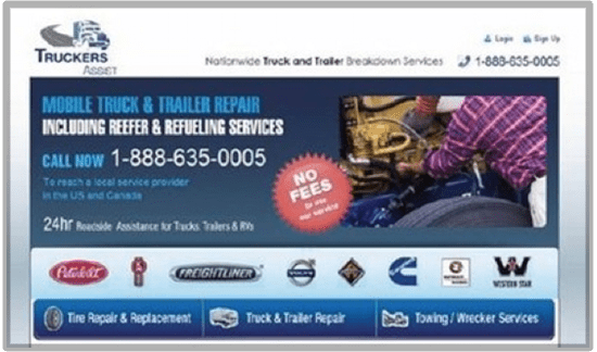
Here’s what the eye tracking study revealed. Visitors attention is pulled toward the color and the logos. Few visitors looked at the call to action…
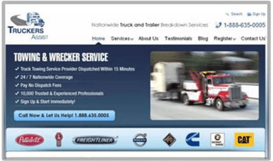
Lets try it again without the big red call out, with a bigger call to action (the light blue box with the phone number) and with a different picture…
Now let’s look at the eye tracking results…
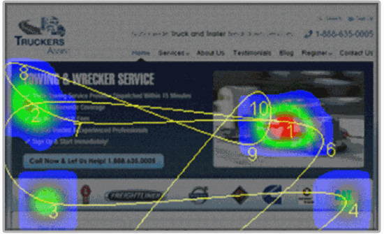
You can see that the big red truck is pulling the eyes toward it. So are the red logos. Since most of the site is blue, you can see the Von Restorff effect in action.
One more try with a blue truck, no logos, and a call to action in a contrasting color…
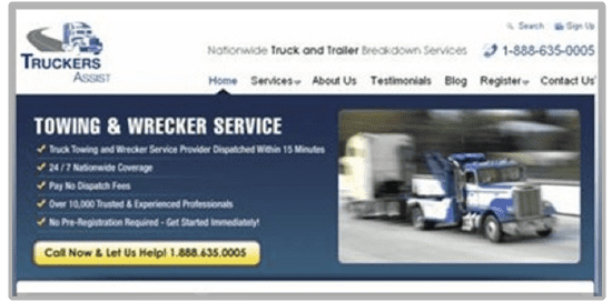
And the study shows…
…that now the desired action is the center of attention. By removing distracting elements and colors, the visitors eyes are successfully guided to the call to action.
Using an “action color” that contrasts with the brand and the design itself is just one of many ways that web designers can guide visitors toward successful outcomes. Find a good designer and trust them!
Brilliant? Or Creepy?
Some brain science-based web design techniques make a huge difference. Others are so subtle, they may give only a tiny improvement, making them worthwhile only if you have a lot of traffic. They might make you want to take a shower to wash off the creepiness, but once you’re aware of them, you’ll see them everywhere.
Remember, 100% of your target audience has brains. B2B or B2C, lead generation, or ecommerce, it doesn’t matter. Keep those brains in mind in your marketing. And as consumers, we should be aware of how marketers are taking advantage of our own biases.