
‘Show, don’t tell’ isn’t just a term in entertainment—it’s fundamental to content marketing and exemplified in infographic data visualizations.
As the world moves increasingly online, visuals have become the key to engaging audiences—especially as brains process images 60,000 times faster than text. But, why infographics, you may ask?
Infographics are an excellent visual tool that combines text, charts, imagery, icons, and colors to tell memorable brand stories. These data visualization examples showcase how powerful and memorable infographics can be. They also position companies to share compelling stories to attract qualified leads.
In this article, we share seven tips so you can create data infographics that will boost your brand awareness and revenue.
1. Use the right kinds of infographic data visualization
Creating infographics that are meaningful and easy to understand can be tricky. For marketing teams without much experience with design, data visualizations become a huge hurdle.
But it doesn’t have to be this way. First, you need to understand some basics, such as how many kinds of data visualizations are available:
- Charts
- Diagrams
- Maps
Now, some of these individual categories include a variety of visualizations, as well. Charts include the following:
- Bar charts
- Bubble charts
- Line charts
- Pictographs
- Pie charts
- Scatter charts
- Wordgraphs
Diagrams can also be broken down into:
- Fishbone diagrams
- Flow charts
- Mind maps
- Wireframes
With so many options available, choosing the right visual becomes an obstacle for designers and marketers—and it happens early on in the creative process. So, which visual should you use for your infographic?
To make the right choice, you need to define the point of your data and your story. That is how you can pick a visual that conveys your message.
Here’s a simple infographic that clarifies how the different infographic data visualizations work.
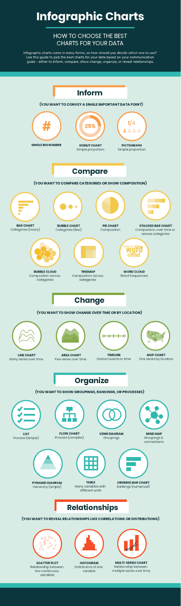
Source: Venngage
Let’s break it down further. If you have one point of data—1/4 people surveyed used our tool—a pictograph will be sufficient to depict that information.
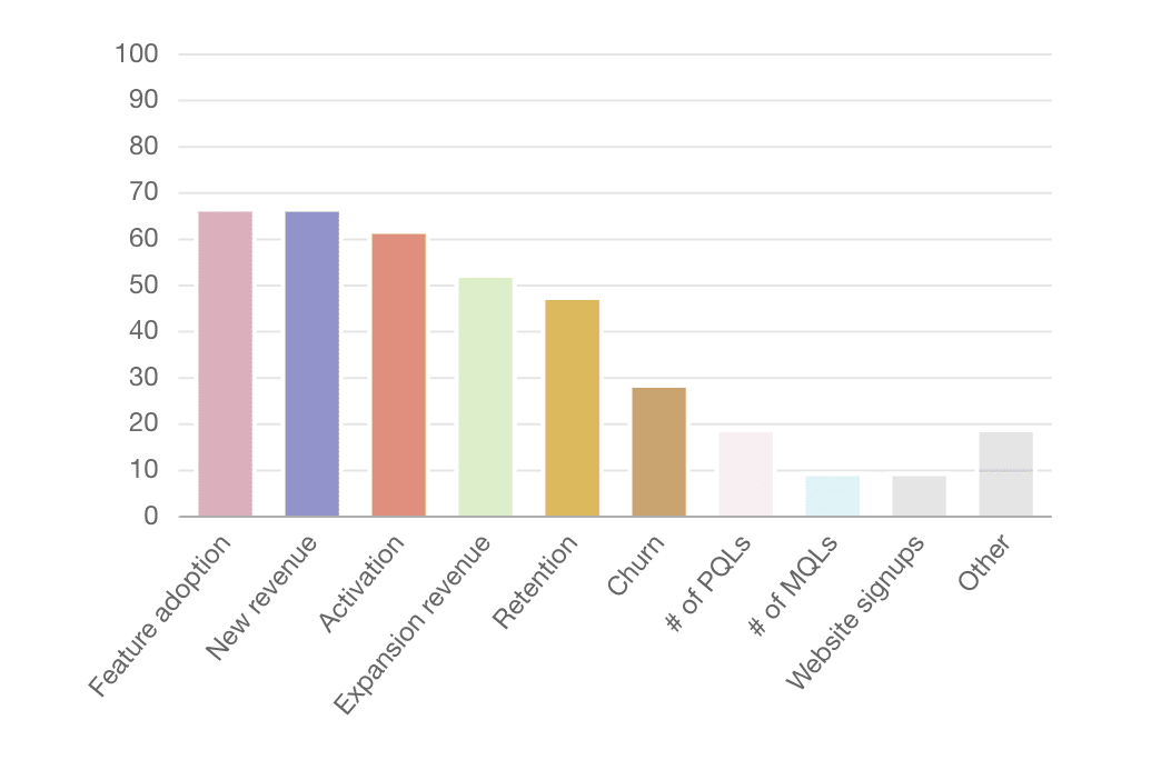
However, if you have multiple points of data that need to be compared, a bar chart will be able to convey the information to audiences better. In this product marketing chart from TryChameleon, you can see how multiple KPIs stack up against each other.
Depending on the focus of your graphic and how many data points you have to share, you can choose the right visual to share your message with prospective leads.
2. Create trust with infographic data visualization
Trust is imperative in marketing—and when you are sharing data, it becomes even more important.
One of the best ways to build trust among leads is to compile your data from credible sources, that are unbiased and objective. Also, verify your data with at least two additional sources to ensure that the studies can be replicated.
Another way to portray trustworthiness is by visualizing your infographic data correctly. Look at the graphic on fast food below. While it clearly states which companies are bringing in sales, the comparison is distorted.
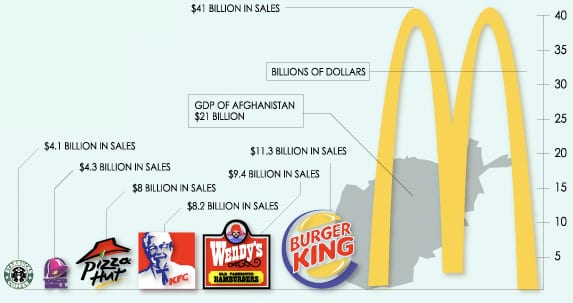
Using logos, which come in a variety of shapes, has distorted the data—because the logos can’t be transformed correctly. This leads to a massive imbalance in scale that doesn’t correspond to the numbers presented.
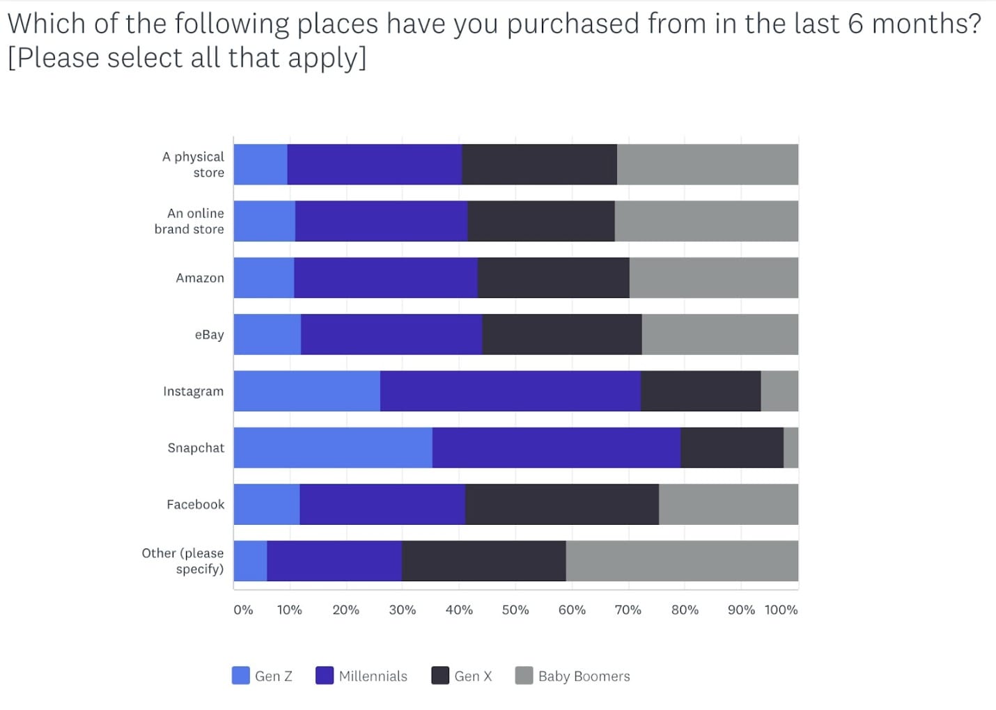
On the other hand, this stacked bar graph on digital transformation includes a clear axis and legend that shows the data at scale.
Here’s how you can avoid data distortions that could potentially lose users’ trust in your brand:
- Include a scale for your data so your information isn’t distorted
- Don’t start your data baseline at points above zero
- Don’t skew the size of the axes
- Include both axes in the graphic
- Avoid cherry-picking data to suit your message
- Pick the right charts for your data
- Stick to the norms of data visualization that your leads are accustomed to
Following these points will make it easier for you to create infographics that build trust in your leads.
3. Keep infographic data visualization simple
Designers can be tempted to create complex infographics—when you have a lot of data to share, designing a multi-layered graphic seems like the best option. But that isn’t the best way to approach design. According to a study on graphic design trends, simple infographic data visualizations are the norm.
This is because complex data should be simplified for the audience—if your design is complicated, people won’t understand it. Nor will they be able to decipher the data.
By overburdening the graphic with data, like in the example below, you run the risk of losing your audience.
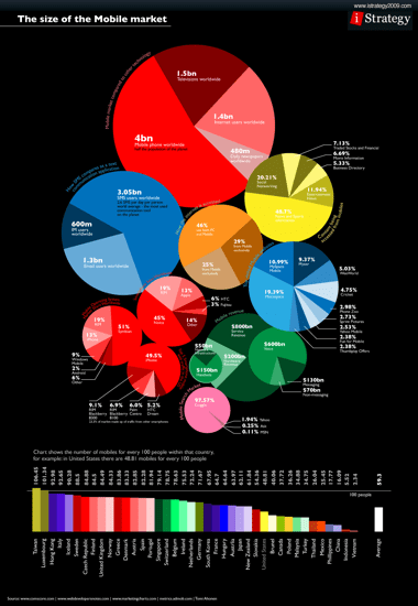
This infographic has so many colors and so many pie charts that potential leads will have no idea where to look or how the data points correspond to each other. Users will spend more time deciphering it than understanding the data—which will inevitably lead them to scroll past your content.
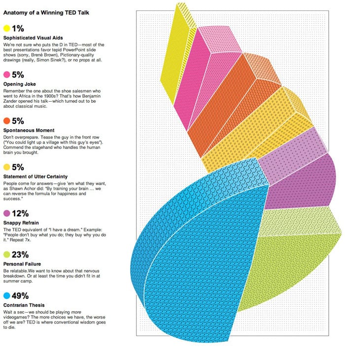
Data visualizations must stand on their own—when a person looks at it, they should be able to understand what information it includes and what the data means, like in this example.
Source: Venngage
This infographic can be easily consumed—the graphs are simple, the images are relevant to the topic, and the icons give the data context. While you can write a blog around your data to share your methodology, your data shouldn’t need additional information to make them understandable.
Infographics need to stand on their own to tell your story. With a simple visual, you can do just that and attract prospects to your brand to boost conversions.
4. Limit text in your infographic data visualization
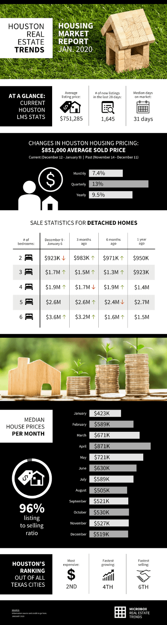
The great thing about infographics is that you can combine text and graphics to share a complex story. But when you visualize data poorly, you end up adding too much text on the graphic to explain what the data is about, like in this example.
The graphic doesn’t convey any information on its own—users have to read the sidebar to understand the data. That shouldn’t be the aim of infographic data visualizations—if you want people to read your graphic, you might as well create a blog.
The point of visual communication is to build connections between data—and to share information with as wide an audience as possible. If your charts aren’t standing on their own, then you haven’t chosen the right ones. Or, you’re trying to share more data than is necessary.
Make your data bite-sized and easy to consume, especially when you’re trying to reach multiple leads with a single graphic. The best way to do that is by using less text and more relevant visuals like icons, images, and illustrations, like in this example.
Typography and text should be a last-minute resort—used only when a visual can’t convey a data point. That is the best way to attract leads and increase conversions.
5. Using color in infographic data visualizations
Colors are an important part of visuals—they serve multiple purposes and give marketers a range of options for sharing their data. However, marketers and designers need to be careful when they incorporate colors in their infographic data visualizations.
Just because you have access to a large swathe of colors, doesn’t mean you use all of them. The color palette you choose should include a handful of colors, at the most.
Too many colors can become overwhelming, while too few will create connections between data that don’t exist. Three to five colors should be more than enough to convey information.
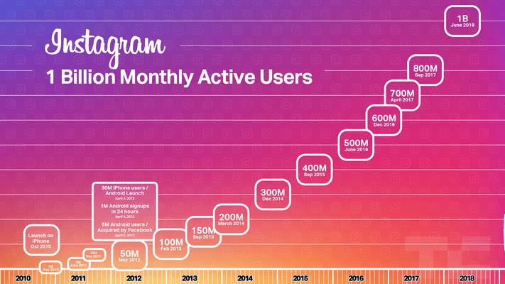
Keep your brand colors in mind when choosing colors—you don’t want to choose a palette that is similar to a competitor’s. Look at these Instagram statistics and how they use the brand colors for the platform to illustrate the chart.
You could also use different hues of one color. Or reduce color transparency to give your visuals more range. Remember that colors must have a purpose within your design—to convey information or to evoke a particular feeling within the user.
If you want to know how to choose a color palette, you can refer to this graphic.
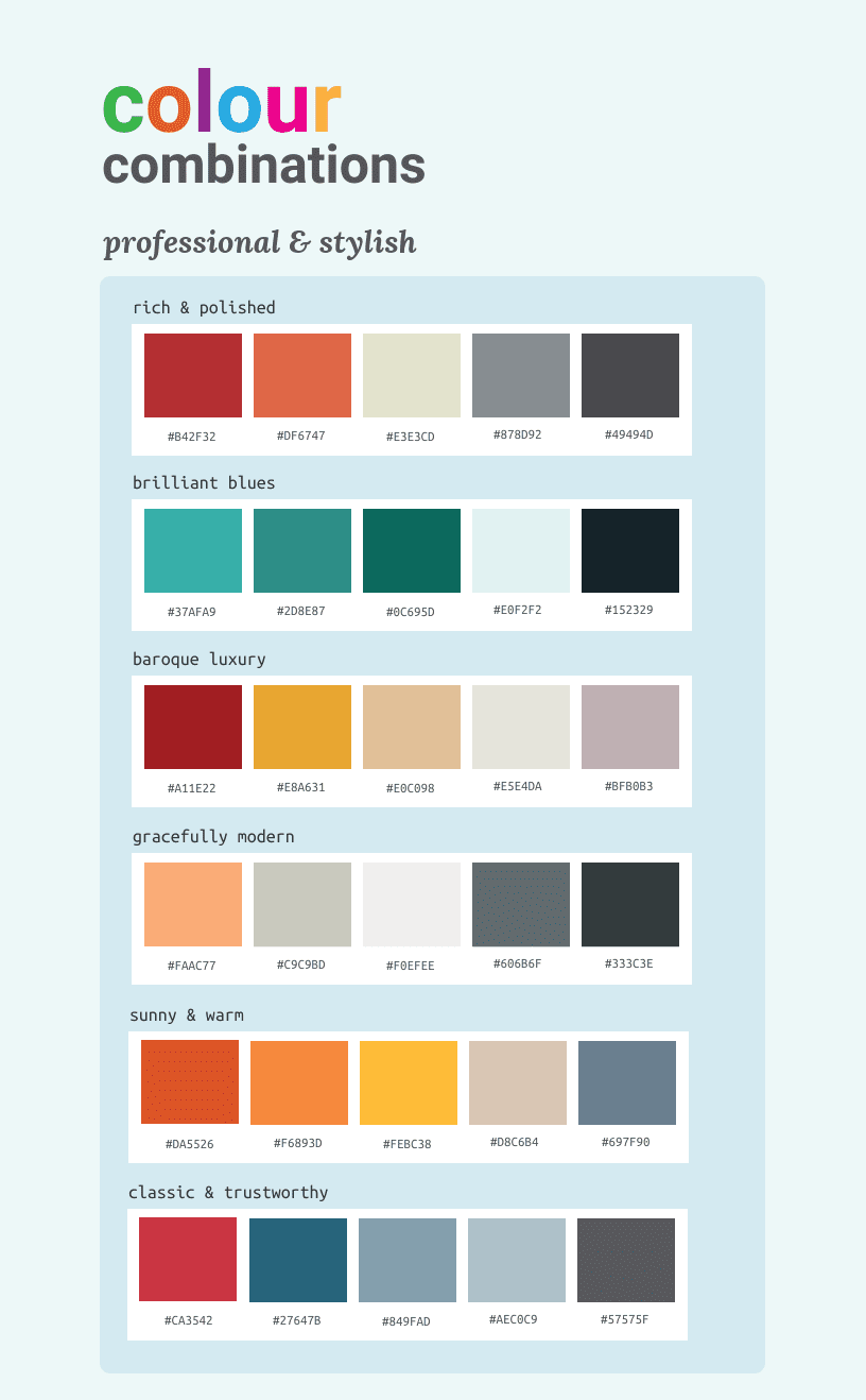
Source: Venngage
Colors already have a role to play in society—green means ‘go’ or ‘earthy’, while red is associated with ‘alert’ or ‘danger’, and blue makes people think of ‘coolness’ or ‘serenity’. When you create data visualizations, note how colors are perceived by users before you include them in your infographics.
Also, keep in mind that muted colors have been on-trend for the past couple of years and are showing no signs of abating. The color palette you choose for your infographic data visualizations should be muted—bright and bold colors will look jarring to audiences.
To understand the difference between muted colors and bold colors, here’s a simple graphic.
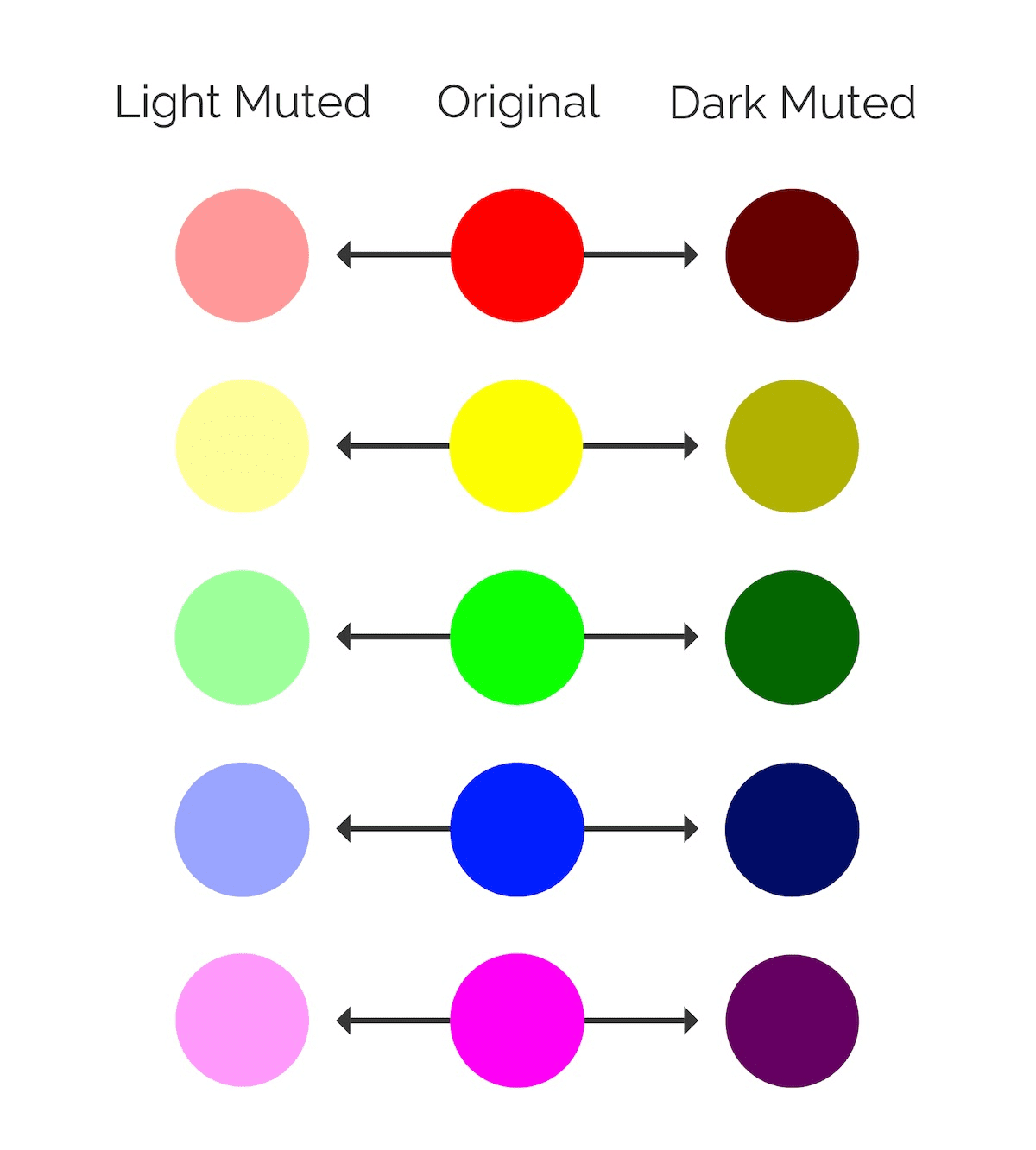
Source: Venngage
A muted color palette doesn’t decrease the range of colors designers can use—but it makes visuals look more authentic and organic than bold colors.
6. Create hierarchies in infographic data visualizations
Your infographic needs to have a visual hierarchy—this will help users follow your infographic story as you mean to tell it. A visual hierarchy is an essential component of communication—because people assign context and importance to the patterns they observe.
You want users to find correlations in your data through the visual itself—and you can do this by creating a distinct hierarchy. There are numerous ways that you can create visual hierarchies within your infographic:
- Different color hues
- Decreasing font sizes
- Grouping related elements together
- Placement of text and visuals
- Styling elements differently
Look at this example that depicts market segmentation for computer consumers.
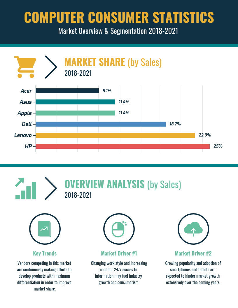
Source: Venngage
The bar chart shows the market share hierarchy through the size of the bars and the color gradient. Users can infer the results of the research just by looking at the infographic—they don’t need any further explanation.
That should be the aim when creating visual hierarchies in your infographic—for users to be able to understand the data correlations at a glance.
7. Highlight information in infographic data visualizations
When you create a visual, you need to highlight key data instead of making your users seek it out. This is particularly important when you have complex data to share, or numerous percentages and numbers.
It can become confusing for users if you don’t draw their eye to the pertinent information. One way to do this is by using icons in infographics—they are a great tool to convey stories.
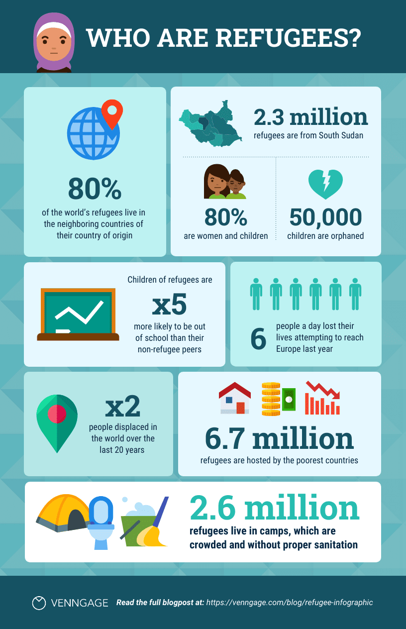
When paired with captions, icons also highlight important data in visuals. For example, look at the icon infographic below.
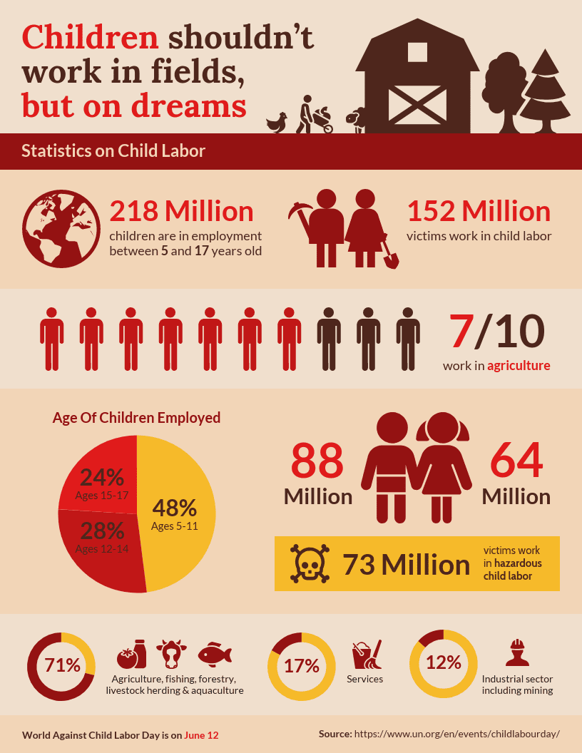
Source: Venngage
This visual is packed with data but the viewer never feels lost because the icons, text, and colors create a cohesive, albeit heartbreaking, story. Remember: when you’re trying to attract leads, the data you share should be relevant to them.
Gathering data and building a story around it takes time. When you create a visual to relay that story, you want to ensure that your users understand it easily.
By highlighting key components in the graphic, you can draw your audience’s interest and grow your leads.
Key takeaways: Understand the story behind your infographic data visualizations
Creating great infographic data visualizations can be a challenge. But when done right, these visuals can attract leads and boost conversion rates.
To recap, here are the seven ways data visualization can increase awareness of your brand:
- Choosing the right kinds of graphics
- Building trust in leads
- Keeping visuals simple
- Limiting text on visuals
- Color use in visuals
- Creating data hierarchies
- Highlighting key information
With these points, your marketing and design team can source data and create visuals that will draw audiences to your brand.