The design and structure of your blog are a big part of your visitors’ experience. As content marketers, web designers and writers, we are always on the lookout for new trends and best practices to improve the experience for our readers.
When our content is easier to find, easier to read and easier to share, it also makes it easier for users to subscribe for more.
Back in 2022, we reviewed the 100 top marketing blogs and reported on the key features and blog design trends. Now in 2025, we are repeating that research.
Here are the data and recommendations, along with decision criteria for what might work best for your blogging platform.
- Blog comments
- Search tool
- Author name and photo
- Published dates
- Share buttons
- Email signup and calls to action
- Related articles
- Reading time
- Most and least common design features
Comment sections on blogs are dead
Perhaps one of the most telling blog trends of 2025…blog comment sections are no more!
The huge drop in comments on blogs was one of the most staggering differences we noted when compiling our research this year.
In 2022, 51% of the top 100 blogs had a space for comments.
In 2025, only 11% of the top blogs contain a comment section.

There are likely a few reasons for this…
The juice isn’t worth the load time
There’s a lot of code and database calls in a comments plugin. It does load last, meaning that the additional load time doesn’t really affect the visitors’ experience. But, it will still show up in your load time reports, and is the impact really worth it? Most of the discussion is happening elsewhere, anyway. That brings me to my next point..
There are better platforms for thought-provoking conversations
Truthfully, the goal of the comments section is to provide a space for feedback, insights and conversations. If you’re aiming to grow your network, increase visibility and encourage more conversations, you’ll have a much easier time connecting with a wider audience on a social media platform like LinkedIn.
Link your blog in a post, ask your question or provide your opinions, and watch the engagement come rolling in.
Ann Gynn, Principal Consultant, G Force Communication“While I’m all for keeping people on your owned media channels, allowing comments on blog articles isn’t helpful for your audience or your brand. Online behavior has evolved so people who truly want to engage in conversations head over to Reddit, Quora, LinkedIn (heck, even Google has turned to Reddit content). That leaves most blog comment sections barren, spammy, or innocuous “nice job” responses.” |
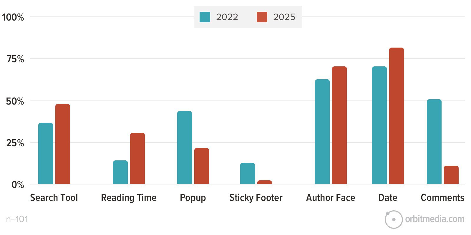
At their worst, comments are spam magnets
Spammers love to use a comment section to promote their own content or service (“check out this post!”). According to our 2024 spam report, 66% of people see spam comments on a regular basis.
Not only are these comments unhelpful for your brand and content marketing strategy, but they can cause extra work on your end with monitoring, reporting and deleting.
Should I allow comments on my blog posts?
So.. does this mean we all need to remove comments from our posts?
While we’ve touched on a few reasons people may opt to get rid of their comment section, we also know that comments are a great listening and feedback tool. In some cases, a comment section may be a very valuable tool for your business.
The TLDR: Unless you have a highly engaged readership that is likely to comment and you have the time and resources to moderate (approve, reply, mark as spam), comments probably aren’t necessary. You can opt to include a comment section and see if it brings your blog any value. If not, you can always remove it.
Most blogs have a search tool, but the number is declining
Even with careful curation, blogs are still piles of articles, listed in reverse chronological order. The search tool is a popular way to help visitors find relevant content quickly.
56% of blogs have a search tool in 2025, compared to 73% of blogs in 2022.
About half of those (48%) just show the icon (click to see the search field and enter your query) and only 17% show the open search field.
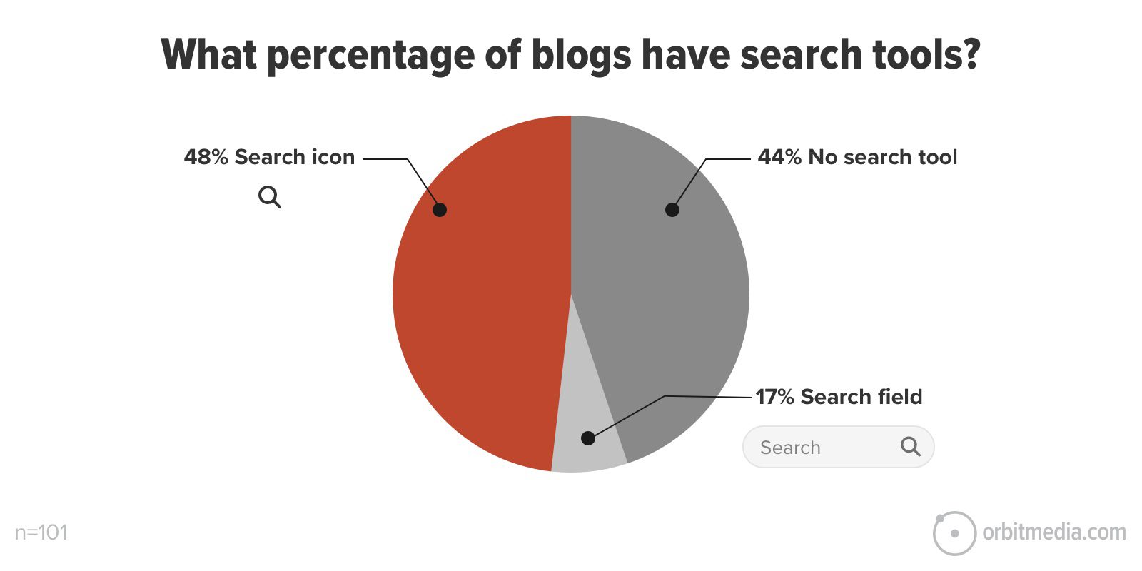
The blog designer is making a decision about the visual prominence of the tool. Should it be a very prominent, big open box? Or tucked away behind an icon? On every post or just in the main blog template?
Analytics can help inform this decision. If you have a search tool (and Analytics is set up properly ) you’ll get insights in your site search reports. These reports show how popular your search tool is:
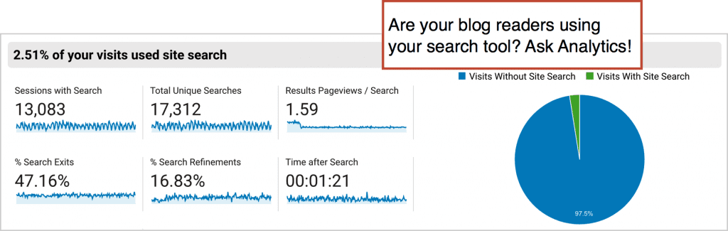
These reports also show what your visitors are searching for and when they don’t click after searching (% search exits) which usually means they’re unhappy. Here’s how to do analysis of the site search reports in case you’ve never checked.
Should I add a site search feature to my blog?
If your blog is a resource with a large body of content on a variety of topics, add a search tool. If Analytics shows that the search tool isn’t popular, remove it or reduce its visual prominence.
Most blogs are continuing to show the author name and photo
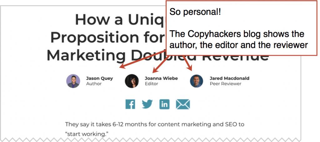
Virtually all blogs show the name of the author. Most blogs also show the picture of the author. 71% of the blogs in our 2025 dataset show the author’s face in the template, compared to 63% in 2022.
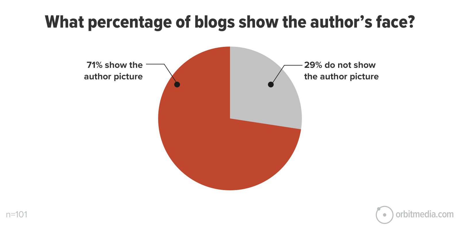
Seeing the author’s face helps build a connection between the reader and the content. It makes the content more human, which may even give you a boost in social engagement. “They look friendly, I should look them up on LinkedIn!”
The identity of the author is also important for thought leadership marketing. The visual just makes their identity stronger.
Should I put the author’s face into the design of my blog?
Unless you are not active in social media and no one involved in the content program is interested in personal branding, add the face. Show off your thought leaders!
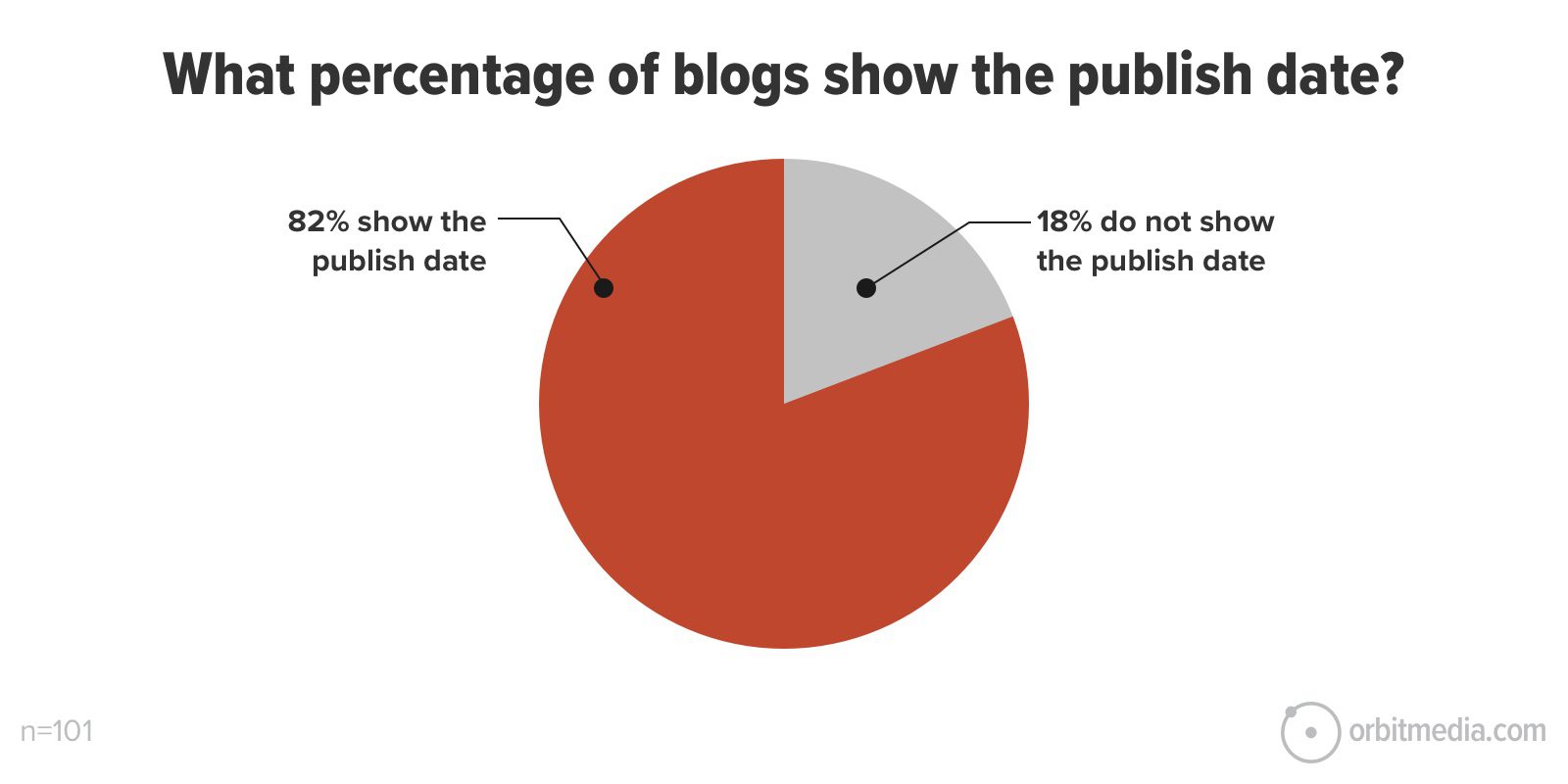
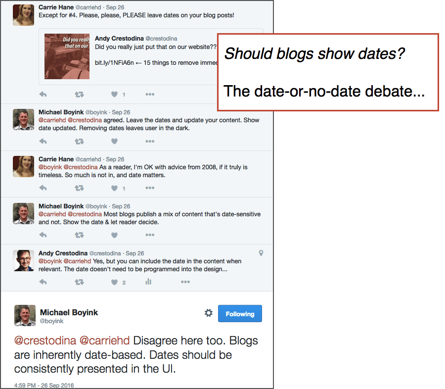
Published dates are popular (but controversial)
Most blogs show the date the post was published. Some show two, the date published and the date updated. In our 2025 review of 100+ marketing blogs, we found that 82% of blogs show the publish date for each blog article, compared to 71% in 2022.
More blogs are showing more dates. See how this CXL post shows both the publish date and the updated date.
But there’s a downside to dating your content: it makes your articles look older sooner.
Although the content may be evergreen, filled with tips that are just as relevant today as they were years ago, when the visitor sees the date they bounce. Or worse, the publish date appears in Google search results and they never click at all.
Removing the date from the template may increase CTR from search and time on page.
If the publish date isn’t built into the template, you can still mention the date to the headline and in the body text. We do this for research-based articles (like this one). If the article is called “2025 Blogging Trends” no one will wonder when it was published.
This is a controversial recommendation, I know. In my defense, this blog is written to help you, the marketer, get better results from your website. This is about your ROI, not your readers’ preferences. And those do not always exactly align. If they did, there would be no pop ups on the internet.
Should I put the date on the design of my blog templates?
If your content strategy includes news or trends, build the date right into the template. If you don’t put the date into the layout itself, don’t forget to date any timely content in the header and body text for any timely posts.
News or no news? Should news be part of your content mix? Not sure?
This post may help you answer that big content strategy question.
Share button placement is fairly consistent
Share buttons are popular features on blogs. They offer a quick and easy way to encourage readers to engage with and share your content.
Designers have a lot of options for where to place these share buttons. What makes the most sense for UX? Is one location more likely to encourage clicks? We analyzed where share buttons appeared in the top 100+ blog designs and found that they are often in more than one place. Here’s the breakdown:
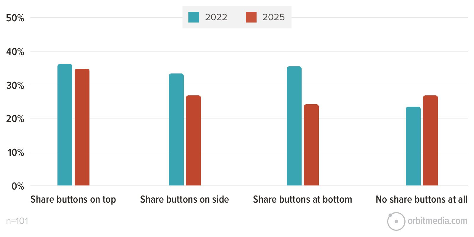
- 34% of blogs have share buttons at the top of the post
- 27% of blogs have share buttons on the side, often as a sticky element that follows the reader down the page
- 23% of blogs have share buttons at the end of each post
- 27% of blogs do not have share buttons at all
The most popular place to put social sharing buttons is at the top of the post. But why put the buttons at the top? The visitor hasn’t read it yet!
Surprisingly, there is no correlation between reading and sharing. People read without sharing and share without reading. So putting the share buttons at the top of a blog post template makes sense.
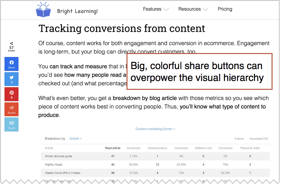
Share buttons are often added through widgets, which creates some issues. Often, these are visually noisy. Sometimes they’re the most colorful element on the page. They can distract from the content.
Also, those little widgets affect load time and will show up in page speed reports. Similarly to blog comments, this won’t necessarily impact UX, but it can raise some flags in reports like Page Speed Insights.
Where should I put the share buttons on my blog?
Put share buttons at the top of the article template, and potentially on the sides and bottom, but make sure they’re not too distracting.
Email signup box and calls to action: fewer popups, more slide-ins
Users who start their visit on a blog post are very unlikely to become a lead, but not unlikely to subscribe. One of the best outcomes of having a blog reader is gaining a new subscriber.
But getting the visitor to subscribe is all about the little signup box. This is conversion optimization for email list growth and it happens in many places.
Signup boxes can be built into the blog design itself, often built into the WordPress theme. They can also be added using a plugin (in the CMS) or widget (in Google Tag Manager).
CTA boxes sometimes appear as overlays, on top of the content. There are three main types of these overlays: popup windows, slide-in boxes and sticky elements, that stay visible regardless of scroll depth.
Here we see how common these features are on blogs. Keep in mind that some blogs use all three.
- Popup windows: 22% in 2025, compared to 44% in 2022.
- Sticky footers: 2% in 2025, 13% in 2022.
- Slide-in boxes: 15% in 2025, 12% in 2022.
 |
Sarah Noel Block, Tiny Marketing“Adding a sticky footer to your blog is one of the least used, but most effective ways to get passive subscribers onto your email list. I have found that my weekly newsletter (which also has a sticky CTA) has been a huge win for my business. I get to have real conversations in my inbox with prospects and provide weekly value. So many people are afraid of email marketing, but – done right – it can grow relationships and be the main driver for sales. But, without subscribers, email marketing will just not work, will it? So, add that sticky footer! ” |
Wherever the CTA appears, it should be visually obvious (prominent), tell the visitor specifically what they’re going to get (promise) and remind people that it’s good (proof). Prominence, promise and proof are the keys to high-performing email signup forms.
Related articles are frequently recommended
One of the most common features on top blog articles is more blog articles.
77% of the blogs we reviewed in 2022 and 2025 show related articles. They are generally under a subhead such as “You might also like…” or “recent articles”.
Traffic is hard to win and easy to lose. A great blog design pulls visitors deeper into the site. Related posts are really just a very visual approach to internal linking.
Marketing sites have an average bounce rate of 62% , but it’s much higher for blog posts. Adding “related articles” to the bottom of each post can help.
There are CMS plugins that will add them automatically to every post. If you have a WordPress blog, you can use Jetpack. It pulls the featured image from the post for better visual prominence.
Should I add related articles to my blog design?
If you have a lot of high-value, relevant content, especially content that does well in social media (which means the headlines likely have high clickthrough rates), you should add related articles to your blog template.
More blogs are including reading time
A few years ago, reading time was the least popular feature on top marketing blogs, showing up on only 14% of the blogs we reviewed.
In 2025 this feature is slightly more popular, with 31% of reviewed blogs showing an estimated reading time.
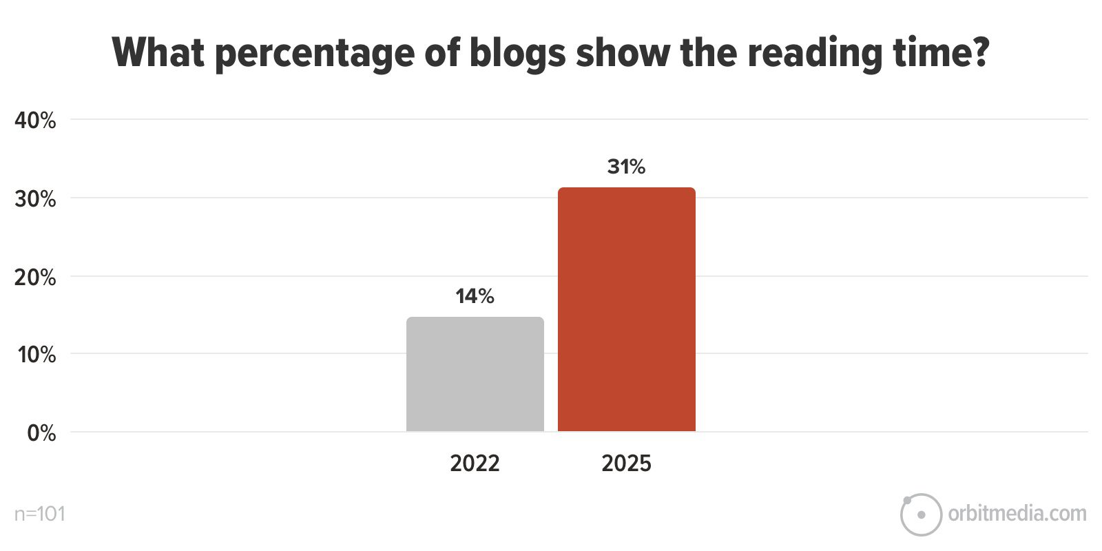
The idea is to give the visitor an idea of how much content they have in front of them, similar to the way videos show total duration.
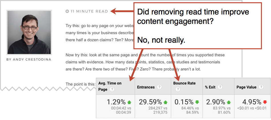
This blog used to show reading times, but since we publish a lot of long-form articles, we eventually worried that a big number (“11 minute read”) would scare away visitors. So we removed it.
Did it make any difference? Not really. The time on page and bounce rate didn’t change.
Should I add reading time to my blog layouts?
Probably, it’s not a very consequential decision. But if you feel that it looks nice and your readers will appreciate it, give it a shot! Check the engagement metrics to see if there was a measurable impact.
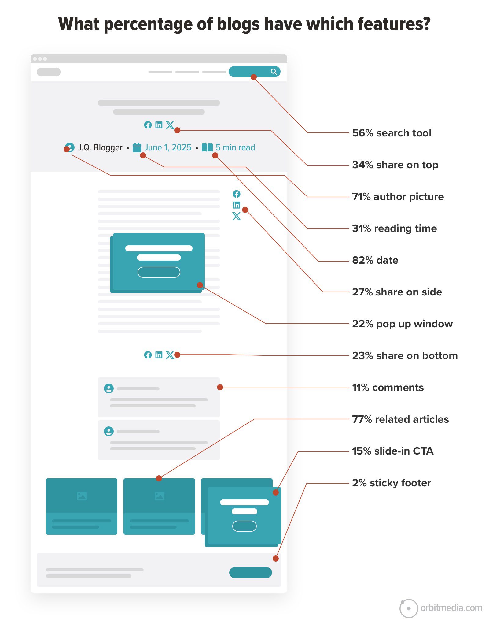
So which features are the most (and least) common in blog designs?
We put all of this data into one infographic to help you visualize your blog template, from the top of the page to the bottom. You can see the relative ubiquity of some UX features and the rarity of others. It quickly gives you a sense for successful blog design best practices.
If your blog isn’t performing well, think beyond the content itself. Maybe it’s time for a website design refresh. Share this with your web design team. Combine these UX ideas and blog design tips with your own brand identity. Add a pinch of little design inspiration and your readers will reward you with low bounce rates.
Wait, what about those other blog design elements?
There are even more features that we didn’t track. Here’s a quick list and a few considerations for each:
- Breadcrumbs: These appear at the top of the blog layout, below the header image and above the content. If your content is organized into clear, helpful categories, they may be useful to your readers.
- Filters: These are drop down menus on the blog homepage, allowing the visitor to apply several criteria (such as format and topic) to narrow down the reading options. If you have a very large body of diverse work, they may be helpful. But after reviewing many Analytics accounts of many blogs with these filters, we’ve noticed that they are not popular with visitors.
- Progress bars: Similar to reading time, this subtle design element shows you how far you are into the content. They are typically a sticky element (the progress bar on the sticky footer of this blog as an example). They’re just a few pixels tall. Since they take almost no space, there’s really no downside.
- Print button: You readers may want a hard copy. If you have a print button, you won’t be able to see its popularity without adding event tracking using Google Tag Manager. Of course, any reader can use the print feature of the browser. That is untrackable.
Final design tip
Let’s give the last word to UX and design expert Rafal Tomal. Rafal has done UX work for some incredible content companies including Microsoft, Smart Passive Income, Social Media Examiner, James Clear and a lot of other sites you’ve probably visited.
I asked him for his best advice for how to design a blog. His answer may surprise you…
 |
Rafal Tomal, Tomal Design“Focus on designing very clean and readable typography. You don’t need to make it beautiful, but make sure it’s easy to read. Keep your font size in an 18px – 22px range with 150%-175% line height and in between 60-75 words per line. Make sure the subheadings are clearly visible by making them bolder with some proper space before and after. It’ll help to scan the content.” |