There has been a spurt of businesses adopting data visualization practices in their content. This isn’t surprising considering how much data is now being shared online.
Data can be very exciting, but raw data doesn’t always tell a compelling story. Not to all audiences.
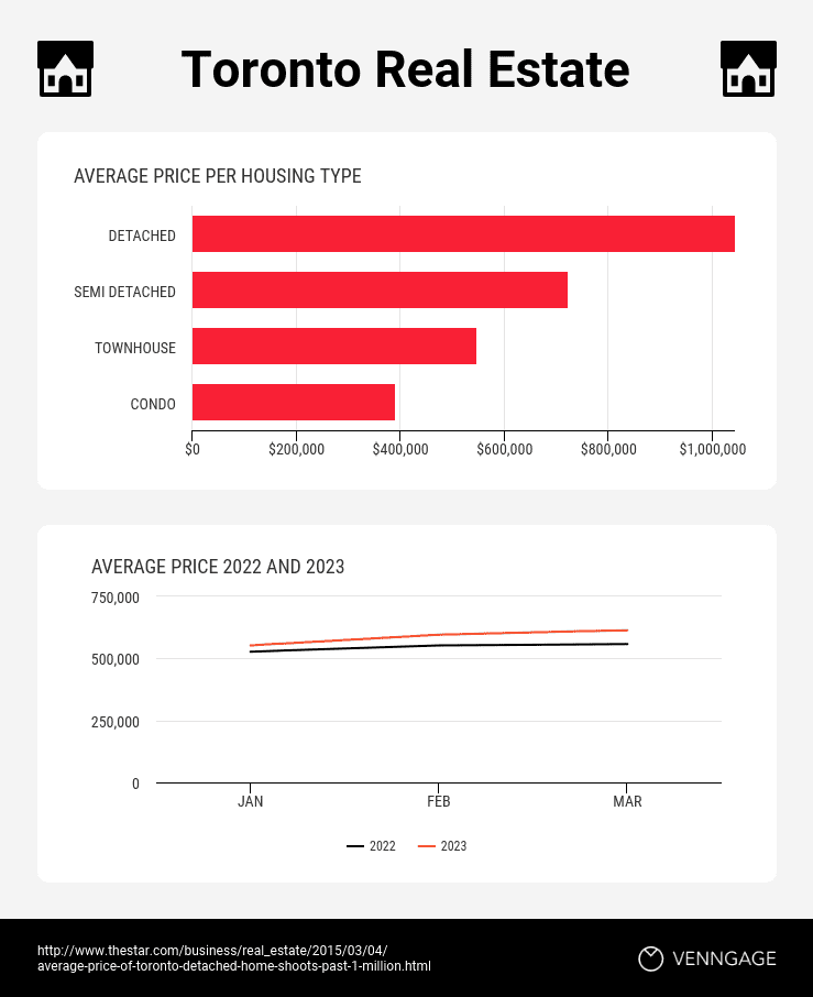
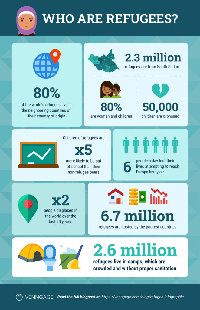
On the other hand, a data visualization infographic, like the below example, shares a memorable story.
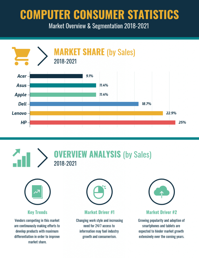
Source: Venngage
There’s another important factor that has contributed to the growing popularity of data visualizations. We have more content available to us than time to absorb it.
Online users simply do not have the time to read paragraphs of text. They want their information condensed and easy to skim. A visualization makes that possible.
Designing visuals has also become easier for marketers, which is also why we are seeing more cohesive visuals.
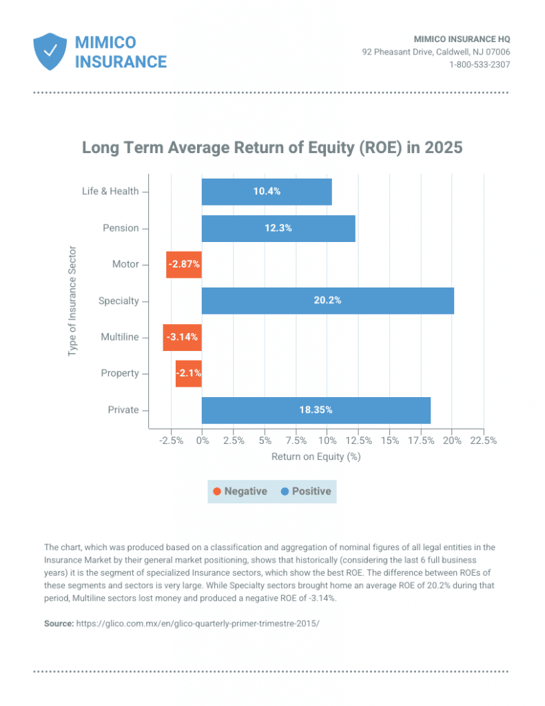
There are numerous data visualization tools at marketers’ disposal. For example, a simple but effective design, like the below report, can be created in minutes using a graph maker.
Source: Venngage
So, what is data visualization? And how can marketers create attractive visuals for their business blogs? We explain it all in this guide.
What is data visualization?
A good data visualization combines three key aspects:
- Data on a topic with a precise angle
- A functional and purposeful visual
- A design that is impactful but balanced
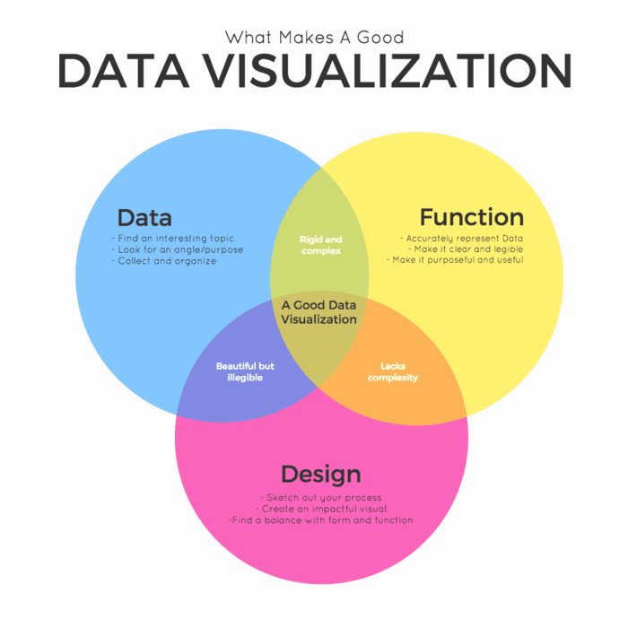
Instead of trying to define data visualization, why don’t I show you what it is via this visualization?
Source: Venngage
The important thing to remember is that one can’t just take some data, put it together in a visual format, and call it a day. That isn’t the purpose of this exercise.
Data visualizations are meant to communicate information on their own. But they also need to be creative and appealing to engage the audience.
What is the importance of data visualization?
Great data visualization design can condense complex information into easy-to-understand graphics. This is because data visuals use aspects of storytelling to convey messages.
Since human beings love stories, a data-driven approach to marketing helps build connections between users and brands.
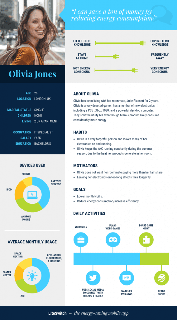
For example, this report was created using data about potential audiences. It helps brands plan and forecast so that their product and marketing campaigns reflect consumers’ needs.
Source: Venngage
What else are data visualization techniques used for? Here are a few use cases:
- Making complex data interesting and understandable
- Backing up an opinion with facts
- Presenting patterns between data points
- Highlighting important data points to audiences
- Storytelling through data
There are numerous data visualization types, and they can be used for multiple purposes:
- Bar graphs
- Infographics
- Line graphs
- Maps
- Pie charts
- Scatterplots
- Timelines
- Venn diagrams
While maps are great for showing geographical information, other types of data visualizations, like bar charts, are better for displaying comparisons between data points, like this example.
Source: Venngage
Choosing the right visual to convey your message takes time and practice. When done right, a great visual will effectively convey a story and result in a new lead.
7 Data Visualization Best Practices
How do you create beautiful visuals that share data concisely with audiences? We have some tips for producing data visualization ideas as well as seven best practices.
1. Understand your audience
The best data visualization examples are the result of brands taking an empathetic approach. You have to ask yourself: what does my audience need from this visual?
Brands create ideal user personas for their products and marketing campaigns. Use a similar technique to generate ideas around data stories. This will help make the visual more impactful.
Here are a few user-related questions to ask before you start designing:
- Who is the target audience for the data story?
- What are their frustrations/ pain points that the data will resolve?
- Is the data for mass consumption or does it have a narrow focus?
- What metrics or KPIs is the visual supposed to help you reach?
- What action do you expect audiences to take when they see the visual?
For example, the below infographic is largely informational and appeals to a wider audience.
On the other hand, if your target audience is very niche, your data visualization can be more complex. You can also include niche terms because the audience will understand them.
But most importantly, your visuals must have an aim. They must evoke the audience’s need to act. This will help you create content that is actionable and measurable.
2. Source your data
Before you begin designing your visuals, you need to collect your data. This process sounds simple but it requires some nuance.
Data should be collected from trusted sources and verified. This is to ensure that the data isn’t biased in any way. If you can’t find the source of the information, don’t use it.
Additionally, verify the data you have with at least two other sources. Use this technique to prove that conclusions weren’t reached by fluke.
When doing your research, collect data from as many respondents as possible so that your results aren’t skewed. This infographic from Workfront includes data from 2000 workers.
Also note how the graphic uses simple data visualizations, alongside icons, so that the information is easy to understand by all audiences.
It’s worth using a data quality tool to parse through large amounts of data and remove any irregularities.
3. Choose your visuals
Jumping off of the previous point, you want to choose the right data visualization graphs for your subject matter.
As we mentioned above, different types of data are suited to different kinds of visualizations. Using the wrong chart can make data appear confusing, if not misleading, to audiences.
How do you choose the right visualization technique for your data? You have to determine the purpose of your data story first. This can be broken down into five categories:
- Informing the audience
- Comparing data
- Showing change over time or area
- Showing how data is organized
- Showing how data points are related
The below graphic illustrates these points and shares the best types of charts and graphs to use in each instance.
For example, if you want to compare multiple data points, bar charts, pie charts, and word clouds are the best tools.
To show change over time, a line chart, area chart, or timeline works best. You can use a map chart to show changes over locations.
Venn diagrams and tables are best for showing how data is organized. A scatter plot or histogram indicates the relationship between data points.
With a bit of practice, it will become easier to determine which types of visualizations suit your data. Until then, you can use the graphic guide we have shared to help you decide.
4. Chart axes and labels
As important as it is for your visuals to do all the storytelling, the best data visualizations include axes and labels that give the data context.
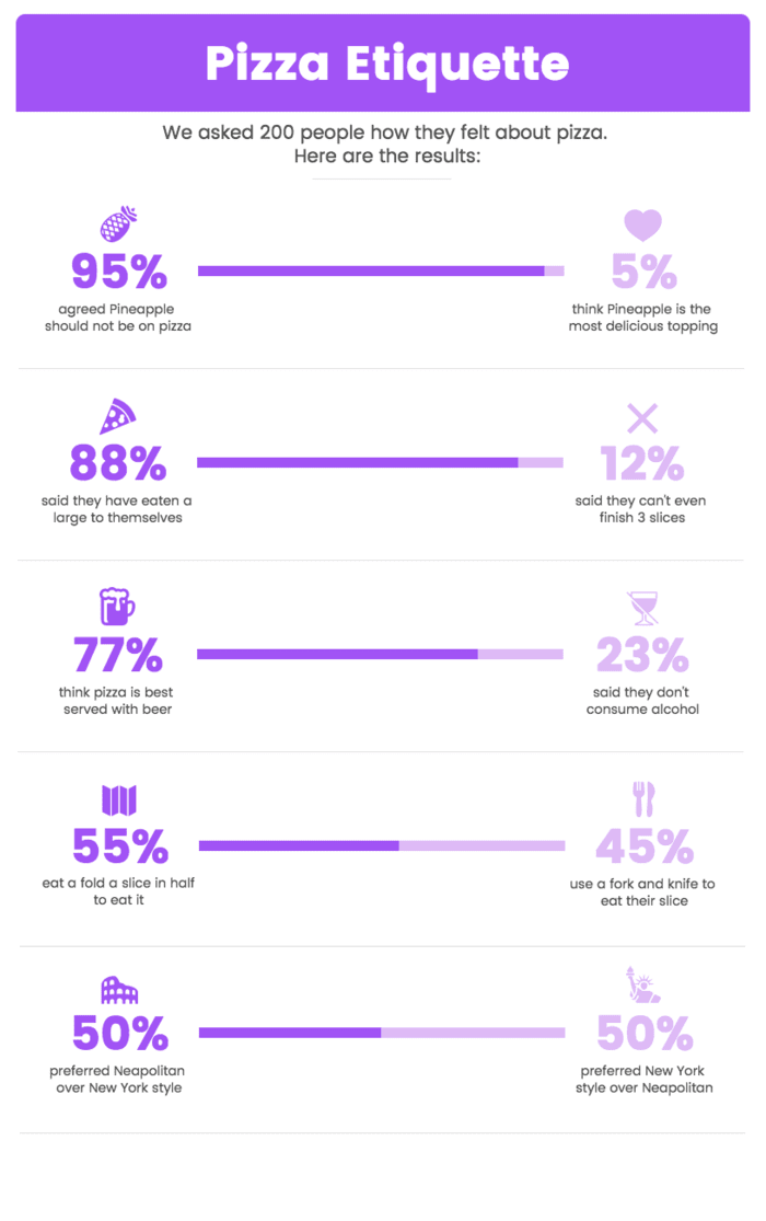
For example, this fun pie chart infographic uses icons to denote the data its describing, alongside text labels.
A glance at the pizza graphic will tell the user all they need to know and they can check the labels for more details.
While designing data graphics, always include the axes and keep them equal. This helps to avoid data distortions and makes your visuals look more trustworthy.
Additionally, axes make it easier to understand the numbers and distribution of data so that comparisons can be made.
5. Create visual connections
Great data visualization ideas focus on telling a story. The best way to do this is by using visual cues that make the story easier to understand and digest.
Icons are a great graphic design tool to incorporate in data visualizations. They immediately draw the eye while also conveying a breadth of information at a glance.
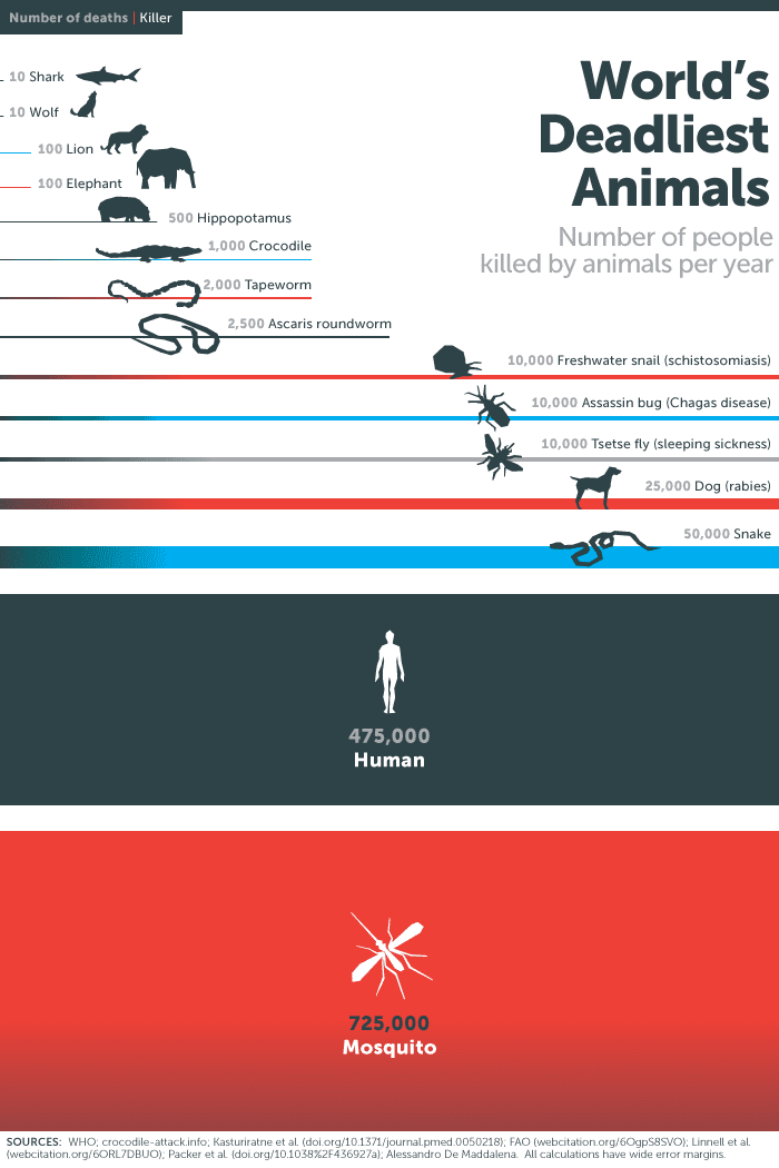
One of the best data visualization examples using icons is this one from the Bill and Melinda Gates Foundation about the world’s deadliest animals.
The increasing size of the icons conveys how much more dangerous the animal is. This is reinforced by the length of the lines, which also prompt the eye to move down the graphic.
6. Data highlights
What do good data visualization examples have in common? Colors used with purpose.
The color spectrum is massive and it can be tempting to use as many colors as possible for your data. But color should be used to highlight information; not to drown it.
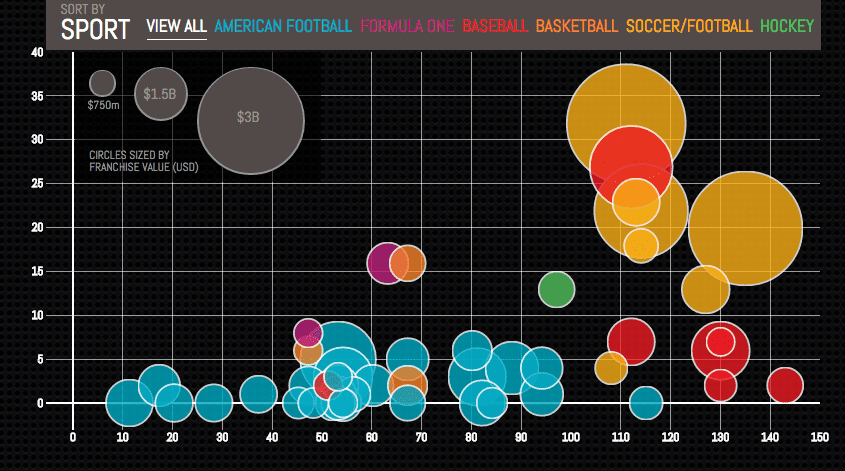
For example, this graph on sports franchises uses colors to differentiate groupings, making it easier to follow the information.
It’s a simple and effective way to group data points and lead the user’s eye to the primary conclusion—that certain sports teams make a significantly larger amount of money than others.
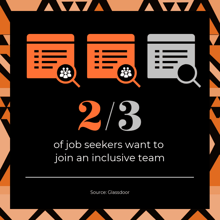
On the other hand, this deceptively simple graphic uses only two colors against a black background. The point of the limited color use is to highlight key information.
You can also use fonts to highlight information. Bold or underline important text in your visuals so that users can immediately see the key takeaways.
7. Diversity in design
The world of design has been missing a certain amount of fairness for years. But that has been changing, with more people being vocal about creating inclusive visuals.
Here are a few ways that brands can start designing for diversity in data visualizations:
- Collect and analyze data without bias
- Include designs—such as illustrations and icons—that are representative
- Use inclusive language in designs
- Be careful with colors so that people with visual impairments can access the visuals
- Get feedback on inclusive designs and data from representative groups
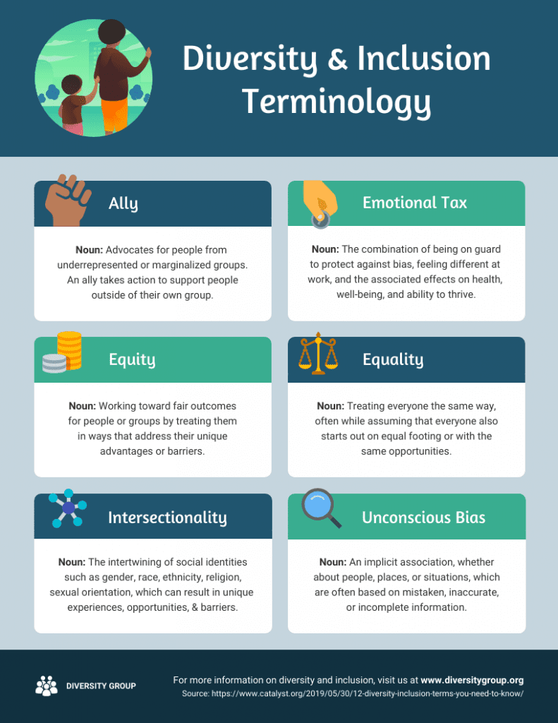
Brands should take the time to educate their staff and executives on diversity. This graphic on diversity and inclusion terminology can be shared with teams or included in onboarding.
The best data visualizations tell compelling brand stories
Visual content marketing has become a powerful method of connecting with consumers. And one of the essential elements of visuals lies in data.
While there is a lot of data to be mined, brands need to remember what the purpose of the data is. Collect data according to the stories your customers want to hear.
Once data has been gathered, create attractive but purposeful visuals to share your story. For brands that don’t have an in-house design team, there are data visualization tools available.

