A visitor clicks “submit,” a lead is born.
It happens a million times a day, all over the web. They searched, they found a website, it was clear and persuasive, they filled out the contact form.
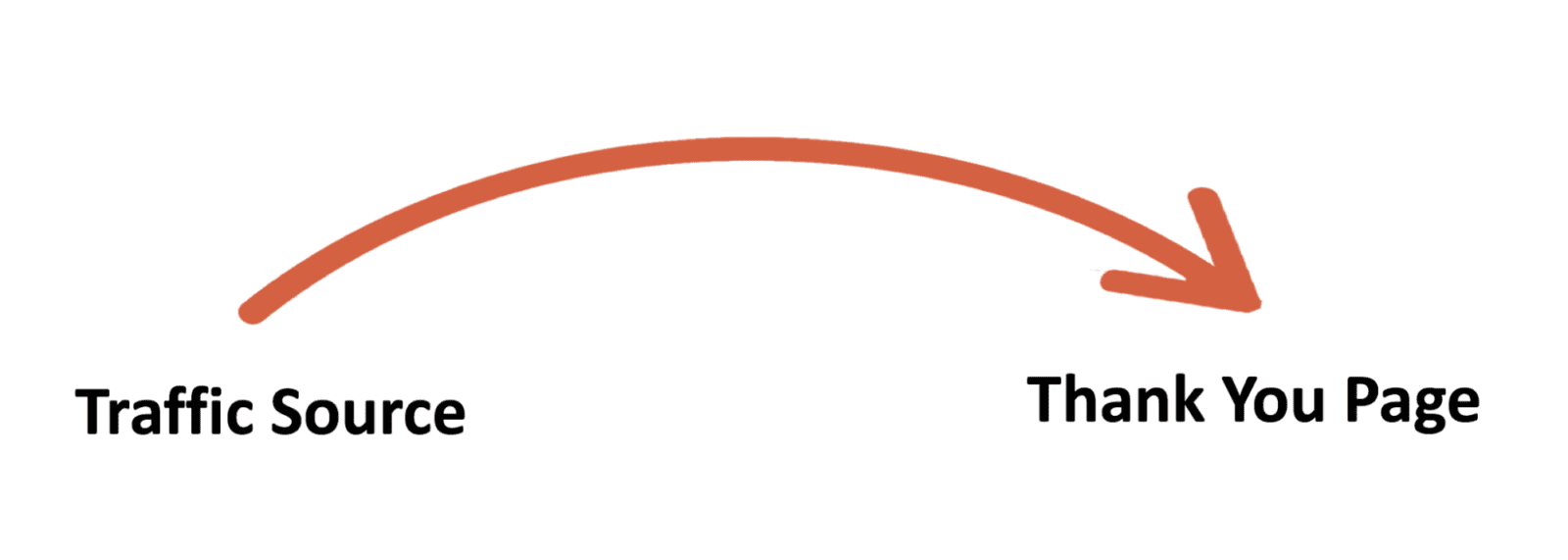
That’s what a lead generation website does. It builds a bridge from a traffic source to a thank you page. This is the purpose of B2B digital marketing.
It’s common, but not simple. In fact, that’s why, according to small business owner stats, 88% of small business owners don’t get regular leads and sales from their websites.
There are dozens of little factors involved in lead generation. They all work together to create visibility, then clarity, then trust.
There is one feature that every lead gen website has in common: the back button. One mistake and the visitor will simply leave and find an alternative. We need to avoid that click and keep visitors in the flow.
The lead generation website flow
A lead generation website has a specific set of pages, each with a specific job and specific elements. Each element aligns with the psychology of the visitor and the marketing goals of the business.
The flow usually looks something like this:
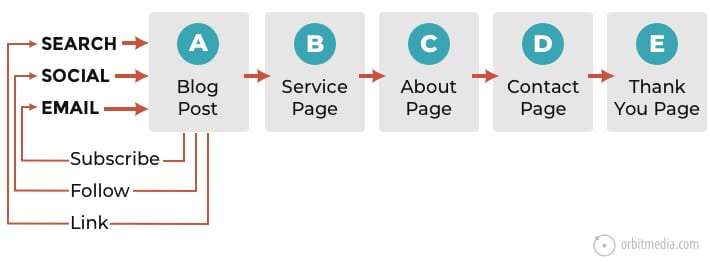
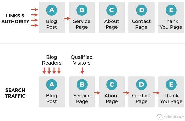
The website is gently guiding the potential customer through a series of steps: awareness, interest, trust, then action. That’s a classic “conversion funnel.” Notice how the pages align with steps in the funnel:
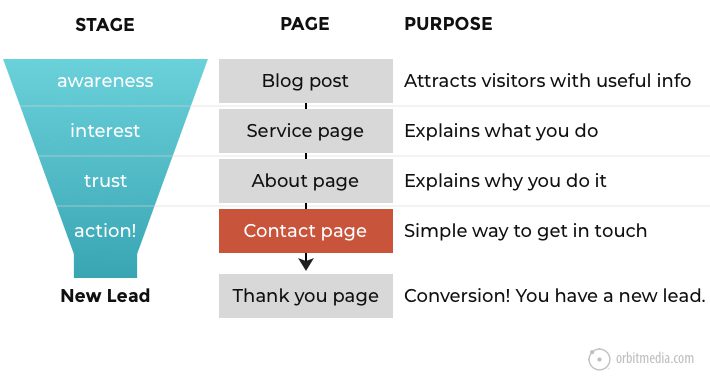
But this only works if each page in the process is built specifically for the purpose.
Each page needs a set of elements that keep the process moving and the visitor flowing. So to avoid mistakes and missed opportunities, here is a set of best practices for lead generation websites, including a breakdown of all the elements on all the pages involved.
The blog post: Helpful advice
The process starts even before the visitor lands on the website.
Your audience is looking for information and answers. To attract them, you’ll need a content strategy framework that gives them a reason to visit. The better you are at getting your expertise out of your brains and into your content marketing, the more visitors you’ll attract.
The article should be so useful that the reader will be thrilled to have found you. And during their visit, they’ll find easy ways to engage
- Get more of your advice via your email program (a prominent signup form)
- Get more or share via social media (social icons, share buttons)
- Get more content during this visit (internal links to related content)
The likelihood that they do any of those things is partly a result of the blog template itself. So a great blog post template is key to the lead generation process. It should include all of the following elements:
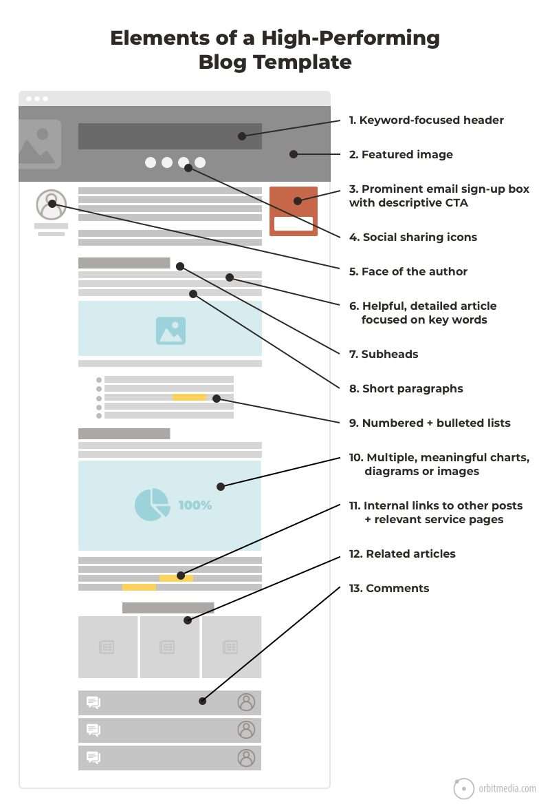
How common are each of these UX elements? Check out our research into blog template design.
1. Keyword-focused header
If the topic is something your audience is searching for AND your website has sufficient authority to compete for the phrase, you have an SEO opportunity. In other words, do your keyword research first.
To capture that opportunity, you’ll need a super high-quality article that indicates its relevance for the phrase. That starts at the top.
Use the target keyphrase once in the <h1> header. Along with the <title> tag, this is the most important place to use the primary keyphrase.
2. Featured image
Every great blog post has a great image. This makes the post more attractive, both on your site and in the social streams when it gets shared. Bright, unexpected or provocative images may increase engagement when the post appears in social streams.
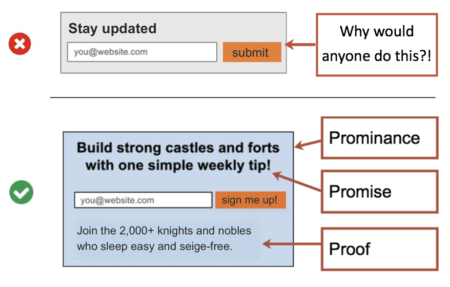
3. Email signup box
Bad signup forms are everywhere.
But that’s weird because great email sign up forms are easy to make. Just follow the three P’s: prominence, promise and proof.
The highest converting signup form stands out visually (prominence), tells people what they’re going to get (promise) and gives some evidence that it’s good (proof). This combination can grow your list even without using lead magnets.
Even the best blogs have extremely high bounce rates. (ever wonder what the average bounce rate is?) One of the best outcomes from a blog visit is a new subscriber. Or maybe they’ll help with a bit of promotion…
4. Social sharing buttons
Make it easy to share by putting your share buttons in several places. Here’s where top blogs put their share buttons (source)
- Above the article: 36% of blogs
- Next to the article: 33% of blogs
- Below the article: 35% of blogs
Many blogs (including this one) put share buttons in several places. Also, there are different styles of share buttons. Some show the number of shares in a little counter; others do not.
- If sharing is high, use share widgets with counters to show the number of shares.
- If shares are low, don’t show a counter …those zeros are negative social proof.
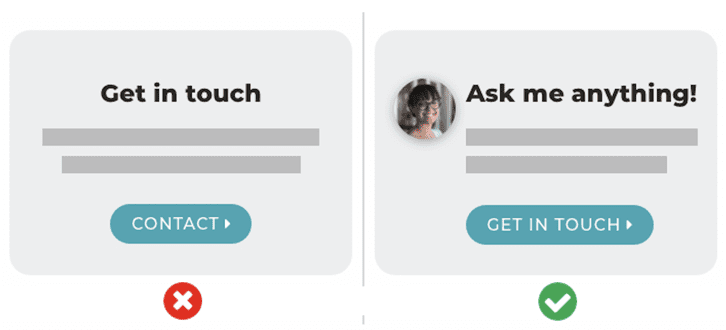
5. Face of the author
Never miss the chance to make your marketing more human.
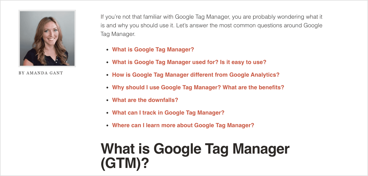
The byline is one of the defining features of blog templates. Adding a face to the byline makes it all the more personal. It supports thought leadership marketing (leaders are people, after all) and gives a little networking boost to the author.
6. Depth, detail and related phrases
It’s the deep, how-to articles that position your site as the go-to resource. If they trust your content and visit regularly, they’ll think of you the moment they need help, the “zero moment of truth” in lead generation.
And the extremely detailed articles are more likely to rank in search engines, partly because they have more opportunities to use the semantically related phrases. They answer more of the related questions. The touch on more of the sub-topics.
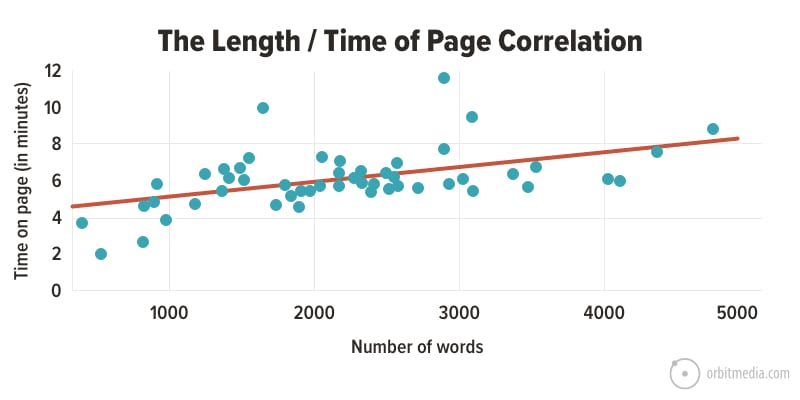
The very detailed articles are also more likely to engage visitors. There is a clear correlation between length and time on page. You can do the analysis for your own content using your own Analytics. That’s just what we did for our top 50 articles in this scatter plot chart.
7. Subheads
Long articles don’t have to be dense and blocky.
Break up the article with plenty of subheads. Remember, most readers are actually scanners. The structure provided by subheads will help your scan reader find answers to their specific questions quickly.
8. Short paragraphs
The longer the paragraph, the more likely it will be skipped.
As a general rule, don’t write paragraphs longer than three or four lines. And look for opportunities to write the occasional very short paragraph of just a few words.
Designers know that visitors love whitespace. But somehow, writers didn’t get the memo.
9. Numbered and bullet lists
Lists are another type of formatting that helps keep the scan reader flowing.
Beyond being easy on the eyes, numbered lists have another advantage: they give you an opportunity to use a number in the headline. And since numerals are more visually prominent than letters, this can help the article stand out when it appears in social streams and inboxes.
Related: Web Content Best Practices: 22-Point Checklist
10. Multiple, meaningful charts, diagrams and other images
We started with a great featured image, but don’t stop there. It’s impossible to overstate the importance of visuals. Here’s how our recommendations have changed:
- 2010: “Make sure to include a great image on every post.”
- 2021: “Make sure there is something of visual interest at every scroll depth on every post.”
This will keep the reader from reaching a wall of text. If they get to a desert of words, without an image in sight, they’re more likely to bounce.
The best images are supportive, not generic. Skip the stock photos and instead add images that add clarity (diagrams) or support the message (charts and graphs) such as this.
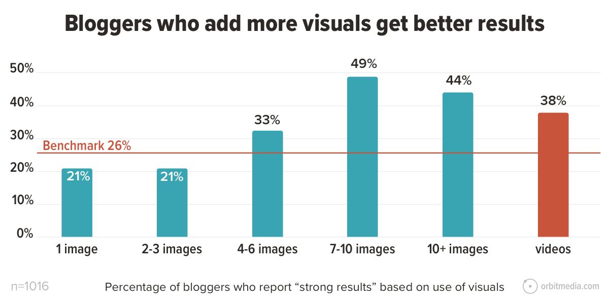
Source: Blogging Statistics
Can’t find a good image? Just take a compelling phrase from the post and turn it into a visual, like this:

Source: Blog Image Best Practices
11. Internal links to other blog posts and service pages
Guide the visitor down the funnel through internal links. Each blog post should have at least two links within the body text:
- Link to a relevant service page
- Link to another blog post
The third type of link is often missed because it’s not on the article itself.
- Link FROM an older post to the new blog post
12. Related articles
This is the most common feature on blog templates. 8 in 10 of the top blogs show related articles. It’s a way to encourage readers to dig deeper (reducing bounce rates) and build interconnected hubs of content.
The recommended articles can be automatically selected based on category and relevance or can be manually curated. Ask your developer.
13. Comments
Still a popular feature and possibly the most social element on the page, blog comments are a golden opportunity to get feedback from your readers. They’re an opportunity to network. They can be a magnet for social proof.
Yes, it’s hard to get readers to comment. To help trigger more comments, end the post with a question and suggestion that the reader share their thoughts.
The service page: Simply what you do
This is the workhorse of the lead generation website.
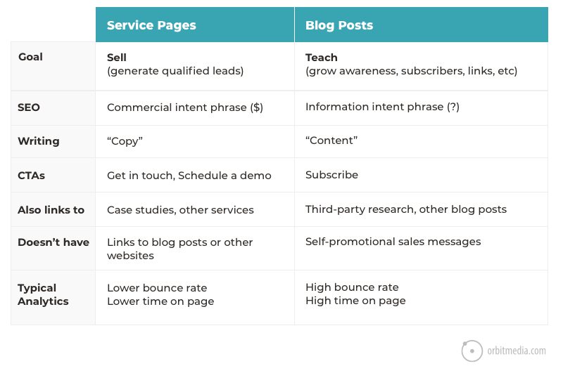
The blog post teaches; the service page sells. But it’s still educational. The content needs to answer the prospects’ top questions and address the top objections. It describes how you do the work.
Here’s a quick breakdown of the differences between the services pages and blog posts:
At a high level, here are the three key ingredients of service pages with high conversion rates.
- Answers to visitors’ questions, adding clarity and addressing objections.
- Evidence to support those answers, without with the page is a big pile of unsupported claims.
- Calls to action that are specific and clear.
The next level of detail is much more interesting.
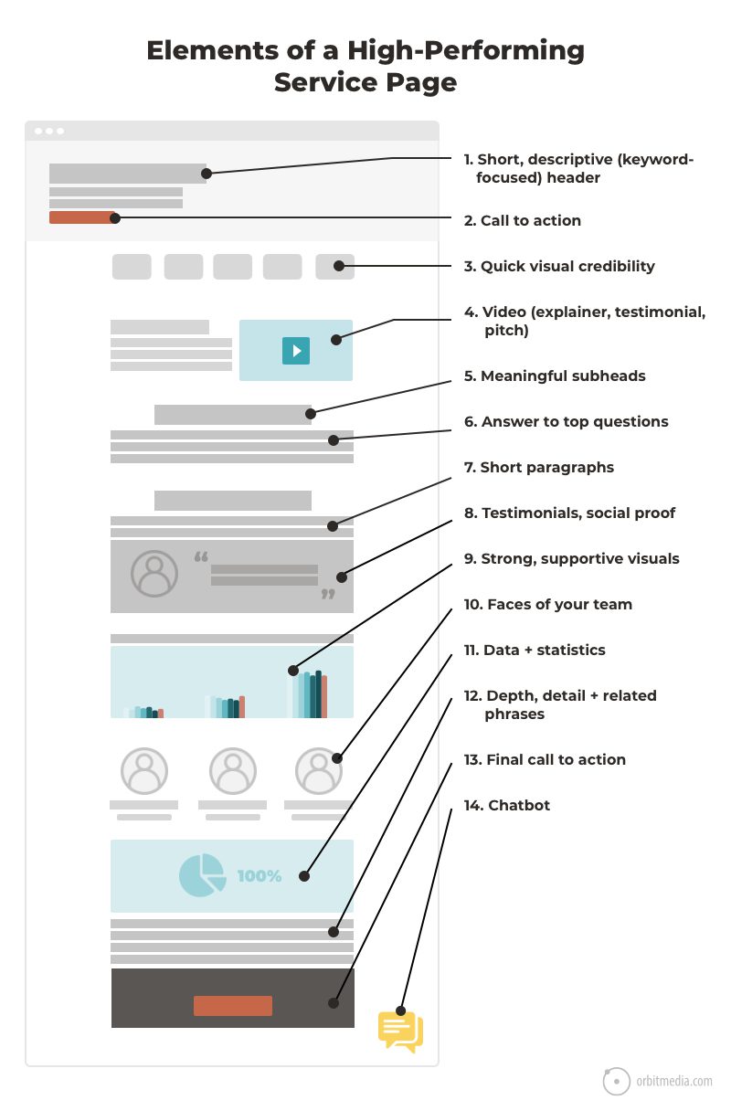
This little diagram shows a one-column layout. For most B2B lead gen websites, it’s more likely a two-column layout with “50/50 page blocks” breaking up the text and visuals.
Either way, it has a clean, simple flow. The visual hierarchy is in line with the messaging priorities which are in line with the information needs (top questions) of the target audience.
Related: The B2B Service Page Checklist
1. Short, descriptive (keyword-focused) header
It’s the first question of every visitor to every web page: “Am I in the right place?” So the header should simply say what you do.
Do it in plain English. Call your services what your visitors would call them. Avoid vague benefits statements such as “Experience Excellence” or “Humanizing Technology.” A descriptive header is good for visitors and good for search rankings.
2. Call to Action (CTA)
It may seem early to ask for the lead, but this may not be their first visit. For the visitor that is ready to go, a CTA high on the page helps trigger that action.
But first, we need to understand the psychology behind the click.
No one clicks anything until they’ve done a split second cost/benefit analysis. Do the benefits exceed the costs? They click. If not, they’ll dismiss the CTA and keep reading and scrolling …or they’ll simply leave.
So to increase the clickthrough rate of your CTAs, make the cost appear smaller (it’s easy/fast/free) or make the benefit appear bigger (it’s valuable).
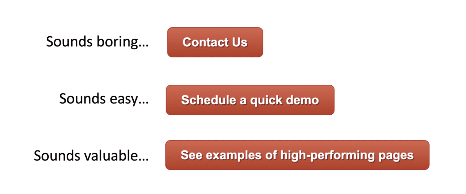
Pay close attention to the verbs in your buttons. “Click” “Read” and “Learn” may not be your strongest options.
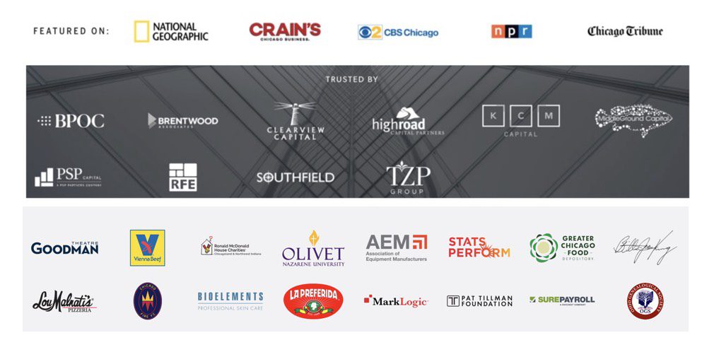
3. Quick visual credibility
A split second after they see what you do, they’ll start scanning for evidence that you are legitimate.
Remember, your visitor has been on hundreds of spammy, sketchy even fraudulent websites. They’re understandably skeptical. So we need to show our credibility fast by adding one of the following:
- Logos of clients or press mentions (triggers the halo effect)
- Certifications, awards, memberships (known as trust seals)
- Number of happy clients, years in business, projects, team members, etc. (data points)
Put these little nuggets of differentiation high on the page. Ideally, above the fold. Here are three examples from recent web development projects.
4. Video explainer, testimonial or pitch
Sometimes, text is insufficient. It lacks the power to build trust and explain complex concepts. Sometimes you’ll need to upgrade to more visual formats, like video.
When is it best to show, rather than tell? Here are times when it may be best to use video:
- The service is complicated
Are there many interrelated or abstract concepts involved?
If so, add an explainer video. - Trust is especially important
Is the visitor especially fearful? Have they been burned before?
If so, add video testimonials. - The service is very high-touch
Is personalized service important to the visitor?
If so, add videos showing your people.
These are all conversion-focused videos. Their job is to support the lead generation process and increase conversion rates. Of the three types of marketing videos, these are worth spending the most money on.
5. Meaningful subheads (no “what we do”)
Subheads are the little section headers on web pages, usually formatted using <h2> tags. Their job is to tell the visitor what follows, so it makes sense that web designers want them to stand out.
The problem isn’t the design, it’s the content.
They often add zero value because they are so vague, they’re meaningless. Not only is a meaningless subhead adding visual noise without adding value, it’s a missed keyword opportunity. Compare:
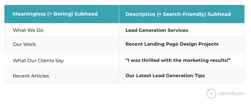
Look at any of the subheads on your service pages. Would the page be just as strong without it? Is it adding clarity, value or keyphrase relevance? If not, change it or remove it.
6. Answers to top questions
There is a true story in the life of every visitor to every webpage.
They have questions and concerns. The better you answer those questions and address those concerns, the more likely they will get in touch and become a quality lead. This is, after all, the reason they’re here.
Every unanswered question increases the odds that they’ll leave and visit a competitor’s website. So the job of the conversion copywriter is to write a page that builds clarity and trust by answering the visitors’ questions.
7. Short paragraphs
As above.
Visitors to service pages have stronger intent, so they are more likely to read deeply. But it’s still important to avoid long blocky paragraphs, whenever possible.
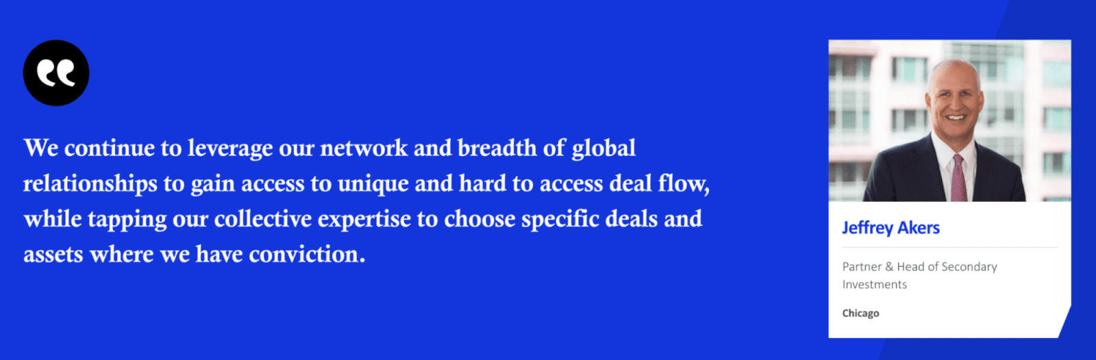
8. Testimonials, social proof
Anyone can claim to do something, but not everyone can prove it.
Add evidence of your legitimacy and the value of your services. This may include examples, statistics and research. Better yet, add social proof in the form of testimonials, using the voice of your happy customers.
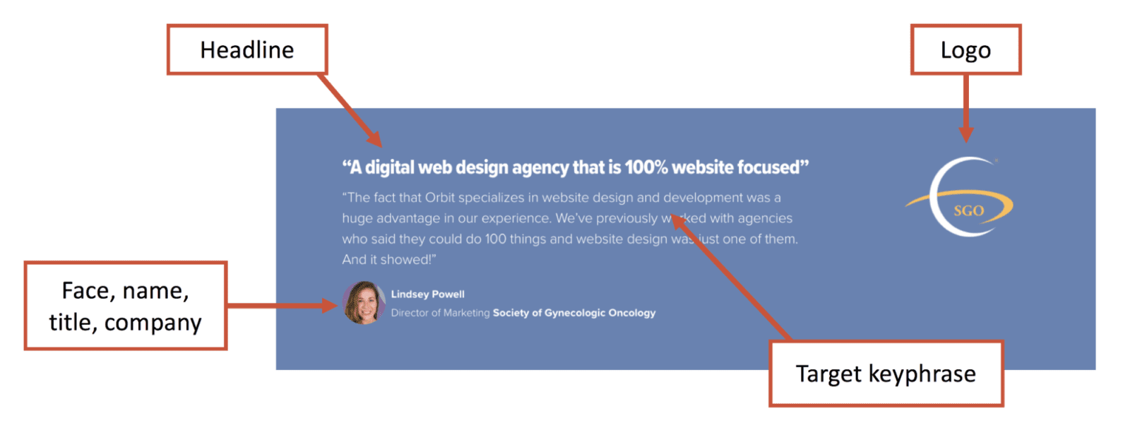
Source: How to Write Testimonials
9. Strong, supportive visuals (no stock photos)
Humans are visual creatures and the internet is a visual place. Obviously, all lead generating websites have images. But the best lead gen sites have relevant visuals that support the message. They add information.
- Charts and diagrams, visualizing supportive data
- The product in use or the service being performed
- Before and after real-world examples
- Brand-aligned visuals, including textures and patterns
- Building exterior or place pictures
Stock photos are not strong. They’re expected and boring. Avoid them if possible.
10. Faces of your people
Pictures of faces are uniquely powerful. Even from infancy, we tend to look at faces more than other types of images. This also works in web design. Add a face and it’s almost automatically at the top of the visual hierarchy.
And faces of people on your team are automatic differentiation since they are unique to your business. It helps position them as thought leaders while making the company more approachable.
One way to showcase your team is to treat them like testimonials. Add a quote, along with the face, title, location, etc.
11. Data and statistics
Support your value proposition with numbers.
When the visitor begins leaning toward action, data helps them justify the decision. Humans aren’t very rational decision makers. But once we begin to decide, our brains seek to rationalize the decision with hard evidence.
Data does that job.
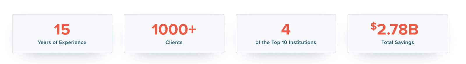
Here are examples of data points that support lead generation messages.
- Years in business
- Number of happy clients
- Number of team members
- Projects completed
- Return on investment
- Dollars sold/saved/earned
12. Depth, detail and related keyphrases
As above.
The page should be detailed and complete. With few exceptions, longer pages tend to convert visitors into leads at higher rates than short pages.
13. Compelling Call to Action (CTA)
As above.
But here at the bottom of the page, the call to action is another opportunity to use faces within a visual hierarchy. The face can pull the visitor’s attention toward the desired action.
14. Chatbot
These are now super popular with B2B marketing programs. Conversational marketing is almost a new standard on lead generation websites. You see chatbots everywhere, trying to catch your eye from the bottom right corner of pages everywhere.
They’re very clever. They ask qualifying questions to quickly engage with visitors (improved lead flow) and help visitors who aren’t a fit disqualify themselves (improved lead quality).
You can write different “playbooks” for different pages and different types of visitors.
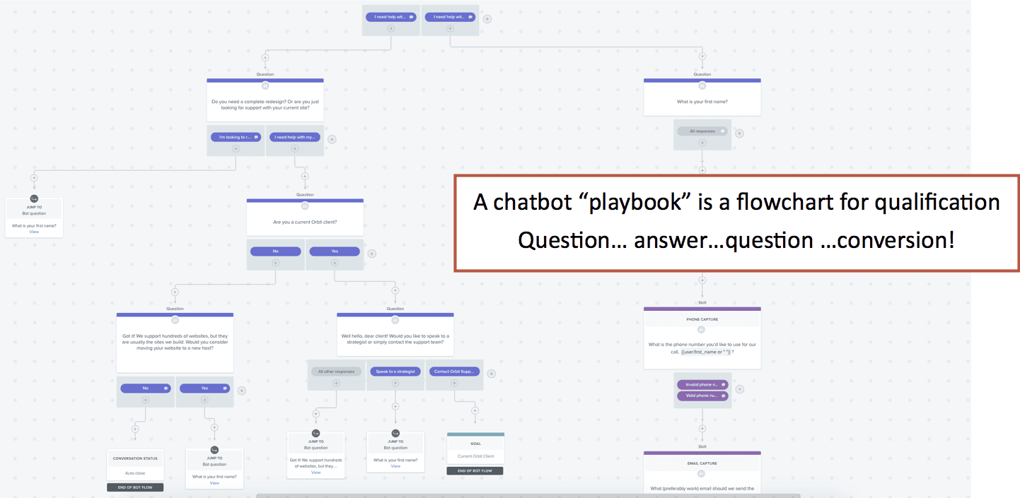
The best chatbots have built-in calendar widgets. If the visitor is a qualified lead, let them schedule a time to talk to an association right then, during their visit.
The about page: Building trust
You’ve shown the visitor what you do and how well you do it. Next, they’ll start to wonder who you are and why your company exists.
You can likely find evidence of this in your Analytics. Look at the “Previous Page Path” in the Navigation Summary for the About page to see which pages send visitors to your about page.
These visitors want to know who you are.
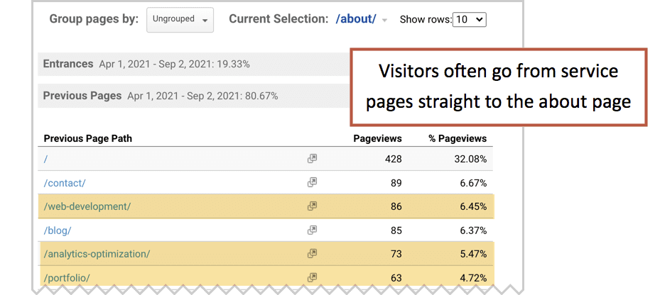
The About page is always one of the most popular pages on every lead generation website. It’s rare to see an Analytics account where About wasn’t one of the top five pages, excluding blog posts
On this page you’ll put a face to the name, explain your mission and tell your story. You can build an entire About section, but it’s not necessary. Most of the important elements can fit on one page.
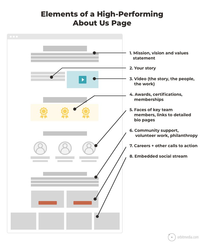
1. Mission, vision and values
These are short, big picture statements. Often, they’re just a statement of the business category “Our mission is to be the best web design company…” That’s fine but expected. If it’s boring, keep it short.
A mission or vision statement can also be a call to arms. It’s your chance to plant your flag and take a stand. The best statements are strong, direct and a little unexpected. Consider these:
- We believe in being relentlessly helpful.
- We believe in a healthy obsession with the experience of website visitors.
- We believe in accessibility. Because access to information is a human right.
- We believe in sweating the small stuff. Because small details make all the difference.
- We believe in generosity. We share everything we know with anyone who is interested.
- We believe in inclusion. Because the best answers are discovered when many voices are heard.
2. Your story
Here you’ll answer the big questions:
- Why are you in this business?
- How did this company get started?
- How long have you been doing this?
- What motivates your team?
- Why does this service matter?
You are the only one with your story, so make this a page that sets you apart. Talk about your values, your origin and why this work is important.
 |
Esther Choy, ALUMinate“Why is the sky blue? Where does money come from? How did you start your business? Origin stories are as old as the universe itself. People crave knowing it. Build trust with your future customers and clients by telling them why you do what you do. You don’t need to be a superhero to tell great stories, because a great story is the strategic sequencing of facts and emotion.“ |
3. The video
It’s simply an upgraded format for the mission and story. Because it’s a video, they’ll see your face and hear your voice.
For B2B service company websites, when trust is key, never miss the chance to upgrade the format to video. Video is the most powerful format, so use it for your most powerful message: why you exist as a company.
4. Awards, certifications, memberships and credentials
This is another place to put any kind of visual credential or evidence of legitimacy. Anything that applies to the entire business and not just one service will work. That includes awards, certifications, ratings and association memberships.
To keep the awards from becoming too visually noisy, give them a treatment (such as wrapping them in laurel wreaths) so they look nice.
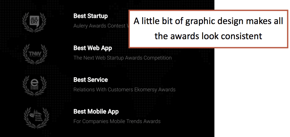
If you have physical trophies in the office, here’s a place to show them to a much larger audience.

5. Faces of key team members, linking to detailed profile pages
Don’t be a faceless corporation. Make your brand human. You are the only company with your people, so feature them prominently.
- If you’re small, show the faces of your entire team.
- If you’re big, show the faces of your key leadership.
Every lead generation website should have pictures of real people. Your visitors want to know who is involved in the service and in the company.
6. Community support, volunteer work, philanthropy
Score some goodwill points by showing how you give back. Highlight any donation programs, volunteer efforts and community support.
 |
“Nobody cares how much you know until they know how much you care.” – Teddy Roosevelt, American President |
Example: Orbit has donated $600,000+ in marketing services, together with like-minded partners and friends over the last nine years. We call it, Chicago Cause. We do it for the community, not for our marketing. But we’re proud of it and we feature it in our About page.
7. Careers and other calls to action
Unlike a service page, the visitor to the about page may not have any intention of becoming a sales lead. About is an all-purpose page that speaks to everyone. For this reason, non-lead generation CTAs make sense.
- Careers / See open positions
- Subscribe to newsletter
- Register for an event
8. Embedded social streams
This is a good place to embed an Instagram feed or content from another social network, assuming there’s a steady stream of activity there.
This is a nice way to give a pulse to an otherwise static page.
The contact page: Where the magic happens
The trick here is to get out of the way.
Filling out the form should be as effortless as possible with no distractions. Make it simple. The idea is to start a conversation, not interrogate your visitors.
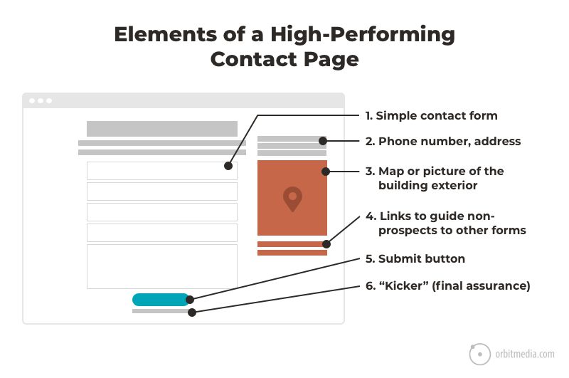
1. Simple contact form
This is one of the classic lead generation best practices: use a contact form with the minimum number of fields. Don’t make them answer 10 questions now. Don’t build a greedy form.
Of course, you’ll need a lot of information to qualify them as a legitimate lead but get it later, during the sales process.
2. Phone number, address and directions
Not all visitors want to fill out your form. Some want to call. Great. Put all of your contact information on this page: phone, fax and physical address.
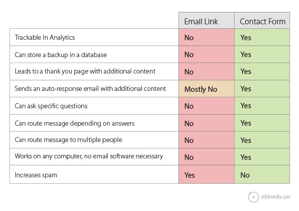
What about an email address?
Of course, some visitors may just want to send an email. Adding your email address is a courtesy to them. And not showing it may be frustrating.
But there is a strong case to be made for NOT putting your email address on your contact page. Far better to guide the visitor to the form for at least nine different reasons:
3. Map or picture of the building exterior
Here’s another chance to show that you’re a legitimate business. Make the place of business real and specific.
Show a may to your space with a link to get directions. And if you have an attractive location, show a photo of it. It’s another indication that you’re a legit business.

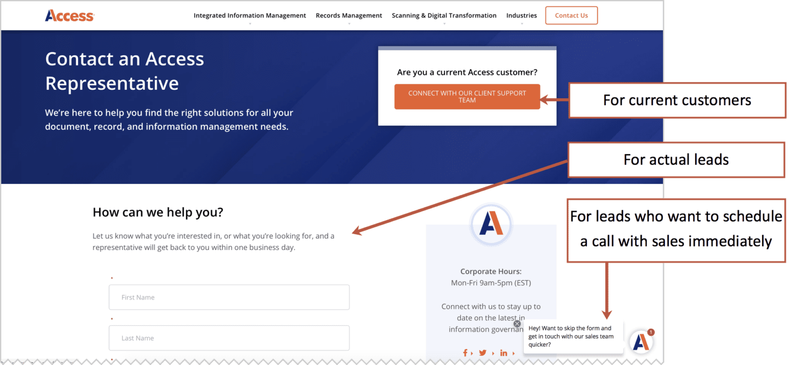
4. Buttons to guide non-prospects to other forms
Here’s your last chance to guide non-prospects toward other conversions. This will help keep your leads flow and CRM database neat and tidy.
It’s also good for the accuracy of your Analytics. The fewer non-leads that fill out your lead gen form, the more accurate your lead scoring will be.
Here’s a good example. Access has a B2B lead gen site with several options on the contact form. The big orange button at the top helps keeps current clients out of the lead generation funnel.
5. The Kicker …a final assurance or expectation setting
Notice the text above the form in the example above:
“…a representative will get back to you within one business day”
In this final moment, the site addresses a final concern.
If you know that the visitor is likely worried about something (Will they sell my data? Will they respect my privacy? Will they ever get back to me?) you can use this final moment to reassure them by adding a little next right next to the submit button.
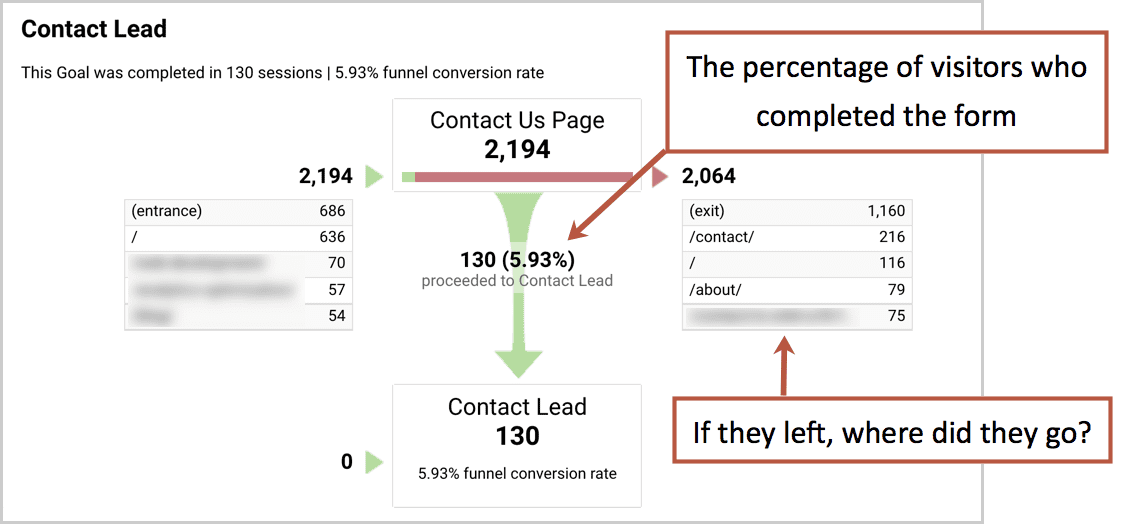
Measuring the performance of your contact page
The effectiveness of the contact form is easily measured in your Funnel Visualization report in Google Analytics. It shows the percentage of visitors who converted from the contact page. It also shows where they went if they left without converting.
The thank you page: Mission accomplished
On many websites, this page is nothing more than two tiny words: “Thank you.”
It might as well say “Goodbye.”
This is a big missed opportunity. The thank you page is your first interaction with your newly generated lead. Make it a good one by setting expectations, starting the conversation and building a connection with your new lead.
If it’s a dead-end, the visitor is more likely to head back to Google to find more possible partners.
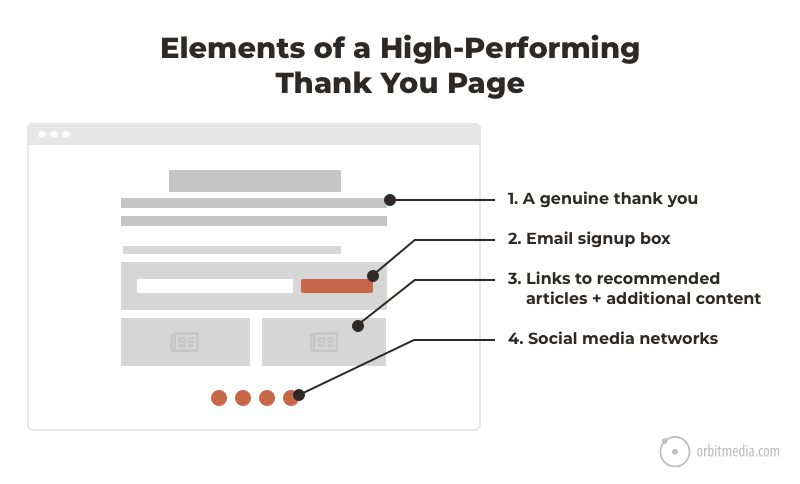
1. A genuine thank you message
Be sincere and use a personal tone. Explain what is going to happen next. How soon will you be in touch? Who will make contact?
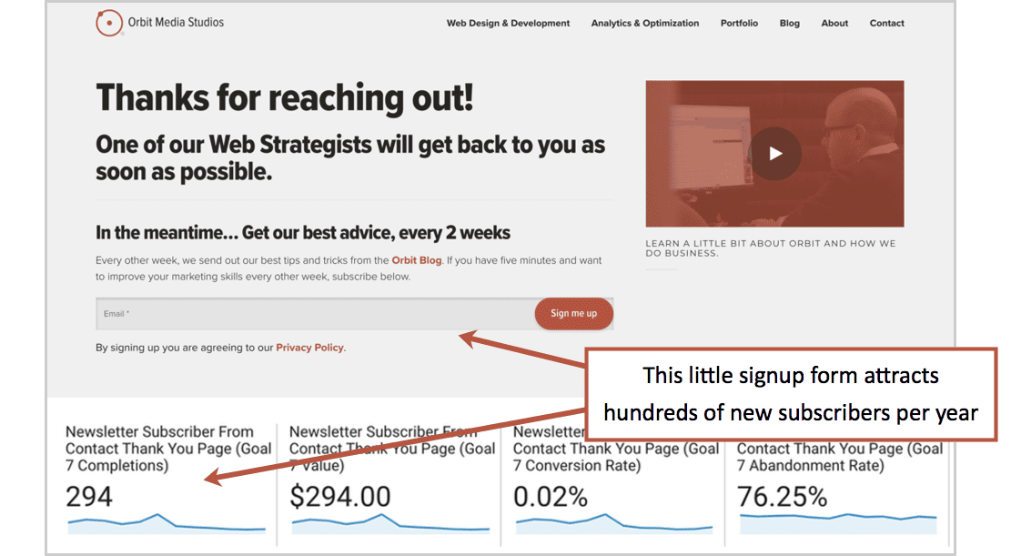
2. Email signup box
If they were ready to reach out, they may already really like you and your brand. Give them the option to subscribe for more of the content that brought them here in the first place.
The results may be excellent.
3. Links to recommended articles
If you don’t offer other options on this page, you might as well tell people to leave the site. Why not invite them into your content for a bit more helpful advice?
4. Social media icons
Even if they don’t follow you, there’s still a chance to show them your latest thinking, to show them a bit of your personality. Include the social networks where you are legitimately active. Don’t link to a dead social profile.
The global elements: Your header and footer
So far, every one of these best practices was within the design of the page. We’ve skipped over the global elements within the header and footer. But of course, these are critical to the experience of the visitor.
Here is a breakdown of header and footer elements on high-performing lead generation websites.
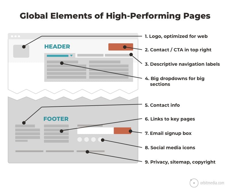
Let’s take a closer look.
The header:
1. Logo, optimized for web
The logo in the top left on a website is a web design standard.
2. Descriptive navigation labels
As with a descriptive <h1> header and meaningful <h2> subheads, navigation labels should be specific and descriptive, both for your visitors and for search engines. This is one of the basic website navigation best practices.
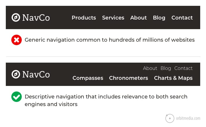
If your navigation labels are “services,” “about,” “blog,” and “contact,” ask yourself: why do we have the same navigation as millions of other websites?
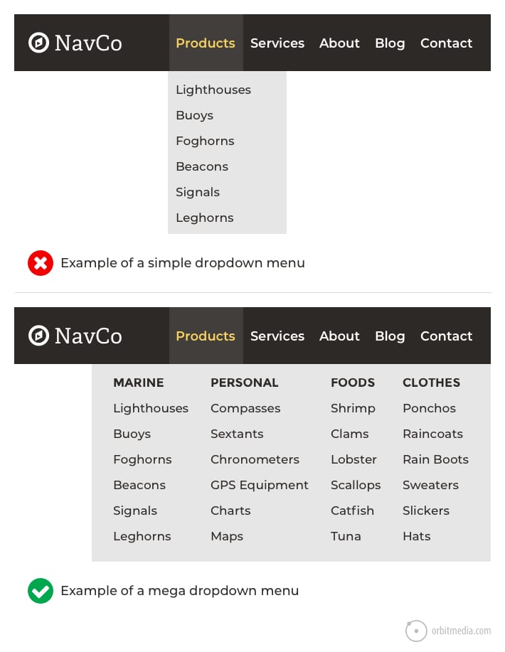
3. Dropdowns menus for big sections
Dropdowns have downsides. They are a convenience for visitors, but they also encourage visitors to skip top level pages. Often, these pages have some of the most compelling content. So the dropdown might be a detour around your best stuff.
This is usually the case for small dropdowns with few items.
But larger dropdowns (often called mega menus) are often excellent for usability when the section has a lot of subsections and pages. They are very useful to visitors, test well in usability studies and support lead generation when used strategically.
4. Contact in the top right
The top right corner is the standard place for contact information. Visitors will look for it here. Use a relevant call to action or a simple button to your contact page. This is also a nice place for a phone number.
The footer:
We once listed 27 things that can be added to a website footer. But for B2B lead generation best practices, we’ll stick with the top five.
5. Contact information
The footer is a standard place to repeat the contact information. Include the full, legal business name along with the address and phone number with the local area code. Altogether, this global instance of NAP (name, address, phone) are an important part of local SEO.
6. Links to key pages
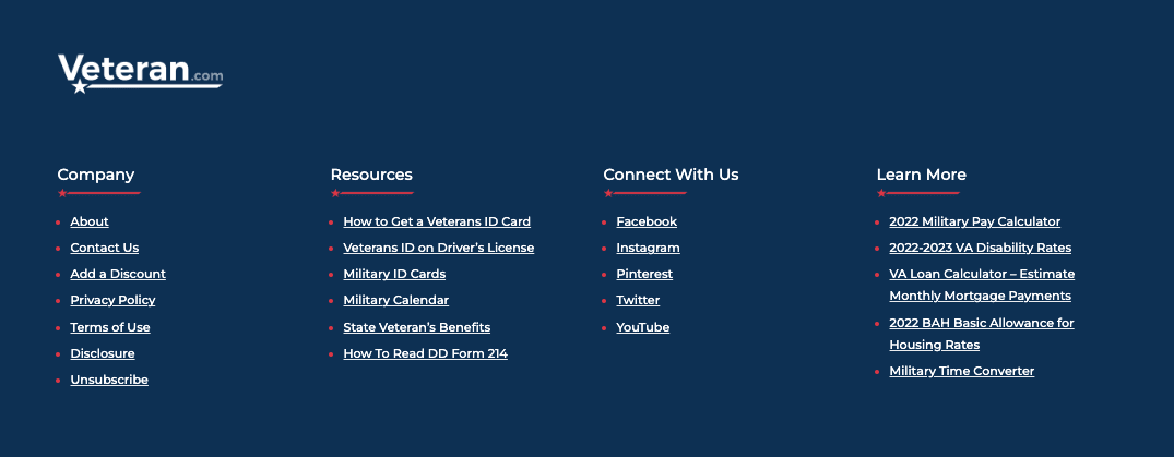
If the visitor came all the way down here, they must not have found what they were looking for above. Help them by adding links to the pages they are most likely to need. The pages that support conversions and leads.
Veteran.com is a good example of using footer links that direct to summaries and tools for their visitors. Users can get information from articles and then immediately put that information to use with the related links in the footer.
7. Email signup CTA
As above.
8. Social media icons
These are basically exit links that bring the visitor to pages filled with distractions. For that reason, we don’t really want to encourage the visitor to click these social icons, but we do want them to be easy to find for anyone who’s looking.
From the footer, link to any social network where you are legitimately active. That means actively sharing content and actively engaging in conversation. Probably, these are just a few. It’s probably not nine.
![]()
9. Privacy, sitemap, copyright
Finally, the ubiquitous footer information, common to virtually all websites.
What they didn’t tell you about content marketing
Very few blog readers never become leads …and that’s ok!
If you consider a “lead” to be anyone who enters an email address to download your ebook or guide, then yes, your blog readers will become leads.
But let’s be honest. These aren’t sales qualified leads. They want your ebook, not your help. Only a tiny percentage of this website traffic will ever become actual leads and customers. But the blog is critical anyway. Even if our conversion rate from blog readers is zero.
Why? The indirect benefits from blogging and content marketing are critical to attracting qualified visitors from search.
- With no content, there is nothing on your website worth linking to.
- With no links, your website will never have authority in search engines.
- With no authority, you will never rank for those competitive “commercial intent” keyphrases.
- With no rankings for those more valuable phrases, you’ll never attract the targeted visitors
- With no targeted visitors, you’ll never convert visitors into qualified leads.
The high-quality blog post, combined with a strong network of content creators and a collaborative approach to content marketing, is what drives SEO. The goal is to rank for those phrases that attract visitors who really need your help, unlike your typical blog reader. This is especially true in B2B marketing
Example: B2B service provider
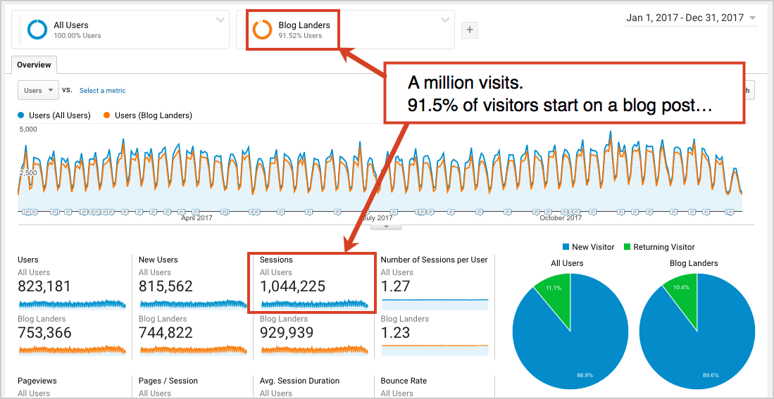
I’ve seen this in action on dozens of websites, digital marketing programs and Analytics accounts. But here’s an example from our own marketing and lead generation program.
This website gets over one million visits per year. (yay!) Around 91% of those visitors land on a blog post.
But do these people ever really turn into leads? Nope!
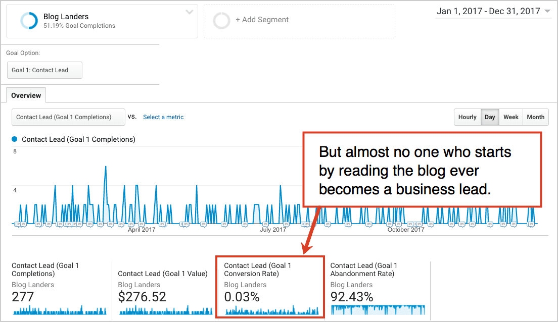
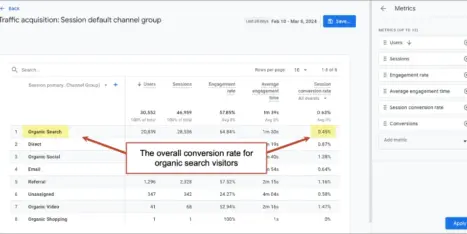
It’s just rare for someone who drops by for a bit of advice to convert into a lead. It happens just .03% of the time. But don’t panic. In a moment you’ll see how we drive hundreds of legitimate leads each year.
Obviously, if we had no blog, we’d have no subscribers, no followers and 930,000 fewer visitors per year. That’s a lot less brand awareness. More importantly, no one would ever link to us.
According to Ahrefs, over 10,000 websites link to orbitmedia.com. 87% of those links are to blog posts. Except for the home page, the top 217 linked to pages are blog posts.
Almost no one links to sales pages or brochure websites. But people link to useful articles every day.
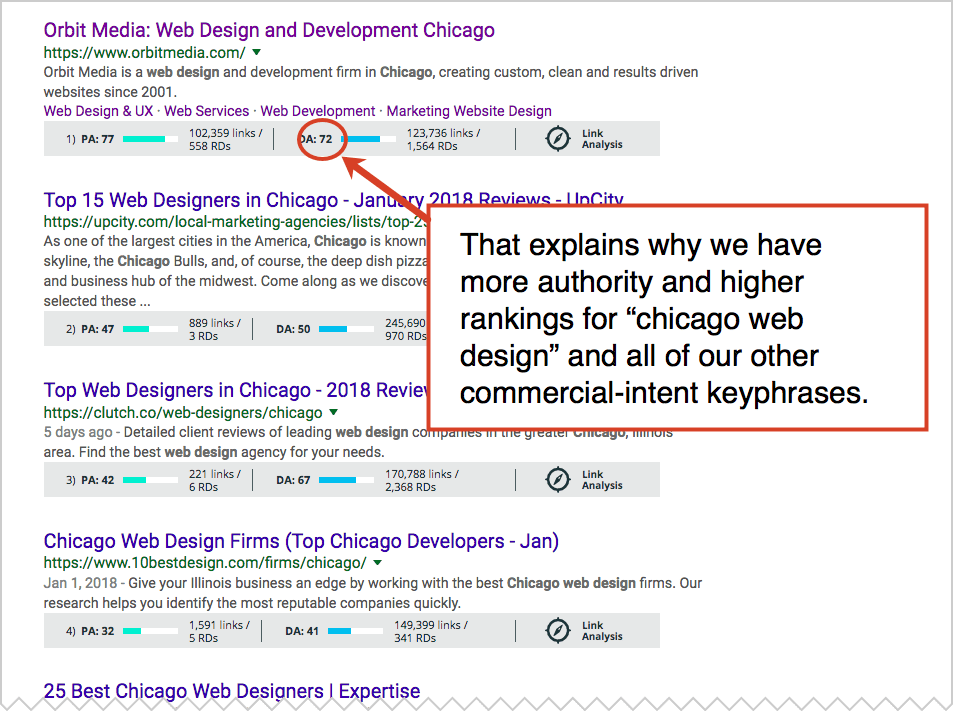
Without these pages, we’d have no authority …and no ranking for the “money phrases.” Here are the search results for “Chicago web design” with MozBar turned on. You can see the Authority for all the top ranking pages.
If you want to attract visitors who have strong intent, who actually may need your services, who actually may become a lead, you have to have a lot of content, links and authority. Otherwise, you’ll never rank for the phrase.
So let’s tweak that first chart. Here you see how the blog posts attract the authority that drives the rankings, and how those rankings attract the more qualified visitors.
This is what many B2B companies don’t understand about content marketing. It’s part of a broader lead generation strategy that takes into account Domain Authority. If you understand search, the benefits of blogging are very powerful. Indirect, but powerful.
So many little factors…
Visitors don’t generally follow a specific flow. There are a ton of little factors in inbound marketing and web design. Together, they combine to directly and indirectly impact your results. But put these best practices in place for your website, and you feel the difference in your pipeline.
Take a look at your website. Anything missing? Are you using all 54 best practices? Or did we miss anything on this list? We’d be grateful for any feedback or comments!