As some of you may have heard, Google updated their mobile search results algorithm on April 21, 2015. Google will now be using the “mobile-friendliness” of your website as a ranking signal.
Here’s Google’s official announcement:
“Starting April 21, we will be expanding our use of mobile-friendliness as a ranking signal. This change will affect mobile searches in all languages worldwide and will have a significant impact in our search results. Consequently, users will find it easier to get relevant, high quality search results that are optimized for their devices.”
Cue freak out!
No, don’t. Everyone remain calm.
Here are a few things to keep in mind before you make any rash decisions:
-
Remember that this only affects organic searches that are performed from a mobile device (your phone). All of your other rankings will remain as they are.
-
It won’t be immediate. It could take days or weeks for Google to roll this out.
-
This is at the page level, so pages will get promoted for being “mobile-friendly” or demoted for not being “mobile-friendly.”
Yes, it’s true that mobile-friendly web pages will rank higher in mobile search results. Why? Because the user is having a better experience on the mobile-friendly version (or should be anyway) and Google will reward you for that.
You’re probably wondering how this will affect your site, right? Let’s find out…
How do I know if my site is mobile-friendly?
Grab your phone and pull up your website. If it looks something like this….

it’s mobile-friendly. It adjusts to your phone’s width and is easy to navigate.
If it looks similar to this…

it’s not mobile-friendly. You’re going to have a hard time clicking on the small links to navigate that website. You know the ol’ pinch to zoom move. We’ve all been there.
Or you can use Google’s mobile-friendly testing tool. But, according to Dr. Pete over at Moz, “some SEOs are saying that different tools/tests are showing different results, and it appears that the mobile-friendly designation has a number of moving parts.”
Google is also labeling web pages as “mobile-friendly” in the actual mobile search results. I did a search for “retro lighting” and this is what I see…
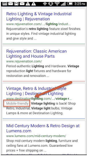
Of those three sites, Google is only labeling one as “mobile-friendly.” Which one would you click on?
How much traffic do I get from mobile?
Now it’s time to dive into your Analytics. The image below just shows us how much traffic is coming from a mobile device. What you need to determine is how much traffic you’re getting from mobile organic search.
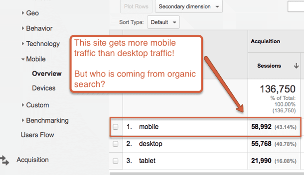
To find the mobile organic traffic, first set your date range to at least 4 months worth of data. Then go to Audience > Mobile > Overview > Secondary Dimension drop down > choose Source / Medium.
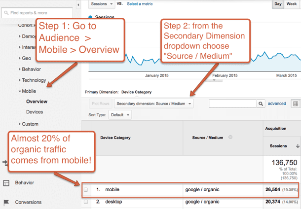
For this site, almost 20% of organic search traffic comes from mobile. That’s quite a lot! But, you don’t know if those are branded searches or keyword searches. I’ll get into that a little more in the section below.
How much will this affect my mobile rankings?
Unfortunately, no one knows how much this will affect mobile rankings. Great answer, right? Hear me out.
Here’s what Google has to say about it (full story here):
“The mobile-friendly algorithm is an on or off algorithm, on a page-by-page basis, but it is not about how mobile-friendly your pages are, it is simply are you mobile-friendly or not.
But as we mentioned earlier, there are over 200 different factors that determine ranking so we can’t just give you a yes or no answer with this. It depends on all the other attributes of your site, whether it is providing a great user experience or not. That is the same with desktop search, not isolated with mobile search.”
Of course there’s a bunch of speculation around this, but Google is only saying that it will be “more visible” than the Panda (duplicate content) or Penguin (backlink penalty) updates.
There are a couple of reasons why this is tricky:
When Google encrypted search, they stopped passing along keyword data from searches so you don’t know what people are actually searching for. This is why you see this report in your Analytics.
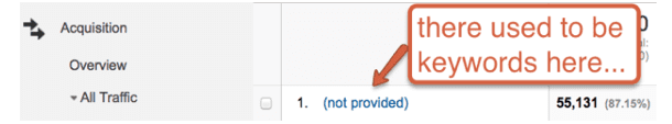
Say 50% of your traffic to your site is coming from mobile organic search. You won’t know if those searches are for your brand name or a keyword phrase. You’ll likely always rank #1 for your brand name. Even if you have a ton of mobile organic traffic to your site and it’s all branded, it’s unlikely you’ll be affected by this algorithm update.
On the flip side, if the majority of those searches are keyword phrases and not branded searches, you should be making a plan to make your site mobile-friendly pretty quickly. If you’re an ecommerce site or a lead generation site that relies on leads through the website, you may want to make it a top priority.
Regardless of either situation, Google is making it pretty clear that you better have a mobile-friendly site in the very near future.
How do I fix this?
The answer to this is quite simple (relatively speaking):
-
If your site is mobile-friendly and you’re still getting warnings from within your Webmaster Tools account, you should figure out if these warnings are legit.
-
If your site is not mobile-friendly, the site will need to become mobile-friendly. You should contact your web developer.
Warnings in Webmaster Tools:
Due to this upcoming algorithm change, Webmaster Tools is sending out mass warnings to all site owners. They look like this:
The majority of the warnings are:
1. Small font size:
This report identifies pages where the font size for the page is too small to be legible and would require mobile visitors to “pinch to zoom” in order to read..
2. Viewport not configured:
Because visitors to your site use a variety of devices with varying screen sizes—from large desktop monitors, to tablets and small smartphones—your pages should specify a viewport using the meta viewport tag. This tag tells browsers how to adjust the page’s dimension and scaling to suit the device.
3. Content not sized to viewport:
This report indicates pages where horizontal scrolling is necessary to see words and images on the page. This happens when pages use absolute values in CSS declarations, or use images designed to look best at a specific browser width (such as 980px).
4. Fixed-width viewport:
This report shows those pages with a viewport set to a fixed width. Some web developers define the viewport to a fixed pixel size in order to adjust a non-responsive page to suit common mobile screen sizes.
5. Touch elements too close:
This report shows the URLs for sites where touch elements, such as buttons and navigational links, are so close to each other that a mobile user cannot easily tap a desired element with their finger without also tapping a neighboring element.
6. Flash usage:
Some component on the site is using Flash.
Are these really red flags?
The other warnings you see in Webmaster Tools may look like this:
Google systems have tested XX pages from your site and found that XX% of them have critical mobile usability errors. The errors on these XX pages severely affect how mobile users are able to experience your website. These pages will not be seen as mobile-friendly by Google Search, and will therefore be displayed and ranked appropriately for smartphone users.
Terrifying right? Maybe not.
You’ll need to dig deep into the “Mobile Usability” report within Webmaster Tools to see which pages are receiving the warnings and why.
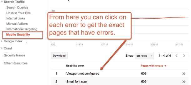
We have access to hundreds of Webmaster Tool accounts and as I’ve been evaluating the warnings (most being for responsive mobile-friendly websites), the warnings seem to be targeted toward blog post pages.
The warnings range from “small font size” to “content not size to viewport.” Meaning, that if you added an image or a link that’s not up to Google’s “mobile best practice standards,” Google will send out a warning.
When Google sends out these warnings, they don’t tell you specifically what needs to be fixed on that page. So, it may say “small font size” but it won’t tell you if it’s the font size in your footer, within the content, etc… Therefore, determining and fixing the exact issue is not as easy as it sounds.
What do I do next?
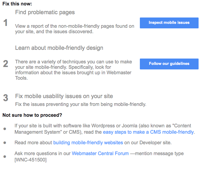
I’m not suggesting you ignore these warnings, but take your time to actually review them. Then make an informed decision on whether or not it will be worth the time and money to make the changes that may be needed. You also have to take into account that any changes that Google is suggesting, may affect the layout of your current site.
If you have questions, I’d recommend calling your web developer and having them take a look. If you’re an Orbit client, feel free to contact me directly and I can take a look for you. If you have any other questions, feel free to leave them in the comments below.