Total visitors. It’s easy to see. Every marketer knows how much traffic they’re getting because it’s right there in your Analytics. But what happens next isn’t as obvious.
That’s why giving advice for driving traffic is easy, but web design tips are hard. There are so many factors. Even after 1000+ successful web design projects, it’s difficult for us to know what will work best.
This article has 27 web design tips for getting more value from every single visitor. Most of these tips are supported by research. These are for beginner designers and advanced UX pros, for small business and big enterprise.
Here is our best advice, ideas and inspiration on how to design a website that gets results. A site that looks beautiful, converts visitors and gets more value from every one of those hard-earned visits.
The two most important studies cited here are at the very end. If you’re impatient, skip down!
The Structural Layout of the Website
Websites are two things: containers and content. The container is two things: structure and style. Let’s start with the first. These tips are about the structure and layout of the pages.
1. Leverage a visual hierarchy
Every page has a visual hierarchy. If you’re not familiar with that concept, here’s our definition:
Visual hierarchy refers to the arrangement, size, color and contrast of visual elements. It determines their relative prominence and the order in which they are seen by the human eye.
Web designers use visual hierarchy to guide visitors attention to important elements first. The website layout includes the position (high or low on the page), sizes (big or small), visuals (video, images, icons) and contrast (color and white space).

Combining aspects multiplies their effect. Everyone will see a large video, high on the page. Few people will see low contrast text surrounded by images.
Visual hierarchy is why your eyes follow a certain path on every page you visit on the internet. When used deliberately, it guides the visitor’s attention through a series of messages, toward a call to action.
2. Use a descriptive, keyphrase-focused headline high on the homepage
The headline on the top of the homepage (and every page) is either descriptive or not. If not, the visitor may not be able to answer their first question: “Am I in the right place?”
It’s also an opportunity to use a target keyphrase and indicate relevance. But a lot of marketers write something clever or vague instead. But clear is better than clever.
Rather than write a fancy, but vague headline, write something descriptive. Make sure that you explain what the company does high up on the page, above the fold.
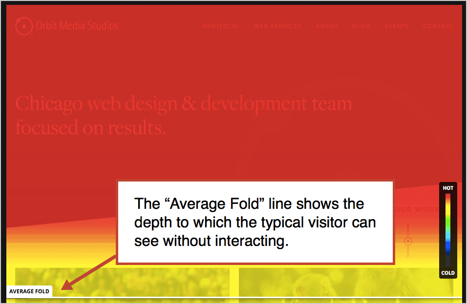
Wait, the fold is still a thing?
Yes, there is a fold. For every visit on every screen, there is a viewable area. At the bottom is the famous fold. To see anything below this line, that visitor must scroll.
Why and if this matters in web design is a hotly debated topic. Here are two of the best arguments: “There is no fold!“ vs “The fold still matters.”
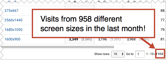
Of course, there are thousands of screen sizes, ranging from tiny to huge. This website was viewed on 958 different sized screens in the last month. So some designers say the fold is no longer relevant.
But here’s the bottom line (get it?) There is still a fold for every visit and still an average fold for all visits. Tools like Hotjar show it clearly as a line in the scroll heatmap, for desktop/laptop, mobile and tablet.
So yes, there’s a fold and it matters what you put above and below it. One study showed that visitors spend 80% of their time above the fold.
![]()
So put your value proposition, that 8-word version of what you do, high on the page, above the fold.
3. But don’t put all of your calls to action at the top
Visitors may be spending more time there, but that doesn’t mean that they’re ready to take action. A lot of persuasion happens farther down the page.
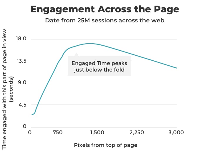
When Chartbeat analyzed 25 million visits they found that most engagement happens below the fold. Content at the top may be visible, it’s not necessarily going to be the most effective place to put your calls to action.
One caveat about this frequently-cited study: Chartbeat is used mostly by news websites, which are very different from marketing websites. No one does much above the fold on a news website! Normal web design tips don’t apply.
Make sure to put calls to action farther down the page, in any place where interest is likely to be high.
4. Make it a tall page. Answer all your visitors’ questions.
More pixels means more space to answer questions, address objections and add supportive evidence. If the visitor doesn’t find an answer to an important question, they can simply keep moving down the page. Once they are satisfied, they’ll simply stop reading.
The most effective sales pages emulate sales conversations.
You would never cut someone off during a sales meeting and stop answering their questions, would you? That’s all a short page does; it stops answering questions.
Here’s where the famous study from Crazy Egg comes in. They surveyed their audience, discovered their top questions and concerns, and built a tall page that addresses everything.
The page was 20x longer. The conversion rate went up by 30%.
 |
“Scrolling is a continuation. Clicking is a decision” – Josh Porter, Rocket Insights |
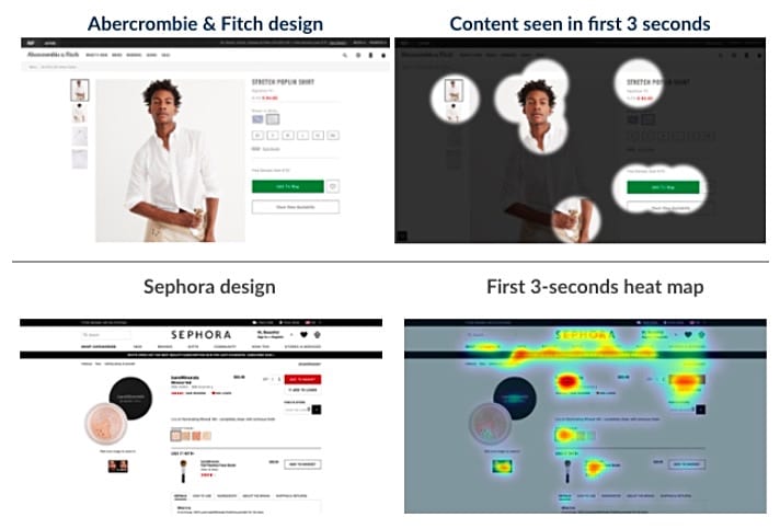
5. Show one thing at a time
“I like clean, modern designs.” That’s what most of our clients tell us when we begin web design projects. They often refer to Apple’s website as an example.
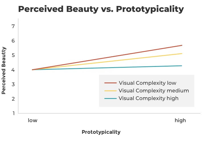
Visitors don’t like clutter. We like whitespace. In other words, we like low visual complexity.
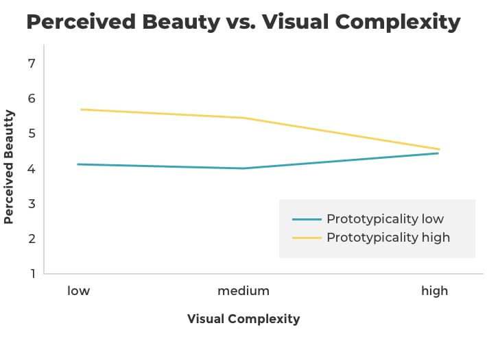
In 2012, Google set out to discover what types of websites are seen as beautiful to visitors. It’s a study about simplicity with a very complicated name: The role of visual complexity and prototypicality regarding first impression of websites: Working towards understanding aesthetic judgments.
They learned that more complex designs are less likely to be perceived as beautiful.
This explains the trend toward single column layouts and tall pages. Designs with multiple columns (left side navigation, content area, right rail) are more complex, with more visual elements within the visitors field of vision.
So cut the clutter. Make one of two elements the focus at each scroll depth.
6. Stick to standard layouts
That same study by Google found that “high prototypicality” also correlates with perceived beauty. In other words, weird isn’t usually pretty. A website that follows web design standards is more likely to be loved.
The sites considered the most beautiful have both high prototypicality and low visual complexity. They are both simple and clean.
Think of it this way, it’s good to differentiate your brand, but the layout isn’t the place to do it. Be different in WHAT you say. But be typical in HOW your site is used.
Some cars look amazing. They’re different. They’re beautiful. But they still have doors on the sides, wheels on the bottom and headlights in front.
But what’s standard? According to our own research, these are the standard elements for a website:
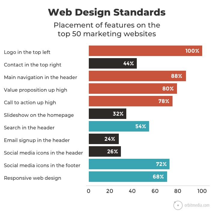
The “standard” website with high prototypicality includes the following:
- Logo in the top left
- Horizontal navigation in the header
- Search bar at the top
- Social icons at the bottom
- Mobile responsive design
7. Beware of “false bottoms”
Modern marketing websites, especially the sales pages, are built with page blocks. These are rows of content, often with an image on one side and text on the other, flowing down the page in a single column.
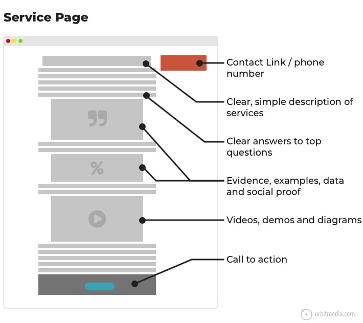
Here’s the anatomy of a typical service page on a lead generation website.
As the diagram shows, the footer has a darker background color. So many sites do this that visitors now expect that a switch to a darker background means the bottom of the page.
But if the design has a pageblock with a dark background, the visitor might think they’ve hit the bottom and stop scrolling. It’s a false bottom.
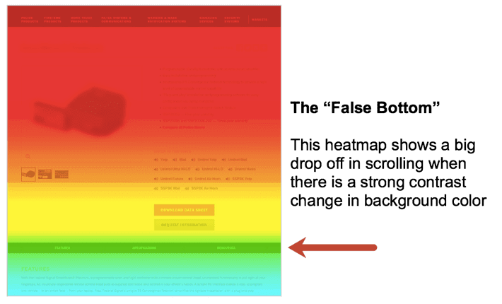
Note: I debate with my own designers about this one. Kurt Cruse, our creative director, makes an excellent point. Changes in background color is an excellent way to let visitors know that the type of content is changing. I hear you, Kurt!
Just be deliberate when selecting background colors for page blocks. To be safe, choose only slight variations or just always use white or light gray. Then switch to dark gray or black in the footer.
8. Avoid carousels and rotating sliders
They’ve been popular for years and clients love them. But there is a problem with the homepage slideshow: visitors might only see the first slide.
There have been a lot of studies that come to the same conclusion. Messages on subsequent slides are less likely to be seen and calls to action are unlikely to be clicked. Just look at the click through rates for the slides on a university website.
They may be popular because they’re easy to get approved. Different stakeholders from different departments all get some pixels above the fold. They’re good for internal politics, not for visitors.
Homepage slideshows are good at keeping people from stabbing each other in conference rooms.
So what to do instead?
- Stack the slides, so the visitor can see each by scrolling down the page. They will suddenly become much more visible.
- Use a featured image, using the one most impactful slide as the hero. Give it a good call to action!
9. Avoid tabs and accordions
Here’s another way to take things out of hiding: avoid tabs and expandable boxes of content.
Knowing that up to 76% of website visitors are scanning, you can make your content more visible to them by keeping it all exposed, with no need to click to reveal something.
If tabs and expandable accordions were effective, you’ll probably see them on Amazon.
Remember, scrolling is faster and easier than clicking. If the visitors have to aim and click or tab to be able to view something, they are less likely to see it.
Images
Let’s move on to the visuals. These tips are specific to the pictures on web pages.
10. Use people pictures
Faces are uniquely powerful imagery. From the time we are born, we gaze at faces more anything else. The magnetic power of people pictures is very useful in web design.
Not only do faces draw attention, they correlate with conversion. The famous case study by Basecamp showed a huge lift in results when faces and testimonials were combined on a sales page.
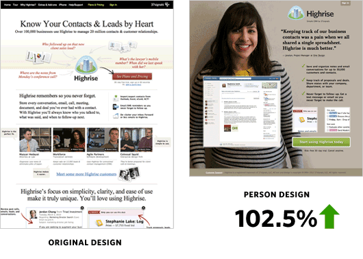
Make sure your website doesn’t look like an “abandoned spaceship” without a soul onboard.
I’ve talked to thousands of businesses about their marketing over the years and I’ve noticed a pattern. Big companies are always trying to look small, and small companies are trying to look big. Strange, right?
Really, every company should just try to be more personal, more human.
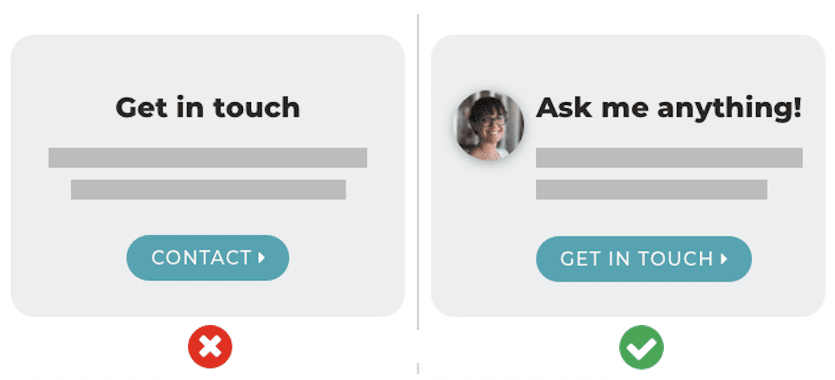
11. But avoid stock photos of people
There is a time and place for stock photos, but I would avoid stock photos of people like the plague. They just never feel genuine, therefore they don’t build trust.
Companies are tempted by stock photos because the production quality is high. But your visitors care more about reality. They would prefer to see real people who actually work at the company.
Authenticity is more important than polish.
The research backs this up. A study by NN Group found that visitors tune out stock photos of people and “filler” images, but actually look at pictures of real people.
So be yourself, show your team and use pictures of real people, even if they are perfectly polished.
12. Use faces as visual cues
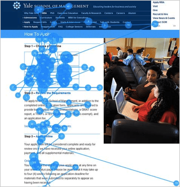
People pictures give you a special opportunity to guide the visitors attention. The famous “you look where they look” phenomenon.
When researcher James Breeze showed designs to 106 people, he demonstrated the power of well-positioned faces. They have the power to direct the visitors attention toward other elements.
This is the famous study with the baby face. When the baby looks at the camera, visitors look at the baby. When the baby looks at the headline, visitors look at the headline.
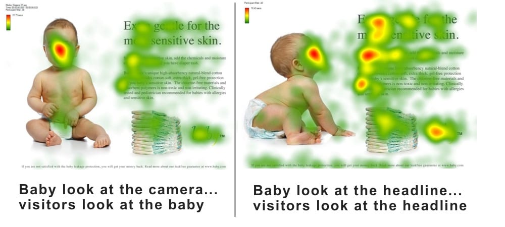
My friend Oli Gardner is tired of this example with the baby (sorry, Oli!). If anyone knows of other research or good examples, please let me know in the comments!
Use a line of sight in face imagery as a directional cue to guide the visitors attention to benefit statements or calls to action.
13. Use arrows as visual Cues
Faces can guide attention, but they aren’t the only way to control the eyes of your visitors. Little hand drawn arrows may be even more effective.
In this eye tracking study by CXL found that a simple arrow was even more powerful at getting visitors to look at a page element.
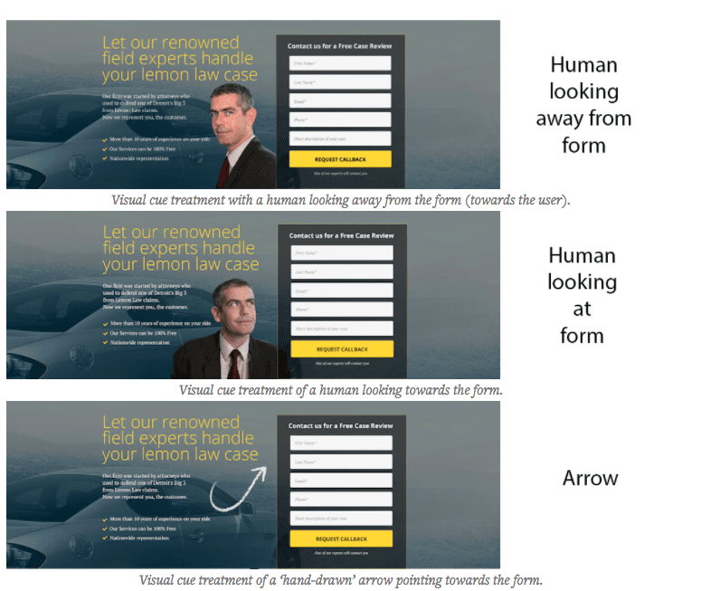
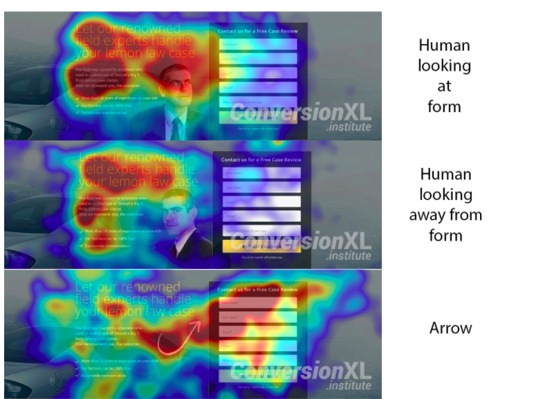
If you want your visitors to look at something, point at it with an arrow. I’m not sure if this tip is ridiculously obvious or profoundly insightful.
14. Use color to guide visitors’ attention toward calls to action
Colors have emotional connotations (red is urgent, blue is calm) and they’re part of brand standards. But they are also opportunities to pull the visitors eye toward buttons and CTAs.
A study by Eyequant about button color confirms the power of color and luminance contrast to draw attention.
But the study shows that colorful buttons aren’t always effective. If you want your button to be more visually prominent:
- Contrast the button color with the background
- Contrast the button color and the button text
- Contrast the button color with nearby elements on the page (or leave plenty of white space around it)
The “Von Restorff Effect”
In the 1930s, German scientist Hedwig von Restorff discovered that when shown a list of ten items, people remember items if they are a color different from the others. This is because the occipital lobe is sensitive to visual differences, or “pattern interrupters.”
Web marketer Paras Chopra conducted experiments that showed how standout colors aren’t just remembered more, they’re clicked more: 60% more!
Pro Tip! Pick an “action color” for all of your links, buttons, and rollover effects. Make it a color that’s distinct from the brand colors used throughout the design (these are the “passive colors”). Use the action color nowhere else but in the clickable items.
Navigation and Links
Now we get into the advice for navigation of the site, including the menus, buttons and links that let your visitors move around.
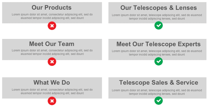
15. Be descriptive
Navigation is always visually prominent, so it’s an opportunity to communicate. Visitors typically start their visit by scanning across the header. Anything there, including your menus, are very likely to be seen.
Source: UX Movement
When the navigation labels are generic, you’ve missed a chance to tell the visitors what you do. Compare these two examples:
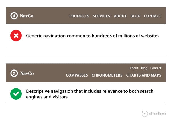
If your navigation labels are generic, then they are common to thousands or even millions of websites. You’ve missed a chance to leverage website navigation best practices, help your visitors and improve your search rankings.
16. Put home on the left, but other than that, don’t worry too much about the order of menu items
If you do have a home link, put it on the left. It’s the most common place for it, so visitors expect to find it there.
As far as the rest of the menu items, research shows that the order isn’t all that important. There are two different eye tracking studies that show a low correlation between the order of menu items and success of visitors (source and source).
So don’t spend a ton of time worrying about the order of things in your menu.
17. Be careful linking from service pages to blog posts
If the visitor is on a service page, the goal is to convert them into a lead. If you add big opportunities to leave and go read your blog, they’ll land on pages that are less focused on lead generation. Blog posts naturally have more distractions, exits opportunities and lower conversion rates.
18. Be careful linking to anything on other websites
Whenever relevant, link to things that help the visitor reach their goals. On a blog post, that’s often a citation of a source or link to external references. This post links to dozens of articles and studies!
But on service pages and on your homepage, you should link away to other sites with care. For any page optimized to convert visitors into leads, ask yourself, do you really want visitors to click on that link? Does it help you reach your goals?
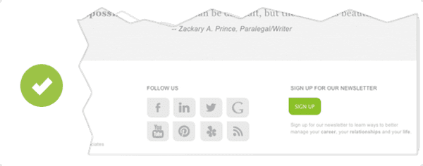
19. Avoid using social media icons in your website header
Similarly, colorful social media icons in your header isn’t great for your goals. If visitors click on any of those candy-colored buttons, they land on a site filled with distractions. They are unlikely to come back.
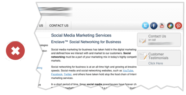
This is generally the wrong way to do social media integration. If you link to a social network, do so from your footer. Visitors can find the social networks if they’re looking, but you’re not suggesting that they leave.
Writing
Let’s talk about words. Earlier, we recommended a keyphrase-focused headline on the homepage. Here are a few more tips for the writing that goes into the website, including headers, subheads and body text.
20. Write meaningful subheads
Vague subheads are everywhere. They are often large and useless but followed by things that are small but useful. Strange, right? The opposite would make more sense.
Make sure that the big things are meaningful and helpful to visitors. If your subheaders say things like “products” or “services,” ask yourself if a more descriptive term would be more helpful. Here are some examples.
This is good for scanners and usability. It’s good for the visually impaired and accessibility. It’s also good SEO best practices. Never miss a chance to indicate relevance!
ProTip: Subheads may be completely unnecessary. Would this page be just as good without it? Would visitors still know what they’re looking at? If so, just remove it.
21. Avoid long paragraphs and long line length
Long, blocky paragraphs do not align with digital content best practices. Simply breaking up long paragraphs makes the content easier to consume. As a general rule, don’t write paragraphs longer than 3-4 lines.
 |
“Short paragraphs get read, long paragraphs get skimmed, really long paragraphs get skipped” – Jason Fried, Founder and CEO, Basecamp |
If line length is very long, it can be more difficult for visitors to read. The Web Style Guide recommends lines of no more than 12 words.
22. Avoid jargon. Use simple words.
The easier it is the read, the more successful the website will be. Use the common words that visitors expect. Long sentences and fancy words force the temporal lobe to work harder. That’s not good.
 |
“Keep it simple! “Cognitive fluency” is a measure of how easily your visitor’s brain processes what they are looking at. When something is difficult to read, we unconsciously find it riskier and/or time-consuming. So, to maximize conversion, use short text, simple fonts, and an easy-to-read design.” – Roger Dooley, author of Brainfluence |
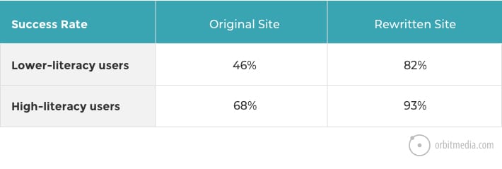
Copy that works well for “low literacy” users works well for everyone. It’s not about dumbing it down; it’s about using simple language that everyone can understand. Research has shown that bringing down the readability levels can improve the success rate for all visitors.
Even PhDs prefer to read at an 8th-grade level.
That big word might make you sound smart, but it might make your visitor feel dumb. A visitor who doubts themselves is unlikely to take action. So as you write, keep asking yourself this question:
Do 100% of visitors know the meaning of the words on this page?
23. List Order and “Serial Position Effect”
When ordering any lists within your copy, put the important stuff at the beginning and end. The reader’s’ attention and retention are lowest in the middle of any list. As visitors scan the page, the first and the last items are most likely to stay in short-term memory.
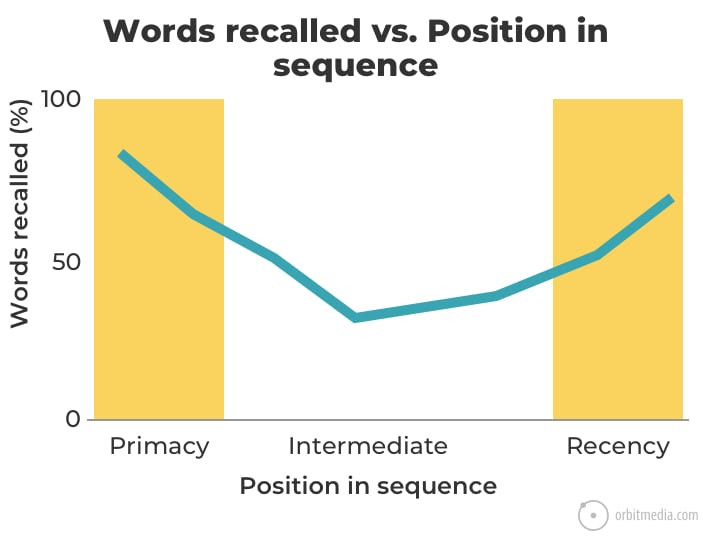
Source: Order Effects Theory: Primacy versus Recency
24. Answer the visitors’ top questions
They came with questions. The main job of the website is to answer those questions. Every unanswered question is a missed opportunity to build trust. Unanswered questions also increase the likelihood that the visitor will leave.
When Joel Klettke applied his process finding questions and writing answers, he was able to double the conversion rates on Hubspot landing pages. He interviewed customers, analyzed their answers, prioritized the messages and in the end, he used the words of the audience themselves in the new marketing copy. Smart!
Here are the questions Joel uses to discover visitors’ top questions:
- What was happening that sent you looking for a solution?
- What else did you try and what didn’t you love about it?
- What almost kept you from buying from us?
- What made you confident enough to give us a try?
- What made X the best solution for you?
- When evaluating X, what was most important to you?
- What can you do now (or do better) that you couldn’t do before?
- Give me an example of when X made a difference for you?
In one word, what is the purpose of your website? Answer.
Additional reading: The Perfect B2B Website Service Page: 13-Point Checklist
25. Add evidence and social proof
The “conformity bias” is the human tendency to do what other people are doing. So giving evidence that others have selected you makes choosing your company seem like a good choice. The goal is to make any decision other than using your company seem outside the norm.
Give your visitors proof that you’re legitimate. Ideally, every one of your marketing claims is supported with evidence.
 |
“How many times have you clicked through to a website on a design award winners’ list and rolled your eyes at a riveting title tag of “Home”? This is what happens when you trust an agency to “create something totally rad and unique” instead of choosing an agency who promises to build something that will work the way your clients/customers need and expect it to work.” – Jen Salamandick, Kick Point |
The fastest, easiest way is to add testimonials. Here are other types of social proof.
- Endorsements from relevant influencers
- Product reviews from customers
- “As seen in…” logos of media where your company has been mentioned
- Social media widgets showing the size of your following
- Trust seals, including association memberships, security certificates, and awards
How much proof is enough? How many testimonials should you add?
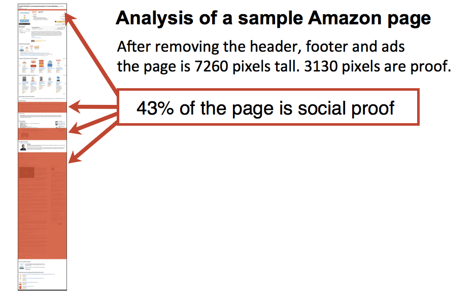
A lot. It’s possible that there is no such thing as too much evidence. We did a quick analysis of one of Amazon’s product detail pages and found that 43% of the page is evidence and reviews.
Pro Tip! Don’t make a testimonials page. They tend to be low traffic pages. Instead, add testimonials to every service page.
26. Mention scarcity, trigger “loss aversion”
Humans are not efficient cost/benefit calculators. We tend to overvalue losses and undervalue gains. In other words, losses are more painful than gains are pleasurable.
This is true online and offline and explains a lot of human behavior. This article explains it well: Applying Behavioral Economics And Cognitive Psychology to the Design Process by Nikki Pfarr.
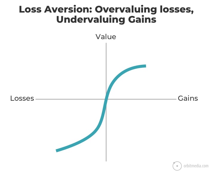
This aversion to losses can be useful to web designers and copywriters. Here are some tips for writing copy with loss aversion in mind.
- Emphasize the costs of not using your product or service.
- Group costs together, list benefits separately.
- Emphasize immediate gains.
- Create urgency with limited time offers. If the product is scarce, say so.
Gently remind your visitors what they’ll miss, risk or lose by not taking action right now.
27. Optimize email signup forms for subscribers
There’s one at the bottom of this post. It’s a call to action to subscribe. If you look closely, you’ll see that it includes three separate elements. These are the 3 P’s for email signup forms.
- Prominence It stands out within the visual hierarchy
- Promise It tells the reader what they’ll get an how often
- Proof It uses social proof: the number of subscribers or a tiny testimonial
When we first experimented with these changes, the conversion rate on the older form was very low, so the improvement was dramatic. We saw a 4,863% increase in email signups.
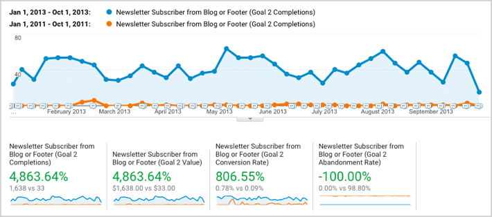
When designing your emails signup form, make it visible, use social proof and tell the readers what they’re going to get.
More than just a pretty site
Everyone loves beauty. Everyone loves cool new design features. Everyone’s a critic. But as visitors, we need more than beauty. We need information. And as website owners, we need results.
Here are two studies with the same finding. The first is a survey by Hubspot that shows visitors value easy to find information more than beautiful design or fancy UX.
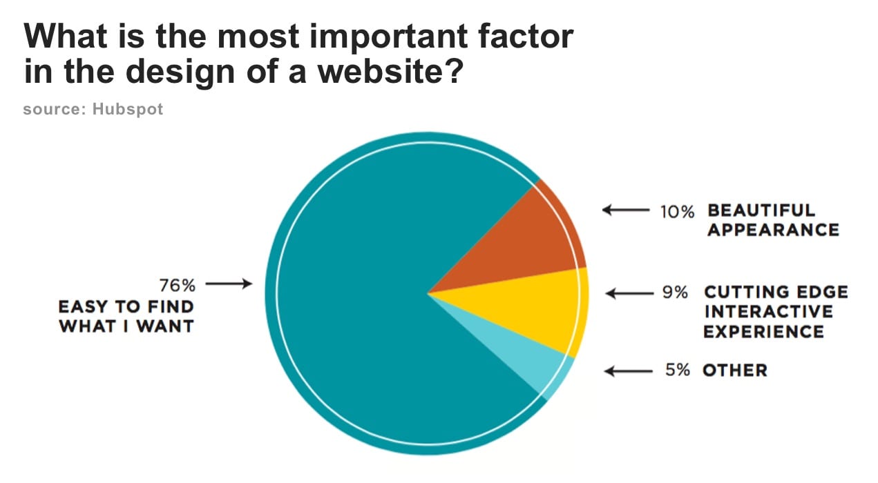
This second study is the conclusion of a set of user tests by NN Group. It shows that when visitors fail, it’s because they can’t find information, not because the site isn’t beautiful enough.
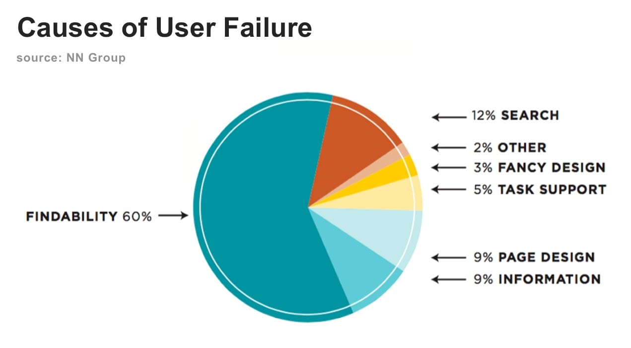
I love beautiful design as much as anyone. It’s why I got started in this business! And I often think of this quote:
 |
“The life of a designer is a life of fight. Fight against the ugliness.” – Massimo Vignelli, design legend |
But in web design, we create containers for content. And the visitors came for the content, not the container.
Websites should be beautiful. They should have a visual or emotional impact on the visitors. But the success of your website goes far beyond beauty. It’s about helping visitors find what they need. That is the heart of every tip in this article. And it’s the true purpose of web design.
Help your visitor find what they came for, and then give them what you want them to have.