There are two kinds of website improvement projects.
The first and more obvious one is creating a new website. Done effectively, the process requires careful planning, the collaborative efforts of a team of talented specialists, and of course, time—usually months.
The other way to improve your website is to tackle small, but meaningful tasks one at a time, over time, on a regular basis. If your website is built on a user-friendly content management system (CMS), you should get in the habit of identifying things that can be improved quickly and making the changes.
I give you this article to give you ideas for refining your website, so visitors are quietly and smoothly swept deeper into it.
Have a user-first mindset
When a restaurant, store, airport, stadium, or any place, satisfies its customers it profits from the experience, draws them back again and cashes in on word of mouth marketing.
A great website must do the same. It must deliver a great user experience (UX). You can define UX a number of ways, but in an effort to keep it simple, I’ll tell you it means the customer got what they came for with no hassles. Pleasure? Yes. Pain? No, thank you.
The interesting thing about designing for user experience is you succeed when the design is invisible to the customer. The user doesn’t experience fussing with your website to find the content they’re after.
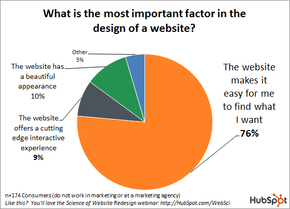
A telling stat from HubSpot research: 76% claim the most important factor of website design is the ability to find information.
Your website might be beautiful. The content might be the best in the business. However, if your website introduces unnecessary challenges to its visitors, it’s bound to impede your success.
Let’s get serious now about UX website improvement tactics you can jump on fast without overly taxing your time and resources.
Branding:
How’s the logo look? Your logo shouldn’t be gigantic or puny. And it shouldn’t be crowded by other elements or lost in the mix. Place it top left and give it breathing room.
Color me simple. You don’t want to dump the entire box of crayons on your site. Shore up your color palette all across your site with 2-3 main colors that work well together.
Add a favicon. The little icon that appears in browser tabs is called a favicon. Add one to help brand your website. Favicons are also used when your site is bookmarked.
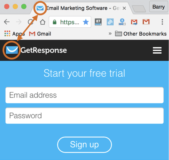
Viola! There’s a favicon, the company’s logo mark is used to also mark the website itself. It’s a smart branding play and simple to execute.
Messaging:
Clean up a headline. If there’s a muddy message where a clear and concise headline should be, clean it up and clarify.
Sliders be gone. If you have a multi-frame slider kicking off your home page, it’s time to nix that old trick. Determine your most compelling message and focus readers solely on it.
Can’t decide? You don’t know what your main message should be? Perform an A/B test and allow the results to guide this important decision.
Get to the point. Chances are you can easily find a page that’s overly wordy. Your busy readers appreciate brevity and clarity, so edit pages that are slow to get to the point.
Meet the A/B split test. In one corner we have A (above) and in the other we have B (below). One will produce better results, which effectively removes opinion or intuition from the equation and allows user interaction to guide the website improvement process. Source: Behave.org.
Credibility:
Replace your stock. Do you have stock photography screaming, “we’re fake” on a key page? Put a more authentic image there.
Prove some points. If you’re stashing all your best testimonials and other forms of social proof on one predictable page or burying them deep, resurface them on popular pages where they’ll reach more eyeballs. If you need help collecting testimonials, here’s a complete guide to website testimonials with examples.
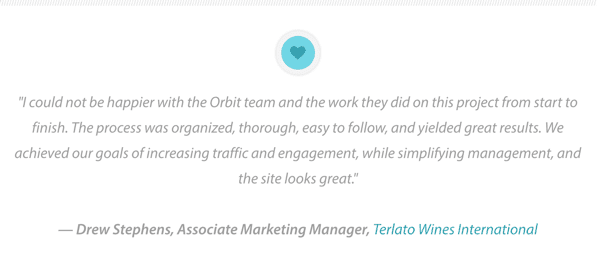
Testimonial pages don’t draw well, but testimonials on pages that do generate traffic perform a valuable role for increasing credibility. (Shameless promotion courtesy of Orbit Media.)
Readability:
Break it up. Even a wonderfully written page or post may feel monotonous if it’s not broken up into sections. Add subheadlines to improve readability.
Whiten and lighten up. Lighten the perceived “weight” of the copy by increasing white space between lines and sections. Avoid dreadfully long line lengths as well.

Want to read this copy? No thank you. It’s even uglier than the illustration that accompanies it. (Thanks for making this point visually for us JeremySai.com.)
Bring in some bullets. Find a paragraph that’s overly dense and laborious to read and turn it into a skimmable list of bullet points.
Reduce hyper type. Don’t go overboard with fancy fonts. Use a small number of elegant fonts consistently. Use italics sparingly. Consider making the text a bit bigger.
Layout:
Use a grid. Examine pages that contain multiple messages and make sure each earns a rightful place in your design hierarchy. Create an attractive grid with borders, backgrounds and column variations.
Relocate your social media icons. Put those social media chiclets somewhere that says we value you following us, but we value you visiting our website more.
Our resident UX champion Andy Crestodina calls these “candy colored exit signs” because their placement and prominence suggest visitors should leave the page to get social here and now. Obviously, such a strategy discourages consuming your onsite content.
Navigation:
Too many items on the menu. Menus with an overabundance of choices may prompt users to make no choice at all. Demote items in the navigation to interior pages when possible.
Jump to it. Did you feel the need to write a massively long page? Fair enough. You can help readers navigate with a menu of links atop the page that “jump” straight to the relevant section.
Decrease defections. One way or another, usually as a result of a missing page or visitor mistake, a generic 404-error page is served. Make yours helpful with links to favorite pages to keep visitors from bailing on you.
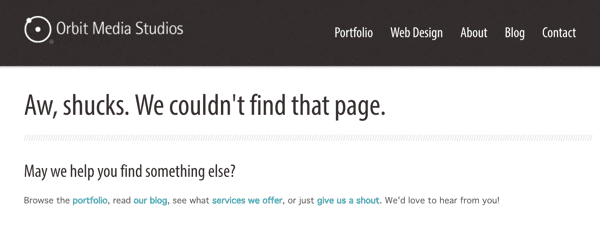
Sh*cks happens. Would-be visitors enter URLs that don’t exist and web hosts retire pages. A useful 404 error page can redirect them to the pages they likely do seek.
Enable onsite search. If yours is a deep website or blog, add onsite search functionality to help readers find what they seek. (Doing so will also help you gather insights for content planning).
Serve up specific routes. If your site means to serve multiple personas, partners, clients, applicants, media writers, etc., create signs to point the way.
Link cleansing. Your site probably has broken links. Find ‘em and fix ‘em using a broken link checker.
Conversion:
Call out your call to action. Can you find a call to action (CTA) that doesn’t call attention to itself? Redesign it as a button. Are some pages actionless? Add a prominent CTA.

A call to action designed as a button with a contrasting color and clear value proposition will help increase conversion.
Fussy forms. Generally, forms that don’t convert at the rate you’d like are simply too demanding. Remove fields that request information you really don’t need.
Slow growing email lists. If you’re trying to build an email list, carefully consider the tools and tactics used wherever you’re asking visitors to opt-in. Experiment with new value propositions until your subscription rates rise.
Email addresses are dangerous. You invite spammers to your inbox by publishing email addresses as CTAs. Put contact forms on pages from which you’d like visitors to connect.
Want foot traffic? If you want site visitors to make actual physical visits to your store or office, offer a map and directions on your website.
Engagement:
Watch this. If you’ve so far refrained from creating video for your site, make one. No need to hire out. Make it simple. Your About page is perfect place to insert your first video.
Promote sharing. Feature social media shares bars on your blog and make sure they can be found instantly. Turn the counters on.
Make links look like links. Have you tried to make hyperlinks an art form? Don’t. Make them obvious. Also, make them longer than one word to help make them obvious.
Add scroll cues. As more and more webpages are designed with border-to-border artwork single-column style, content below the fold is more likely to be missed. Add arrows or other visual cues to encourage scrolling.
Be there for your buyers. Far too many sites hoping to sell products and services make it cumbersome for prospects to get answers. When possible, man your website with a chat feature (and attendant).
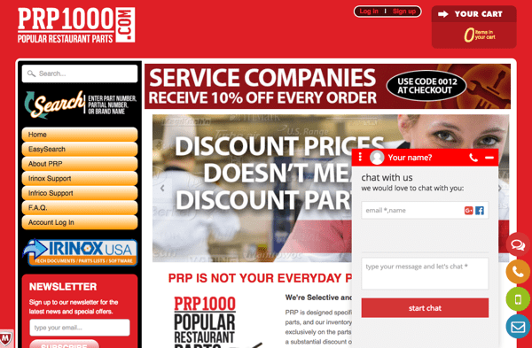
The PRP1000.com eCommerce site supports its visitors with the option to ask questions via online chat, phone, SMS or email.
Site Speed:
Got bloat? Identify images that are bandwidth hogs and optimize them for an acceptable screen resolution and faster page loading.
An auto accelerator. Plugins such as WP Super Cache or W3 Total Cache will cache parts of your site, so return visitors enjoy an even faster user experience.
Search Engine Optimization:
Titles that matter. The title tags of your pages should describe the page and indicate relevance to search engines. Swap in meaningful keywords where pages are tagged generically with terms such as home, about, or services.
Descriptions that pull. If you find a page with no meta description, write a keyword-rich meta description you hope will attract clicks when it’s served as a snippet in search results.
Image alts. Search bots don’t see images, but will see the alt text (or tags) you mark them with so be sure use keywords and make this change to your nameless images.
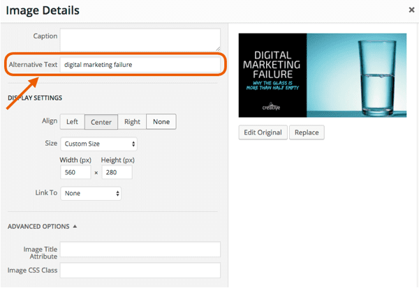
When you include images on your page, use the “Alternative Text” field to tag your image with relevant keywords.
Keep linking. You probably publish blog posts then move on to the next one. However, with each new topic and angle, your blog explores comes new opportunities to create internal links, so dig through older posts and optimize them further with new links to recent content.
Boost a second page post. Use your analytics to identify a post that ranks on page two of search. Give that post new life and greater search potential with something new: a video, expert quote, graphic, SlideShare or a new section.
Analytics:
Get smarter. Google Analytics is an essential tool for monitoring your traffic, page views and goals. Make sure you have your tracking code in place.
Tool up. Search Console is another free tool Google offers to help you monitor, diagnose and optimize your site. Have it setup properly.
Go forth and improve your website
Website user experience impacts your customers’ experience with your brand in a big way. A great user experience ensures visitors can find what they seek easily and fast.
It’s on you to create a user experience that engages visitors and converts them into leads, buyers and brand advocates. The process need not call for a website overhaul, but rather, a commitment to perpetual website improvement.
My job is done here. Now it’s your turn. Do something to improve your UX today.
We love dialogue here on the Orbit blog. Chime in with your thoughts in the comment stream. Have your applied any ideas in this post? Did you see any results? Do you have website improvement ideas you could offer our readers?
