It’s a website. You can put anything there. But should you?
People add all kinds of crazy stuff to their sites, often without a thought for strategy or their visitors. It’s common to see websites that distract, confuse or worse.
On this blog, we’ve published research showing which website features are standard and how some of those features don’t align with best practices. Today we’re being more direct. Here is a list of things that should probably just be removed from all websites. Some are common. All are suspect.
This is based on our experience planning 1000+ website projects and reviewing just as many Google Analytics accounts. But there is rarely one correct answer in digital marketing. At the end of this article, we’ll give you a chance to provide your own input.
1. Vague homepage headers …we’re the best, at what?
It’s the first question of every visitor on every web page: “Am I in the right place?”
The H1 header on the homepage answers that question by telling visitors (and search engines) what the business does. But homepage headers often fail at this. Instead they offer a general statement about quality or value. They often say “We love us.”
Ironically, the “what we do” information is usually just below the headline in smaller text. Here’s an example:
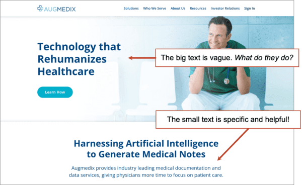
The big header “Technology that Rehumizes Healthcare” is an unhelpful tagline. But the small text “medical documentation and data services” actually explains what they do.
 |
Justin Rondeau, Invisible PPC“Whether it’s vague or just “cute” your messaging shouldn’t be left up to interpretation. State what you do, who it’s for, why it matters, and what to do next with such clarity it can be understood in seconds. Most folks use a cute headline and rely on the subheadline to do the heavy lifting. If this is you, one tip is to just swap your headline with your subheadline and your page will perform much better.” |
The homepage H1 header on the homepage is critical for SEO. It’s the most important place to use a keyphrase on your more authoritative page. That clever but vague tagline does nothing to help your rankings.
What to do instead:
Be clear, not clever.
And if your headline is vague, but the text below is specific, flip them, so every visitor can tell what you do at a glance.
Tip! The Five Second Test
Use a service like Lyssna to run a Five Second Test. It’s easy. Upload a screenshot of your homepage, they’ll show it to a random group of panelists for 5 seconds each, then each panelist will answer any question you provide. If they can’t answer “what does this company do?” then you just failed the five second test.
2. Generic navigation labels …which to click?
As soon as the visitor lands, they start scanning the page. Am I in the right place?
One of the first things they see is the navigation. What does this company do?
When the navigation labels in the menu are vague, the visitor can’t tell what you do. Labels like Products, Services and Solutions are generic to millions of companies. Those labels provide no specifics. They are unhelpful.
When the navigation labels are specific and descriptive, then the visitor knows where they are and what you do. They know where to click and why. They’re less likely to hit the back button after they click.
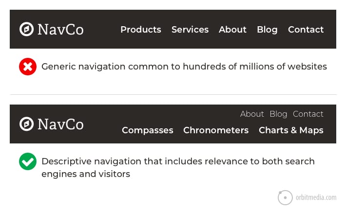
In the mockup above, the key pages from the “Products” section have been turned into the primary navigation. The less important items have been moved up into the secondary (aka “eyebrow”) navigation.
Every click on every menu is segmentation. The button text guides the visitor deeper into the site to pages that speaks to them more specifically. Vague labels make it harder for visitors to know what they’ll get if they click.
The goal of the homepage is to get the visitor off of the homepage.
They also make it harder for the UX pro to know what the visitor needs. If the visitor clicked “Products” what are they really looking for? If they clicked “Chronometers” you know exactly how to help them.
3. Meaningless subheads
As the visitor scans down the page, subheads (formatted as H2 headers) tell the visitor what’s next. Each pageblock at every scroll depth has its own little header guiding them along.
Unless they are vague and meaningless.
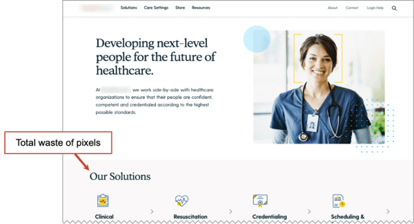
The screenshot below has a subhead that reads “Our Solutions”which is unhelpful for visitors. It adds visual noise without adding clarity. But if it said “Workforce training for healthcare professionals” then visitors would know what the company does.
Another option is to simply remove the subhead and move everything below it up a bit. In this example, it would bring the names of the actual services up above the fold. That’d be great for visitors too.
 Vague subheads are also bad SEO. Each one is a missed opportunity to add a keyword. The best H2s help to tell search engines what the page is about. They’re perfect for semantic SEO.
 |
Britt Skrabanek, Superneat Marketing“Meaningless subheads are the kiss of death for your website. Visitors will make a split-second decision when they land and ask (in the words of The Clash): Should I stay, or should I go now? When visitors are skimming your content, you have to flag them down with subheads that help them immediately recognize they’re in the right place. Lose the jargon, empty promises, and ambiguity. Focus on giving them the exact information they need at that exact point in their website journey. By all means, be creative…but be clear.” |
You can often find vague subheads atop the testimonials block. It’s a classic example of a flipped visual hierarchy. The big text is vague and unhelpful “What our clients say” and the little text is compelling and persuasive “They really are the best team in the business.”
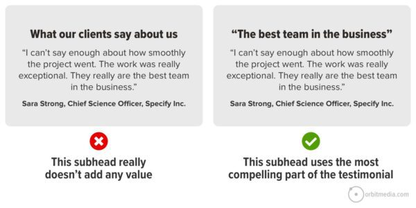
Image Source: 5 Ways to Improve Pages by Adding Specificity
4. Homepage slideshows …a little bit of everything
Should homepages have slideshows? It’s an ongoing debate. There are strong arguments on both sides and the issue isn’t settled. 42% of websites still have slideshows on their homepages.
- The case for slideshows
The homepage is for all visitors and we have a lot we want to say. We can’t decide on one message, so let’s stop arguing and put all the options into a slideshow …In other words, sliders solve a political problem on marketing teams.
Homepage sliders prevent stabbings in conference rooms.
- The case against slideshows
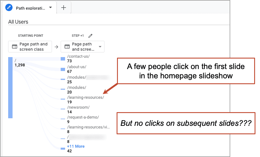
We have one, most important message and we need to decide what that is. Movement is distracting and takes away from that message. Secondary messages can be addressed farther down the page or on other pages. Only the first slide gets much engagement anyway.
Don’t take my word for it. Create a path exploration in GA4 and check for yourself. Make the homepage the starting point and see if anyone is clicking on the call to action in even the second slide.
Yes, there are exceptions. If the offer is best shown visually and the subsequent slides don’t have different messages or calls to action, then the slider is really just a nice gallery. Think of a travel site with a timed slideshow of beautiful pictures. It makes sense.
But you’re not really promoting something by putting it on the homepage in slide number four. In reality, you have hidden it.
What to do instead:
- Make the top of the homepage simple and descriptive. Let it say what the business does and pass the Five Second Test. Any other messages can appear below.
- Resist the temptation to put sliders in other places, such as testimonial sliders, or do so knowing that most visitors will not see any but the first slide. So make the first slide a good one.
5. Stock photos of people …stranger danger
Pictures of people are special. Faces are magnetic by nature. From the time we are infants, we focus on faces more than other types of images. So it’s good to show people, to show personality, to show your humanity and be real for your readers.
But it doesn’t work with fake pictures.
People can smell a stock image a mile away. And stock images of people are the worst kind. They just don’t feel genuine. Yes, there is a time and place for stock images, and our web design team has used stock imagery on hundreds of projects. But it’s always a thoughtful decision, made for important reasons. Stock is never the first choice.
Probably, stock photos don’t help or hurt. Visitors have seen it before and they scan past. Even if they aren’t harmful, they are a missed opportunity.

What to do instead:
Use pictures of real people if at all possible. Invest in some photography. Every face on every page is a chance to connect with the visitor, slow them down and show them who you are.
- The best web pages have real pictures of real people at the business.
- The best testimonials show the client’s face.
- The best blog articles show the faces of the author and contributors.
6. Social icons on service pages …candy colored exit signs
We share content on social media when we think others will find it interesting or useful. We don’t share content that is promotional, such as ads and service pages.
So why do brands put social media widgets on their sales pages?
This makes no sense to me. Especially when they are colorful. They’re visually noisy, distracting visitors from the content on the page.
Even worse are social media icons in headers. They’re at the top of the visual hierarchy and they take people away from your website. Traffic is hard to win and easy to lose. Why encourage your visitors to leave?
Amazing but true. 13% of B2B websites have social icons in their headers.
![]()
Social media is a great way to promote a business, but don’t distract visitors who are already on your website. The visitor to your service pages is your most valuable visitor. Your job is to persuade them to become a lead, not suggest that they leave or share. Social icons are not on our B2B service page best practices checklist.
What to do instead:
- Put social media icons in your website footer. Visitors can find them there if they’re looking.
- Put social media share buttons on your blog article template
7. Dates on blog posts …showing off your age
This one always triggers a debate. Some people strongly disagree with this advice. But I strongly recommend against showing the date in the blog post template.
Please keep in mind that I’m advocating for you, the marketer, not your readers. Of course, I know that readers have preferences and like seeing dates. But I also know that the goals of readers and marketers are not always 100% aligned. If they were, there would be no pop ups on the internet. There would be no gated content. There would be no cookies or Analytics.
- Most content strategies are focused on evergreen topics
Very few “newsletters” are news. They are tips and best practices. These topics are often relevant and helpful for years. The date isn’t that important. Some things don’t change much over time. - You can still show the date in the content
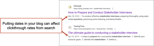
Often, the date is important, especially for research-based articles. In these cases, you can add the date to the H1 header, the title tag and in the body text. But when the blog template itself shows a date, you have no choice. - Dates make your content look older sooner
Dated content ages faster. It gives the reader a reason to bounce, reducing engagement rates in a measurable way. It also has a less measurable impact: the date often gets picked up by Google and shown in the search snippet. This can reduce clickthrough rates and search traffic. Not great.
8. Long paragraphs …make those readers work
We call them readers, but really they’re scanners.
Research suggests that the average visitor will read only 20% of the words on a page. That’s not good or bad. It’s just the reality we all must accept. Also, we can adapt.
Great pages are easy to scan. They help fast-moving visitors know where to slow down and jump into the text. Good subheads can slow down the scan reader. Bullet and numbered lists help too. Short paragraphs are just as important.
If the paragraph is short, visitors are likely to read it. Long paragraphs may get scanned. Very long paragraphs will get skipped altogether.
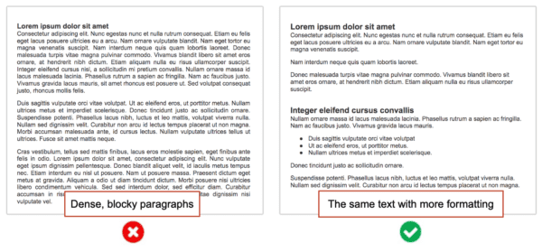
Every designer knows that visitors love whitespace. But some writers didn’t get the memo. Your blog is not assigned reading. It is not a book. It has a back button.
What to do instead:
The remedy for blocky paragraphs is simple: press the return key more often while writing.
- Never write a paragraph longer than three or four lines.
- Never miss the chance to turn a paragraph into a bullet list.
As a general rule for this blog, we do not write paragraphs longer than three lines. We do it all for you, dear scan reader!
9. Press releases …save, upload, hope
This content format pre-dates the internet. It does a specific job and targets a specific audience and it can be effective. Press releases are easy to add to websites. Just upload a link. It can’t hurt, right? And it might help.
But press releases do not align with digital content best practices at all.
And they aren’t typically written for the web. They’re just copied and pasted into web pages or uploaded as PDFs (more on PDF files in a minute). Here’s a quick breakdown of the many ways in which a typical press release falls short as web content.
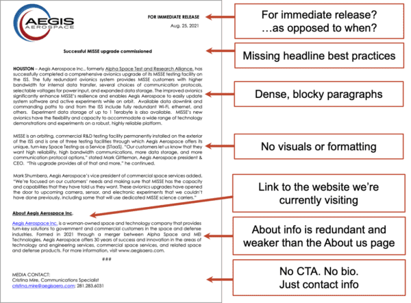
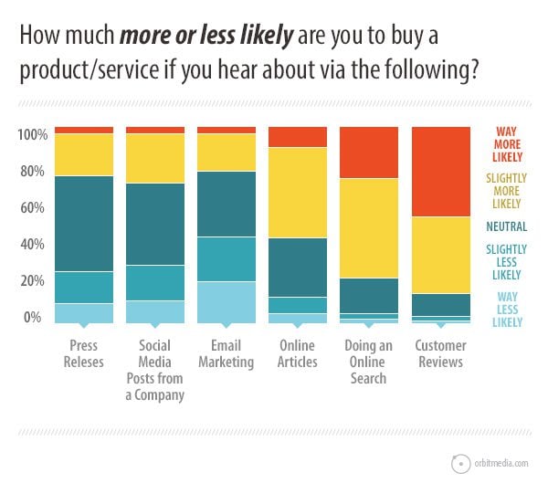
Do you expect your visitors to find your press release compelling? Research suggests that they won’t. This study shows them to be one of the least persuasive formats you can put on your site.
Uploading a press release may not be a huge mistake, but it’s definitely a missed opportunity. With a few hours of work, any content marketer can convert it into an article following headline best practices and blog image best practices.
What to do instead:
Write the story, rather than just hoping that the media will write the story. Once turned into a blog article, the piece would have the following upgrades with the following outcomes:
- A more compelling headline (clickthrough rates, social sharing)
- Visuals and formatting (higher engagement rates)
- Contributor quotes (credibility, social sharing)
- Internal linking (increasing traffic)
- Call to action (email list growth)
I suggest removing the “Press” section and adding company news to your content strategy, and simply writing every story yourself. Tell your own story.
And if you want to pitch an article? Go for it! Send that press release to every editor you know. But don’t bother uploading it to your website. The news media isn’t browsing your website looking for stories.
For our counterpoint, we turn to an actual PR expert who has spent decades helping hundreds of clients win love from the media.
 |
Michelle Garrett, PR Consultant and Author of B2B PR That Gets Results“Including a ‘news’ or ‘press’ tab on your site is helpful when you want to engage in media outreach. Why? Because a reporter can see at a glance the news your company has issued in the form of press releases as well as any media coverage that has appeared. Posting press releases allows reporters to see your company’s momentum, as they’re posted in chronological order. Further, posting them gives your brand credibility, as they’re more ‘official’ than a blog post. If you’re a publicly traded company, for example, you need to issue press releases to disclose financial information. You could change the formatting when you post the release on your site, as long as it’s clear that your company issued the news. |
10. PDF files …the rust of the internet
They’re easy to upload, but PDF files are not a good format for websites. They have many disadvantages compared to your basic HTML page. Compare:
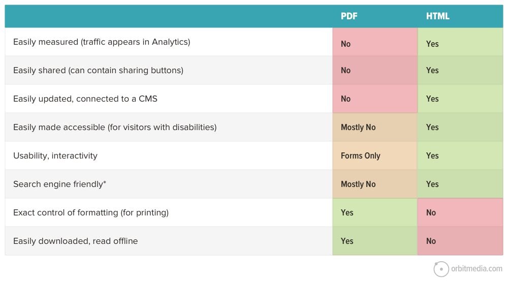
Views of PDF files don’t appear in your analytics. You can track clicks to them, but PDFs don’t show up in your main reports. Search engines can index them, but they lack SEO best practices. No SEO would recommend them.
PDF files are easy to create and upload, so they are an easy fix for content management when sites are hard to update. That’s why I call them rust. Save that word doc and upload it. Problem solved. Or at least, you did the minimum. Probably, this is why government sites are filled with PDFs.
Don’t get me started on Word Docs. They’re even worse. It’s like a PDF file that can contain viruses.
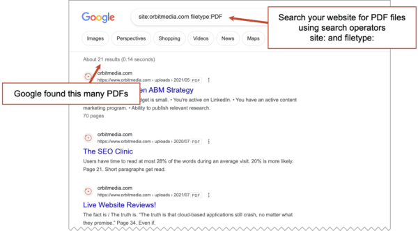
Does your site have a PDF problem?
You can use Google to count the PDFs on your website. Do a search using two search operators, site: and filetype:. So the query will look like this…
site:orbitmedia.com filetype:PDF
What to do instead:
- All content should be HTML pages.
- Use PDFs as an alternate version when information is likely to be printed or downloaded.
11. Testimonials page …hiding your best messenger
Testimonials are a powerful form of social proof. They leverage the conformity bias. They align with Google’s E-A-T recommendations in the Quality Rater Guidelines. And testimonials differentiate your brand, because you’re the only business with that testimonial.
But testimonials are far less effective if you squirrel them all away on a separate page.
That’s because visitors tend not to visit testimonials pages. When you give them their own page, they become less visible.
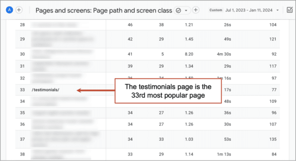
Don’t believe me? Check for yourself in GA4. Probably, your Pages and Screens report looks something like this. In this account, the testimonials page is the 33rd most popular page.
What to do instead:
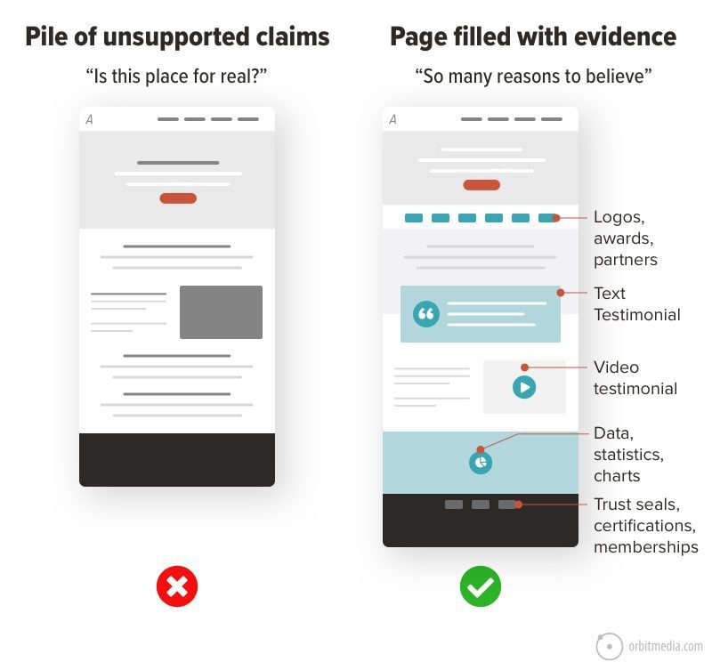
Make every page a testimonials page. Fill your website with testimonials. Use them throughout your website. Put the testimonial near the marketing claim that it supports.
Use testimonial videos if possible. If you can’t use video, use text. If you use text, try to use testimonials that include keyphrases. A keyphrase-focused testimonial can improve traffic and conversions. Cheese and mousetrap!
Can’t put names on testimonials? Make them anonymous. Can’t get testimonials at all? Use some other type of evidence. Whatever you do, don’t let your service pages be piles of unsupported marketing claims.
12. Email links …unreliable, untrackable, spam magnets
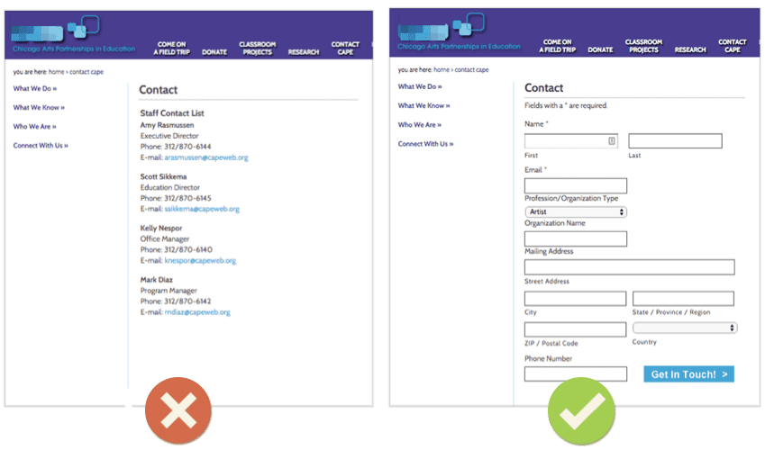
When a visitor gets in touch, you get an email. But was the email sent from a contact form? Or just an email link? The user experience is very different. Compare:
Those two examples also have real differences in marketing outcomes. The one with email links is less reliable. Compare:
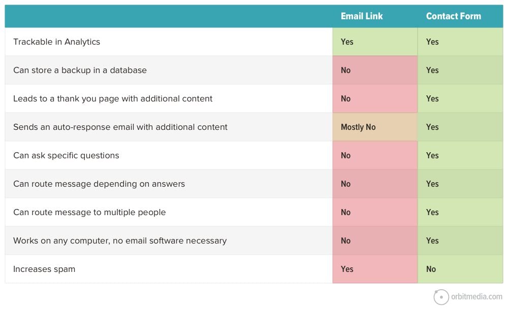
The winner here is obvious. Email links fail on every criterion for good marketing, from messaging to routing, from usability to tracking.
Beyond that, email links are spam magnets. Spammers use robots that scrape the web for email addresses. So that email link on your website is filling up your spam folder.
What to do instead:
- Remove every email link from your website
- Add a simple contact form with a thank you page
- Tell GA4 the URL of this thank you page by setting up conversion goals
- Setup an auto-response email, telling your new leads when you’ll be in touch
- Make sure your CMS saves a backup of every submission. Email doesn’t always get through!
13. Dead end thank you pages
Success! The visitor landed on your site. They can tell what you do (descriptive headers). They knew where to go (descriptive navigation labels). They saw your real people (not stock photos). They weren’t distracted (no prominent social icons). They eventually made their way to a contact page and filled out a contact form (no email links).
What happens next?
On too many websites, the next step in the user experience is a dead end. The thank you page has no messages, no links, nothing. It might as well say “Good Bye.”
But the thank you page is your first interaction with your new lead. It’s your chance to roll out the red carpet and let them know what happens next. It’s also a chance to offer them more, in case they’re interested.
|
Justin Rondeau, Invisible PPC“My #1 rule for the Thank You page is “No Stop Signs.” Even if the page feels like the last step, there is more you can get the visitor to do! You’ll want to include the logical next step in the customer journey to help expedite the process. Someone signed up for a lead magnet? Ask them to book a meeting. Someone already booked a meeting? Give them resources that will ensure it’s worth their time! This is the perfect place to introduce a new concept that you’ll be promoting in your follow up sequences, because reminding about something they’ve seen (even briefly) is a better approach than introducing something new down the line.” |
What to do instead:
- Tell the visitor about next steps and how soon you’ll be in touch. Hopefully they’ll have enough confidence in your brand that they won’t go fill out your competitors’ forms.
- Provide links to your highest value articles
- Suggest they follow you on social media (example: after applying for a job… “Thanks for applying for this position! Follow us on LinkedIn and you’ll be the first to know when new jobs are posted”)
- Give the visitor an opportunity to subscribe to your newsletter.
That last one can work very well. On our website, we track email signups on our contact form separately from other conversions. So it’s easy to report. Take a look:
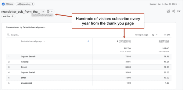
That’s hundreds of email signups that we wouldn’t have had with a dead end thank you page.
Let’s make the internet a better place.
You can help! Just share these tips with friends, family and anyone embarking on a website redesign. You may save them (and their visitors) a little grief.
Your turn…
Want to defend any of the features we added here? Was I totally wrong about something? What else should we have covered? Vcards? Popup windows?
Ok, I’m ready. Tell us here and we’ll share your feedback. Or join the conversation on LinkedIn.