What’s Happening with Your Homepage Header, Hero and Headline?

My goal for this article is to show you examples of compelling and persuasive homepage headers, hero shots and headlines.

I want you to understand why they’re effective, so I’ll riff on what I believe is working.

I’ll tell you, composing the post was a chore. If instead, I chose to present weak homepages I would have been done in one-tenth the time. Sadly, most make you work hard to figure out if you’re in the right place.

But my sunny side’s up today. We’re going to focus on good ones.

Does your homepage make a powerful first impression?

Reality check: the number of people that woke up this morning intent on hanging out on your website is exactly zero. Unless they’re already loyal customers, they go here:

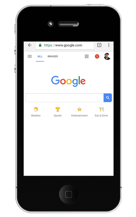
Then they type or say some version of what they need. If you’re good at search engine marketing (paid ads) or search engine optimization (organic search), what they’ll do next is:

  • See your ad or snippet (an organic listing)
  • Make a fast determination if your page might solve their challenge
  • Click or tap (or bail)

(For this article, we’ll assume they landed on your homepage. If they landed elsewhere, they’re likely to visit your homepage if they’re interested in what you offer.)

Hello new visitor

Your website is now in service mode. It only succeeds if it makes a powerful first impression. It has to do so fast. Web wanderers are not known for their patience.

And so…. Some portion of the top of your homepage flashes before them. They take in what appears on their phone, computer, or tablet. The smaller the device, the less they see.

What you want them to see is your header, hero image, and headline.

And what you want them to understand is what your company can do for them.

Websites serve the needs of all kinds of companies, but they don’t serve the needs of first-time visitors unless they quickly and clearly establish the value of being there.

You have one goal, but many options

Your goal is to get them to stick around and click around. A successful homepage gets the visitor to dive deeper into your website. Their credit cards are not coming out otherwise.

This leads us back to the discussion of the first impression. What should you show and say atop the page?

There may be a million and one answers, but the correct ones include something that:

  • Prompts them to understand the value proposition of your business
  • Determine if your website will be helpful
  • Inspires them to click, scroll, or interact in some way—maybe signup for something

Let’s define header, hero and headline

Header: Many describe the header as the narrow bar (or strip) that tops the page. Like this:

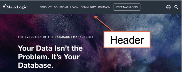
Websites that feature a distinct header bar often feature logos, navigational links, contact details, search prompts, offers, and more.

I don’t mean to dismiss this topic. Website navigation is extremely important, so dig into these seven best practices and tips to learn more. However, this post is really about the hero image and headline. Modern website design often seamlessly marries all three.

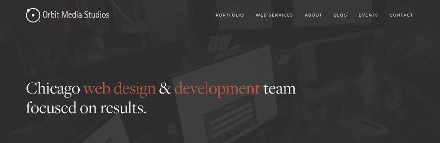
Upon landing on the Orbit Media homepage, there’s no delineation between the header and hero shot. However, when scrolling, the header is separated to give visitors easy access to the website’s main navigation.

Hero: The “space” atop the page may be referred to as the hero shot, hero image or even the header. On occasion, I also see it referred to as the “image banner” or “banner image.” Whatever you call it, it’s what we’re here to examine.

Headline: No rule states a headline must be imposed atop your hero image. Sometimes the headline is above or below it. Sometimes there’s no headline.

Most of the time the homepage headline is designed into the hero shot. Often, a sub-headline follows. Sometimes even more components are included.

This post means to examine the homepage header, hero and headline as one big, vitally important, and (usually) integrated thing. Okay? Again, the point is to learn how to keep people on your website.

It’s show-and-tell time. We’ll start with ecommerce.

Valuable lessons can be extracted from leading SaaS brands because they tend to believe strongly in testing what they do. As such, the companies will establish a specific objective, create a call to action (CTA) to prompt visitors to take action, analyze their results and revise accordingly.

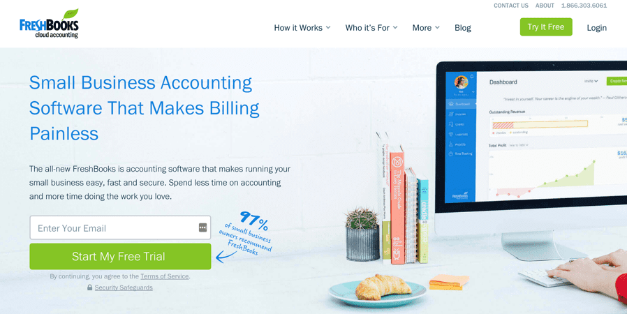
The current hero shot on the FreshBooks homepage probably isn’t the prettiest example we’ll look at today, but may be the best. It works for so many reasons:

  • The “who” is immediately addressed. The service is clearly for small business owners/finance managers.
  • The “what” is unmistakable too. FreshBooks offers accounting software. The headline says so and the image reinforces it.
  • The “why” couldn’t be more obvious. The headline says the SaaS provider makes billing painless.
  • The brief copy that follows makes an effective emotional appeal. “Spend less time on accounting and more doing the work you love.”
  • The call to action is compelling. (1) It asks for one thing: your email. (2) It prompts you to “Get Started” with a big button that can’t be missed. (3) For good measure, they toss in a nice little bit of social proof and visual prompt: “97% of small business owners recommend FreshBooks.” (And note the arrow.)

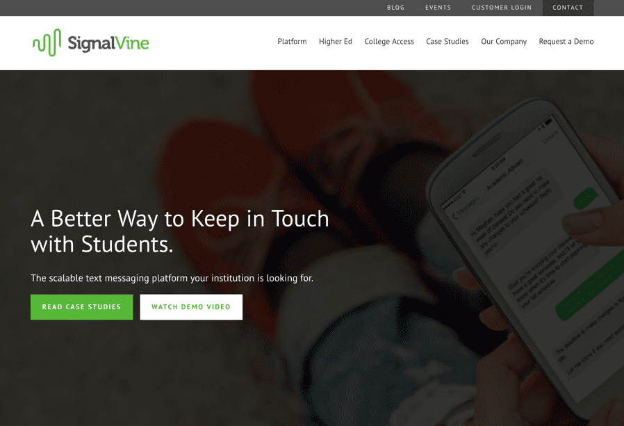
SignalVine makes their hero shot work with two calls to action.

  • Like FreshBooks, the headline and subheadline are on-point with a clear “who, what and why.”
  • SignalVine anticipates you’ll want to learn more and therefore offers “Read case studies” and “Watch demo video” as two options. Visitors can learn more by reading or watching. It’s a smart play to appeal to different content consumption preferences.

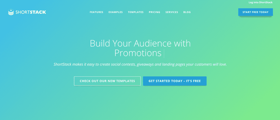
ShortStack doesn’t fuss with screenshots, background video or any needless distractions.

  • The focus is entirely on the benefit-driven headline, which features a bit of typographical animation.
  • The final word of the headline rotates such that the headline reads, “Build Your Audience with Contents/Giveaways/User-Generated Content/Quizzes/Promotions.”
  • Two CTAs are presented. The more visually prominent of the two features the powerful directive, “Get Started Today — It’s Free.”

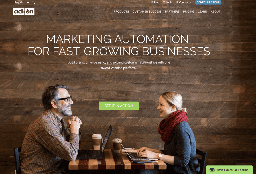
I was hard on a slew of marketing automation vendors in a post on my website because so many failed to make their point clearly and fast. Act-On has got their act together here with a good homepage header, hero and headline because:

  • The headline addresses the “what” and “who” clearly.
  • The subhead hits on benefits and offers a slice of social proof.
  • Smart design creates a clear eye-path to a conversion-focused CTA. Your eyes are bound to follow the line of sight of the two characters.

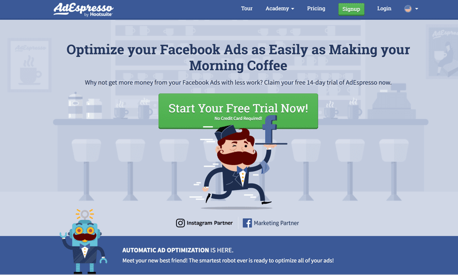
Here’s a winner from AdEspresso by Hootsuite.

  • Illustrations carry the weight from a design POV but don’t detract from the message.
  • The headline’s clear, benefit-focused and fun.
  • The copy serves up even more reason to “Claim your free 14-day trial.”
  • The CTA is strong and overcomes a common objection by mentioning “No credit card required.”

Next up: ecommerce homepage heroes

You’ve probably gathered SaaS companies (or at least those with homepages I like) adhere to a certain style that encourages action—usually trials.

Not so with ecommerce companies. They experiment with a variety of approaches and update their homepages often, much like a physical retailer would change their displays throughout the year.

We’ll look at a few ideas I find compelling.

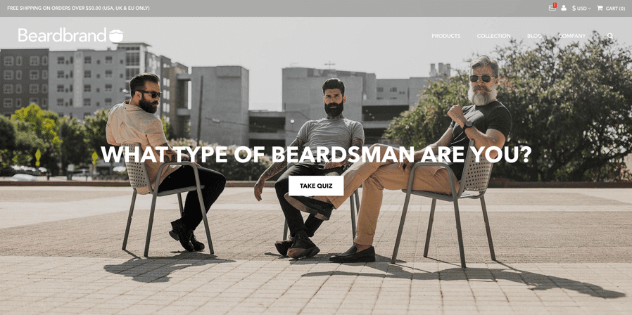
At Beardbrand products don’t spring forth atop the page. They take a completely different tact by offering a quiz.

I’m a big fan of interactive content and applaud a brand bold enough to present a quiz before anything else. Beardbrand seems to be telling me, “We’d like to get to know you.”

  • Fun stuff: You’re asked 10 quick questions and on then following screen you can enter your email to subscribe to their newsletter, or not.
  • Next, you’re thanked, told what kind of beardsman you are, invited to view products, encouraged to share via social, and given another chance to join the email list.

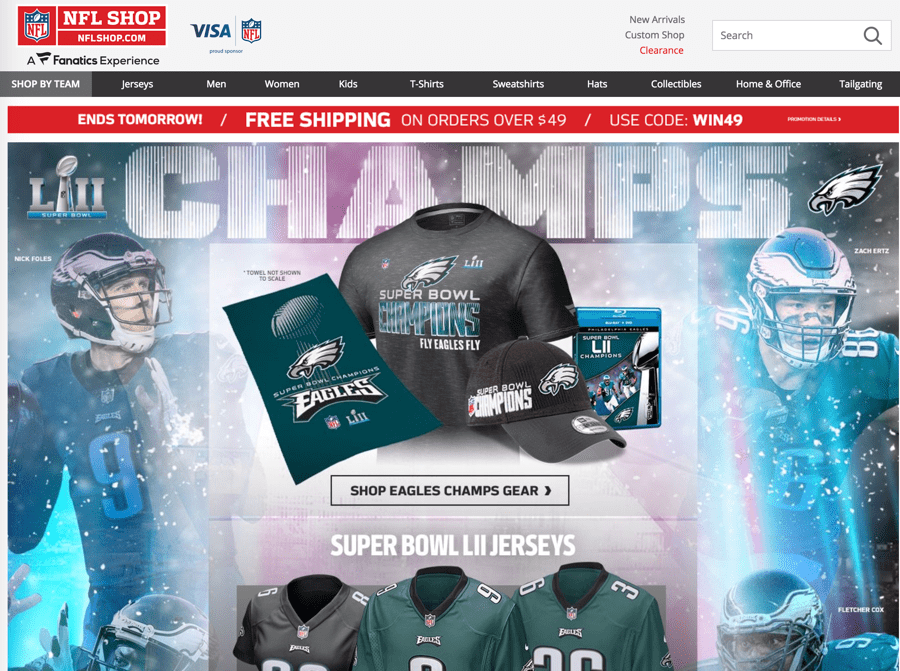
Yes, there’s a lot going on atop the NFLShop’s homepage. There often is at ecommerce sites. However, they’ve done several smart things with their layout.

  • First and foremost, they’re selling in the moment by presenting a portfolio of branded merchandise to honor the Super Bowl champs.
  • Various tools help you quickly find what you want: search, new arrivals, custom shop, clearance items, shop by team, and popular merchandise categories.
  • Free shipping is highlighted.

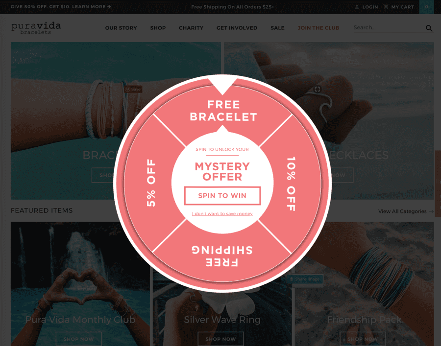
PuraVida Bracelets wants you to have some fun at their online shop.

  • Upon arrival, you’re shown a header and hero shot featuring their two leading product types.
  • Seconds later a popup grays-out the page and you’re invited to spin to win. My spin earned me 10% off, a nice way to say hi.

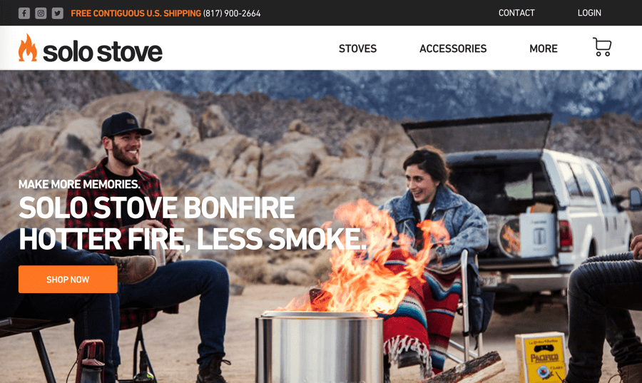
I love the simplicity of this ecommerce site and wanted to demonstrate having a store doesn’t preclude you from presenting a strong headline. Here’s what I found at Solo Stove:

  • Hot stuff—A nice one-two headline punch combining an emotional and rational appeal.
  • An awesome image—Whether these are models or not it feels real. These car campers are having a good time even though it doesn’t look like they’ve busted out the Pacifico yet.
  • An invitation to “Shop now.”

What I didn’t find was any games, newsletter offers, or limited time offers (though an “Ends Soon” Valentine’s Day Sale served as a sticky footer). It’s refreshing to see an ecommerce company keep it simple.

I also didn’t find a slider or image carousel. Presenting multiple images/headlines/offers in a slideshow format remains a popular approach for ecommerce companies and though it’s often done elegantly, it’s not practical for mobile shoppers and therefore a bit risky.

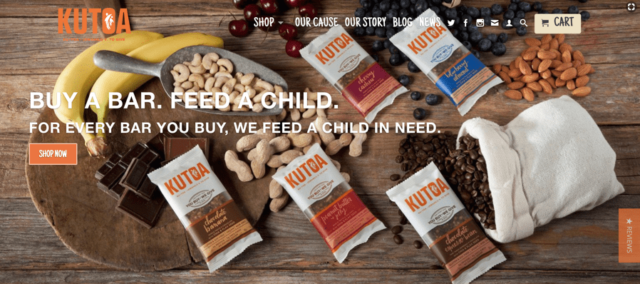
Here’s a socially conscious approach from Kutoa much like the “purchase with purpose” approach Toms is known for. They could have made the headlines easier to read, but I made it through and feel good about doing business with the brand.

Simplicity at work

The web is wide. I didn’t get into publishing, restaurants, retail, and countless other business categories here and now. I’ll conclude the show-and-tell section with homepage heroes from a handful of various service companies and product providers.

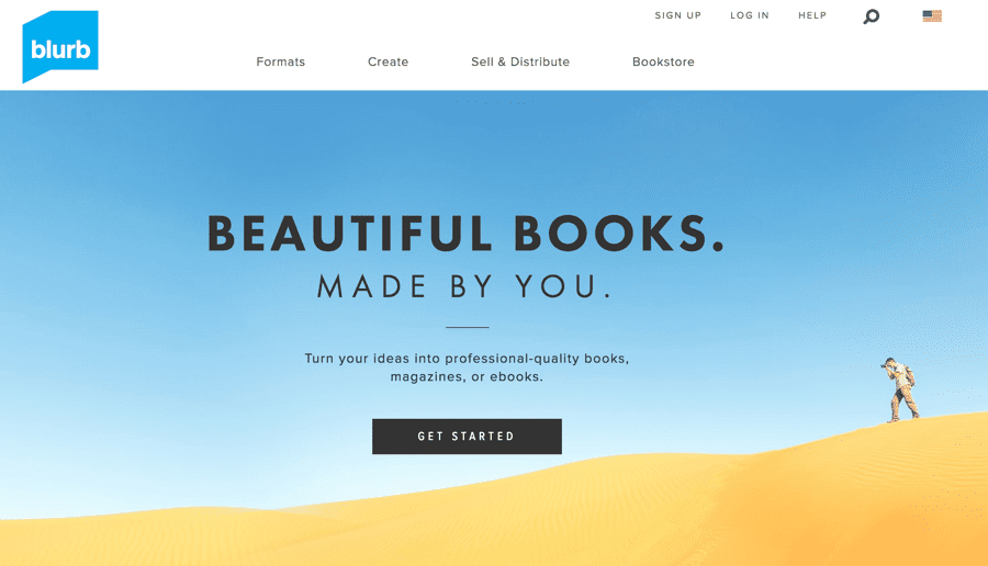
Beautiful image. Beautiful design. Beautiful one-two, chop/chop headline. Beautiful subhead and CTA. Blurb gives us a wonderful lesson in minimalism.

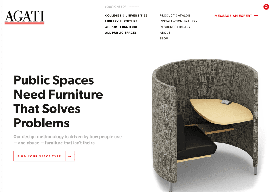
I plucked the Agati homepage from the Orbit Media portfolio, where visual simplicity reigns. What do we have here?

  • An interesting approach to the header’s menu—two stacked columns
  • A great headline “that solves problems” by revealing the problem it solves
  • An even greater subhead: Our design methodology is driven by how people use—and abuse—furniture that isn’t theirs.
  • A great CTA too: Find your space type.

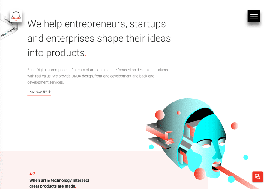
I don’t love the “We” approach to headline writing and urge you to be careful if you go there. Enso Digital pulls if off well here.

  • Though the headline is a WE statement it clearly tells YOU, if you’re the right type, you’re in the right place.
  • See Our Work is a smart CTA for many types of design companies.
  • Some risky stuff is going on in the header: the logo has no type and there’s no visible menu (the “hamburger” must be expanded), but it all seems to mesh with the very idea at work.
  • Bravo to the ultra utilitarian type-on-white minimalism and bravo again for how the only image and splash of color moves your eye down to the next section

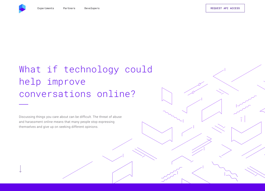
I don’t want to like this extremely minimal header/hero from Perspective API.

  • The company is not identified (unless you know their logo mark) and I’m not quite sure what the deal is. The answers come in the row below (not shown).
  • I’m a fan of question headlines. I’m a fan of presenting the problem first.
  • The odd and risky little splash of purple geometry and type pulls me down the page. It works.

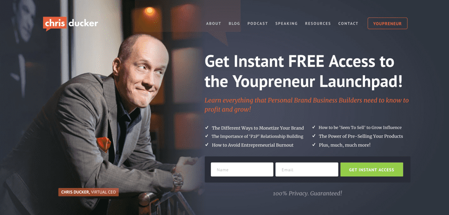
And now for a quick look at a personal brand site, a fast-growing category. Chris Ducker’s site also happens to be about personal branding.

  • Again, we see a header, hero shot and headline come together as one.
  • It’s no accident Chris is gazing at the headline. This is an eye path trick proven effective time and again by heat mapping analysis.
  • Everything else (subhead, bullet points, form, button, and privacy message) acts as one big CTA. You might make the case the bullet points are overkill, but it works and presents yet another cool idea for the top of your homepage…
  • If lead nurturing is a factor in your brand building strategy capture email addresses with a lead magnet.

Are you happy with your hero?

The bottom line for what goes atop your homepage is a combination of copy and design that assures the right type of customer he or she is in right place.

Your homework: put your hero shot and headline to the test. Review the points I’ve made above.

If your audience is largely mobile, review what you’ve published on a smartphone and ask yourself if what you see is…

  • Simple enough
  • Clear enough
  • Easy to respond to with thumbs

Obviously, I didn’t get to every type of home page. Obviously I didn’t look at all of the web’s 1-billion-plus websites (though it feels like I did). However…

I’m game for looking at yours. Let me know if you’d like me to do so in the comment section below.

What are your thoughts?

By signing up you agree to our Privacy Policy.

Comments (53)
  • Great post to make anyone with a website think about the user/viewer/target. Your hero header is the lead reindeer to establish quick and easy what’s ahead.

  • What if you have a product pages and run promotions from time-to-time: Is changing out the h1 and h2 on a hero image to match the promotion (while still mentioning the product name) okay for SEO?

  • Hey Barry,

    I love what I learned from what you wrote, we’re really trying to optimize our sites by your guides but we still have little visibility for each, it would really help if you take a look at it thanks. Here’s the link https://scissortec.com/

  • Great article Barry! Really enjoyed the reviews of different types of sites as well. I will changing a few things up on mine before even asking for a quick review (haha). Thanks for the awesome tips.

  • Hi Barry – this is an absolute excellent read. Would you offer the same recommendations for a B2B manufacturer in the construction industry who needs to be very technical and serve many audiences? We run into this problem with our homepage where we tend to find the need to have many CTA’s for 5 or more key customers. Each customer needs a different answer.

    • Katie,
      I might be more helpful if I saw your site. So, for now, yes, I offer the same recommendations.

  • Thanks. I found this post really useful. I’m working on my website now so hope to have a URL to share with you soon. I’d certainly really appreciate your insight and experience.

  • Hi Barry, thanks so much for this article. I’m glad that I stumbled on this article. I struggle with having the “who”, “what” and “why”, all at once in my headline. I’ve already rewritten my headline several times, but I still feel that it’s missing some sort of connection with my ideal visitor that lands on the page. Could you please review my homepage at http://www.sparkthinking.net and give me some feedback?
    Thanks in advance.

    • Syliva,
      I agree with you. It looks like your website would benefit from some professional copywriting. The headline’s not bad, but you might try some other approaches. That said, “your child’s confidence” does seem to make a connection. If you have a list of headlines, feel free to show me them via email and I’ll give you my feedback.

      • Excellent tips, Barry! Before I begin implementing the ideas this article has inspired, I’d like to get your feedback on our site: http://www.myedusolutions.com
        Your time & recommendations are much appreciated! 🙂

  • I’ve just completed a major update of my website. Not happy with the design of the home page – and I can see it doesn’t comply with your advice in the above article. Would appreciate your feedback/guidance.

    • Can you drop in the link, Kim?

      • Sure – https://cuttingedgepr.com/. The design put together by the digital media firm does not include a hero shot or strong headline, just pics accompanying each article or blog (I’m still adding a small “feature” pic to each piece of content on the home page). I think that showing an “opinion piece” accompanied by the headlines and first paras of several articles down the page doesn’t provide a strong focal point

        • Kim,

          You’re right in every way. As you say…

          “The design does not include a hero shot or strong headline.”

          It reads, “Ideas and information to boost your career.” What kind of ideas? What kind of information? Whose careers?

          As of now, your site definitely falls into the “I don’t know why I should be here” trap. Add some specifics.

          It looks like you do PR. For who? Why? How? What should they click next?

          • Many thanks, Barry. Greatly appreciated! As my communication interests are diverse, ranging from employee recognition to sponsorship to business presentations to corporate communication, etcdo you think I should set up a small website for each, rather than trying to include them all in the one website? Would appreciate your thoughts. Regards, Kim

  • Good stuff, Barry. Thank you.

  • Hi Barry, excellent material. I would love to implement your ideas, but where to start !?!? Can you look at my site: daniProNails.com. I think we have a decent amount of visitors, but not nearly enough conversions ! thank you !
    Gary

  • Great read, Barry. I just happened to be in the process of refreshing my site and would appreciate your input on my current home page. I’m a graphic designer selling my expertise and creative services but think my landing page should also reflect how I think. Thanks!

    • I’ll need the link/URL.

      • Oops. Filled in the field but forgot it in the text. Here you go….http://kinkopfdesign.com/
        Thanks! Kathleen

        • Got it. Kathleen, our conversation could be detailed and lengthy, but I would definitely reconsider a number of things on your homepage:

          – Hello (or Welcome) is a throwaway statement.
          – Your homepage, actually all your pages, have generic page titles that won’t serve you well on search. Optimize them with specific keywords.
          – You need a selling proposition.
          – You need a CTA. It may be “see our work” or “get a quote” or some action you want the visitor to take. Your ace card appears to be your portfolio. Direct people to it.
          – You don’t need that slider.
          – I perceive “Let’s chat” to be about real-time chatting (becase it usually is). Appears to me you’re asking to connect.
          – On your contact page… Why would you want people to “say hello?” Give them a compelling reason to complete your form. Maybe “small but mighty” means quick turns and competiive prices?
          – Tell me why we might have a fit.

          • Hi Barry. Thanks for your quick response, comments and direction. All good. Many designers just make their portfolio their landing page, which would be a consideration, but I’d like to create a more searchable, CTA home/landing page, as you suggest, that links them there. In addition to your notes, I plan to re-read your post and get busy….thanks again.

  • Barry, great post (as always)! I love how you emphasize how the different elements of the page are best when they work together. That often goes overlooked!

  • Amazing article, sounds weird, but most of the case studies I’ve read here is exactly how I will comment to those websites.
    Kudos

  • While some of these contents make sense, I do think it’s possible to be too “practical” in designing a homepage. By putting a bunch of content (words, numbers) right up front, you’re missing out on an opportunity to elicit emotions (esp. trust) in users. A picture says 1000 words.

    As someone who manages a corporate B2B website, I’d be interested in seeing examples of what you consider good homepage designs?

  • I appreciate you’re approach of demonstrating stuff that works for you and not pointing out perceived fails!
    I’d love it if you took a look at my newly constructed eCommerce (Amazon affiliate) site and offered your observations.

    http://www.djmixers.co

    • Jose,
      I like this line, which is buried a bit: find your next DJ mixer and even more!

      That feels like your headline.

      You may also want to review the readability of your hero shot’s design. A lot of white type hits a white background, which makes it a bit of a challenge to read. Good luck with your store.

      • Thanks so much!

  • Barry, thank you for sharing. I’m curious if you have any suggestions about what I can do to improve my homepage. https://www.bedandbreakfastblogging.com/

    • Kristi,
      Well, your site is a blog, so I’ve believe you’ve put your best foot forward. It does occur to me your search mechanism is at the bottom of the page and my never be seen. I’d place it atop the page to help visitors quickly find what they seek.

  • Hi Barry,
    Thanks for the great article. If you could take a look at my homepage and offer any feedback, I would really appreciate it: https://www.scissormall.com/
    I know I am using the “We” approach, so I am not sure if I should change that.
    Thank you in advance,
    Sara

    • Sara,
      Your header/hero/headlines work well IMO. Perfectly captures the who, what and why. Strong CTAs as well.

  • Gary, my friend, all opinions are welcome here. Clearly, I’m not the website writer for you. Having written websites since they existed, I am confident I offer good ideas and execute them well. But that doesn’t mean you have to agree with them.

    Andy likes to say, “Digital ink never dries,” so understand, whatever tactics you use on your homepage (or any page) should be considered an experiment.

    Please don’t hold my opinions against Orbit Media. I’m a guest here. I write here often and do a podcast with Andy, so I believe there’s a high degree of trust in my expertise and experience, but I don’t necessarily “speak for them.”

    BTW, I’ve never been told high schoolers write better. I do my best and have written for thousands of companies. But I’m not for everyone.

    • Trolls are gonna troll. Great stuff Barry (and even better response).

  • I agree with some of the other comments. It would be interesting to get more context on:

    1. Why ‘We’ is a bad approach
    2. What the stats are that make a case against slideshows

    • Tim,
      I’m hoping you’ll hear from Andy regarding your question about slideshows. I know he has cited some data that indicates hidden elements tend to go unseen, which is the risk slideshows present. Also applied to “tabbed” sections.

    • Tim,
      With an assist from Amanda (Orbit Marketing Director), I learned of a post on this blog that uncovers ideas and data regarding sliders: https://www.orbitmedia.com/blog/rotating-sliders-hurt-website/

  • Would like to know your thoughts on our homepage: https://www.interproinc.com/

    • Stefanie,
      It could use some work. Yours is the classic slider that attempts to act as a site navigation element. I’d go with a singular message. Also, it loads slowly, so it will indeed test the visitor’s patience.

  • Thanks for a great article. I’m curious though: What are the concerns about using “we” in a headline?

    • PRW,

      Good question. My belief is your homepage should be about your visitor, not your company. I see too many terrible headlines that are “all about us.” Often generic and dull statements… “We provide simple solutions to complex problems” or something vague like that.

      Also, brands tend to drone on about themselves all over the homepage, when the information would be a better fit for the about page.

      All that said, you could write a “We” headline that DOES effectively assure the reader they have landed in the right place to solve their problem.

  • Hi Barry,

    Thanks for the article…an interesting read, although not sure I agree with all of it.

    I would be interested to hear your thoughts on my ecommerce store homepage, http://www.ThePGB.co.uk

    As you can see it has carousel images rather than a single hero image. To me a single image is very limiting when I sell hundreds of different products.

    You state “Presenting multiple images/headlines/offers in a slideshow format remains a popular approach for ecommerce companies and though it’s often done elegantly, it’s not practical for mobile shoppers and therefore a bit risky.” – I’m curious why the slideshow wouldn’t work on mobile?

    Many thanks in advance for your time and I look forward to your reply…

    Rich.

    • Rich,

      Your site may be a fit for a slider. However, whether you sell 3 products or hundreds, everything can’t go first. My thought is it’s risky to present sliders because they test the patience of visitors. You can’t assume he or she will wait for each to load. And, as I say in the article, it often presents even more of a problem for mobile users considering the smaller screen space and potential bandwidth issues.

      Now, with your site’s design, you have a first element atop the page which does answer the most important questions a visitor will have, so your carousel is really the page’s third element.

      Still, you may want to experiment with making some of those slides static elements. The star ratings and site features could be presented beneath the main image or as part of it.

    • Thanks for your input Barry, very much appreciated!

  • Great examples! I am curious to hear your thoughts on what to do when you have a very clear split audience—in our case, as a nonprofit, the people we serve and our donors—and how you can entice both (or should you) on the homepage. Here’s our page now, leading with our new brand anthem video. I feel like it’s too ambiguous for a visitor who does not know us: UnitedWaySEM.org

    • Jessica,
      Yeah, the video may or may not get the job done. I’d get some feedback on that and look at your analytics. As for the split audience, that’s always a challenge. I think the best you can do is clearly present some sign posts calling out what pages/sections of for what audience. Eg. Are you a donor?

  • Hi Barry, this is a great article and has given me some food for thought. I’m putting my website in here if you’d like to look at it great, if not I understand…. http://www.designedbydaddy.net
    Thanks,
    Jeremy

    • Jeremy, I like your approach. Cool headline and great images to support your message. You’ve made it clear how you can help and added a nice emotional element.

  • As always the content from Andy and his team or in this case Barry is always not just good or even brilliant but amazing, i have learned so much from their content and have only just this week been discussing that our home page is not good enough. Barry i would love you to take a look at our home page and let me know your thoughts. theprintedbagshop.co.uk

  • I’ve met with Tim Ash from https://sitetuners.com/ on three or four occasions at trade shows.

    He has always been consistent in saying “the single purpose of your home page is to get them off your home page”.

    So after 20 months – I’m going to abandon my Zen cart word press store and migrate to woocommerce/WP

    I have two front pages which sounds crazy

    My homepage https://www.windycityparrot.com/ (I know the search box is small which is one of the reasons that I’m leaving Zen cart the CSS “shifts” – you wake up one morning and things have changed)

    That main image (with the 2 cockatiels) changes every Monday – which means I’ve literally changed it close to 10 dozen times all with a different “heros” having no impact on conversion or site navigation which is why there’s nothing there now because it doesn’t make a difference – at least for us.

    The second homepage is https://www.windycityparrot.com/blog/ that I had integrated into Zen cart so it looks as though you’re on the same site but you are truly now on a WordPress site.

    (the oversized blog images are in anticipation of the site move so they look clunky now but if you re-size images it may take google two weeks to reindex the image tying it back to the original indexed image – or so I’m told)

    The current integration also makes WP design very limiting (2016 theme and i can not change it) I can’t do full with pages and so forth

    So the new design will use this homepage http://birdadoptionexam.org/ that I’m repurposing from a site that I’m not ready to deploy and it will be perfectly appropriate for our site’s home landing page.

    Obviously I’m going to change the text but where you see “ready to take the exam?” And the big blue button I’m going to have some sort of widget/call to action/buttons which read “learn” and “shop” navigating obviously to the blog or store

    Using https://elementor.com/ I can easily go back and add woo commerce widgets throughout the blog to hopefully push more traffic from the blog to the store – I built http://birdadoptionexam.org/ page in 25 minutes – I don’t know CSS

    We have 4000 pages of product and content. We have 1100 blog pages and yet the blog receives 50% of the overall site traffic

    Love to hear your thoughts

    Thank you Barry

    • When I get to your homepage it’s hard to tell what you want me to do. In fact, the idea that it’s a store doesn’t register real fast. I think you definitely want to take a look at other niche ecommerce sites and put some elements in place that work for them.

      Re: blog. If the blog receives half the traffic that means you’re doing a good job with your blog, right?

    • I’m not an expert at all, but i must say the second one – bird adoption, was much cleaner and much more appealing to the eye. It also gets it point across about bird adoptions and rescue.

 
Join over 16,000 people who receive web marketing tips every two weeks.

By signing up you agree to our Privacy Policy.