Websites are containers for content. They’re a magic combination of design and programming that deliver words and images to visitors. That’s the whole idea. So here’s the question…
What should you put on your website?
What content works best? What’s the worst? This post covers a bit of both. Here are four things to put on your site and a few things to remove ASAP.
1. Answers to the top 5 questions
Right now as you read this, someone, somewhere is researching your services. They’re looking for answers, deciding who to contact. 57% of buying decisions are made before the prospect contacts a salesperson.
If your site doesn’t answer their top questions quickly, they will look for the answers somewhere else.
Your website must answer their questions. Marcus Sheridan is the champion of this approach, encouraging all of us to live by these words:
They ask. You Answer
It sounds simple, but it takes guts. Ask yourself, how many of these five questions are answered on your website?
- Cost
“Can you give me some idea of cost, even if it’s a range?” - Problems
“Be honest with me. What are the potential issues with this approach?” - Comparison
“How does this compare to the other options and competitors?” - Reviews
“What are others saying about this product or service?” - Best
“Who are the best service providers / What are the best products in this category?”
Marcus answered these questions on his site, and he’s attributed millions of dollars in sales to these pages. He has the data to prove it.
Those are the five most common questions, but what Marcus really wants is for us to listen to our audiences and answer their specific questions.
Honest and transparent content is the greatest sales tool in the world – Marcus Sheridan
2. Add the topics that your visitors aren’t finding
If you have a search box on your site, then you have a tool for listening. As long as Site Search is setup in GA4, you can see what visitors are looking for.
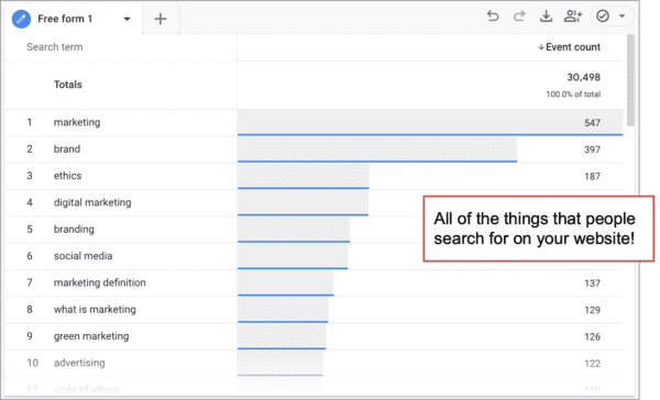
Pretend you are the visitor and go to your website and search for the top phrases that your visitors are searching for. Look at the search results. What do you see? Anything unexpected? Are you having the same experience you want your visitors to have?
Sometimes it’s so obvious. I bet you already have some ideas of how to improve the user experience.
3. Show pictures of you and your team
Real photos. Not stock photos. The faces of the people that work there. Your people are unique to your company, so they’re a differentiator. Show them off by building up the team bios in the about section. There are benefits to both traffic and conversion.
- Social media: Visitors aren’t going to engage with a faceless website. Pictures of people encourage comments, likes, follows, shares, etc…
- Search optimization: Websites often rank for the names of your team members, but only if there is a page for each person. It doesn’t work if there’s one page with everyone.
- Conversion rate: Put a name and a face on the site, and you build trust. Trust leads to phone calls, form submissions and sales.
If you’re a small business, here’s where you have an advantage. You can be more personal, more human.
Big companies are always trying to look small, and small businesses are always trying to look bigger. Really, all businesses should just be more human.
Your site shouldn’t look abandoned. Put a face on it. Be a person.
4. Tell your passion story!
Why is your company in business? What is your purpose? What do you believe? What are you opposed to? What got you started? Why does this stuff matter?
This is your story.
No one cares how much you know, until they know how much you care. – Theodore Roosevelt
Your story lets people connect with you on a deeper level. It’s why they clicked “About.” So put your passion story on your website. Put it on the about page and if possible, use video.
3 things to remove from your website
Now that you’ve put the good stuff on your site, time to get rid of the bad. Here are three things to NOT put on your site.
- Cut out paragraphs longer than five lines
Most website visitors scan pages, looking for relevant content. Long, blocky paragraphs get scanned or skipped entirely. Write short paragraphs if you want your content to be read. - Get rid of your testimonial page
Testimonials are powerful social proof. But visitors tend not to go to testimonial pages. If you want your testimonials to be seen, sprinkle them throughout the site, on every page. (Here’s a complete guide on website testimonials with examples). - Skip the “We’re the #1 Best Top Greatest”
Seriously. That just smells like marketing. It’s also common, expected and ineffective…
Fill ‘er up
It’s a container, but watch what you put in it. Fill it with things your audience wants and your visitors will reward you with low bounce rates and high time on site.
Resources:
- Need help creating web content? Ask a content developer.
- Need more content ideas? Try answering these questions.