One of the worst things you can do is make someone wait too long for your page to load and then POOF! you’ve lost them.
Image optimization and page speed are crucial for your Google ranking, it’s also essential for a great mobile user experience. Don’t be the last one to know how to “Save Images for Web” – you could be saving yourself and your customers a boatload of frustration and time with a few simple steps.
Before we get into how you can optimize your images, let’s review the why.
The importance of page weight
So, what is page weight?
Page weight is how large a webpage is in megabytes or gigabytes (the size of all the combined files on the page); relevant to how long the page takes to load in the browser. This is impacted by all the files that are used to create the page, such as images, scripts, videos, HTML, and more.
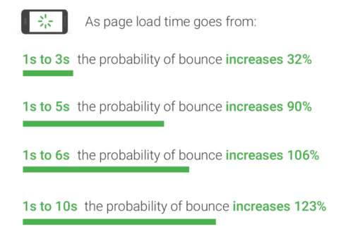
While it’s great to have a working site, if one or more pages are loading slowly, it might as well be broken. Data shows that the longer it takes for a page to load, the higher the chance that visitors will leave the page (aka bounce).
TLDR: Page weight, also known as page size, refers to the size of a webpage. A larger page weight = longer load times, which can have a negative impact on SEO and user experience.
“Photos and videos continue to be the bulkiest part of websites, making up almost three-fourths their size,”—CNN Money’s Hope King
If you want to measure your site’s load time, Pingdom is a great option. This tool lets you see all the individual elements that are causing your page weight to be higher. In addition to the dimensions of your images, you should also consider the overall file size of the imagery you’re using. Images larger than ~200KB can add up quickly, slowing down your page speed.
Visuals are a key element in blog posts
The internet is a visual place- people like to see images and videos. In fact, research shows that visual elements help keep users’ attention.
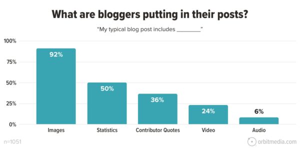
While images are one of the most common elements seen in blog posts, they are often not optimized for the web.
“This gets talked about a lot, but it bears repeating: images are one of the single greatest impediments to front-end performance. All too often, they’re either in the wrong format or they’re uncompressed or they’re not optimized to load progressively — or all of the above.” —Tammy Everts, Web Performance Evangelist
The average blog post has grown +75% since 2014
Learn more blogging trends in this annual blogging statistics round-up, or read through 11 best practices for adding images.
What are web-optimized images?
Now that we’ve covered the importance of optimized imagery, what exactly does a web-optimized photo look like?
Web-optimized simply means that your image settings should indicate that your image resolution is 72, set to sRGB color space, and saved for the web at a reduced file size — all for faster page load.
- Resolution – Most devices are only set up to display between 72-130 PPI (pixels per inch), so make sure your image dimensions match that. Anything higher than 72 is a waste of space and your user’s bandwidth.
- sRGB – sRGB is the world’s default color space and should always be used for web images in order to ensure the best color quality and consistency. Avoid CMYK altogether since that mode is only used for printed materials.
- Reduced File Size/Optimization – Browsers don’t need the excess information stored in your images from the camera (ie. lens, model, etc), so make sure to remove the bloat!
- PNG vs JPG – JPGs store less information and therefore tend to be smaller in weight than PNGs, so use JPGs as a default unless your image contains fine lines and text or needs to be partially transparent (i.e., iconography).
Essentially, we want to shrink file size without compromising the highest possible quality of your photo for the best user experience.
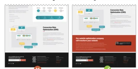
PRO TIP: Your page might have similar relevant content as a competitor’s page, but if your page weight is larger (and your page experience is worse), your page might rank lower on the SERP.
How do I know if my images are optimized?
The typical scenario is that we check out our site, and everything seems to be working fine. Your page doesn’t seem to be loading slowly, and your images seem to be the right size because they fit in your website template like the designer told you they would. If they look nice and crisp, what could be the problem?
The problem with that typical scenario is that it’s not typical – most website owners only look at their sites on a desktop computer while using a dedicated high-powered wifi network.
Additionally, you won’t know if your images are too big just by looking with the naked eye; you will have to investigate the file size and image settings. Your site is most likely built in a way that conforms to fit a certain set of dimensions.
If you’re an Orbit client and wondering whether or not your images are sized correctly, consulting your website’s style guide is a good place to start. Your style guide will tell you the exact pixels your images need to be for every kind of placement (I.e., hero images need to be 1920×600 pixels, image block images 900×600 pixels, and icons need to be 80×80 pixels).
Consider your mobile users
It’s a good idea to occasionally try simulating the user experience for someone visiting your site for the first time. Clear your cache and take a look at your site on desktop and mobile with a fresh pair of eyes, and you might find the loading experience more cumbersome than you realized.
You have to consider mobile users who are in line for their take-out order, waiting for the bus, living in rural areas, or using the public library’s Internet connection.
Think about your mobile users first since there are so many people using their mobile devices to visit your website.
“The vast majority of Americans – 97% – now own a cellphone of some kind. The share of Americans that own a smartphone is now 85%, up from just 35% in Pew Research Center’s first survey of smartphone ownership conducted in 2011.” —Pew Research Center
How to get the best quality image in Photoshop
In the video below, Aaron Nace shows you how to get the best quality image for the web when working in Photoshop.
Saving images for web in Photoshop
1. Open Photoshop, and your image file.
2. Check image size to make sure it is set to 72dpi and color settings are set to sRGB mode. Most likely, your team will have given you height and width dimensions for particular parts of your site. Double-check those dimensions are correct and are in pixel format.
3. From the File menu, choose File > Export > Save for Web, and you will presented with the screen below:
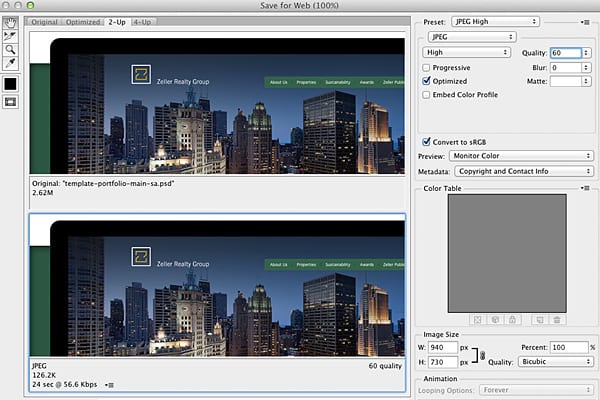
In the top left corner of the Save for Web window are a series of tabs labeled Original, Optimized, 2-Up, and 4-Up. By clicking these tabs, you can switch between a view of your original photo, your optimized photo (with the Save for Web settings applied to it), or a comparison of two or four versions of your photo. Choose “2-Up” to compare the original photo with the optimized one. You will now see side-by-side copies of your photo.
Choose “2-Up” to compare the original photo with the optimized one. You will now see side-by-side copies of your photo. The second photo is the optimized photo – check to see that it’s not pixelated.
4. Click on the second photo. Choose “JPEG High” from the Preset menu. You can now compare your optimized photo (which will eventually be your final file) with your original. Depending on the quality of the photo, you may be able to use “JPEG Medium,” but double-check that you aren’t pixelating your photo.
In the example above, you can see I decreased the file size from 2.62M to 126K – this is a HUGE difference and will increase productivity/load time on your site tremendously.
Adobe has a great video tutorial if you would like to watch how it’s done.
What if you don’t have Photoshop?
There are apps out there that you can download for FREE if you’d rather not spend the money for Photoshop. Good news is, Photoshop is available for a very affordable small ($9.99) monthly fee.
Some FREE options for software:
There are many other ways to optimize your website for quicker load time, but for the purposes of curating your own content and images, shrinking image sizes is a great place to start. There are also some WordPress plugins, like Smush Pro, that will help to shrink your image sizes and improve the overall speed of your site.
This should make a significant difference in your customers’ experience online, whether they are on mobile or desktop, in line for tacos, or at their desk viewing the full site with dedicated Internet.
We have the power to take control of website performance – let’s work to make that happen.