Success or failure comes down to a single click.
And getting that website click (or tap) depends on a lot of little factors. One factor that makes a big difference is the design of the button itself.
They’re everywhere, on emails, landing pages, contact forms and ecommerce carts. I’ve made hundreds myself, I’m sure. But how much time do we spend on the button design? The call to action?
After building hundreds of websites and reviewing each, we’re happy to share what we’ve learned about designing calls to action.
Here are seven best practices you can apply to design a button for your site.
Note: This article is specifically about how to design buttons for calls-to-action (CTA) buttons, not general website navigation, clickable icons or in-text links.
1. Intent: Align the visitor intent with the call to action
Let’s answer the big question first: why do people click things?
The short answer: People click on a call to action because they believe they’ve found the help they need.
So the biggest factor in clickthrough rates is the motivation of the visitor, not button design. If the visitor doesn’t want or need what the page offers them, nothing is going to get them to click. It’s that simple. And there’s not much you can do to fundamentally change the motivations of your visitor.
But if they do need your help, there are ways to build a page that will win over your visitor:
- Is the offer crystal clear? If they need it, they’ll know they’re in the right place.
- Did you handle their objections? If they need it, but something is stopping them, you’re addressing it.
- Are you attracting the right visitor? Is the traffic source (or navigation label) bringing in people who are a fit for the offer on the page?
There’s a true story in the life of every visitor to every webpage. Think long and hard about this visitor. Now look at the page. Is there a mismatch between their needs and your CTA?
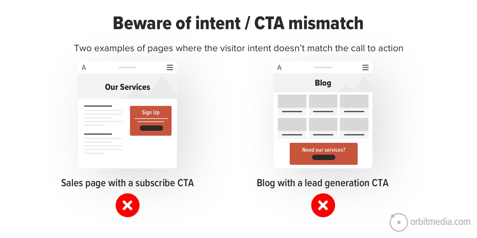
A classic example of an intent/call to action mismatch is the email signup CTA on a service page. The visitor is here because they need your help. Suggest they get in touch, not subscribe to emails.
Another mismatch example is a lead generation CTA on a blog. The visitor is here because they’re looking for information. Suggest they sign up for more information. Don’t expect that they’ll need your services.
Know the motivations of your visitor and help them qualify (or disqualify) themselves. If the CTA matches their intent, clickthrough rates (CTRs) will be higher. This is more important than all of the following tips combined…
2. Specificity: Verbs & Specificity
Every click is actually symbolic of another action.
A click can mean “buy,” “send,” “browse” or a hundred other things. With this in mind, look at any button on your website and ask what the click really indicates. Is the verb accurate? Is it specific?
The text on the button sets the visitor’s expectations about what they’re really doing. More than other button design aspect – color, shape, size, placement – the text is the key factor for the visitor.
So it’s not just a question of how to design a button, but how to write a button. Compare these examples:
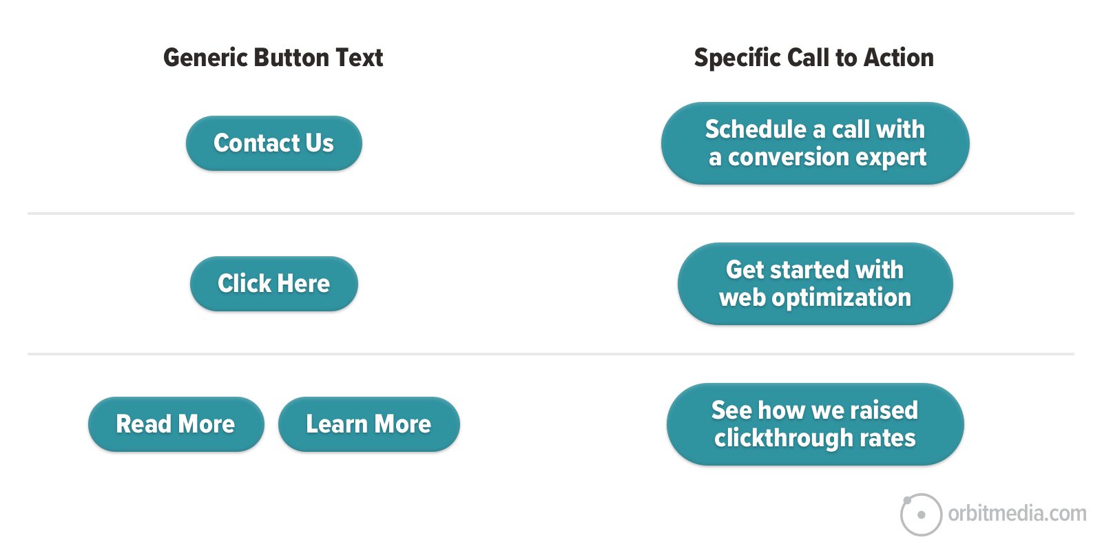
Yes, specific CTAs are longer. Web designers may cringe at the idea of an 8-word button, especially when it starts wrapping on mobile devices. But it’s worth testing.
Visitors on websites (and all internet users everywhere) click only after they’ve done a split-second cost/benefit calculation. They’ve concluded that the benefit of clicking exceeds the cost or risk that they’re wasting their time.
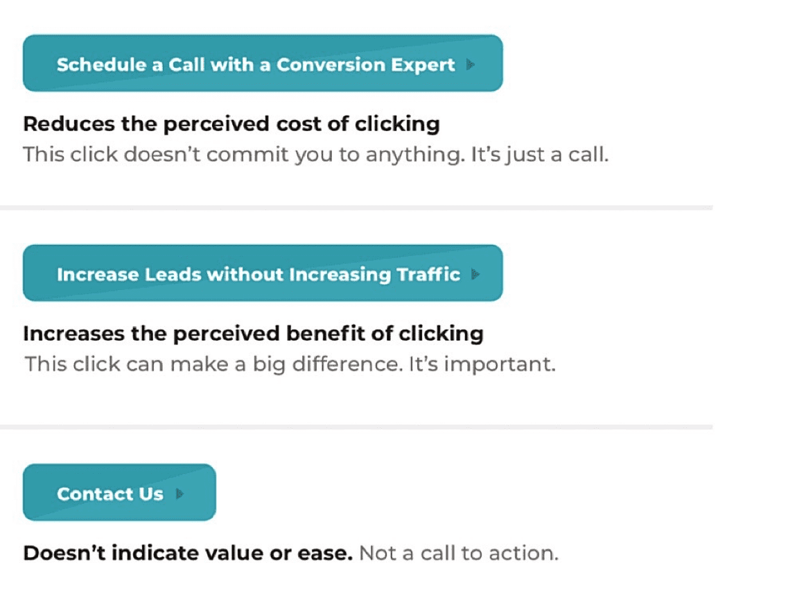
So when you make a button for a website, you can improve CTRs by making the benefit seem bigger or the cost seems smaller.
Make buttons that sound easy
For a lead generation call to action, remind them that they’re not committing yet. They’re just starting a conversation. Buttons that suggest a lower level of commitment require less trust and motivation, which can increase clickthrough rates.
- Book a call with an associate
- Chat with a web design professional
- Schedule a quick call with a consultant today
For a content (signup or download) call to action, remind them that there’s no waiting or effort required.
- Download now
- Get instant access to the guide
- Send the weekly tips to my inbox
The easier the button sounds, the more likely they’ll click. Buttons that imply a bigger commitment trigger bigger concerns.
 |
Justine Jordan, Postmark“We’ve tested several variations of the ‘low commitment performs better’ hypothesis—on blog posts, in emails, and directly on our pricing and sign-up page. What we’ve found is that low commitment almost always increases clicks, but isn’t always better for the bottom line—so choose your success metrics wisely. While a specific button treatment may result in more clicks (a standard goal for testing buttons in an email), a better measure of success for other experiments may be visits, sign ups, conversions or revenue.” |
Make buttons that sound valuable
The other way to make a button that gets clicked is to make clicking sound valuable. This is the other way to add specificity. For a lead generation CTA, it may indicate credentials or impact.
- Discuss your project with a web design expert
- Got a question? Connect with a UX professional
- Submit your website for a complete audit
And for a content (signup or download) CTA, highlight the value of the content
- Get the step-by-step guide
- See the 2023 conversion rate benchmarks
- Read the analysis of a panel of behavioral psychology experts
The more valuable the button sounds, the more likely they are to click.
3. Obvious Buttons: Visual Prominence
Does your call to action stand out?
Every scroll depth on every webpage has a visual hierarchy. This is how the organization of the design elements guides the eye through the page. Some things are more visually prominent than others. They stand out.
Web designers create visual hierarchies to deliberately guide the eye toward key messages, supportive evidence and CTAs. There are five basic ways to make something more obvious on a website:
- High placement on the page
- Size of the element
- Contrast/color temperature
- Surrounded by whitespace
- On every page (header/footer)
Occasionally, little animations are added to buttons to catch your attention, but this often looks spammy. It’s too much. But adding little arrows can work very well, as on the homepage of this marketing agency.
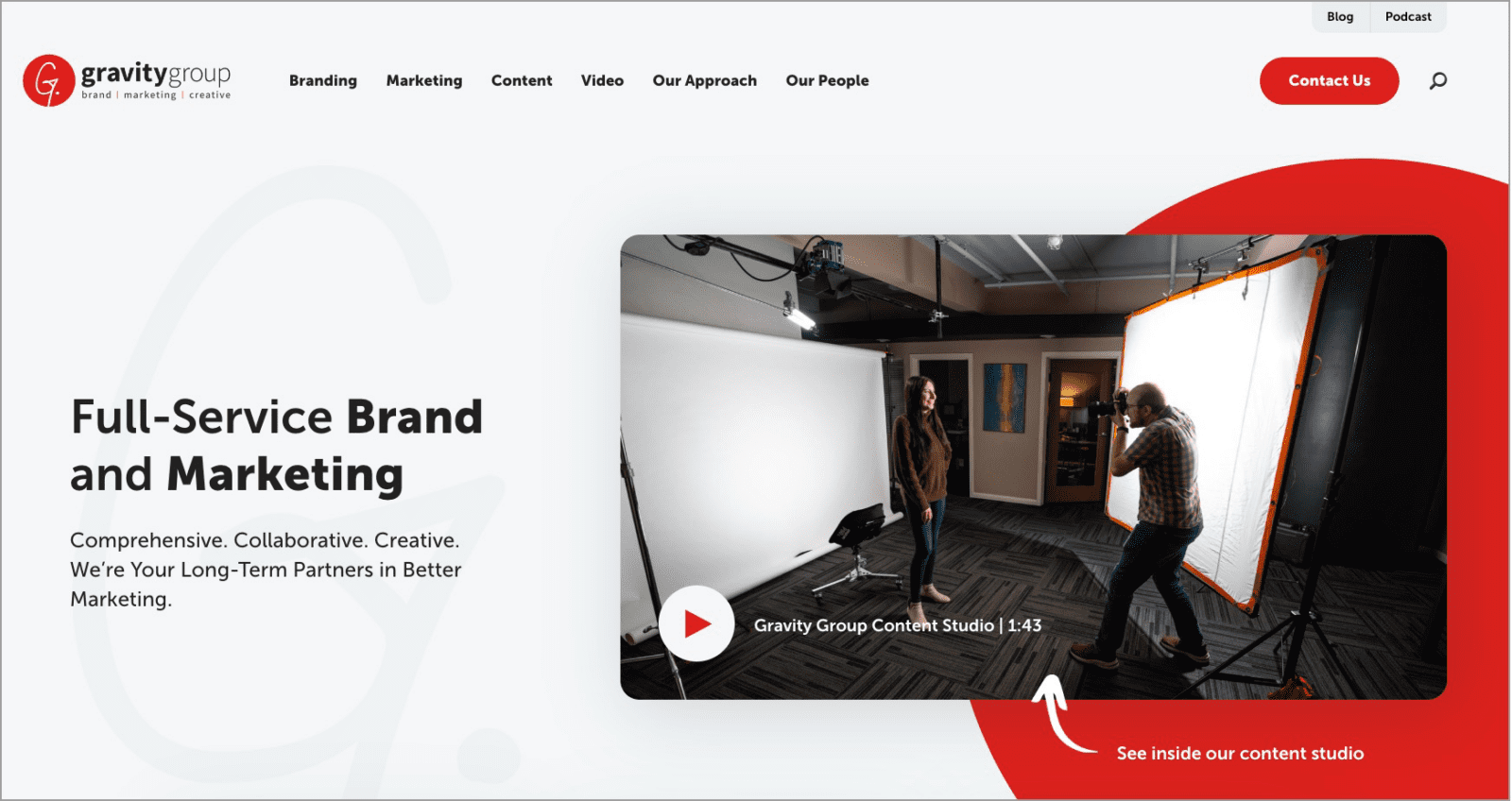
Arrows pull in the visitor’s attention.
Color temperature and visual prominence
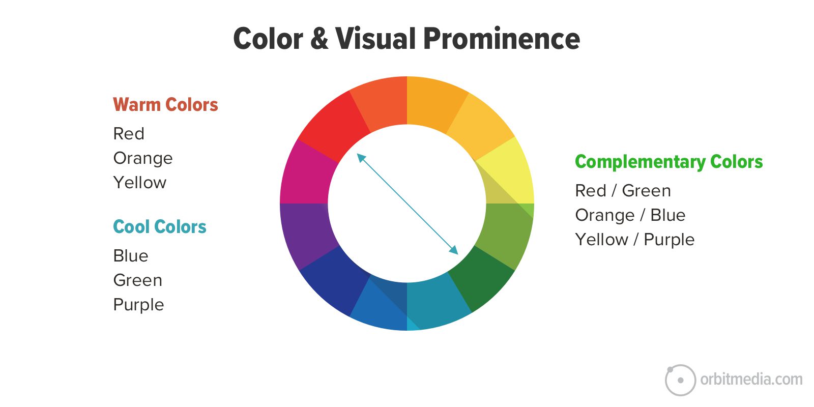
Our eyes are constantly scanning for “pattern interrupters.” Anything that contrasts with its surroundings automatically gets our attention. It’s fundamental to the biology of the human eye and brain. It’s called the Von Restorff Effect.
The use of color is a great example.
Button designers can use contrasting colors to draw attention to the desired action. The strongest contrasts are colors on opposite sides of the color wheel. These are called complementary colors. Warm colors (red, orange and yellow) contrast with cool colors (green, purple and blue).
In the context of cool colors, a drop of warm color jumps out.
Some web designs even pick one color to be the “action color” using that color on all links and buttons and for nothing else.
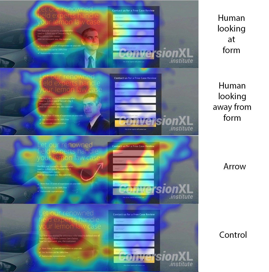
Faces can also guide attention. Humans are naturally inclined to look where others look. So images of people looking toward a button can make that button more obvious.
Heat maps generated in eye tracking studies measure the impact of layout, color, faces and arrows. Here’s an example from a classic study by CXL. The arrow wins.
 |
Angie Schottmuller, Conversion Specialist“The call to action should be the first thing to stand out on any piece of marketing. No one likes wasting time scanning a page to find their logical next step. Make sure your primary CTA not only stands out, but that your users’ eye will magnetically be drawn to it.” |
4. Pronouns: First or Second Person?
The point of view of website copy is typically second person. The writers of the page are speaking to the visitor as the brand. “We have been designing website buttons for 20 years. We can help you design your buttons.”
But there is one possible exception: button text.
When a button or link uses first-person pronouns, they become part of the reader’s internal dialog. The idea is to invite the reader to think of themselves taking the action. These buttons speak from the perspective of the action taker, the person holding the mouse or touching the screen.
Studies have shown this can improve clickthrough rates.
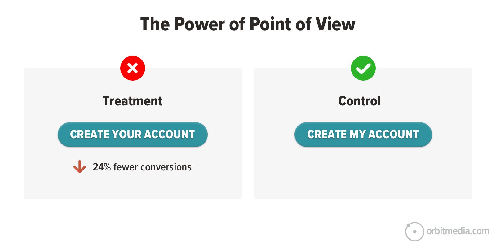
The button with the first-person perspective (Create My Account) was clicked by 24% more visitors than the buttons with the second-person perspective (Create Your Account). Pronouns and point-of-view can make a difference.
 |
Tim Paige“Eugene Schwartz once said that you should ‘enter the conversation the prospect is having in their own mind’ — so if they’re looking at your call to action, what would they say they want to do? ‘I want to…” |
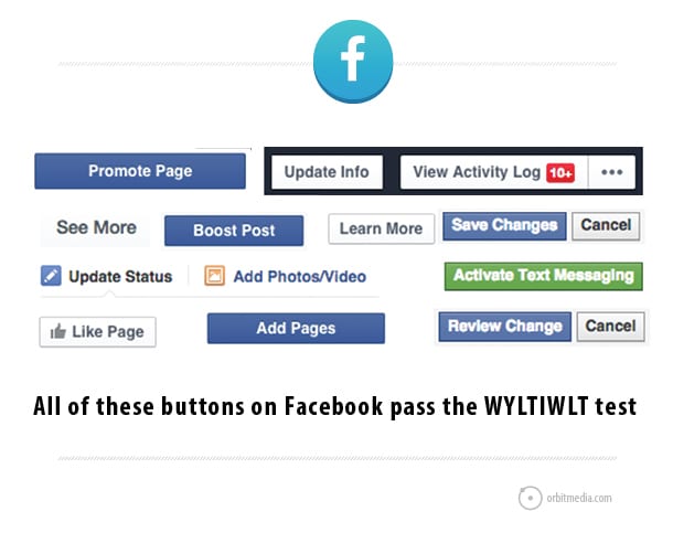
Alternative: Avoid pronouns and pass “The WYLTIWLT Test”
Some buttons have no pronouns. They have a neutral point of view. There’s actually a test for this. Add these phrases before the text of your button and see if the button label still makes sense:
- Would you like to [button text]?
- I would like to [button text].
If your button text is “learn more,” you would say, “Would you like to learn more?” and “I would like to learn more.” Since it works both ways, this button passes the test.
This approach was suggested by Jonathan Richards, who created an acronym for it, shortening “Would you like to, I would like to” to WYLTIWLT, pronounced “Wilty Wilt.” That’s your new marketing buzzword for the day.
Buttons that pass this test can be read in both the voice of the website and the voice of the visitor.
It’s a way to quickly make sure that each button begins with an action word and works in the voice of both the marketer and the visitor. Virtually every button on Facebook passes the WYLTIWLT test!
5. Easy to reach on mobile
Some website buttons are literally out of reach, at least on mobile screens.
After growing steadily for years, the average phone screen size is holding steady at 6.3 inches. That’s about the size of an iPhone13. It’s big. And it affects website usability for mobile users reaching for faraway tap targets.
Your thumb is about 60 pixels wide.
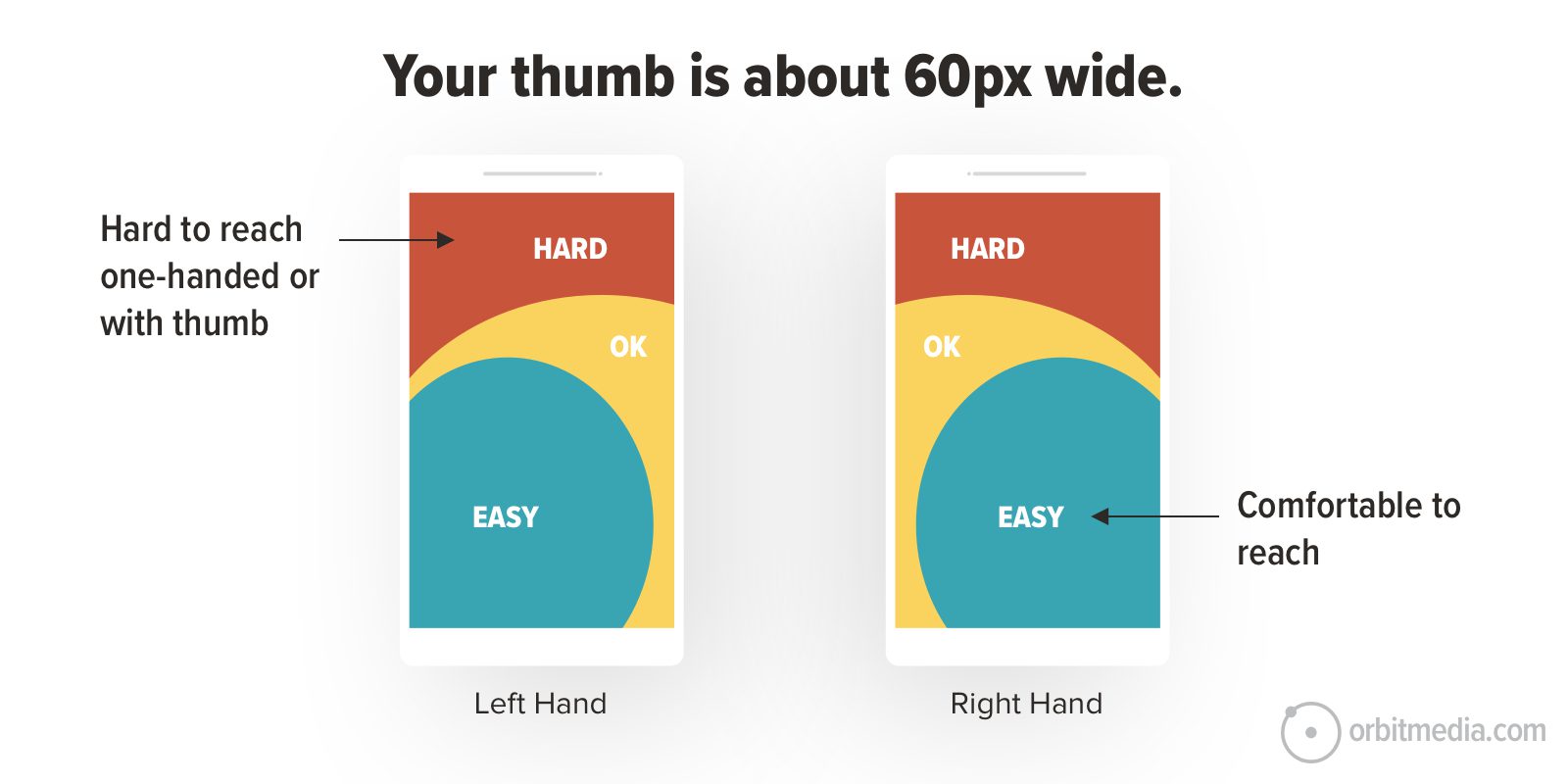
Mobile navigation in headers are still standard but there’s a debate in the UX community about moving them to the bottom of the mobile viewport, closer to thumbs.
But any web design can put CTA buttons within reach by simply putting them in the content area. As the visitor moves through the page, that button slides right under their thumb. CTAs in a sticky header are harder to reach.
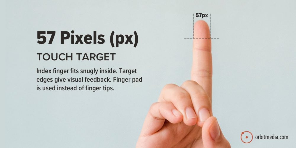
It’s also helpful to keep those mobile tap targets large. This is one reason why buttons are better than links, they’re a touch-friendly size for fingers and thumbs. A fingertip is roughly 60 pixels wide.
 |
Brian Massey, Conversion Scientist“Consider adding choice. Add a secondary link or lower-contrast button next to the call to action button that presents a negative result of not acting. The button text would communicate “I don’t want the good thing you promise on the other button”. This changes the decision from “Do I press the button?” to “Which button do I press?” |
6. Make buttons with code, not graphic.
The word “button” usually means a graphical image, just like “link” usually means text. However, smart developers create buttons that look like images but are built like links.
Graphical buttons have problems…
- They’re slower to load
- They aren’t accessible to visitors with disabilities
- They may not be displayed in email. Many email clients don’t display images until “display images” is clicked.
Code-based buttons have none of these problems. Since you can design lovely buttons using HTML and CSS, I can’t think of a single reason to make your button an image.
Buttons made from HTML/CSS are sometimes called “bulletproof buttons” since they render everywhere, including emails. If your team doesn’t have time to help, no worries. Here is a tool that makes it easy to create bulletproof buttons.
Here’s an example of a button that looks like a graphic but is 100% code.
Even though it’s code, you can (and should) still add ALT tags. It’s good for accessibility, usability and search friendliness. This is an excellent use for ALT tags!
7. Track and optimize your button for better clickthrough rates
We’ve shared a lot of button design best practices. But if you try them, there’s only one way to know if the change worked: data. You need Analytics to measure the performance of your buttons. You need GA4 to track the CTRs of your CTAs.
Some clicks are easier to track than others.
Any click that moves the visitor forward from one URL to another is easily tracked in GA4 without any fancy setup required. Simple user flow analysis will show the clickthrough rate of every menu item and CTA.
But clicks that keep the visitor on a given page (the address in the address bar doesn’t change) and clicks that take the visitor to another website (3rd party conversions) are not simple to track. They often require setup, or at least a bit more skill, to measure.
Easy to track (visitors flow through URLs):
- Clicks that bring the visitor to another page
Difficult to track (non-pageview interactions):
- Clicks that take visitors to another website
- Clicks that show the visitor a thank you message
- Clicks that launch or dismiss a popup window
So, whenever possible, make your buttons easy to track by building them into a flow of pages. Use thank you pages, not thank you messages. Avoid pop ups and third-party conversions unless you have no other choice.
How to optimize your buttons for better clickthrough rates
It’s live. It’s visually prominent. It has action-oriented button text. It’s tracking in GA4 and you’ve benchmarked your clickthrough rate.
The next step is the most important step. You’re ready to run an A/B test on your button. See if any alternate versions might perform better. This is the key to website optimization.
Try another best practice or just a weird idea, and set up a test. A few best practices for AB testing your buttons.
- Tests on button text are the easiest
Tests on visual elements (button colors, placement, layout) are both more difficult and less likely to yield a result. - Low traffic sites take time
You may need to let the test run for weeks before you get a result with strong probability. Long tests are less reliable because time itself becomes a variable. - Variants must be sufficiently varied
A test of two buttons “Contact” and “Contact Us” isn’t really what we’re doing here. Try something different and see what happens!
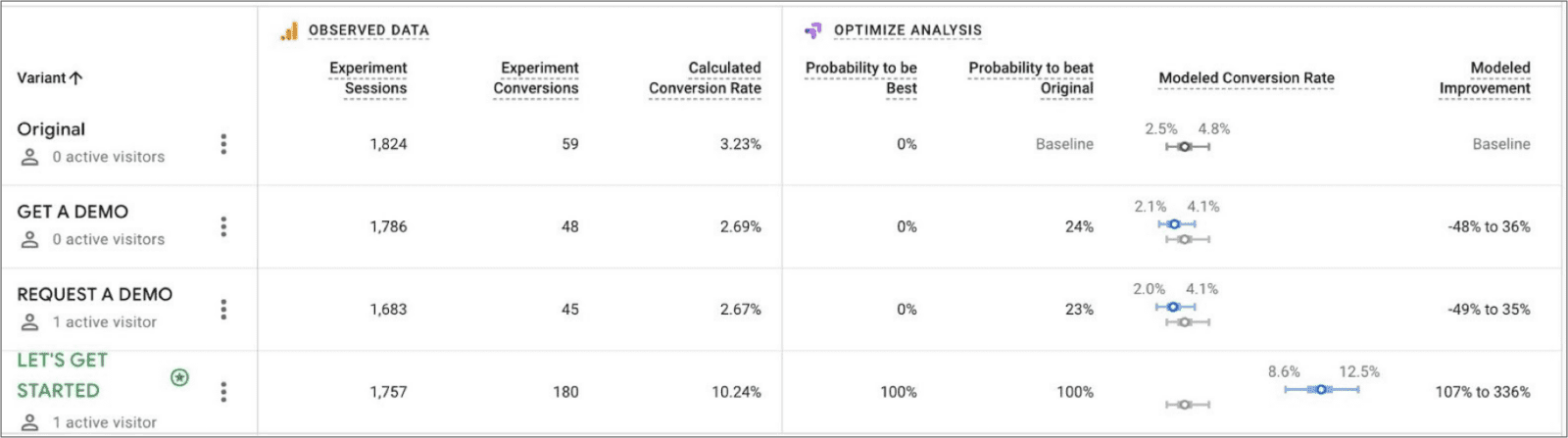
Here’s what the results might look like in a test of several variants on a homepage CTA. You can see that “Get a Demo” and “Request a Demo” performed the same. But “Let’s get started” was a clear winner.
Button design, clicks and lead generation
Getting traffic is only half the battle; getting visitors to act is the other half. The click is the moment of truth and the button itself makes a huge difference. The little things can make a difference.
Your CTA button is on the critical path toward conversion. Its performance directly affects lead generation and demand. The big players know this and it’s often obvious that they’re working hard on button design and optimization.
But any digital marketer can make a better button.